Storytelling with data and data visualization
- 1. STORY TELLING WITH DATA Frehiwot Mulugeta June 24, 2021
- 2. Outline I. Why story telling with data matters? II. What is DataVisualization? III.Chart types & When to use IV. Summery of charts by their purpose Please Note: All data presented here are fake
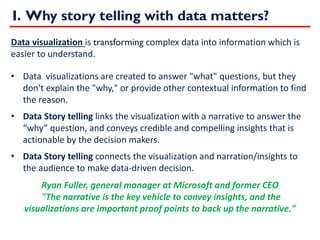
- 3. I. Why story telling with data matters? Data visualization is transforming complex data into information which is easier to understand. ? Data visualizations are created to answer "what" questions, but they don't explain the "why," or provide other contextual information to find the reason. ? Data Story telling links the visualization with a narrative to answer the ˇ°whyˇ± question, and conveys credible and compelling insights that is actionable by the decision makers. ? Data Story telling connects the visualization and narration/insights to the audience to make data-driven decision. Ryan Fuller, general manager at Microsoft and former CEO "The narrative is the key vehicle to convey insights, and the visualizations are important proof points to back up the narrative."
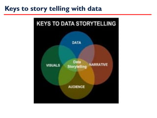
- 4. Keys to story telling with data
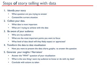
- 5. Steps of story telling with data 1. Identify your story ? What question are you trying to answer ? Context/the current situation 2. Collect your data. ? What data is most important ? What am I trying to achieve with the data 3. Be aware of your audience ? Who are my audience ? What are the most important points you want to focus ? What level of data detail will they likely expect or appreciate? 4. Transform the data to data visualization ? How you want to present the data: charts, graphs; to answer the question 5. Generate your insights / Narration/ ? Answer the ˇ°WHYˇ± question of your visualization ? What is the one thing I want my audience to know or do with my data? ? Conclude with actions to taken
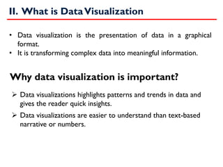
- 6. II. What is DataVisualization ? Data visualizations highlights patterns and trends in data and gives the reader quick insights. ? Data visualizations are easier to understand than text-based narrative or numbers. ? Data visualization is the presentation of data in a graphical format. ? It is transforming complex data into meaningful information. Why data visualization is important?
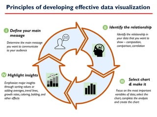
- 7. Principles of developing effective data visualization Define your main message +20% Determine the main message you want to communicate to your audience I II III IV Identify the relationship Identify the relationship in your data that you want to show ¨C composition, comparison, correlation Select chart & make it Focus on the most important variables of data, select the chart, complete the analysis and create the chart Highlight insights Emphasize major insights through sorting values or adding averages, trend lines, growth rates, coloring, bolding, and other effects
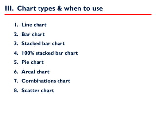
- 8. 1. Line chart 2. Bar chart 3. Stacked bar chart 4. 100% stacked bar chart 5. Pie chart 6. Areal chart 7. Combinations chart 8. Scatter chart III. Chart types & when to use
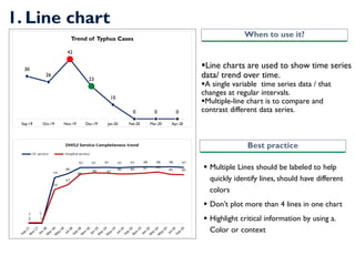
- 9. 1. Line chart ?Line charts are used to show time series data/ trend over time. ?A single variable time series data / that changes at regular intervals. ?Multiple-line chart is to compare and contrast different data series. ? Multiple Lines should be labeled to help quickly identify lines, should have different colors ? DonˇŻt plot more than 4 lines in one chart ? Highlight critical information by using a. Color or context When to use it? Best practice 30 26 42 23 10 0 0 0 Sep-19 Oct-19 Nov-19 Dec-19 Jan-20 Feb-20 Mar-20 Apr-20 Trend of Typhus Cases
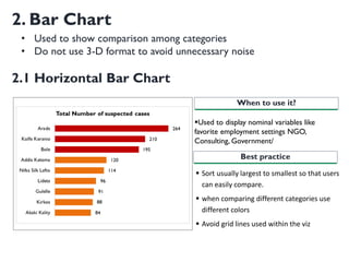
- 10. 2. Bar Chart ?Used to display nominal variables like favorite employment settings NGO, Consulting, Government/ When to use it? Best practice ? Sort usually largest to smallest so that users can easily compare. ? when comparing different categories use different colors ? Avoid grid lines used within the viz 2.1 Horizontal Bar Chart ? Used to show comparison among categories ? Do not use 3-D format to avoid unnecessary noise
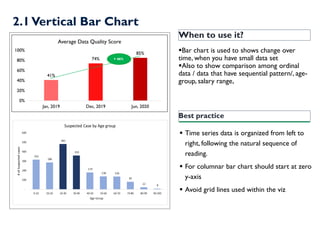
- 11. When to use it? ?Bar chart is used to shows change over time, when you have small data set ?Also to show comparison among ordinal data / data that have sequential pattern/, age- group, salary range, Best practice ? Time series data is organized from left to right, following the natural sequence of reading. ? For columnar bar chart should start at zero y-axis ? Avoid grid lines used within the viz 41% 74% 85% 0% 20% 40% 60% 80% 100% Jan, 2019 Dec, 2019 Jun, 2020 Average Data Quality Score + 46% 2.1Vertical Bar Chart
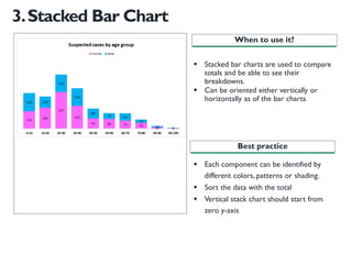
- 12. 3.Stacked Bar Chart ? Stacked bar charts are used to compare totals and be able to see their breakdowns. ? Can be oriented either vertically or horizontally as of the bar charts ? Each component can be identified by different colors, patterns or shading. ? Sort the data with the total ? Vertical stack chart should start from zero y-axis When to use it? Best practice
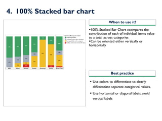
- 13. 4. 100% Stacked bar chart ?100% Stacked Bar Chart ccompares the contribution of each of individual items value to a total across categories ?Can be oriented either vertically or horizontally ? Use colors to differentiate to clearly differentiate separate categorical values. ? Use horizontal or diagonal labels, avoid vertical labels When to use it? Best practice
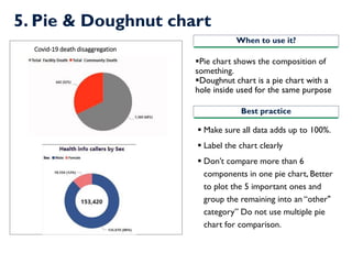
- 14. 5. Pie & Doughnut chart ?Pie chart shows the composition of something. ?Doughnut chart is a pie chart with a hole inside used for the same purpose ? Make sure all data adds up to 100%. ? Label the chart clearly ? DonˇŻt compare more than 6 components in one pie chart, Better to plot the 5 important ones and group the remaining into an ˇ°other" categoryˇ± Do not use multiple pie chart for comparison. When to use it? Best practice Covid-19 death disaggregation
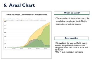
- 15. 6. Areal Chart ?Always label the axis and fields clearly. ? Avoid using dimensions with more categories in an area chart as it can lead to clutter. ?The X-axis must start from zero ? The area chart is like the line chart, the area below the plotted line is filled in with color to indicate volume. When to use it? Best practice COVID-19 Lab Test, Confirmed cases & recovered cases
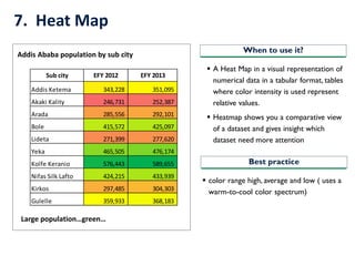
- 16. 7. Heat Map ? A Heat Map in a visual representation of numerical data in a tabular format, tables where color intensity is used represent relative values. ? Heatmap shows you a comparative view of a dataset and gives insight which dataset need more attention When to use it? Best practice ? color range high, average and low ( uses a warm-to-cool color spectrum) Sub city EFY 2012 EFY 2013 Addis Ketema 343,228 351,095 Akaki Kality 246,731 252,387 Arada 285,556 292,101 Bole 415,572 425,097 Lideta 271,399 277,620 Yeka 465,505 476,174 Kolfe Keranio 576,443 589,655 Nifas Silk Lafto 424,215 433,939 Kirkos 297,485 304,303 Gulelle 359,933 368,183 Addis Ababa population by sub city Large populationˇgreenˇ
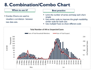
- 17. 8. Combination/Combo Chart ? Limit the number of series and keep each chart simple ? Use similar scale to improve the graph readability, similar scale for both axis ? Use multipleY-axis to show different scale ? Combo Charts are used to visualize a correlation between two data sets. When to use it? Best practice
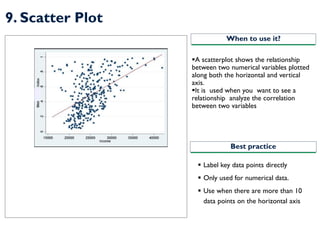
- 18. 9. Scatter Plot ?A scatterplot shows the relationship between two numerical variables plotted along both the horizontal and vertical axis. ?It is used when you want to see a relationship analyze the correlation between two variables When to use it? Best practice ? Label key data points directly ? Only used for numerical data. ? Use when there are more than 10 data points on the horizontal axis
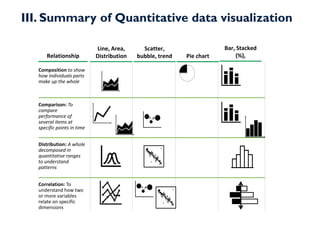
- 19. III. Summary of Quantitative data visualization Line, Area, Distribution Scatter, bubble, trend Bar, Stacked (%), Pie chart Composition to show how individuals parts make up the whole Distribution: A whole decomposed in quantitative ranges to understand patterns Correlation: To understand how two or more variables relate on specific dimensions Relationship Comparison: To compare performance of several items at specific points in time
- 20. Reference ? Data Visualization: How To Tell A Story With Data https://www.forbes.com/sites/nicolemartin1/2018/11/01/data- visualization-how-to-tell-a-story-with-data/?sh=4dea01e54368 ? Telling a story with data https://www2.deloitte.com/us/en/insights/deloitte- review/issue-12/telling-a-story-with-data.html ? https://www.kdnuggets.com/2021/02/telling-great-data-story- visualization-decision-tree.html ? Different websites and books

