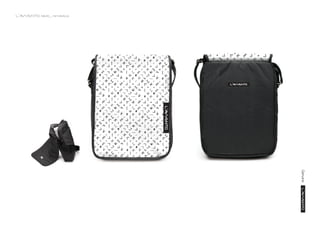
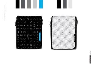
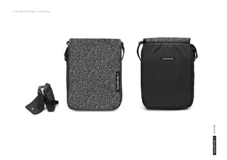
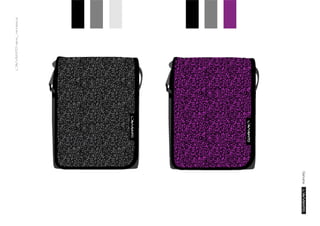
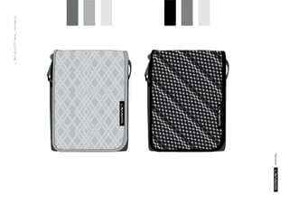
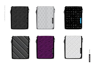
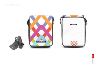
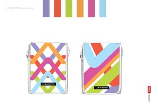
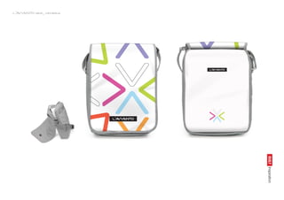
New L'Avvento Mini Bags
0 likes638 views

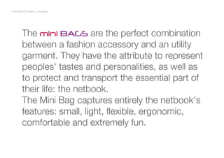
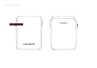
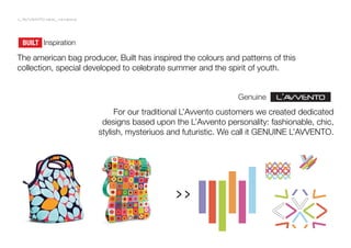
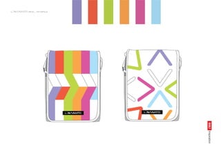
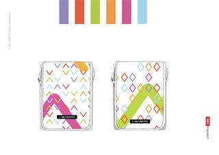
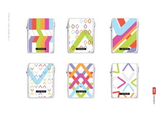
L'Avvento is a laptop bag brand within the 2B Computers. Its products are available on the Middle East and Asian Market.
1 of 36
Download to read offline


Ad
Recommended
New L'Avvento Backpacks
New L'Avvento BackpacksAndrei Popa
?
Backpacks design proposal for L'Avvento.
L'Avvento is a laptop bag brand within the 2B Computers. The L'Avvento products can be found on the Middle East and Asian Market. Fahem Logo Proposal
Fahem Logo ProposalAndrei Popa
?
FAHEM Identity Proposal.
FAHEM is an alliance between several big computer specialized shops in Egypt. The alliance intents to counter balance the influence of the big retailers as Carrefour or Wallmart over the egyptian buying predispositions. The alliance announces a better deal for their customers in terms of quality, service, price and buying experience.Brand Name Proposal
Brand Name ProposalAndrei Popa
?
Brand Name Proposal for a computer accessories brand, on the Middle East Market.Modern Brand Building Stop Campaigning and Start Committing
Modern Brand Building Stop Campaigning and Start CommittingBetsey Merkel
?
The document discusses modern brand building and the evolution from campaigning to committing. It argues that brands should stop changing their message for short-term gains and instead build their brand on core principles that remain consistent over time. This committing approach leads to brand loyalty while campaigning does not. The document provides suggestions for brands to start committing such as defining what they stand for and creating coherent brand experiences and stories over time.Andrei Popa Portfolio
Andrei Popa PortfolioAndrei Popa
?
Design Portfolio - Corporate/Graphic/Advertising/Point of Sale/Packaging/WebBAISITAI Brand Manual Identity
BAISITAI Brand Manual Identity Andrei Popa
?
The document provides guidelines for BAISITAI's corporate identity system including their logo, colors, typefaces, and stationery. It defines the proper usage of the logo and establishes color standards using Pantone colors and CMYK, RGB, and web safe values. It also outlines the primary Futura and secondary Arial typeface families to be used consistently in communications materials.Inatech Brand Manual
Inatech Brand ManualAlexandru Darie
?
The logo, colors, typography, visuals, and stationery are outlined with specifications on correct usage to ensure consistency across Inatech's materials. Guidelines cover logo variations and placement, color variations, approved typefaces and sizes, using the grid for layouts, approved imagery using chevrons and shapes, and examples of business cards, envelopes, letterhead, folders, and other materials. Adherence to these brand identity guidelines is important to maintain Inatech's visual style.GE Case Study
GE Case StudyWolff Olins
?
GE underwent a transformation from a manufacturing company organized into silos to a digital industrial company focused on building customer solutions platforms. As part of this transformation, GE created a modern brand identity centered around the idea of "Imagination at work" to excite leaders and drive impact throughout the business. Since launching this new brand, GE has seen consistent revenue growth averaging 10.25% annually and added $85 billion in additional revenues through 85 "Imagination breakthroughs" inspired by the brand idea.A-BST Logo Proposal
A-BST Logo ProposalAndrei Popa
?
A-BST is a wire and cables producer on the chinese market. Their request was to refresh the brand by creating a new logo and visual identity. The client with no real experience in brand construction required a training and advising on the matter. Along the new logos presented, a small introduction on the value of branding and how to choose a logo. Usm25 Brand Manual
Usm25 Brand ManualMohamad Abdullah
?
This document provides guidelines for using the brand identity of Universiti Sains Malaysia (USM). It describes the primary identity elements, including the crest featuring symbols of Malaysia, the logotype consisting of the letters U, S, and M, and the brand signature combining the crest, logotype, and descriptor. The brand signature can be used in horizontal or vertical formats. Consistent use of these identity elements is important to effectively communicate USM's message as a world-class university.Episode I: Investing in Gold and Silver
Episode I: Investing in Gold and SilverAbdulrahman Ghalayini
?
The document discusses the nature of wealth, emphasizing its definition as the value of assets owned by a person and highlighting the importance of money as a medium for trading time and services. It outlines the historical context of money, distinguishing between silver and gold as real money versus fiat currency, and presents rules for understanding financial systems and investing. Additionally, it offers insights on setting economic goals and planning investments in precious metals.Anatomy of an Effective Website Redesign
Anatomy of an Effective Website RedesignPrimacy
?
The document discusses the complexities of website redesigns, particularly for colleges and universities, emphasizing the need for strategic planning and cross-functional collaboration. It outlines common challenges faced during such projects, including budget constraints and stakeholder disagreements, while highlighting the importance of content strategy and usability. Additionally, it stresses the necessity of a user-focused approach and the integration of both evergreen and fresh content for effective web experiences.V&A Case Study
V&A Case StudyWolff Olins
?
The Victoria and Albert Museum in London underwent a major renewal effort led by its new director Mark Jones to revitalize its buildings and collections displays and move it from acting as the nation's attic to an inspiration for contemporary design. Wolff Olins was hired to update the V&A's brand to reinvigorate its purpose and position it as a global art and design brand. The refreshed brand launched in 2002 helped boost programming, visitor numbers, which increased 34% to 2.5 million by 2009, and website visitors, which grew from 1.6 to 20 million, establishing the V&A as a global brand.Naming presentation
Naming presentationSusan Strandberg
?
The NYSHA Education Department has developed a new self-guided tour system for its popular Spring Field Days program. Educators will appreciate the wide range of subject matter covered and students will enjoy the free-spirited format. They now need to develop a name for the new curriculum. Two direction options are presented: Museum Centered names that reinforce learning at two museums, or Going on a Journey names that combine learning with the idea of travel.Branding proposal
Branding proposalCapital Group
?
The document discusses how AT&T can better define its brand identity. It recommends empowering employees and leveraging them as brand ambassadors, as their passion can embed the brand's message when interacting with customers. Rather than relying solely on outside firms and research, AT&T should involve employees by having them provide direct feedback on the company's image and vision for its brand through interactive exercises. This would help create a stronger, unified brand identity while inspiring employees to actively promote the brand from the inside.Unilever Case Study
Unilever Case StudyWolff Olins
?
Unilever wanted to transform from a diffuse company with too many brands and no growth strategy into a single-minded, idea-led business focused on growth. With Wolff Olins' help, Unilever adopted the idea of "adding vitality to life" as a unifying theme. Wolff Olins created a new visual identity and worked on projects to embed the vitality idea throughout Unilever's operations and culture. As a result of this vitality-driven approach, Unilever achieved nearly 6% underlying sales growth, launched several new successful products, and saw worldwide revenue reach €40.5 billion in 2008.Casio watches
Casio watchesMayuresh Tiwari
?
Casio Industries is the world's sixth largest and India's leading manufacturer of watches, with over 25% of the domestic watch market share. It has several popular brands including G-Shock, Edifice, Sheen, Protek, Outgear, and Oceanus. Casio has showrooms across India to serve customers in every segment. The company was founded in 1957 in Tokyo, Japan and released innovative watches over the decades such as the first G-Shock in 1983 and a digital watch with camera in 2000.The Website Redesign Process
The Website Redesign ProcessGary Schroeder
?
This document outlines the key steps in a successful website redesign process:
1) Define clear project goals and success metrics upfront, including how the redesign will address existing problems and needs.
2) Analyze the intended website audiences to understand their motivations, tasks, and needs.
3) Plan the site structure, content, and functionality based on the audience analysis to ensure usability and task completion.
Key phases include content audits, new content creation, design drafts, programming, and launch. Wireframes and usability testing along the way help refine the design. Clear requirements and plans are essential for a successful redesign.Very Case Study
Very Case StudyWolff Olins
?
Shop Direct Group wanted to attract younger customers and transition to being an online retailer. They hired Wolff Olins to create a new brand called Very based on a social shopping network where customers provide feedback. Wolff Olins developed the Very brand identity, website, and marketing materials. Very launched 10 months later in July 2009 and generated enthusiastic reactions from customers.Casio (Brand Strategy, NYU Stern - Gromley)
Casio (Brand Strategy, NYU Stern - Gromley)Jason Rawlins
?
The document discusses revitalizing the CASIO brand by leveraging the successful G-Shock sub-brand. It proposes infusing CASIO's corporate brand with G-Shock's exciting, colorful image to make CASIO seem more dynamic and stylish. Key elements of the rebranding plan include launching concept stores globally, sponsoring pop-up stores at events, and using taglines that encourage consumers to capture, color and create their lives with CASIO products. The goal is to reposition CASIO as a provider of innovative, rugged electronics that enable active lifestyles.Presentation - Marketing Analysis of Casio ( G-Shock)
Presentation - Marketing Analysis of Casio ( G-Shock)Min Soe Paing
?
The document provides an overview of Casio, including its history, product range (notably G-Shock), and market strategies. It discusses company strengths, weaknesses, opportunities, and threats, alongside a competitive analysis with brands like Rolex and Timex. Additionally, it covers marketing strategies and collaborations with various brands and celebrities.Substitution Presentation in Dark Navy and Orange Geometric Style.pptx
Substitution Presentation in Dark Navy and Orange Geometric Style.pptxhazlienasyiqeen
?
Used for slidesRound 1 Final Assessment-Chelsea Black.pptx
Round 1 Final Assessment-Chelsea Black.pptxindiapoliticscom
?
Round 1 Final Assessment-Chelsea Black.pptxArchitect list in Bangalore. Architects list in Bangalore.pdf
Architect list in Bangalore. Architects list in Bangalore.pdfTejas758706
?
Architect list in BangaloreMore Related Content
Viewers also liked (15)
Inatech Brand Manual
Inatech Brand ManualAlexandru Darie
?
The logo, colors, typography, visuals, and stationery are outlined with specifications on correct usage to ensure consistency across Inatech's materials. Guidelines cover logo variations and placement, color variations, approved typefaces and sizes, using the grid for layouts, approved imagery using chevrons and shapes, and examples of business cards, envelopes, letterhead, folders, and other materials. Adherence to these brand identity guidelines is important to maintain Inatech's visual style.GE Case Study
GE Case StudyWolff Olins
?
GE underwent a transformation from a manufacturing company organized into silos to a digital industrial company focused on building customer solutions platforms. As part of this transformation, GE created a modern brand identity centered around the idea of "Imagination at work" to excite leaders and drive impact throughout the business. Since launching this new brand, GE has seen consistent revenue growth averaging 10.25% annually and added $85 billion in additional revenues through 85 "Imagination breakthroughs" inspired by the brand idea.A-BST Logo Proposal
A-BST Logo ProposalAndrei Popa
?
A-BST is a wire and cables producer on the chinese market. Their request was to refresh the brand by creating a new logo and visual identity. The client with no real experience in brand construction required a training and advising on the matter. Along the new logos presented, a small introduction on the value of branding and how to choose a logo. Usm25 Brand Manual
Usm25 Brand ManualMohamad Abdullah
?
This document provides guidelines for using the brand identity of Universiti Sains Malaysia (USM). It describes the primary identity elements, including the crest featuring symbols of Malaysia, the logotype consisting of the letters U, S, and M, and the brand signature combining the crest, logotype, and descriptor. The brand signature can be used in horizontal or vertical formats. Consistent use of these identity elements is important to effectively communicate USM's message as a world-class university.Episode I: Investing in Gold and Silver
Episode I: Investing in Gold and SilverAbdulrahman Ghalayini
?
The document discusses the nature of wealth, emphasizing its definition as the value of assets owned by a person and highlighting the importance of money as a medium for trading time and services. It outlines the historical context of money, distinguishing between silver and gold as real money versus fiat currency, and presents rules for understanding financial systems and investing. Additionally, it offers insights on setting economic goals and planning investments in precious metals.Anatomy of an Effective Website Redesign
Anatomy of an Effective Website RedesignPrimacy
?
The document discusses the complexities of website redesigns, particularly for colleges and universities, emphasizing the need for strategic planning and cross-functional collaboration. It outlines common challenges faced during such projects, including budget constraints and stakeholder disagreements, while highlighting the importance of content strategy and usability. Additionally, it stresses the necessity of a user-focused approach and the integration of both evergreen and fresh content for effective web experiences.V&A Case Study
V&A Case StudyWolff Olins
?
The Victoria and Albert Museum in London underwent a major renewal effort led by its new director Mark Jones to revitalize its buildings and collections displays and move it from acting as the nation's attic to an inspiration for contemporary design. Wolff Olins was hired to update the V&A's brand to reinvigorate its purpose and position it as a global art and design brand. The refreshed brand launched in 2002 helped boost programming, visitor numbers, which increased 34% to 2.5 million by 2009, and website visitors, which grew from 1.6 to 20 million, establishing the V&A as a global brand.Naming presentation
Naming presentationSusan Strandberg
?
The NYSHA Education Department has developed a new self-guided tour system for its popular Spring Field Days program. Educators will appreciate the wide range of subject matter covered and students will enjoy the free-spirited format. They now need to develop a name for the new curriculum. Two direction options are presented: Museum Centered names that reinforce learning at two museums, or Going on a Journey names that combine learning with the idea of travel.Branding proposal
Branding proposalCapital Group
?
The document discusses how AT&T can better define its brand identity. It recommends empowering employees and leveraging them as brand ambassadors, as their passion can embed the brand's message when interacting with customers. Rather than relying solely on outside firms and research, AT&T should involve employees by having them provide direct feedback on the company's image and vision for its brand through interactive exercises. This would help create a stronger, unified brand identity while inspiring employees to actively promote the brand from the inside.Unilever Case Study
Unilever Case StudyWolff Olins
?
Unilever wanted to transform from a diffuse company with too many brands and no growth strategy into a single-minded, idea-led business focused on growth. With Wolff Olins' help, Unilever adopted the idea of "adding vitality to life" as a unifying theme. Wolff Olins created a new visual identity and worked on projects to embed the vitality idea throughout Unilever's operations and culture. As a result of this vitality-driven approach, Unilever achieved nearly 6% underlying sales growth, launched several new successful products, and saw worldwide revenue reach €40.5 billion in 2008.Casio watches
Casio watchesMayuresh Tiwari
?
Casio Industries is the world's sixth largest and India's leading manufacturer of watches, with over 25% of the domestic watch market share. It has several popular brands including G-Shock, Edifice, Sheen, Protek, Outgear, and Oceanus. Casio has showrooms across India to serve customers in every segment. The company was founded in 1957 in Tokyo, Japan and released innovative watches over the decades such as the first G-Shock in 1983 and a digital watch with camera in 2000.The Website Redesign Process
The Website Redesign ProcessGary Schroeder
?
This document outlines the key steps in a successful website redesign process:
1) Define clear project goals and success metrics upfront, including how the redesign will address existing problems and needs.
2) Analyze the intended website audiences to understand their motivations, tasks, and needs.
3) Plan the site structure, content, and functionality based on the audience analysis to ensure usability and task completion.
Key phases include content audits, new content creation, design drafts, programming, and launch. Wireframes and usability testing along the way help refine the design. Clear requirements and plans are essential for a successful redesign.Very Case Study
Very Case StudyWolff Olins
?
Shop Direct Group wanted to attract younger customers and transition to being an online retailer. They hired Wolff Olins to create a new brand called Very based on a social shopping network where customers provide feedback. Wolff Olins developed the Very brand identity, website, and marketing materials. Very launched 10 months later in July 2009 and generated enthusiastic reactions from customers.Casio (Brand Strategy, NYU Stern - Gromley)
Casio (Brand Strategy, NYU Stern - Gromley)Jason Rawlins
?
The document discusses revitalizing the CASIO brand by leveraging the successful G-Shock sub-brand. It proposes infusing CASIO's corporate brand with G-Shock's exciting, colorful image to make CASIO seem more dynamic and stylish. Key elements of the rebranding plan include launching concept stores globally, sponsoring pop-up stores at events, and using taglines that encourage consumers to capture, color and create their lives with CASIO products. The goal is to reposition CASIO as a provider of innovative, rugged electronics that enable active lifestyles.Presentation - Marketing Analysis of Casio ( G-Shock)
Presentation - Marketing Analysis of Casio ( G-Shock)Min Soe Paing
?
The document provides an overview of Casio, including its history, product range (notably G-Shock), and market strategies. It discusses company strengths, weaknesses, opportunities, and threats, alongside a competitive analysis with brands like Rolex and Timex. Additionally, it covers marketing strategies and collaborations with various brands and celebrities.Recently uploaded (20)
Substitution Presentation in Dark Navy and Orange Geometric Style.pptx
Substitution Presentation in Dark Navy and Orange Geometric Style.pptxhazlienasyiqeen
?
Used for slidesRound 1 Final Assessment-Chelsea Black.pptx
Round 1 Final Assessment-Chelsea Black.pptxindiapoliticscom
?
Round 1 Final Assessment-Chelsea Black.pptxArchitect list in Bangalore. Architects list in Bangalore.pdf
Architect list in Bangalore. Architects list in Bangalore.pdfTejas758706
?
Architect list in BangaloreDevelopment of a Reinforcement Learning-Based Optimization Model for Customer...
Development of a Reinforcement Learning-Based Optimization Model for Customer...ljo758
?
Development of a Reinforcement Learning-Based Optimization Model for Customer Order Scheduling with Missing OperationsHow Smart Design Can Transform Your RestaurantˇŻs Customer Experience
How Smart Design Can Transform Your RestaurantˇŻs Customer ExperienceSprintCo
?
Poor design can silently hurt your restaurantˇŻs customer experience and bottom line. From cluttered layouts that disrupt flow to inconsistent branding that weakens identity, these pitfalls can cost more than you think.
In our latest post, weˇŻre sharing practical fixes to common design challengesˇŞfrom optimizing kitchen layouts to creating seamless customer experiences.
Ready to elevate your space? LetˇŻs build a restaurant that looks great and works even better!
#RestaurantDesign #FandBInteriors #DesignTips #RestaurantSuccess #SprintCo #EfficientSpaces #CustomerExperience #BrandIdentity #sonamantri×îĐ°ćĂŔąúÍţËążµĐÇ´óѧĆŐŔĚŘά¶ű·ÖĐŁ±Ďҵ֤Ł¨±«°Â±Ę±Ďҵ֤Ę飩԰涨ÖĆ
×îĐ°ćĂŔąúÍţËążµĐÇ´óѧĆŐŔĚŘά¶ű·ÖĐŁ±Ďҵ֤Ł¨±«°Â±Ę±Ďҵ֤Ę飩԰涨ÖĆtaqyea
?
2025Ô°ćÍţËążµĐÇ´óѧĆŐŔĚŘά¶ű·ÖĐŁ±Ďҵ֤Ęépdfµç×Ӱ桾qޱ1954292140ˇżĂŔąú±Ďҵ֤°ěŔíUWPÍţËążµĐÇ´óѧĆŐŔĚŘά¶ű·ÖĐŁ±Ďҵ֤Ęé¶ŕÉŮÇ®Łżˇľqޱ1954292140ˇżşŁÍâ¸÷´óѧDiploma°ć±ľŁ¬ŇňÎŞŇßÇéѧУÍƳٷ˘·ĹÖ¤Ę顢֤ĘéÔĽţ¶ŞĘ§˛ą°ěˇ˘Ă»ÓĐŐýłŁ±ĎҵδÄÜČĎ֤ѧŔúĂćÁŮľÍҵĚáą©˝âľö°ě·¨ˇŁµ±ÔâÓöąŇżĆˇ˘żőżÎµĽÖÂÎŢ·¨ĐŢÂúѧ·ÖŁ¬»ňŐßÖ±˝Ó±»Ń§ĐŁÍËѧŁ¬×îşóÎŢ·¨±ĎҵÄò»µ˝±Ďҵ֤ˇŁ´ËʱµÄÄăŇ»¶¨ĘÖ×ăÎ޴룬ŇňÎŞÁôѧһłˇŁ¬Ă»ÓĐ»ńµĂ±Ďҵ֤ŇÔĽ°Ń§ŔúÖ¤Ă÷żĎ¶¨ĘÇÎŢ·¨¸ř×ÔĽşşÍ¸¸Ä¸Ň»¸ö˝»´úµÄˇŁ
ˇľ¸´żĚÍţËążµĐÇ´óѧĆŐŔĚŘά¶ű·ÖĐŁłÉĽ¨µĄĐĹ·â,Buy University of Wisconsin-Platteville Transcriptsˇż
ąşÂňČŐş«łÉĽ¨µĄˇ˘Ó˘ąú´óѧłÉĽ¨µĄˇ˘ĂŔąú´óѧłÉĽ¨µĄˇ˘°ÄÖŢ´óѧłÉĽ¨µĄˇ˘ĽÓÄĂ´ó´óѧłÉĽ¨µĄŁ¨q΢1954292140Ł©ĐÂĽÓĆ´óѧłÉĽ¨µĄˇ˘ĐÂÎ÷ŔĽ´óѧłÉĽ¨µĄˇ˘°®¶űŔĽłÉĽ¨µĄˇ˘Î÷°ŕŃŔłÉĽ¨µĄˇ˘µÂąúłÉĽ¨µĄˇŁłÉĽ¨µĄµÄŇâŇĺÖ÷ŇŞĚĺĎÖÔÚÖ¤Ă÷ѧϰÄÜÁ¦ˇ˘ĆŔąŔѧĘő±łľ°ˇ˘ŐąĘľ×ŰşĎËŘÖʡ˘Ěá¸ß¼ȡÂĘŁ¬ŇÔĽ°ĘÇ×÷ÎŞÁôĐĹČĎÖ¤ÉęÇë˛ÄÁϵÄŇ»˛ż·ÖˇŁ
ÍţËążµĐÇ´óѧĆŐŔĚŘά¶ű·ÖĐŁłÉĽ¨µĄÄÜą»ĚĺĎÖÄúµÄµÄѧϰÄÜÁ¦Ł¬°üŔ¨ÍţËążµĐÇ´óѧĆŐŔĚŘά¶ű·ÖĐŁżÎłĚłÉĽ¨ˇ˘×¨ŇµÄÜÁ¦ˇ˘ŃĐľżÄÜÁ¦ˇŁŁ¨q΢1954292140Ł©ľßĚĺŔ´ËµŁ¬łÉĽ¨±¨¸ćµĄÍ¨łŁ°üş¬Ń§ÉúµÄѧϰĽĽÄÜÓëĎ°ąßˇ˘¸÷żĆłÉĽ¨ŇÔĽ°ŔĎʦĆŔÓďµČ˛ż·ÖŁ¬Ňň´ËŁ¬łÉĽ¨µĄ˛»˝öĘÇѧÉúѧĘőÄÜÁ¦µÄÖ¤Ă÷Ł¬Ň˛ĘÇĆŔąŔѧÉúĘÇ·ńĘĘşĎÄł¸ö˝ĚÓýĎîÄżµÄÖŘŇŞŇŔľÝŁˇ
ÎŇĂÇłĐŵ˛ÉÓõÄĘÇѧУ԰ćÖ˝ŐĹŁ¨Ô°ćÖ˝Öʡ˘µ×É«ˇ˘ÎĆ·Ł©ÎŇĂÇą¤ł§ÓµÓĐČ«Ě×˝řżÚÔ×°É豸Ł¬ĚŘĘ⹤ŇŐ¶ĽĘDzÉÓò»Í¬»úĆ÷ÖĆ×÷Ł¬·ÂŐć¶Č»ů±ľżÉŇÔ´ďµ˝100%Ł¬ËůÓĐłÉĆ·ŇÔĽ°ą¤ŇŐЧąű¶ĽżÉĚáÇ°¸řżÍ»§ŐąĘľŁ¬˛»ÂúŇâżÉŇÔ¸ůľÝżÍ»§ŇŞÇó˝řĐе÷ŐűŁ¬Ö±µ˝ÂúŇâÎŞÖąŁˇ
ˇľÖ÷ÓŞĎîÄżˇż
Ň»ˇ˘ą¤×÷δȷ¶¨Ł¬»ŘąúĐčĎȸř¸¸Ä¸ˇ˘Ç×ĆÝĹóÓŃż´ĎÂÎÄĆľµÄÇéżöŁ¬°ěŔí±Ďҵ֤|°ěŔíÎÄĆľ: Âň´óѧ±Ďҵ֤|Âň´óѧÎÄĆľˇľqޱ1954292140ˇżÍţËążµĐÇ´óѧĆŐŔĚŘά¶ű·ÖУѧλ֤Ă÷ĘéČçşÎ°ěŔíÉęÇ룿
¶ţˇ˘»Řąú˝řË˝Ćóˇ˘ÍâĆóˇ˘×ÔĽş×öÉúŇâµÄÇéżöŁ¬ŐâĐ©µĄÎ»ĘDz»˛éŃŻ±Ďҵ֤ŐćαµÄŁ¬¶řÇŇąúÄÚĂ»ÓĐÇţµŔČĄ˛éŃŻąúÍâÎÄĆľµÄŐćĽŮŁ¬Ň˛˛»ĐčŇŞĚáą©Őćʵ˝ĚÓý˛żČĎÖ¤ˇŁĽřÓÚ´ËŁ¬°ěŔíĂŔąúłÉĽ¨µĄÍţËążµĐÇ´óѧĆŐŔĚŘά¶ű·ÖĐŁ±Ďҵ֤ˇľqޱ1954292140ˇżąúÍâ´óѧ±Ďҵ֤, ÎÄĆľ°ěŔí, ąúÍâÎÄĆľ°ěŔí, ÁôĐĹÍřČĎÖ¤Ideo on friction - resource to aid you in that process
Ideo on friction - resource to aid you in that processvikram sood
?
ItˇŻs natural for business leaders to avoid friction at all costs. When left
unchecked, friction can be costly, both in terms of money and morale.
For large organizations seeking to diversify their offer by building a new venture, thereˇŻs often tension between the parent company and the fledgling. The new venture holds potential rewards, but also potential risk, as it introduces new models, metrics, and norms.
But what if you could harness the kinetic energy that friction causes, and use it to catapult your venture toward success? In the right conditions, friction can show you the difference between how youˇŻve been operating, and how you need to be.
This resource was created to aid you in that process. The cards in this deck introduce nine common frictions that arise when building new ventures, how each could derail you, and how someone else has used them to fuel success.PowerISO Crack 9.0 + Serial Key Free Download 2025
PowerISO Crack 9.0 + Serial Key Free Download 2025Ayesha khan
?
COPY & PASTE LINK ???
https://pcsoftsfull.org/dl/
PowerISO is a powerful and versatile software that allows you to create, edit, extract, convert, compress, encrypt, split and mount CD/DVD image files.The-Future-of-Fashion-in-Singapore-Moushumi-Khara.pdf
The-Future-of-Fashion-in-Singapore-Moushumi-Khara.pdfThe Lifestyle Editor
?
At The Lifestyle Editor, founder Moushumi Khara is redefining what it means to dress with purpose. Known for her timeless style philosophy, Moushumi combines years of fashion expertise with an intuitive understanding of personal expression. One of her standout servicesˇŞColour analysis SingaporeˇŞhelps clients discover the shades that naturally enhance their features, creating a wardrobe that feels authentic, confident, and effortlessly elegant. Her fashion legacy lies in guiding clients away from fleeting trends and toward styles that last a lifetime. Through curated styling, personalised consultations, and a deep understanding of colour psychology, The Lifestyle Editor has become a trusted name in Singapore's fashion space. With Moushumi Khara leading the way, experience how colour and style can work in harmony to reflect your true self.The power of storytelling in design.pdf
The power of storytelling in design.pdfZohaib421
?
This is the detail presentation on the topic of why storytelling is important in product design2025 UX Connect Aarhus - garbage in garbage out.pptx
2025 UX Connect Aarhus - garbage in garbage out.pptxCaroline Jarrett
?
ThereˇŻs a big push to implement AI everywhere, hoping for better productivity and faster decisions. To get the best out of any AI, it helps to start with good quality data.
So what are we doing to measure our error rates and data quality?
In this workshop, Caroline gave participants the opportunity to compare thoughts on error rates, including trying a new six-aspect framework for errors.
Data quality isnˇŻt static. The session also considered how data might deteriorate over time or in other ways, with a chance to share ideas about people are measuring that, too.
The session ended with ˇ°tips and next stepsˇ±: an opportunity to consider what what participants now need to find out or do differently.
Participant takeaways:
What do we think good data quality is? How are we currently defining it?
How are we measuring error rates and data quality at the moment?
How much do we know about the consequences of errors in our data?
What ways of measuring error rates and data quality are practical and where can we make improvements? ČŐ±ľĽŮ±Ďҵ֤ľĹÖÝÇ鱨´óѧ¼ȡ֪ͨĘé°±ő±őł§°ż´Ú´Ú±đ°ůÔőĂ´°ě
ČŐ±ľĽŮ±Ďҵ֤ľĹÖÝÇ鱨´óѧ¼ȡ֪ͨĘé°±ő±őł§°ż´Ú´Ú±đ°ůÔőĂ´°ětaqyed
?
2025Ä꼫ËŮ°ěľĹÖÝÇ鱨´óѧ±Ďҵ֤ˇľqޱ1954292140ˇżŃ§ŔúČĎÖ¤Á÷łĚľĹÖÝÇ鱨´óѧ±Ďҵ֤ČŐ±ľ±ľżĆłÉĽ¨µĄÖĆ×÷ˇľqޱ1954292140ˇżşŁÍâ¸÷´óѧDiploma°ć±ľŁ¬ŇňÎŞŇßÇéѧУÍƳٷ˘·ĹÖ¤Ę顢֤ĘéÔĽţ¶ŞĘ§˛ą°ěˇ˘Ă»ÓĐŐýłŁ±ĎҵδÄÜČĎ֤ѧŔúĂćÁŮľÍҵĚáą©˝âľö°ě·¨ˇŁµ±ÔâÓöąŇżĆˇ˘żőżÎµĽÖÂÎŢ·¨ĐŢÂúѧ·ÖŁ¬»ňŐßÖ±˝Ó±»Ń§ĐŁÍËѧŁ¬×îşóÎŢ·¨±ĎҵÄò»µ˝±Ďҵ֤ˇŁ´ËʱµÄÄăŇ»¶¨ĘÖ×ăÎ޴룬ŇňÎŞÁôѧһłˇŁ¬Ă»ÓĐ»ńµĂ±Ďҵ֤ŇÔĽ°Ń§ŔúÖ¤Ă÷żĎ¶¨ĘÇÎŢ·¨¸ř×ÔĽşşÍ¸¸Ä¸Ň»¸ö˝»´úµÄˇŁ
ˇľ¸´żĚľĹÖÝÇ鱨´óѧłÉĽ¨µĄĐĹ·â,Buy Kyushu Institute of Information Sciences Transcriptsˇż
ąşÂňČŐş«łÉĽ¨µĄˇ˘Ó˘ąú´óѧłÉĽ¨µĄˇ˘ĂŔąú´óѧłÉĽ¨µĄˇ˘°ÄÖŢ´óѧłÉĽ¨µĄˇ˘ĽÓÄĂ´ó´óѧłÉĽ¨µĄŁ¨q΢1954292140Ł©ĐÂĽÓĆ´óѧłÉĽ¨µĄˇ˘ĐÂÎ÷ŔĽ´óѧłÉĽ¨µĄˇ˘°®¶űŔĽłÉĽ¨µĄˇ˘Î÷°ŕŃŔłÉĽ¨µĄˇ˘µÂąúłÉĽ¨µĄˇŁłÉĽ¨µĄµÄŇâŇĺÖ÷ŇŞĚĺĎÖÔÚÖ¤Ă÷ѧϰÄÜÁ¦ˇ˘ĆŔąŔѧĘő±łľ°ˇ˘ŐąĘľ×ŰşĎËŘÖʡ˘Ěá¸ß¼ȡÂĘŁ¬ŇÔĽ°ĘÇ×÷ÎŞÁôĐĹČĎÖ¤ÉęÇë˛ÄÁϵÄŇ»˛ż·ÖˇŁ
ľĹÖÝÇ鱨´óѧłÉĽ¨µĄÄÜą»ĚĺĎÖÄúµÄµÄѧϰÄÜÁ¦Ł¬°üŔ¨ľĹÖÝÇ鱨´óѧżÎłĚłÉĽ¨ˇ˘×¨ŇµÄÜÁ¦ˇ˘ŃĐľżÄÜÁ¦ˇŁŁ¨q΢1954292140Ł©ľßĚĺŔ´ËµŁ¬łÉĽ¨±¨¸ćµĄÍ¨łŁ°üş¬Ń§ÉúµÄѧϰĽĽÄÜÓëĎ°ąßˇ˘¸÷żĆłÉĽ¨ŇÔĽ°ŔĎʦĆŔÓďµČ˛ż·ÖŁ¬Ňň´ËŁ¬łÉĽ¨µĄ˛»˝öĘÇѧÉúѧĘőÄÜÁ¦µÄÖ¤Ă÷Ł¬Ň˛ĘÇĆŔąŔѧÉúĘÇ·ńĘĘşĎÄł¸ö˝ĚÓýĎîÄżµÄÖŘŇŞŇŔľÝŁˇ
ÎŇĂÇłĐŵ˛ÉÓõÄĘÇѧУ԰ćÖ˝ŐĹŁ¨Ô°ćÖ˝Öʡ˘µ×É«ˇ˘ÎĆ·Ł©ÎŇĂÇą¤ł§ÓµÓĐČ«Ě×˝řżÚÔ×°É豸Ł¬ĚŘĘ⹤ŇŐ¶ĽĘDzÉÓò»Í¬»úĆ÷ÖĆ×÷Ł¬·ÂŐć¶Č»ů±ľżÉŇÔ´ďµ˝100%Ł¬ËůÓĐłÉĆ·ŇÔĽ°ą¤ŇŐЧąű¶ĽżÉĚáÇ°¸řżÍ»§ŐąĘľŁ¬˛»ÂúŇâżÉŇÔ¸ůľÝżÍ»§ŇŞÇó˝řĐе÷ŐűŁ¬Ö±µ˝ÂúŇâÎŞÖąŁˇ
ˇľÖ÷ÓŞĎîÄżˇż
Ň».ľĹÖÝÇ鱨´óѧ±Ďҵ֤ˇľq΢1954292140ˇżľĹÖÝÇ鱨´óѧłÉĽ¨µĄˇ˘ÁôĐĹČĎÖ¤ˇ˘ĘąąÝČĎÖ¤ˇ˘˝ĚÓý˛żČĎÖ¤ˇ˘ŃĹËĽÍиŁłÉĽ¨µĄˇ˘Ń§Éúż¨µČŁˇ
¶ţ.ŐćʵʹąÝą«Ö¤(Ľ´Áôѧ»ŘąúČËÔ±Ö¤Ă÷,˛»łÉą¦˛»ĘŐ·Ń)
Čý.Őćʵ˝ĚÓý˛żŃ§ŔúѧλČĎÖ¤Ł¨˝ĚÓý˛ż´ćµµŁˇ˝ĚÓý˛żÁô·ţÍřŐľÓŔľĂżÉ˛éŁ©
ËÄ.°ěŔíąúÍâ¸÷´óѧÎÄĆľ(Ň»¶Ôһרҵ·ţÎń,żÉČ«łĚĽŕżŘ¸ú×Ů˝ř¶Č)Ad