
1 of 2
Download to read offline
Recommended
Old target audience questionnaire
Old target audience questionnaireOlga Shurakova
Ěý
This document is a questionnaire for a target audience of horror film fans. It asks for the respondent's age, favorite film genre, how often they watch horror films, why they enjoy the genre, if marketing influences their viewing decisions, an example of a film they saw due to promotions, what makes an effective horror film poster, and recently enjoyed horror titles. The goal is to better understand the horror film audience in around 2 minutes.Trailer analysis two
Trailer analysis twoOlga Shurakova
Ěý
The document analyzes the trailer for the 2005 horror film "The Exorcism of Emily Rose". It discusses how the trailer effectively uses conventions to appeal to the target supernatural horror audience. It signals the film's supernatural subgenre through religious imagery, the possessed teenage protagonist, and scenes set in isolated locations. The trailer also uses non-diegetic text and a narrative structure to draw viewers in and leave them wanting more without revealing too much of the plot. Character representations further set the serious, tense tone. Camerawork establishes the rural setting and builds tension through close-ups.Film trailer analysis 
Film trailer analysis Olga Shurakova
Ěý
The trailer for the horror film 'Sinister' effectively promotes the supernatural subgenre through its use of appropriate horror iconography and technical codes. It establishes normality by showing a happy family who recently moved, then creates intrigue by revealing disturbing footage the protagonist discovered. Through quick cuts, it builds tension by depicting possessed children threatening the family. The trailer concludes by displaying the film title and release date to inform viewers.Film trailer analysis 
Film trailer analysis Olga Shurakova
Ěý
The document analyzes the trailer for the horror film "Insidious". It finds the trailer effectively promotes the supernatural horror genre through its use of iconography, technical elements, and conventions. It establishes the film's genre through demonic imagery and a possessed child. Sound and editing build tension, like amplified noises. Mise-en-scene sets an isolated setting and establishes the family's equilibrium before disruption. Cinematography and lighting create meaning and an unsettling atmosphere through shot types and ambient lighting. The trailer follows horror trailer conventions but also breaks some to surprise viewers. Overall, it effectively lures audiences through its scary yet exciting presentation.Target audience questionnaire 2
Target audience questionnaire 2Olga Shurakova
Ěý
This document is a questionnaire about horror films that asks respondents about their demographics, interests, and preferences regarding horror films. It asks about the respondent's age, gender, hobbies, fears, what scares them most in horror films, their preferred type of horror film and why, whether they find posters effective and what catches their attention, what makes an effective trailer, and the type of content they'd like to see on a film magazine cover. The questionnaire aims to gather information about the target audience of horror films in 2-10 multiple choice or short answer questions.Question two
Question twoOlga Shurakova
Ěý
The promotional materials for "The Devil's Notebook" effectively maintain consistency through repeated use of the female protagonist, supernatural visual elements like scars and a cracked face, a dark color palette, and identical typography and positioning of the film title. This consistency across the poster, magazine cover, and trailer strengthens the horror film's brand identity and creates a symbiotic relationship that will more powerfully communicate the narrative and appeal to the target supernatural horror film audience.sinister film trailer analysis
sinister film trailer analysisOlga Shurakova
Ěý
The trailer for the horror film 'Sinister' effectively promotes the supernatural subgenre through appropriate iconography, codes, and conventions. It establishes the family's normal life before disrupting their equilibrium with the discovery of disturbing tapes. Through fast-paced editing and scary imagery, tension and excitement are built as the children become possessed and the family fights for survival against the demon Bughuul. Non-diegetic text, sound, and the isolated setting further signal the supernatural elements and appeal to horror fans.A2 g324 evaluation questions
A2 g324 evaluation questionshasnmedia
Ěý
This document provides guidance and assessment criteria for evaluating a media production coursework unit. It discusses how the unit will be marked out of 100 marks, with different aspects allocated different mark ranges. Students will be required to electronically evaluate and reflect on their creative process and experience individually or in a group. The evaluation can take different forms, which can be negotiated between the teacher and student. Examples of previous student evaluations are provided as models. Homework involves designing a feedback questionnaire and collecting audience responses over half term to incorporate into answering evaluation questions upon return.Dps 2nd analysis (draft 1)
Dps 2nd analysis (draft 1)Olga Shurakova
Ěý
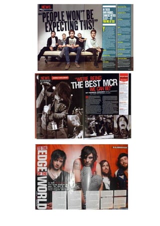
The document discusses the layout of a double page spread (DPS) in a magazine. It analyzes a specific DPS from Kerrang! magazine featuring the band Linkin Park. The DPS follows standard conventions, including a large main image taking up half the pages that relates to the headline. The headline is written in big, bold, capital letters to grab attention. Smaller photos and body copy in columns make the page organized and easy to read. Overall, the DPS effectively engages the target audience through its use of images and design conventions.Dps 2nd analysis (draft 1)
Dps 2nd analysis (draft 1)Olga Shurakova
Ěý
The title used on this DPS grabs attention with its large capital letters and quotation from Linkin Park. The main image takes up half the page and features the band, looking powerful yet relatable. The article discusses their new album in three columns and uses many quotes to engage readers. Colors of black, white and red create a heavy look appealing to the magazine's target audience. Text features like the red strap line and bold album name help promote the story. Overall the layout effectively presents the band and story for rock fans.Front cover overview
Front cover overviewOlga Shurakova
Ěý
The document analyzes common patterns and conventions across front covers of the rock music magazine 'Kerrang!'. Key findings include:
1) Covers typically feature a prominent image of a rock band, with one member at the front and others arranged behind forming a triangle. This highlights the band's leader and draws attention.
2) Other repeated elements are the consistent masthead design/placement, photos of featured articles, and a color scheme using black, white and another primary color.
3) Analyzing 'Kerrang!' covers provided ideas for effectively designing the front cover of a new music magazine, such as featuring a band in the main image.This is a visual introduction to the various
This is a visual introduction to the variousOlga Shurakova
Ěý
Hollywood Undead and Deuce will be featured prominently in the magazine. Hollywood Undead was formed in 2005 by Deuce and became popular with their 2007 album "Swan Song". Deuce left in 2010 which caused controversy since both sides have different stories about what happened. Deuce then began a solo career in 2012 with his album "Nine Lives" and song "America" being his most commercially successful. The magazine will write an article revealing the truth about Deuce's departure from Hollywood Undead.Dps analysis checked
Dps analysis checkedOlga Shurakova
Ěý
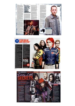
This double page spread (DPS) in a music magazine follows standard conventions. It features a large main image of the band Metallica filling half the page. The other half contains an interview with the band in two columns of text. Questions are in capital letters and a different font to distinguish them from answers. Smaller photos of band members appear next to their responses. The headline "Less alcohol, less drugs and less dodgy women" in large uppercase letters draws attention. Overall the layout, images, colors and text features used make the content clear and engaging for the target audience.Front cover analysis
Front cover analysisOlga Shurakova
Ěý
The document summarizes key elements of a music magazine cover design. It discusses design elements like the masthead placement, use of color, images of bands, and promotional offers to attract readers. Specific techniques are examined, such as using exclamation points to emphasize free offers, quotes to spark curiosity, and listing additional artists to provide value. Maintaining consistent branding elements like layout and font helps readers recognize the magazine. The cover aims to entice the target audience through visuals and promises of exclusive content related to the profiled genre of music.Music questionnaire analysis
Music questionnaire analysisOlga Shurakova
Ěý
The document summarizes the results of a questionnaire about music preferences and magazine reading habits. The questionnaire was conducted to gather information for creating a new music magazine. Most respondents listened to rock music and preferred rock-oriented magazines. They were also more likely to read magazines that featured foreign artists and included free items. The optimal price was found to be under ÂŁ5. Interior elements like interviews, photos and news were most appealing. Based on this market research, the creator decided to produce a rock magazine titled "Bullet".Music questioner
Music questionerOlga Shurakova
Ěý
The document is a music questionnaire containing 12 questions about a person's music preferences and habits. It asks about the styles of music they listen to most, whether they read music magazines, how often they buy magazines, whether they prefer weekly or monthly magazines, if their favorite artist is from the UK, how much they spend on music and magazines monthly, where they get their music from, what magazine cover features they find most important, what parts of magazines they like the most, if music is an important part of their life, and what title would be appropriate for a rock magazine. The questions are aimed at gathering information about music tastes and consumption to better understand music audiences.More Related Content
More from Olga Shurakova (8)
Dps 2nd analysis (draft 1)
Dps 2nd analysis (draft 1)Olga Shurakova
Ěý
The document discusses the layout of a double page spread (DPS) in a magazine. It analyzes a specific DPS from Kerrang! magazine featuring the band Linkin Park. The DPS follows standard conventions, including a large main image taking up half the pages that relates to the headline. The headline is written in big, bold, capital letters to grab attention. Smaller photos and body copy in columns make the page organized and easy to read. Overall, the DPS effectively engages the target audience through its use of images and design conventions.Dps 2nd analysis (draft 1)
Dps 2nd analysis (draft 1)Olga Shurakova
Ěý
The title used on this DPS grabs attention with its large capital letters and quotation from Linkin Park. The main image takes up half the page and features the band, looking powerful yet relatable. The article discusses their new album in three columns and uses many quotes to engage readers. Colors of black, white and red create a heavy look appealing to the magazine's target audience. Text features like the red strap line and bold album name help promote the story. Overall the layout effectively presents the band and story for rock fans.Front cover overview
Front cover overviewOlga Shurakova
Ěý
The document analyzes common patterns and conventions across front covers of the rock music magazine 'Kerrang!'. Key findings include:
1) Covers typically feature a prominent image of a rock band, with one member at the front and others arranged behind forming a triangle. This highlights the band's leader and draws attention.
2) Other repeated elements are the consistent masthead design/placement, photos of featured articles, and a color scheme using black, white and another primary color.
3) Analyzing 'Kerrang!' covers provided ideas for effectively designing the front cover of a new music magazine, such as featuring a band in the main image.This is a visual introduction to the various
This is a visual introduction to the variousOlga Shurakova
Ěý
Hollywood Undead and Deuce will be featured prominently in the magazine. Hollywood Undead was formed in 2005 by Deuce and became popular with their 2007 album "Swan Song". Deuce left in 2010 which caused controversy since both sides have different stories about what happened. Deuce then began a solo career in 2012 with his album "Nine Lives" and song "America" being his most commercially successful. The magazine will write an article revealing the truth about Deuce's departure from Hollywood Undead.Dps analysis checked
Dps analysis checkedOlga Shurakova
Ěý
This double page spread (DPS) in a music magazine follows standard conventions. It features a large main image of the band Metallica filling half the page. The other half contains an interview with the band in two columns of text. Questions are in capital letters and a different font to distinguish them from answers. Smaller photos of band members appear next to their responses. The headline "Less alcohol, less drugs and less dodgy women" in large uppercase letters draws attention. Overall the layout, images, colors and text features used make the content clear and engaging for the target audience.Front cover analysis
Front cover analysisOlga Shurakova
Ěý
The document summarizes key elements of a music magazine cover design. It discusses design elements like the masthead placement, use of color, images of bands, and promotional offers to attract readers. Specific techniques are examined, such as using exclamation points to emphasize free offers, quotes to spark curiosity, and listing additional artists to provide value. Maintaining consistent branding elements like layout and font helps readers recognize the magazine. The cover aims to entice the target audience through visuals and promises of exclusive content related to the profiled genre of music.Music questionnaire analysis
Music questionnaire analysisOlga Shurakova
Ěý
The document summarizes the results of a questionnaire about music preferences and magazine reading habits. The questionnaire was conducted to gather information for creating a new music magazine. Most respondents listened to rock music and preferred rock-oriented magazines. They were also more likely to read magazines that featured foreign artists and included free items. The optimal price was found to be under ÂŁ5. Interior elements like interviews, photos and news were most appealing. Based on this market research, the creator decided to produce a rock magazine titled "Bullet".Music questioner
Music questionerOlga Shurakova
Ěý
The document is a music questionnaire containing 12 questions about a person's music preferences and habits. It asks about the styles of music they listen to most, whether they read music magazines, how often they buy magazines, whether they prefer weekly or monthly magazines, if their favorite artist is from the UK, how much they spend on music and magazines monthly, where they get their music from, what magazine cover features they find most important, what parts of magazines they like the most, if music is an important part of their life, and what title would be appropriate for a rock magazine. The questions are aimed at gathering information about music tastes and consumption to better understand music audiences.