1 of 1
Download to read offline
Recommended
Question 1
Question 1Rosannatodd
Ěý
The document discusses how the author's media product uses and challenges conventions of real music magazines. The front cover features a medium close-up image of the target audience and uses colors and fonts typical of the genre. Layout follows conventions like the rule of thirds and placement of the masthead. The contents page includes coverlines, images, and sections like features and news. While mostly following conventions, the editorial uses an unconventional three-column structure.Questionnaire
QuestionnaireRosannatodd
Ěý
1) The document is a questionnaire for audience research on a music magazine front cover, contents page, and double page spread created by Rosanna Todd for her final product.
2) The questionnaire contains 15 multiple choice and rating scale questions to gather feedback on the design, content, target audience, and overall quality of the magazine pages.
3) It asks respondents about their demographics, opinions on the suitability of the design for the indie/rock genre, pricing, and whether the magazine pages appear cohesive and representative of a single publication.
Question 5
Question 5Rosannatodd
Ěý
The document summarizes how a music magazine targets its audience of indie rockers aged 16-24. It identifies several design elements that appeal to this audience, including a bold color scheme, youthful artists featured, and casual language. The layout uses eye-catching images and fonts to draw readers in. Overall, the magazine is designed to attract its target demographic through relatable content and a style they would find interesting.Question 2
Question 2Rosannatodd
Ěý
The document discusses how a music magazine represents the social group of teenage indie rockers. It analyzes the front cover, contents page, and double page spread of the magazine in comparison to existing magazines like Kerrang and NME. These similarities in layout, images, and style show that the magazine appeals to and represents the subculture of 16-24 year old indie rockers, who are generally portrayed as white, middle class, and individual free spirits. The magazine aims to represent both male and female indie rockers.Drafts of front cover, contents page and
Drafts of front cover, contents page andRosannatodd
Ěý
The document provides draft designs for the front cover, contents page, and a double page spread for a music magazine. The front cover features the magazine title, header with band names, competitions to attract readers, and price. The contents page lists the issue number, masthead, main image, editorial, article titles with page numbers for easy navigation. The double page spread includes a pull quote, main artist image, and text interview to feature an indie/rock artist.Question 7
Question 7Rosannatodd
Ěý
The document reflects on the progression from the author's preliminary task of designing magazine covers to their main task of designing a music magazine. They learned to include things like placing pictures behind mastheads, adding effects to text, creating flashers, and using headers. They also improved their understanding of magazine design codes and conventions. For the contents page, they learned to create a more realistic layout with a main image and smaller ones. Overall, they developed better skills using design software like Photoshop and InDesign from analyzing existing magazines and applying conventions in their own music magazine.Quesiton 6 evaluation
Quesiton 6 evaluationRosannatodd
Ěý
The document discusses the various hardware, software, and technologies used to plan and construct a music magazine as a coursework project. It describes using a computer and internet for research, a scanner to transfer drafts, a printer and photocopier to distribute questionnaires, and a memory stick to transfer work between locations. Photoshop and InDesign were used to design pages, PowerPoint for presentations, and various online tools like Photobucket and şÝşÝߣshare to share work. The key learning was gaining experience with professional design software like Photoshop and InDesign that were new to the author.Construction of the double page spread2
Construction of the double page spread2Rosannatodd
Ěý
Using InDesign, the author created a double page spread for a music magazine. They added text in columns, fonts, a masthead, standfirst, pull quote, and background image. Colors were changed to attract the target audience and credits were added. The masthead was enlarged to take up more space like real music magazines. The final spread looked more professional and eye-catching.Construction of the contents page
Construction of the contents pageRosannatodd
Ěý
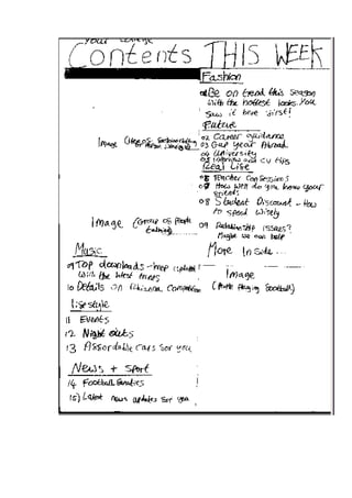
Using InDesign, Rosanna Todd created a contents page for her music magazine by adding the main image, masthead, and coverlines. She then edited fonts and added more images, the issue number, cover date, editorial, and page numbers. Finally, she completed the contents page by editing subtitles to stand out more, changing the masthead color to yellow, switching the editorial image, and adjusting fonts and page numbers until satisfied with the design.Construction of the contents page
Construction of the contents pageRosannatodd
Ěý
Using InDesign, Rosanna Todd created a contents page for her music magazine by adding the main image, masthead, and coverlines. She then edited fonts and added more images, the issue number, cover date, editorial, and page numbers. Finally, she completed the contents page by editing subtitles to stand out more, changing the masthead color to yellow, switching the editorial image, and adjusting fonts and page numbers until satisfied with the design.Task 8
Task 8Rosannatodd
Ěý
The document discusses conducting audience research for a proposed indie/rock music magazine. It includes a 12 question survey to understand the target audience's music preferences, spending habits related to music magazines, desired magazine content and design elements. Key details include the target audience being males and females aged 16-24 interested in indie/rock music and questions about current artists enjoyed, reasons for interest in the genre, willingness to pay for a magazine, and preferences for cover images, articles and general magazine content.Task 8
Task 8Rosannatodd
Ěý
This document contains a survey for research on a proposed music magazine targeting 16-24 year olds interested in indie/rock music. It asks respondents about their music preferences, what attracts them to the genre, how much they would pay for the magazine and their opinions on content, covers and articles. The survey aims to better understand the target audience to create a successful indie/rock focused magazine.Task 8
Task 8Rosannatodd
Ěý
The document discusses audience research for a proposed music magazine focused on indie/rock music. It includes a survey with questions about the target audience's music interests, spending habits related to music magazines, preferred content and styles. The questions aim to better understand what would attract 16-24 year olds interested in indie/rock music to read and purchase this new magazine.Task 8 summary of results
Task 8 summary of resultsRosannatodd
Ěý
The document summarizes the results of a questionnaire given to 12 people aged 16-24 who are interested in indie/rock music. [1] Key findings include that respondents listen to bands like Arctic Monkeys, Kings of Leon, and Paramore, and are attracted most to the instruments and vocals used in the genre. [2] Most said they would pay ÂŁ2-ÂŁ3 for a magazine and want exclusive news and interviews. [3] This information will influence the content and design of the author's indie/rock music magazine to ensure it appeals to this target audience.Task 8 summary of questionnaire results-
Task 8 summary of questionnaire results-Rosannatodd
Ěý
The document summarizes the results of a questionnaire distributed to 12 people aged 16-24 about indie/rock music. Pie charts and graphs show that most respondents are attracted to indie/rock music and are willing to spend money on a music magazine. The results also indicate what would encourage people to buy a magazine and which magazine covers were most appealing. Conducting the questionnaire provided useful information about the target audience for the music magazine.Task 9
Task 9Rosannatodd
Ěý
The target audience for the music magazine is males and females aged 16-24 who enjoy indie/rock music. They like going to gigs and festivals and listening to music on their devices. They would be interested in interviews with bands they like and images from concerts. The focus group provided feedback on what they would like to see in the magazine, including eye-catching images on the cover of artists they recognize. They also prefer darker colors, band/artist photos and festival images in the magazine along with articles about new music and fashion.Questionnaire
QuestionnaireRosannatodd
Ěý
1) The document is a questionnaire for audience research on a music magazine front cover, contents page, and double page spread created by Rosanna Todd for her final product.
2) The questionnaire contains 15 multiple choice and rating scale questions to gather feedback on the design, content, target audience, and overall quality of the magazine pages.
3) It asks respondents about their demographics, opinions on the suitability of the design for the indie/rock genre, pricing, and whether the magazine pages appear cohesive and well-designed.Quesiton 3
Quesiton 3Rosannatodd
Ěý
Bauer media would be a suitable company to distribute an indie rock magazine because it is Europe's largest privately owned publishing group that publishes magazines for a wide range of audiences, including established titles like Kerrang and Q magazine that cover similar indie/rock genres and have found success in that market.Quesiton 6
Quesiton 6Rosannatodd
Ěý
The document discusses the various hardware, software, and technologies used to plan and construct a music magazine as a coursework project. It describes using a computer and internet for research and writing, a scanner and printer for transferring drafts and printing questionnaires, a memory stick for transferring files between locations, and the college camera for taking images. Software mentioned includes PowerPoint, Word, and Excel for aiding research and presenting results, as well as Photoshop and InDesign for constructing pages like the cover and contents page of the magazine. Additional technologies discussed are Photobucket for image slideshows, şÝşÝߣshare for converting PowerPoints, and Scribd and Prezzie as alternatives for presenting work online.Question 7
Question 7Rosannatodd
Ěý
The document reflects on the progression from the author's preliminary magazine cover task to the final music magazine cover task. The author learned to include things like a picture in front of the masthead, text effects, a flasher, and header. This shows improved skills with Photoshop and increased knowledge of magazine design codes. For the contents page task, the author's final version had a more realistic layout with a main image and smaller ones. They also better understood conventions like editorials. Overall, the author felt they developed a deeper understanding of magazine creation through additional research, using new software like InDesign, and having more time to focus on realism.Question 5
Question 5Rosannatodd
Ěý
The document summarizes how a music magazine targets its audience of indie rockers aged 16-24. It identifies several design elements that appeal to this audience, including a bold color scheme, youthful artists featured, and casual language. The layout uses eye-catching images and fonts to draw readers in. Overall, the magazine is designed to attract its target demographic through relatable content and a style they would find interesting.Question 2-Evaluation 
Question 2-Evaluation Rosannatodd
Ěý
The document discusses how a music magazine represents the social group of teenage indie rockers. It analyzes the front cover, contents page, and double page spread of the magazine in comparison to existing magazines like Kerrang and NME. These similarities in layout, images, and style show that the magazine appeals to and represents the subculture of 16-24 year old indie rockers, who are generally portrayed as white, middle class, and individual free spirits. The magazine aims to represent both male and female indie rockers.Question 2
Question 2Rosannatodd
Ěý
The document discusses how a music magazine represents the social group of teenage indie rockers. It analyzes the front cover, contents page, and double page spread of the magazine in comparison to existing magazines like Kerrang and NME. These similarities in layout, images, and style show that the magazine appeals to and represents the subculture of 16-24 year old indie rockers, who are generally portrayed as white, middle class, and individual free spirits. The magazine aims to represent both male and female indie rockers.Construction of the double page spread
Construction of the double page spreadRosannatodd
Ěý
Using InDesign, the author created a double page spread for a music magazine by adding text in columns, a masthead, standfirst, pull quote, and background image on the second page. Colors were changed to attract the target audience, including a black background and bright colors. Design elements like a drop capital, credits, and differently colored fonts for questions and answers were also included to make the article clearer for readers.Construction of the contents page
Construction of the contents pageRosannatodd
Ěý
Using InDesign, Rosanna Todd created a contents page for her music magazine by adding the main image, masthead, and coverlines. She then edited fonts and added more images, the issue number, cover date, editorial, and page numbers. Finally, she completed the contents page by editing subtitles to stand out more, changing the masthead color to yellow, switching the editorial image, and adjusting fonts and page numbers until satisfied with the design.More Related Content
More from Rosannatodd (20)
Construction of the double page spread2
Construction of the double page spread2Rosannatodd
Ěý
Using InDesign, the author created a double page spread for a music magazine. They added text in columns, fonts, a masthead, standfirst, pull quote, and background image. Colors were changed to attract the target audience and credits were added. The masthead was enlarged to take up more space like real music magazines. The final spread looked more professional and eye-catching.Construction of the contents page
Construction of the contents pageRosannatodd
Ěý
Using InDesign, Rosanna Todd created a contents page for her music magazine by adding the main image, masthead, and coverlines. She then edited fonts and added more images, the issue number, cover date, editorial, and page numbers. Finally, she completed the contents page by editing subtitles to stand out more, changing the masthead color to yellow, switching the editorial image, and adjusting fonts and page numbers until satisfied with the design.Construction of the contents page
Construction of the contents pageRosannatodd
Ěý
Using InDesign, Rosanna Todd created a contents page for her music magazine by adding the main image, masthead, and coverlines. She then edited fonts and added more images, the issue number, cover date, editorial, and page numbers. Finally, she completed the contents page by editing subtitles to stand out more, changing the masthead color to yellow, switching the editorial image, and adjusting fonts and page numbers until satisfied with the design.Task 8
Task 8Rosannatodd
Ěý
The document discusses conducting audience research for a proposed indie/rock music magazine. It includes a 12 question survey to understand the target audience's music preferences, spending habits related to music magazines, desired magazine content and design elements. Key details include the target audience being males and females aged 16-24 interested in indie/rock music and questions about current artists enjoyed, reasons for interest in the genre, willingness to pay for a magazine, and preferences for cover images, articles and general magazine content.Task 8
Task 8Rosannatodd
Ěý
This document contains a survey for research on a proposed music magazine targeting 16-24 year olds interested in indie/rock music. It asks respondents about their music preferences, what attracts them to the genre, how much they would pay for the magazine and their opinions on content, covers and articles. The survey aims to better understand the target audience to create a successful indie/rock focused magazine.Task 8
Task 8Rosannatodd
Ěý
The document discusses audience research for a proposed music magazine focused on indie/rock music. It includes a survey with questions about the target audience's music interests, spending habits related to music magazines, preferred content and styles. The questions aim to better understand what would attract 16-24 year olds interested in indie/rock music to read and purchase this new magazine.Task 8 summary of results
Task 8 summary of resultsRosannatodd
Ěý
The document summarizes the results of a questionnaire given to 12 people aged 16-24 who are interested in indie/rock music. [1] Key findings include that respondents listen to bands like Arctic Monkeys, Kings of Leon, and Paramore, and are attracted most to the instruments and vocals used in the genre. [2] Most said they would pay ÂŁ2-ÂŁ3 for a magazine and want exclusive news and interviews. [3] This information will influence the content and design of the author's indie/rock music magazine to ensure it appeals to this target audience.Task 8 summary of questionnaire results-
Task 8 summary of questionnaire results-Rosannatodd
Ěý
The document summarizes the results of a questionnaire distributed to 12 people aged 16-24 about indie/rock music. Pie charts and graphs show that most respondents are attracted to indie/rock music and are willing to spend money on a music magazine. The results also indicate what would encourage people to buy a magazine and which magazine covers were most appealing. Conducting the questionnaire provided useful information about the target audience for the music magazine.Task 9
Task 9Rosannatodd
Ěý
The target audience for the music magazine is males and females aged 16-24 who enjoy indie/rock music. They like going to gigs and festivals and listening to music on their devices. They would be interested in interviews with bands they like and images from concerts. The focus group provided feedback on what they would like to see in the magazine, including eye-catching images on the cover of artists they recognize. They also prefer darker colors, band/artist photos and festival images in the magazine along with articles about new music and fashion.Questionnaire
QuestionnaireRosannatodd
Ěý
1) The document is a questionnaire for audience research on a music magazine front cover, contents page, and double page spread created by Rosanna Todd for her final product.
2) The questionnaire contains 15 multiple choice and rating scale questions to gather feedback on the design, content, target audience, and overall quality of the magazine pages.
3) It asks respondents about their demographics, opinions on the suitability of the design for the indie/rock genre, pricing, and whether the magazine pages appear cohesive and well-designed.Quesiton 3
Quesiton 3Rosannatodd
Ěý
Bauer media would be a suitable company to distribute an indie rock magazine because it is Europe's largest privately owned publishing group that publishes magazines for a wide range of audiences, including established titles like Kerrang and Q magazine that cover similar indie/rock genres and have found success in that market.Quesiton 6
Quesiton 6Rosannatodd
Ěý
The document discusses the various hardware, software, and technologies used to plan and construct a music magazine as a coursework project. It describes using a computer and internet for research and writing, a scanner and printer for transferring drafts and printing questionnaires, a memory stick for transferring files between locations, and the college camera for taking images. Software mentioned includes PowerPoint, Word, and Excel for aiding research and presenting results, as well as Photoshop and InDesign for constructing pages like the cover and contents page of the magazine. Additional technologies discussed are Photobucket for image slideshows, şÝşÝߣshare for converting PowerPoints, and Scribd and Prezzie as alternatives for presenting work online.Question 7
Question 7Rosannatodd
Ěý
The document reflects on the progression from the author's preliminary magazine cover task to the final music magazine cover task. The author learned to include things like a picture in front of the masthead, text effects, a flasher, and header. This shows improved skills with Photoshop and increased knowledge of magazine design codes. For the contents page task, the author's final version had a more realistic layout with a main image and smaller ones. They also better understood conventions like editorials. Overall, the author felt they developed a deeper understanding of magazine creation through additional research, using new software like InDesign, and having more time to focus on realism.Question 5
Question 5Rosannatodd
Ěý
The document summarizes how a music magazine targets its audience of indie rockers aged 16-24. It identifies several design elements that appeal to this audience, including a bold color scheme, youthful artists featured, and casual language. The layout uses eye-catching images and fonts to draw readers in. Overall, the magazine is designed to attract its target demographic through relatable content and a style they would find interesting.Question 2-Evaluation
Question 2-Evaluation Rosannatodd
Ěý
The document discusses how a music magazine represents the social group of teenage indie rockers. It analyzes the front cover, contents page, and double page spread of the magazine in comparison to existing magazines like Kerrang and NME. These similarities in layout, images, and style show that the magazine appeals to and represents the subculture of 16-24 year old indie rockers, who are generally portrayed as white, middle class, and individual free spirits. The magazine aims to represent both male and female indie rockers.Question 2
Question 2Rosannatodd
Ěý
The document discusses how a music magazine represents the social group of teenage indie rockers. It analyzes the front cover, contents page, and double page spread of the magazine in comparison to existing magazines like Kerrang and NME. These similarities in layout, images, and style show that the magazine appeals to and represents the subculture of 16-24 year old indie rockers, who are generally portrayed as white, middle class, and individual free spirits. The magazine aims to represent both male and female indie rockers.Question 2
Question 2Rosannatodd
Ěý
The document discusses how a music magazine represents the social group of teenage indie rockers. It analyzes the front cover, contents page, and double page spread of the magazine in comparison to existing magazines like Kerrang and NME. These similarities in layout, images, and style show that the magazine appeals to and represents the subculture of 16-24 year old indie rockers, who are generally portrayed as white, middle class, and individual free spirits. The magazine aims to represent both male and female indie rockers.Question 2
Question 2Rosannatodd
Ěý
The document discusses how a music magazine represents the social group of teenage indie rockers. It analyzes the front cover, contents page, and double page spread of the magazine in comparison to existing magazines like Kerrang and NME. These similarities in layout, images, and style show that the magazine appeals to and represents the subculture of 16-24 year old indie rockers, who are generally portrayed as white, middle class, and individual free spirits. The magazine aims to represent both male and female indie rockers.Construction of the double page spread
Construction of the double page spreadRosannatodd
Ěý
Using InDesign, the author created a double page spread for a music magazine by adding text in columns, a masthead, standfirst, pull quote, and background image on the second page. Colors were changed to attract the target audience, including a black background and bright colors. Design elements like a drop capital, credits, and differently colored fonts for questions and answers were also included to make the article clearer for readers.Construction of the contents page
Construction of the contents pageRosannatodd
Ěý
Using InDesign, Rosanna Todd created a contents page for her music magazine by adding the main image, masthead, and coverlines. She then edited fonts and added more images, the issue number, cover date, editorial, and page numbers. Finally, she completed the contents page by editing subtitles to stand out more, changing the masthead color to yellow, switching the editorial image, and adjusting fonts and page numbers until satisfied with the design.