ݺߣ

ݺߣShare a Scribd company logo
Mariya Ahmed

Media Studies

Representation

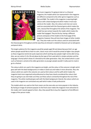
The music magazine I’m going to look at is a Classical
magazine; the models which are represented in the magazine
are different compared to the other genre magazines such as
Pop and R&B. The model in this magazine is wearing bright
colours with a black background which makes it more eyecatchy to the reader. Also, the colours and mise-son-scene
used are associated with the Classical genre which makes the
calm, classical feel throughout the whole of the magazine. The
model has eye contact towards the reader which makes the
reader feel engaged. They do this by, having a different
pictures and poses of the model on the front page of the
magazine; however they will also have images of other models
too. They also make sure the colours used are associated with
the Classical genre throughout and the way they are dressed is related to Classical such as ball gowns
and pencil skirts.
The target audience for this magazine would be people aged 30 and above because that’s an age
where people would like to listen to calm, classic music and it would be aimed at higher class people
as these magazines tend to be quite expensive which working class people might not be able to buy.
Also, we can notice it’s for 30 and above by the type of font used which is simple and plain and the
language is formal which shows it’s directed to the older generation. Also, the context which is used
such as festivals is aimed at the older generation as younger people wouldn’t really want to read or
go to a festival.
The colours which are used in the magazine are bright, and the colour of the costume is bright which
goes well with the black background as it makes it stand out and makes it more attractive. Also, the
colours which are used in the costume are used as font colours and for puffs which makes the
magazine look more organised and professional as they have clearly considered the colours that
they are going to use and make sure they use these colours constantly throughout the rest of the
magazine. The white masthead goes well with the black background. Overall, the colours which are
used in the magazine are contrasted very well which makes it look professional.
The models which are used on the front covers are the ones who are more popular in the industry.
By having an image of someone popular on the front cover makes the magazine more attractive to
the reader and it would appeal to them. Also, they would like to buy the magazine to find different
images of the person inside.

More Related Content

Representation

  • 1. Mariya Ahmed Media Studies Representation The music magazine I’m going to look at is a Classical magazine; the models which are represented in the magazine are different compared to the other genre magazines such as Pop and R&B. The model in this magazine is wearing bright colours with a black background which makes it more eyecatchy to the reader. Also, the colours and mise-son-scene used are associated with the Classical genre which makes the calm, classical feel throughout the whole of the magazine. The model has eye contact towards the reader which makes the reader feel engaged. They do this by, having a different pictures and poses of the model on the front page of the magazine; however they will also have images of other models too. They also make sure the colours used are associated with the Classical genre throughout and the way they are dressed is related to Classical such as ball gowns and pencil skirts. The target audience for this magazine would be people aged 30 and above because that’s an age where people would like to listen to calm, classic music and it would be aimed at higher class people as these magazines tend to be quite expensive which working class people might not be able to buy. Also, we can notice it’s for 30 and above by the type of font used which is simple and plain and the language is formal which shows it’s directed to the older generation. Also, the context which is used such as festivals is aimed at the older generation as younger people wouldn’t really want to read or go to a festival. The colours which are used in the magazine are bright, and the colour of the costume is bright which goes well with the black background as it makes it stand out and makes it more attractive. Also, the colours which are used in the costume are used as font colours and for puffs which makes the magazine look more organised and professional as they have clearly considered the colours that they are going to use and make sure they use these colours constantly throughout the rest of the magazine. The white masthead goes well with the black background. Overall, the colours which are used in the magazine are contrasted very well which makes it look professional. The models which are used on the front covers are the ones who are more popular in the industry. By having an image of someone popular on the front cover makes the magazine more attractive to the reader and it would appeal to them. Also, they would like to buy the magazine to find different images of the person inside.