
1 of 2
Download to read offline
Ad
Recommended
Medio amvientevictor alfonso Rodriguez Ayala
╠²
El documento presenta un an├Īlisis de la legislaci├│n ambiental en Colombia, enfoc├Īndose en la protecci├│n del medio ambiente y el manejo de recursos naturales. Se abordan normativas sobre la gesti├│n de residuos, la contaminaci├│n del aire y agua, as├Ł como la protecci├│n de la flora y fauna. Adem├Īs, se enfatiza la importancia de pr├Īcticas sostenibles en la construcci├│n para minimizar el impacto ambiental.Youth sub cultures
Youth sub culturesBryony Skelton
╠²
George Cheetham's song "nonetheless" is an acoustic track performed solely using an acoustic guitar and loop pedal. Acoustic music produces sound through entirely acoustic means, often using electronic amplification to increase volume without altering the natural sound. The youth subculture associated with acoustic music would involve sociable, family-oriented people who dress in traditional, understated clothing like tees, shirts, jeans, and traditional women's attire.Music vid effects
Music vid effectsBryony Skelton
╠²
This document lists several songs and artists and mentions that the last three music videos referenced, Blink 182 - I miss you, aosis - wonderwall, use a technique called layering where one video recording is made transparent and placed over another video to create the final music video.Music vids
Music vidsBryony Skelton
╠²
The music video for "Clint Eastwood" by Gorillaz is an animated video that depicts the band members as cartoon characters performing against backgrounds that reference zombie and horror films. It features the band members emerging from the ground in a cemetery as zombies and gorillas pursue one member, before concluding with each character shown individually. The video won an award and helped popularize the band's visual style of featuring animated characters rather than the real band members.Skills dev'
Skills dev'Bryony Skelton
╠²
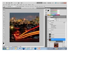
The document provides instructions for adding a grid overlay in Photoshop to help align elements on the page. The grid allows you to ensure text and images are straight and positioned properly. Without a grid, it would not look professional to have unaligned elements.Skills dev'
Skills dev'Bryony Skelton
╠²
The document provides instructions for creating a grid overlay in Photoshop to help align elements on a page. The grid allows you to ensure text and images are straight and positioned properly. Without a grid, it would be unprofessional to have unaligned or crooked text and images.Skills dev'
Skills dev'Bryony Skelton
╠²
The document provides instructions for creating a magazine layout in Photoshop. It describes adding a grid for alignment, selecting fonts and images, arranging layers, and providing formatting like headlines, captions and page numbers to make the magazine look professional. The goal is to organize content on the front cover and contents page to effectively showcase stories and entertain readers.Skills dev'
Skills dev'Bryony Skelton
╠²
The document provides instructions for adding a grid overlay in Photoshop to help align elements on a page. The grid allows you to ensure text and images are straight and positioned properly. Adding a grid makes the layout look more professional compared to unaligned elements.Skills dev'
Skills dev'Bryony Skelton
╠²
The document provides instructions for adding a grid overlay in Photoshop to help align elements on a page. The grid allows you to ensure text and images are straight and positioned properly. It notes that having unaligned elements would be unprofessional. It describes how to access the grid view option in Photoshop.Skills dev'
Skills dev'Bryony Skelton
╠²
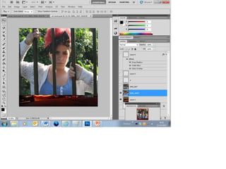
The document provides instructions for adding a grid in Photoshop when viewing and selecting the grid option. The grid allows you to align work and ensure it is straight. It then discusses pasting text and an image into a Photoshop document and positioning the image behind the text.Skills dev'
Skills dev'Bryony Skelton
╠²
The document provides instructions for adding a grid in Photoshop to help align elements on a page. Selecting "View" then "Show" and choosing "Grid" will make a grid appear over the background to aid in positioning text and images straight. The grid allows ensuring work is straight and professionally presented without misaligned elements.Mojo
MojoBryony Skelton
╠²
MOJO is the world's biggest UK music magazine that delivers world class journalism and iconic photography representing a carefully crafted musical archive. It provides an authentic, independent, and emotional connection to music with a mix of classic and cutting edge content. The magazine features a lead article about an artist on the cover in an easy to read font that contrasts with the background colors. The contents page shows the main article at the same size as others and includes page numbers for navigation.NME
NMEBryony Skelton
╠²
The document provides demographic insights about NME readers, noting that 69% are male, with an average age of 24, and that 29% are still studying while the majority work full-time. It highlights spending habits, including an average of ┬Ż532 on clothes annually and a preference for quality goods. The magazine's layout and design elements, particularly featuring Jimi Hendrix, are discussed as appealing to a younger audience, emphasizing visual elements over extensive text.Cd covers
Cd coversBryony Skelton
╠²
This document discusses and analyzes several album cover designs. It notes that Calvin Harris' cover has an electronic feel shown through its futuristic font and silver glasses. It also analyzes a Plan B cover that features the artist's face but also a prop that steers the audience away from a mainstream R&B/pop audience. Finally, it summarizes that Rihanna's cover follows typical conventions for R&B/pop albums by featuring her face and using a skinny white font and exaggerated red colors that have become associated with her image.Cd covers
Cd coversBryony Skelton
╠²
This document discusses and analyzes several album covers. It notes that Calvin Harris' cover has an electronic feel shown through its futuristic font and silver glasses. It also analyzes a Plan B cover that features the artist's face to appeal to mainstream R&B and pop audiences while retaining classic music associations. Additionally, it states that Rihanna's cover follows typical conventions for R&B/pop by featuring her face and using a skinny white font and exaggerated red colors that have become associated with her image.More Related Content
More from Bryony Skelton (7)
Skills dev'
Skills dev'Bryony Skelton
╠²
The document provides instructions for adding a grid overlay in Photoshop to help align elements on a page. The grid allows you to ensure text and images are straight and positioned properly. It notes that having unaligned elements would be unprofessional. It describes how to access the grid view option in Photoshop.Skills dev'
Skills dev'Bryony Skelton
╠²
The document provides instructions for adding a grid in Photoshop when viewing and selecting the grid option. The grid allows you to align work and ensure it is straight. It then discusses pasting text and an image into a Photoshop document and positioning the image behind the text.Skills dev'
Skills dev'Bryony Skelton
╠²
The document provides instructions for adding a grid in Photoshop to help align elements on a page. Selecting "View" then "Show" and choosing "Grid" will make a grid appear over the background to aid in positioning text and images straight. The grid allows ensuring work is straight and professionally presented without misaligned elements.Mojo
MojoBryony Skelton
╠²
MOJO is the world's biggest UK music magazine that delivers world class journalism and iconic photography representing a carefully crafted musical archive. It provides an authentic, independent, and emotional connection to music with a mix of classic and cutting edge content. The magazine features a lead article about an artist on the cover in an easy to read font that contrasts with the background colors. The contents page shows the main article at the same size as others and includes page numbers for navigation.NME
NMEBryony Skelton
╠²
The document provides demographic insights about NME readers, noting that 69% are male, with an average age of 24, and that 29% are still studying while the majority work full-time. It highlights spending habits, including an average of ┬Ż532 on clothes annually and a preference for quality goods. The magazine's layout and design elements, particularly featuring Jimi Hendrix, are discussed as appealing to a younger audience, emphasizing visual elements over extensive text.Cd covers
Cd coversBryony Skelton
╠²
This document discusses and analyzes several album cover designs. It notes that Calvin Harris' cover has an electronic feel shown through its futuristic font and silver glasses. It also analyzes a Plan B cover that features the artist's face but also a prop that steers the audience away from a mainstream R&B/pop audience. Finally, it summarizes that Rihanna's cover follows typical conventions for R&B/pop albums by featuring her face and using a skinny white font and exaggerated red colors that have become associated with her image.Cd covers
Cd coversBryony Skelton
╠²
This document discusses and analyzes several album covers. It notes that Calvin Harris' cover has an electronic feel shown through its futuristic font and silver glasses. It also analyzes a Plan B cover that features the artist's face to appeal to mainstream R&B and pop audiences while retaining classic music associations. Additionally, it states that Rihanna's cover follows typical conventions for R&B/pop by featuring her face and using a skinny white font and exaggerated red colors that have become associated with her image.