ݺߣ

ݺߣShare a Scribd company logo
eLearning Design – Tips for Better Learning Outcomes
eLearning Design Tips
to Improve Learning Outcomes
eLearning courses need to be engaging and
visually appealing to be effective.
Here are some tips that will help you improve
learning outcomes.
Break Up
Your eLearning Content
1
Chunk content and cover only 1 learning
point per screen.
Use multiple slides to improve readability
and ensure a consistent look.
Apply
Visual Hierarchy
2
Improve design by highlighting text in
different sections and using unique font
styles and sizes.
This ensures a seamless reading
experience, and that important
information is visible at a glance.
Use Meaningful
Images and Short Videos
3
Text is the primary source of information, but images
and videos create an emotional impact on learners,
boost retention, and improve information recall.
Use Colors
for Better Harmony
4
Colors evoke emotions and improve
attention spans.
Use colors aligned with your company’s
brand and style guidelines.
Choose dark colors for the text and light
colors for the background.
Include
Gamification Elements
5
Gamification makes courses more engaging. Learners
will spend more time learning and interacting with your
courses, which is exactly what you want.
Use game elements such as points,
timer, simulations, and branching scenarios.
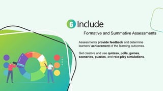
Include
Formative and Summative Assessments
6
Assessments provide feedback and determine
learners’ achievement of the learning outcomes.
Get creative and use quizzes, polls, games,
scenarios, puzzles, and role-play simulations.
For holistic insights on designing effective
eLearning courses,
download this eBook, now!
https://resources.commlabindia.com/
ebook/ehacks-to-jumpstart-elearning

More Related Content

eLearning Design – Tips for Better Learning Outcomes

  • 2. eLearning Design Tips to Improve Learning Outcomes eLearning courses need to be engaging and visually appealing to be effective. Here are some tips that will help you improve learning outcomes.
  • 3. Break Up Your eLearning Content 1 Chunk content and cover only 1 learning point per screen. Use multiple slides to improve readability and ensure a consistent look.
  • 4. Apply Visual Hierarchy 2 Improve design by highlighting text in different sections and using unique font styles and sizes. This ensures a seamless reading experience, and that important information is visible at a glance.
  • 5. Use Meaningful Images and Short Videos 3 Text is the primary source of information, but images and videos create an emotional impact on learners, boost retention, and improve information recall.
  • 6. Use Colors for Better Harmony 4 Colors evoke emotions and improve attention spans. Use colors aligned with your company’s brand and style guidelines. Choose dark colors for the text and light colors for the background.
  • 7. Include Gamification Elements 5 Gamification makes courses more engaging. Learners will spend more time learning and interacting with your courses, which is exactly what you want. Use game elements such as points, timer, simulations, and branching scenarios.
  • 8. Include Formative and Summative Assessments 6 Assessments provide feedback and determine learners’ achievement of the learning outcomes. Get creative and use quizzes, polls, games, scenarios, puzzles, and role-play simulations.
  • 9. For holistic insights on designing effective eLearning courses, download this eBook, now! https://resources.commlabindia.com/ ebook/ehacks-to-jumpstart-elearning