Pentaho_Tableau_Comparison
0 likes276 views

The document compares the features of Pentaho and Tableau dashboards. It finds that report loading time is similar, but Pentaho allows more detailed drill down of data and advanced chart types like packed circle, sun burst, chord and tree map visualizations. However, navigation is less intuitive than Tableau and interaction within charts is limited in Pentaho compared to being able to select groups in Tableau. The document also provides steps to create a sample forecast analysis dashboard in Pentaho with filters, charts and drill down of weekly and market segment data.
Pentaho_Tableau_Comparison
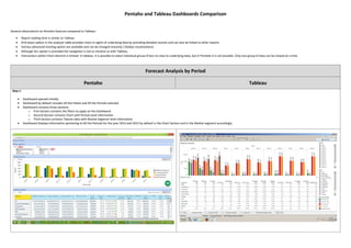
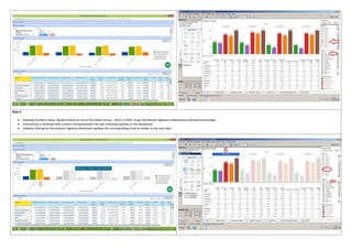
- 1. Pentaho and Tableau Dashboards Comparison General observations on Pentaho features compared to Tableau: ´éÀ Report loading time is similar to Tableau ´éÀ Drill down option in the analyzer table provides more in-sights of underlying data by providing detailed records and can also be linked to other reports ´éÀ Various advanced charting option are available and can be changed instantly ( holiday visualizations) ´éÀ Although ALL option is provided the navigation is not as intuitive as with Tableau ´éÀ Interactions within Chart element is limited. In tableau, it is possible to select individual group of bars to view its underlying data, but in Pentaho it is not possible. Only one group of data can be viewed at a time. Forecast Analysis by Period Pentaho Tableau Step 1: ´éÀ Dashboard opened initially. ´éÀ Dashboard by default includes All the Hotels and All the Periods selected ´éÀ Dashboard contains three sections. o First Section contains the filters to apply on the Dashboard o Second Section contains Chart with Period Level information o Third Section contains Tabular data with Market Segment level information ´éÀ Dashboard displays information pertaining to All the Periods for the year 2014 and 2015 by default in the Chart Section and in the Market segment accordingly
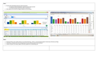
- 2. Step 2: ´éÀ We will select the following values for Hotels and Periods o For Hotels we select only Berkshire, Heathrow and The May Fair hotel o For Periods we select only 2014.10, 2014.11 and 2014.12 ´éÀ After selection, we can see the changes reflected in the chart below. Step 3: ´éÀ Keeping the filters same, double clicked on one of the Period Group ÔÇô 2014.11, to get the Market Segment related data refreshed accordingly. ´éÀ Interactivity is achieved with content linking between the two individual portlets in the dashboard. ´éÀ Likewise clicking on the analyzer segment dimension updates the corresponding chart.
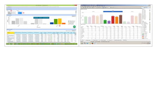
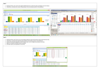
- 4. Forecast Analysis by Week Pentaho Tableau Step 1: ´éÀ Dashboard opened initially. ´éÀ Dashboard by default includes All the Hotels and All the Periods selected ´éÀ Dashboard contains three sections. o First Section contains the filters to apply on the Dashboard o Second Section contains Chart with Week Level information o Third Section contains Tabular data with Market Segment level information ´éÀ Dashboard displays information pertaining to all the Weeks for All the Periods for the year 2014 and 2015 by default in the Chart Section and in the Market segment accordingly Step 2: ´éÀ We will select the following values for Hotels and Periods o For Hotels, select All hotels o For Periods, select only 2014.11 o After selection, we can see the changes reflected in the chart below. (Each group in a Chart is a Week in that Period)
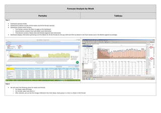
- 5. Step 3: ´éÀ Keeping the filters same, double clicked on one of the Week Group ÔÇô 2014.11 W45, to get the Market Segment related data refreshed accordingly. ´éÀ Interactivity is achieved with content linking between the two individual portlets in the dashboard. ´éÀ Likewise clicking on the analyzer segment dimension updates the corresponding chart as shown in the next step.
- 6. Step 4: ´éÀ Keeping the filters same, click on the segment (BAR) dimension to refresh the data accordingly on the chart above. ´éÀ Interactivity is achieved with content linking between the two individual portlets in the dashboard. Step 5: ´éÀ Keeping the filters same, Click on one of the Segment Measure to get the Drill Down report of that particular data. ´éÀ Interactivity is achieved with hyperlink option enabled on the Analyzer portlets in the dashboard. ´éÀ Columns that should be displayed on the Drill Down report can be configured according to one needs. ´éÀ Option for sorting the individual column is available. ´éÀ Drill Down report can be exported in CSV format.
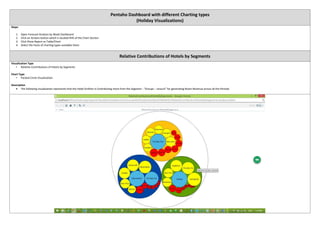
- 7. Pentaho Dashboard with different Charting types (Holiday Visualizations) Steps: 1. Open Forecast Analysis by Week Dashboard 2. Click on Actions button which is located RHS of the Chart Section 3. Click Show Report as Table/Chart 4. Select the hosts of charting types available there Relative Contributions of Hotels by Segments Visualization Type ÔÇó Relative Contributions of Hotels by Segments Chart Type ÔÇó Packed Circle Visualization Description ´éÀ The following visualization represents that the Hotel Grafton is Contributing more from the Segment - ÔÇ£Groups ÔÇô LeisureÔÇØ for generating Room Revenue across all the Periods.
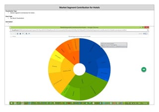
- 8. Market Segment Contribution for Hotels Visualization Type ÔÇó Market Segment Contribution for Hotels Chart Type ÔÇó Sun Burst Visualization Description ÔÇó .
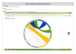
- 9. Relative Contribution of Hotels by Market Segment Visualization Type ÔÇó Relative Contribution of Hotels by Market Segment Chart Type ÔÇó Chord Chart Visualization Description ÔÇó This is another way of Visualizing the Relative Contribution of Hotels by Market Segment across all Periods
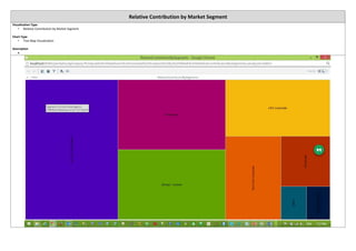
- 10. Relative Contribution by Market Segment Visualization Type ÔÇó Relative Contribution by Market Segment Chart Type ÔÇó Tree Map Visualization Description ´éÀ
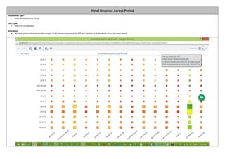
- 11. Hotel Revenue Across Period Visualization Type ÔÇó Hotel Revenue Across Period Chart Type ÔÇó Heat Grid Visualization Description ´éÀ This heat grid visualization provides insights of the Revenue generated for OTB and Last Year by all the Hotels across the given period