際際滷

際際滷Share a Scribd company logo
This is an advertising campaign showing abuse to children. They way
that they have made this is they have used a sad looking child to make
those looking feel bad for the child. Then they have used harsh words
that could be used towards the child to make them upset, and they
have placed the words in the position to make it look like a hand
strangling the child. This shows that the words are more than just
words. They have kept this advert simple because it is extremely
effective and you don/t need anything else within the advert to
explain what it is about. The colours have been kept the same as the
original image because they want to show that this is a real situation
that happens to real people and it is important that people know that
it generally does happen.
This is an advertising campaign from SASH . SASH is a charity who help
those who are homeless between the ages of 16 and 24. They have made
this advert very simple and clear because their main objective is to get the
message across to everyone and to make them more aware that there is
help for those who need it. To try and grab peoples attention they have
used a bright bold colour that stands out. They have used red because it is a
sign of emergency. SASH is an emergency company who help people in
need almost straight away. They have also made sure that the fonts are
clear and easy to read, because with a poster or advert people dont want
to be stood for a long time reading it therefor they have made it short ad
simple including all important information but making it so people can get
the details quick and easy. As well as keeping the fonts and text clear they
have also decided not include any images to make it even more simple.
They have included the logo so you know which charity the advert is coming
from. They also have a website that they use to tell everyone a lot more
information that isn't included within the advert.
This advert is for homeless people but this is the railway children
and in these adverts they are telling people that every 5 minutes
a child runs away from home. To get their point and issue across
they have shown an image of a child who looks unhappy. In the
top image you can clearly see that the child is homeless as they
are sitting outside with a blanket and she doesnt look very
happy. The images also have been made to look darker to show
that they aren't happy images and the issue isn't something
good. The bottom image has been made black and white again to
put across the issue. The bottom image also has the effect that is
has cracks all over this is to show that people who are homeless
aren't happy and they are cracked emotionally.
This advert is showing some important information
that they want to get across. They have used the
colour red because it stands out and grabs peoples
attention, it also shows that is could be danger or an
emergency. They have included a picture of a young
child which looks as though she is up against a
window which gives the effect that she is trapped. It
also includes information to get help such as a web
address or a number. The font that is used is kept
nice and simple so that it is easy to read from afar.
The layout is simple too to get the point across
without been to complicated.

More Related Content

What's hot (10)

DOCX
Media analysis of nspcc advert poster
sukhpreetrayatt
DOCX
Psychology journal
Thien Hee
DOC
My Advert Analysis
laurenx
PPTX
Advertising campaigns
CS05092582
PDF
Cameron questionnaire feedback
Heath Park, Wolverhampton
DOC
4. starburst written analyse
MurrayDuggan
DOC
Icegloss
Sanjay Bajaj
PPTX
Cc8
haikenm
PDF
Instabusiness - Estrat辿gias para marcas no Instagram
Maratona Digital
PPTX
Photoshoot for magazine listing and poster
kerrisduffin
Media analysis of nspcc advert poster
sukhpreetrayatt
Psychology journal
Thien Hee
My Advert Analysis
laurenx
Advertising campaigns
CS05092582
Cameron questionnaire feedback
Heath Park, Wolverhampton
4. starburst written analyse
MurrayDuggan
Icegloss
Sanjay Bajaj
Cc8
haikenm
Instabusiness - Estrat辿gias para marcas no Instagram
Maratona Digital
Photoshoot for magazine listing and poster
kerrisduffin

Similar to existing ideas (20)

PPTX
Research for posters LO2
Hannah Sewell
PPTX
Existing homeless charitie
hannahlaufeyson
PPTX
Homeless charities
MarieSie
PPTX
Homeless charities
MarieSie
DOCX
Evaluation
MarieSie
PPTX
Social action
chamahan
PPTX
Task 3
Hannah Harkus
PPTX
Task 3
shaaannon118
PPTX
Research into exsisting products
savannahryan11
DOC
Research in to existing charities
katiesteph5
PPTX
Task 3 and 4 re done
olibrandon
PPTX
Task 3
AbbeyAndJess
PPTX
Purposes & Impacts
calandjess
PPTX
Sash presentation
chamahan
DOCX
Evaluation
MarieSie
PPTX
Task 12
olibrandon
PPTX
Task 3
niksssp
DOCX
Evaluation
olibrandon
PPTX
Evaluationhomeless
Callumknight
PPTX
Homeless Posters
ChloeandRachel
Research for posters LO2
Hannah Sewell
Existing homeless charitie
hannahlaufeyson
Homeless charities
MarieSie
Homeless charities
MarieSie
Evaluation
MarieSie
Social action
chamahan
Task 3
Hannah Harkus
Task 3
shaaannon118
Research into exsisting products
savannahryan11
Research in to existing charities
katiesteph5
Task 3 and 4 re done
olibrandon
Task 3
AbbeyAndJess
Purposes & Impacts
calandjess
Sash presentation
chamahan
Evaluation
MarieSie
Task 12
olibrandon
Task 3
niksssp
Evaluation
olibrandon
Evaluationhomeless
Callumknight
Homeless Posters
ChloeandRachel
Ad

More from chloejefferson (20)

DOCX
Task 10
chloejefferson
PPTX
Task 9
chloejefferson
PPTX
Task 2
chloejefferson
PPTX
Task 8
chloejefferson
DOCX
Task 2 unfinished
chloejefferson
PPTX
Task 7
chloejefferson
PPTX
Task 7
chloejefferson
PPTX
Task 1
chloejefferson
DOCX
Task 5
chloejefferson
PPTX
Task 6
chloejefferson
PPTX
Task 5
chloejefferson
PPTX
Task 4
chloejefferson
PPTX
Task 3
chloejefferson
PPTX
Factual Writing: Task 1
chloejefferson
PPTX
Discovery
chloejefferson
PPTX
Task 3
chloejefferson
PPTX
Task 1
chloejefferson
PPTX
Task 5
chloejefferson
PPTX
Task 1
chloejefferson
DOCX
Task 2 22
chloejefferson
Task 10
chloejefferson
Task 2 unfinished
chloejefferson
Factual Writing: Task 1
chloejefferson
Discovery
chloejefferson
Task 2 22
chloejefferson
Ad

existing ideas

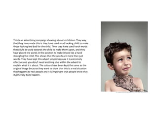
  • 1. This is an advertising campaign showing abuse to children. They way that they have made this is they have used a sad looking child to make those looking feel bad for the child. Then they have used harsh words that could be used towards the child to make them upset, and they have placed the words in the position to make it look like a hand strangling the child. This shows that the words are more than just words. They have kept this advert simple because it is extremely effective and you don/t need anything else within the advert to explain what it is about. The colours have been kept the same as the original image because they want to show that this is a real situation that happens to real people and it is important that people know that it generally does happen.
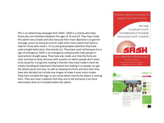
  • 2. This is an advertising campaign from SASH . SASH is a charity who help those who are homeless between the ages of 16 and 24. They have made this advert very simple and clear because their main objective is to get the message across to everyone and to make them more aware that there is help for those who need it. To try and grab peoples attention they have used a bright bold colour that stands out. They have used red because it is a sign of emergency. SASH is an emergency company who help people in need almost straight away. They have also made sure that the fonts are clear and easy to read, because with a poster or advert people dont want to be stood for a long time reading it therefor they have made it short ad simple including all important information but making it so people can get the details quick and easy. As well as keeping the fonts and text clear they have also decided not include any images to make it even more simple. They have included the logo so you know which charity the advert is coming from. They also have a website that they use to tell everyone a lot more information that isn't included within the advert.
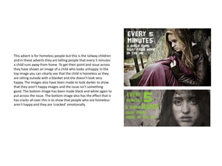
  • 3. This advert is for homeless people but this is the railway children and in these adverts they are telling people that every 5 minutes a child runs away from home. To get their point and issue across they have shown an image of a child who looks unhappy. In the top image you can clearly see that the child is homeless as they are sitting outside with a blanket and she doesnt look very happy. The images also have been made to look darker to show that they aren't happy images and the issue isn't something good. The bottom image has been made black and white again to put across the issue. The bottom image also has the effect that is has cracks all over this is to show that people who are homeless aren't happy and they are cracked emotionally.
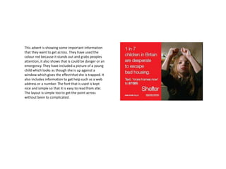
  • 4. This advert is showing some important information that they want to get across. They have used the colour red because it stands out and grabs peoples attention, it also shows that is could be danger or an emergency. They have included a picture of a young child which looks as though she is up against a window which gives the effect that she is trapped. It also includes information to get help such as a web address or a number. The font that is used is kept nice and simple so that it is easy to read from afar. The layout is simple too to get the point across without been to complicated.