Responsive Design for Digital VU Month 2012
Download as key, pdf1 like779 views

The document discusses designing websites to be responsive across different devices. It recommends embracing the flexibility of the web rather than trying to control layout as with print. The key steps are to write semantic HTML, use CSS that works for small screens, and add styles with media queries for wider browsers. The goal is an adaptive design that looks good on any device rather than separate sites for each.
1 of 11
Download to read offline


Ad
Recommended
Responsive Web Design - Internet Hungary 2013
Responsive Web Design - Internet Hungary 2013Akos Szabo
╠²
The document discusses the concept of responsive web design and whether it is a friend or foe. It notes that responsive design embraces flexibility and adapting to different devices rather than rigid pixel-perfect control. Responsive design provides an optimized experience across devices from a single code base but has limitations and may not be right for all situations depending on customer and monetization needs. It provides a checklist to consider whether responsive design is needed and can be properly supported.Responsive Design + LESS for Digital VU Meeting
Responsive Design + LESS for Digital VU MeetingRyan Huber
╠²
The document discusses responsive web design as an approach to crafting mobile, tablet, netbook, and smart TV experiences without building separate sites for each device. It explains that responsive web design uses fluid, media query-based layouts and flexible images to automatically adapt content to different screen sizes through CSS rather than separate mobile sites. It covers topics like writing responsive HTML and CSS, using media queries, disabling initial scaling, handling images, grids, videos, tables and performance.Tips for Wide Format & Display Graphics
Tips for Wide Format & Display Graphics Adney Sam
╠²
The document provides tips for creating effective wide format and display graphics, emphasizing the importance of a clear core message and concise text. It advises on using simple graphics with negative space and recommends starting with larger files and using vector images over raster ones. The information reflects the author's personal opinion and is not affiliated with the referenced website.Web design lexington
Web design lexingtondeegzip
╠²
Creating a website optimized for mobile devices is as important as designing for desktops, as some visitors will only access the site on their phone or tablet. While developing apps can fill gaps for some sites and purposes, continuing to improve a responsive website design is often the best next step for most businesses to reach all types of online audiences.Responsive Design for Digital VU Month 2011
Responsive Design for Digital VU Month 2011Ryan Huber
╠²
This document discusses responsive web design techniques for building device-agnostic websites. It recommends embracing flexibility and designing for different devices rather than trying to control layout as in print. The key techniques include using fluid images, responsive tables, and media queries to dynamically change styles based on screen width. It also recommends starting with a mobile-first approach, using lean valid HTML and separating structure from presentation before adding basic styles and responsive exceptions using media queries.1 2012 sporting regulations 09-03-2012
1 2012 sporting regulations 09-03-2012lukatak
╠²
The 2012 Formula One Sporting Regulations document outlines the rules and structure for the Formula One World Championship season. It discusses the organization of the championship and events by the FIA, the licensing requirements for drivers and teams, the points system for drivers and constructors, and safety, technical, and procedural regulations for practices, qualifying, and races. It aims to govern the season to determine the Formula One World Champion Driver and Constructor in a fair and regulated manner.Descripci├│n general fia all champ's
Descripci├│n general fia all champ'slukatak
╠²
1. The 2007 General Prescriptions document outlines regulations for all FIA championships and qualifying events held on circuits, except for Formula One.
2. Key points include that regulations must comply with the FIA International Sporting Code, these General Prescriptions, and the specific championship regulations. Organizers must publish regulations in English or French at least two months before an event.
3. Only vehicles specified in the relevant regulations can participate. Acceptance of entries cannot be refused to competitors scoring over 30% of the championship points leader's total. Scrutineering and checks must be conducted according to the published schedule.1 2011 sporting regulations 10-12-2010
1 2011 sporting regulations 10-12-2010lukatak
╠²
The document outlines the sporting regulations for the 2011 Formula One World Championship. It details the organization and structure of the championship events and outlines rules regarding driver and constructor titles, points scoring, licenses, car requirements, race procedures, and other operational aspects. The FIA will organize 20 championship events over the course of the season, with a minimum of 8 events. The regulations aim to govern fair competition and ensure safety at all times.Responsive web design
Responsive web designMetatagg Solutions
╠²
Responsive web design allows a website to automatically adapt to different screen sizes and devices. It uses fluid grids and flexible images to render well on everything from phones to TVs. Responsive sites use CSS media queries and fluid layouts for small screens, with fixed widths for larger screens. This provides a seamless experience for users on any device while making the site easier for search engines to index with one codebase across all screensizes.Responsive Design Tools & Resources
Responsive Design Tools & ResourcesClarissa Peterson
╠²
This document discusses responsive web design, emphasizing its tools and concepts for adapting websites across various devices. It outlines the key components of responsive design, including flexible grids, flexible images, and media queries, and introduces frameworks that simplify the process, like Foundation and Bootstrap. Additionally, it addresses navigation patterns and best practices for creating a smooth user experience on different screen sizes.Responsive Web Design
Responsive Web Design ░õ│óĘĪ│šĘĪĖķ┬░╣¾Ėķ┤Ī▒Ę░ŁĘĪ
╠²
- Responsive web design involves creating interfaces that work across a variety of screen resolutions using CSS3 media queries and fluid design.
- Designers should start with a mobile-first approach, designing the interface for mobile and expanding it for larger screens.
- Key techniques include using flexible units like percentages and ems, responsive images, and media queries to trigger layout changes at breakpoint widths. Frameworks can help implement responsive grids.Responsive Web Design
Responsive Web DesignAbhas Agnihotri
╠²
Responsive design is a web development approach that enables layouts to adapt to various screen sizes for optimal user experience. Key elements include media queries, flexible grid layouts, and responsive images. The document also provides useful tools for implementing responsive design and emphasizes its growing importance in the design community.Responsive Design
Responsive DesignIdan Ben Ari
╠²
This document discusses responsive web design and atomic design. It notes that responsive design uses fluid grids, flexible images and media queries to provide a continuous experience across devices. Atomic design is introduced as a methodology that breaks interfaces into basic building blocks called atoms, and then combines them into larger components called molecules and organisms. Defining appropriate breakpoints is also discussed as key to responsive design. The document encourages responsive design as it allows for single development and maintenance while adapting content for different screens.Responsive Web Design - more than just a buzzword
Responsive Web Design - more than just a buzzwordRuss Weakley
╠²
The document discusses the evolution and principles of responsive web design (RWD) as introduced by Ethan Marcotte, emphasizing its key components: flexible layouts, images, and CSS3 media queries. It contrasts RWD with adaptive web design and the broader 'responsive' concept, citing various design strategies for mobile navigation and the potential benefits of server-side responsive design (RESS). Additionally, it advocates for a 'mobile first' approach to ensure optimal user experience across all devices.Responsive Design Workflow
Responsive Design WorkflowShivanku Kumar
╠²
The document discusses responsive web design, emphasizing the need for a unified approach to accommodate various devices through techniques like fluid grids, flexible images, and media queries. It critiques traditional design methods and highlights case studies like 'The Boston Globe' and 'The Responsive Workflow' to demonstrate collaborative, component-driven strategies. The piece concludes with suggestions for tools to enhance responsive design workflows while recognizing that ongoing discussions about design approaches continue within the field.Two approaches to RWD: Pure & Hybrid. Brendan Falkowski
Two approaches to RWD: Pure & Hybrid. Brendan Falkowski MeetMagentoNY2014
╠²
This document discusses two approaches to responsive web design: pure RWD and hybrid approaches using techniques like responsive proxies, adaptive layouts, and responsive design with server-side components (RESS). It provides an overview and comparison of these techniques, including insights from a survey of RESS users. Key advantages of pure RWD include a single URL, no redirects, and better crawler efficiency, though other hybrid approaches can also be viable depending on a site's needs and resources.Responsive Web Design for Foodies
Responsive Web Design for FoodiesDavid Ip
╠²
The document discusses responsive web design (RWD) for food-focused professionals. It begins by introducing the author as more interested in food than eBusiness. The key goals are then presented as discussing the emergence of a new approach to web development through RWD and its philosophy. The document considers whether RWD is suitable for different audiences. It then examines different types of restaurants and mobile website designs. Core concepts of RWD like context, flexible grids, and media queries are outlined. The document raises considerations around whether RWD is right depending on specific business needs and challenges. It closes by emphasizing the importance of a mobile strategy for any future strategy.Responsive web design
Responsive web designAngela Brown
╠²
Responsive web design is an approach where the design adapts to the user's screen size, platform, and orientation. It uses flexible grids and layouts, intelligent CSS media queries, and images that automatically resize depending on screen resolution and size. This allows websites to automatically adjust for different devices like laptops and iPads without needing separate designs. It eliminates separate development phases for each new device on the market.Lecture 9 Usability Orignal
Lecture 9 Usability OrignalSur College of Applied Sciences
╠²
The document discusses various aspects of usability and web design. It defines usability as ensuring a website is easy to use by its intended audience. It highlights the importance of usability, giving examples of problems that occur when usability is not considered. It provides tips for improving usability, such as using clear titles and writing simply for web readers. It also warns against design elements that can hurt usability, such as flashing content, auto-playing music, and browser incompatibility.Intro to Responsive
Intro to ResponsiveTom Elliott
╠²
This document provides an overview of responsive web design, highlighting essential concepts like scaling, breakpoints, and the importance of a modular approach to accommodate various devices and contexts. It discusses practical examples from Amazon and offers tips for designing responsively, emphasizing the need for standard grids and strategic reference resolutions. Additionally, it addresses challenges and trends in responsive design, illustrating that while the approach is evolving, it remains crucial to prioritize user experience over device specifications.The exploration of a responsive web design ŌĆō that elevates your websiteŌĆÖs pot...
The exploration of a responsive web design ŌĆō that elevates your websiteŌĆÖs pot...vanitharajblaze
╠²
La conception web responsive est une solution de plus en plus populaire pour optimiser les sites internet sur divers appareils, permettant une personnalisation, une ├®volutivit├® et une flexibilit├®. Ce design permet aux pages de d├®tecter automatiquement le type d'appareil et la taille de l'├®cran, garantissant une meilleure exp├®rience utilisateur gr├óce ├Ā une navigation fluide. De plus, il est favorable au SEO en ├®vitant la surcharge du serveur associ├®e ├Ā des sites s├®par├®s pour chaque plateforme.Re-Coding for Responsive Design: Tips, Tricks, and Traps
Re-Coding for Responsive Design: Tips, Tricks, and TrapsAliciaVirtue
╠²
The document discusses the re-coding of a library website to incorporate responsive design, providing guidelines on maintaining visual and thematic consistency while adapting layouts for different devices. It outlines strategies for responsive layouts, menu behaviors, and testing methods while also addressing legacy browser compatibility issues. The author emphasizes the need to convert existing designs to be more fluid and responsive while collaborating with external vendors for improved user experience.Responsive Web Design helps SEO Boost up by XHTMLChamps
Responsive Web Design helps SEO Boost up by XHTMLChampsXHTML Champs
╠²
Responsive web design (RWD) optimizes websites for a variety of devices, enhancing user experience by allowing pages to adapt to different screen sizes without creating separate mobile sites. This approach saves time and costs associated with managing multiple websites, improves usability, and boosts search engine optimization (SEO) by simplifying content indexing. Companies like XHTML Champs provide PSD to responsive conversion services, ensuring high quality and innovative designs backed by expert support.PSD to Responsive Webdesign
PSD to Responsive Webdesign XHTML Champs
╠²
Responsive web design (RWD) allows websites to automatically adapt their layout to different screen sizes and devices. It provides an optimal viewing and interaction experience across a wide range of devices without the need for separate mobile websites. The document discusses the benefits of RWD, including allowing websites to adapt to different devices, saving time and money by eliminating separate mobile sites, improving usability across all devices, and boosting search engine optimization. It also provides an overview of the key technologies used in RWD like HTML5, CSS3, and media queries.Responsive Web design Zambig
Responsive Web design ZambigTribune Media
╠²
Responsive web design allows websites to automatically adjust their layout depending on the screen size and orientation of the device being used. It uses flexible grids, images and CSS media queries to detect screen size and orientation and rearrange the layout accordingly. The key aspects are a flexible grid, images that scale with the grid, and using media queries to apply different CSS styles based on screen properties. This allows a single website to be accessible and usable on any device.Why should we build our website responsive
Why should we build our website responsiveOmkarsoft Bangalore
╠²
Responsive web design allows a single website to automatically adapt to different screen sizes and devices. It works by adjusting content, layout, and interactions using fluid grids, flexible images, and media queries. The main benefits are lower costs through a single site, easier updates and SEO, and compatibility with new devices. While initial development costs may be higher, responsive design is recommended for better usability, user experience, and mobile search engine optimization.Keys to Responsive Design
Keys to Responsive DesignIntelligent_ly
╠²
The document presents an overview of responsive web design, covering best practices, setting breakpoints, design patterns, responsive media, and responsive JavaScript. Key principles include treating websites as single entities rather than mobile or desktop, and using media queries effectively. It also highlights tools and resources for creating and testing responsive designs.Responsive Web Design- Trending
Responsive Web Design- TrendingDeepakHavock
╠²
Responsive web design (RWD) ensures web pages look good across all devices by using HTML and CSS for flexible content resizing. It enhances user experience by making websites easier to navigate on desktops, tablets, and smartphones without the need for separate mobile sites. Key practices include using a viewport meta tag, testing across browsers, and avoiding design constraints that diminish mobile usability.More Related Content
Similar to Responsive Design for Digital VU Month 2012 (20)
Responsive web design
Responsive web designMetatagg Solutions
╠²
Responsive web design allows a website to automatically adapt to different screen sizes and devices. It uses fluid grids and flexible images to render well on everything from phones to TVs. Responsive sites use CSS media queries and fluid layouts for small screens, with fixed widths for larger screens. This provides a seamless experience for users on any device while making the site easier for search engines to index with one codebase across all screensizes.Responsive Design Tools & Resources
Responsive Design Tools & ResourcesClarissa Peterson
╠²
This document discusses responsive web design, emphasizing its tools and concepts for adapting websites across various devices. It outlines the key components of responsive design, including flexible grids, flexible images, and media queries, and introduces frameworks that simplify the process, like Foundation and Bootstrap. Additionally, it addresses navigation patterns and best practices for creating a smooth user experience on different screen sizes.Responsive Web Design
Responsive Web Design ░õ│óĘĪ│šĘĪĖķ┬░╣¾Ėķ┤Ī▒Ę░ŁĘĪ
╠²
- Responsive web design involves creating interfaces that work across a variety of screen resolutions using CSS3 media queries and fluid design.
- Designers should start with a mobile-first approach, designing the interface for mobile and expanding it for larger screens.
- Key techniques include using flexible units like percentages and ems, responsive images, and media queries to trigger layout changes at breakpoint widths. Frameworks can help implement responsive grids.Responsive Web Design
Responsive Web DesignAbhas Agnihotri
╠²
Responsive design is a web development approach that enables layouts to adapt to various screen sizes for optimal user experience. Key elements include media queries, flexible grid layouts, and responsive images. The document also provides useful tools for implementing responsive design and emphasizes its growing importance in the design community.Responsive Design
Responsive DesignIdan Ben Ari
╠²
This document discusses responsive web design and atomic design. It notes that responsive design uses fluid grids, flexible images and media queries to provide a continuous experience across devices. Atomic design is introduced as a methodology that breaks interfaces into basic building blocks called atoms, and then combines them into larger components called molecules and organisms. Defining appropriate breakpoints is also discussed as key to responsive design. The document encourages responsive design as it allows for single development and maintenance while adapting content for different screens.Responsive Web Design - more than just a buzzword
Responsive Web Design - more than just a buzzwordRuss Weakley
╠²
The document discusses the evolution and principles of responsive web design (RWD) as introduced by Ethan Marcotte, emphasizing its key components: flexible layouts, images, and CSS3 media queries. It contrasts RWD with adaptive web design and the broader 'responsive' concept, citing various design strategies for mobile navigation and the potential benefits of server-side responsive design (RESS). Additionally, it advocates for a 'mobile first' approach to ensure optimal user experience across all devices.Responsive Design Workflow
Responsive Design WorkflowShivanku Kumar
╠²
The document discusses responsive web design, emphasizing the need for a unified approach to accommodate various devices through techniques like fluid grids, flexible images, and media queries. It critiques traditional design methods and highlights case studies like 'The Boston Globe' and 'The Responsive Workflow' to demonstrate collaborative, component-driven strategies. The piece concludes with suggestions for tools to enhance responsive design workflows while recognizing that ongoing discussions about design approaches continue within the field.Two approaches to RWD: Pure & Hybrid. Brendan Falkowski
Two approaches to RWD: Pure & Hybrid. Brendan Falkowski MeetMagentoNY2014
╠²
This document discusses two approaches to responsive web design: pure RWD and hybrid approaches using techniques like responsive proxies, adaptive layouts, and responsive design with server-side components (RESS). It provides an overview and comparison of these techniques, including insights from a survey of RESS users. Key advantages of pure RWD include a single URL, no redirects, and better crawler efficiency, though other hybrid approaches can also be viable depending on a site's needs and resources.Responsive Web Design for Foodies
Responsive Web Design for FoodiesDavid Ip
╠²
The document discusses responsive web design (RWD) for food-focused professionals. It begins by introducing the author as more interested in food than eBusiness. The key goals are then presented as discussing the emergence of a new approach to web development through RWD and its philosophy. The document considers whether RWD is suitable for different audiences. It then examines different types of restaurants and mobile website designs. Core concepts of RWD like context, flexible grids, and media queries are outlined. The document raises considerations around whether RWD is right depending on specific business needs and challenges. It closes by emphasizing the importance of a mobile strategy for any future strategy.Responsive web design
Responsive web designAngela Brown
╠²
Responsive web design is an approach where the design adapts to the user's screen size, platform, and orientation. It uses flexible grids and layouts, intelligent CSS media queries, and images that automatically resize depending on screen resolution and size. This allows websites to automatically adjust for different devices like laptops and iPads without needing separate designs. It eliminates separate development phases for each new device on the market.Lecture 9 Usability Orignal
Lecture 9 Usability OrignalSur College of Applied Sciences
╠²
The document discusses various aspects of usability and web design. It defines usability as ensuring a website is easy to use by its intended audience. It highlights the importance of usability, giving examples of problems that occur when usability is not considered. It provides tips for improving usability, such as using clear titles and writing simply for web readers. It also warns against design elements that can hurt usability, such as flashing content, auto-playing music, and browser incompatibility.Intro to Responsive
Intro to ResponsiveTom Elliott
╠²
This document provides an overview of responsive web design, highlighting essential concepts like scaling, breakpoints, and the importance of a modular approach to accommodate various devices and contexts. It discusses practical examples from Amazon and offers tips for designing responsively, emphasizing the need for standard grids and strategic reference resolutions. Additionally, it addresses challenges and trends in responsive design, illustrating that while the approach is evolving, it remains crucial to prioritize user experience over device specifications.The exploration of a responsive web design ŌĆō that elevates your websiteŌĆÖs pot...
The exploration of a responsive web design ŌĆō that elevates your websiteŌĆÖs pot...vanitharajblaze
╠²
La conception web responsive est une solution de plus en plus populaire pour optimiser les sites internet sur divers appareils, permettant une personnalisation, une ├®volutivit├® et une flexibilit├®. Ce design permet aux pages de d├®tecter automatiquement le type d'appareil et la taille de l'├®cran, garantissant une meilleure exp├®rience utilisateur gr├óce ├Ā une navigation fluide. De plus, il est favorable au SEO en ├®vitant la surcharge du serveur associ├®e ├Ā des sites s├®par├®s pour chaque plateforme.Re-Coding for Responsive Design: Tips, Tricks, and Traps
Re-Coding for Responsive Design: Tips, Tricks, and TrapsAliciaVirtue
╠²
The document discusses the re-coding of a library website to incorporate responsive design, providing guidelines on maintaining visual and thematic consistency while adapting layouts for different devices. It outlines strategies for responsive layouts, menu behaviors, and testing methods while also addressing legacy browser compatibility issues. The author emphasizes the need to convert existing designs to be more fluid and responsive while collaborating with external vendors for improved user experience.Responsive Web Design helps SEO Boost up by XHTMLChamps
Responsive Web Design helps SEO Boost up by XHTMLChampsXHTML Champs
╠²
Responsive web design (RWD) optimizes websites for a variety of devices, enhancing user experience by allowing pages to adapt to different screen sizes without creating separate mobile sites. This approach saves time and costs associated with managing multiple websites, improves usability, and boosts search engine optimization (SEO) by simplifying content indexing. Companies like XHTML Champs provide PSD to responsive conversion services, ensuring high quality and innovative designs backed by expert support.PSD to Responsive Webdesign
PSD to Responsive Webdesign XHTML Champs
╠²
Responsive web design (RWD) allows websites to automatically adapt their layout to different screen sizes and devices. It provides an optimal viewing and interaction experience across a wide range of devices without the need for separate mobile websites. The document discusses the benefits of RWD, including allowing websites to adapt to different devices, saving time and money by eliminating separate mobile sites, improving usability across all devices, and boosting search engine optimization. It also provides an overview of the key technologies used in RWD like HTML5, CSS3, and media queries.Responsive Web design Zambig
Responsive Web design ZambigTribune Media
╠²
Responsive web design allows websites to automatically adjust their layout depending on the screen size and orientation of the device being used. It uses flexible grids, images and CSS media queries to detect screen size and orientation and rearrange the layout accordingly. The key aspects are a flexible grid, images that scale with the grid, and using media queries to apply different CSS styles based on screen properties. This allows a single website to be accessible and usable on any device.Why should we build our website responsive
Why should we build our website responsiveOmkarsoft Bangalore
╠²
Responsive web design allows a single website to automatically adapt to different screen sizes and devices. It works by adjusting content, layout, and interactions using fluid grids, flexible images, and media queries. The main benefits are lower costs through a single site, easier updates and SEO, and compatibility with new devices. While initial development costs may be higher, responsive design is recommended for better usability, user experience, and mobile search engine optimization.Keys to Responsive Design
Keys to Responsive DesignIntelligent_ly
╠²
The document presents an overview of responsive web design, covering best practices, setting breakpoints, design patterns, responsive media, and responsive JavaScript. Key principles include treating websites as single entities rather than mobile or desktop, and using media queries effectively. It also highlights tools and resources for creating and testing responsive designs.Responsive Web Design- Trending
Responsive Web Design- TrendingDeepakHavock
╠²
Responsive web design (RWD) ensures web pages look good across all devices by using HTML and CSS for flexible content resizing. It enhances user experience by making websites easier to navigate on desktops, tablets, and smartphones without the need for separate mobile sites. Key practices include using a viewport meta tag, testing across browsers, and avoiding design constraints that diminish mobile usability.The exploration of a responsive web design ŌĆō that elevates your websiteŌĆÖs pot...
The exploration of a responsive web design ŌĆō that elevates your websiteŌĆÖs pot...vanitharajblaze
╠²
Responsive Design for Digital VU Month 2012
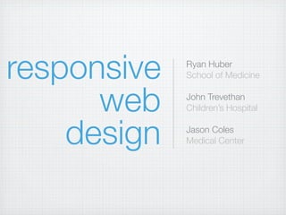
- 1. responsive Ryan Huber School of Medicine web John Trevethan ChildrenŌĆÖs Hospital design Jason Coles Medical Center
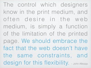
- 2. The control which designers know in the print medium, and often desire in the web medium, is simply a function of the limitation of the printed page. We should embrace the fact that the web doesnŌĆÖt have the same constraints, and design for this flexibility. - John Allsopp
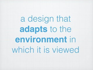
- 3. a design that adapts to the environment in which it is viewed
- 5. rather than a separate site for each device
- 6. how do you do it? the really really condensed version... also, the ŌĆ£in an ideal worldŌĆØ version...
- 7. STEP 1 write pretty html
- 8. STEP 2 write css in a way that it looks good on small screens
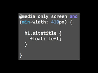
- 9. STEP 3 Layer on styles for increasingly wider browsers using media queries
- 11. show and tell
Editor's Notes
- #2: talk a little about us\ntalk a little about them\n
- #3: from “A Dao of Web Design”\n
- #4: \n
- #5: Whether that device is a computer, tablet, or phone (or anything in between.)\n\nMostly, we’re talking about width, but also about capabilities.\n\nimage courtesy: http://theindustry.cc/assets/2012/01/responsive_web_design.png\n
- #6: Benefits -- not maintaining multiple sites, not making bad assumptions about what content users want.\n
- #7: Benefits -- not maintaining multiple sites, not making bad assumptions about what content users want.\n
- #8: 1. Meaningful HTML\n2. Valid HTML\n3. Separate content and style\n4. Quality content\n5. Lean as possible\n
- #9: \n
- #10: \n
- #11: hide / show elements, change font sizes, etc.\nHow do you choose breakpoints? Find natural breakpoints.\n
- #12: It’s more complicated than that, but also more interesting. Ask questions along the way!\n