11 INTRO TO ARCHITECTURE PRESENTATION.pptx
Download as PPTX, PDF0 likes63 views
Architecture Education
1 of 19
Download to read offline
Ad
Recommended
Architecture presentation board
Architecture presentation boardCECOS University Peshawar, Pakistan
?
The document provides tips for effectively structuring and designing architecture presentation boards. It recommends:
1) Organizing the information and images to be presented based on the story and criteria before starting layout.
2) Using a grid system and hierarchy to structure boards with impact images visible from a distance and details up close.
3) Keeping backgrounds plain, usually white, to make images and text stand out professionally.Presentation Board Layout
Presentation Board Layout NYCCTfab
?
This document provides guidance on laying out presentation boards for architectural projects. It discusses organizing content with a grid, using visual hierarchy through scale and proportion, establishing rhythm, choosing fonts, aligning related drawings, leaving white space, and includes examples of competition boards. Key recommendations include using a basic grid, arranging elements by importance, limiting fonts and sizes, and aligning plans and sections at the same scale.Presentation board for data and analystic.pptx
Presentation board for data and analystic.pptxwaleedgharibwg
?
The document outlines essential tips and guidelines for creating effective architectural design presentations. It emphasizes the importance of layout, color palette, and minimal text to enhance viewer engagement and showcase artistic skills. It also provides practical advice on using appropriate tools and maintaining balance in visual elements to avoid distractions.Comm Art Unit 3 - Display Board for Design Fest!
Comm Art Unit 3 - Display Board for Design Fest!MrLawler
?
The document provides guidance for creating a display board for "Design Fest 2014". It outlines the required components of the display board and trade show booth. The display board must include sections on the project title, abstract, mission/vision statements, goals, background research, results, and future plans. Guidance is provided on layout, design, and visual elements. Students are advised to include samples of their work, tell their story in a logical manner, and "sell themselves" at the trade show.Presentation Tips
Presentation TipsAlshimaa Aboelmakarem Farag
?
The document provides 17 tips for creating effective presentation boards for design projects. Key recommendations include using a plain white background with 1-3 fonts, including sketches showing the design development process, using drawings to demonstrate context and enhance ideas, presenting concepts through short informative sentences and keywords rather than paragraphs of text, and properly organizing and composing boards to clearly communicate the project to viewers. Creativity, neatness, and avoiding last minute work are also emphasized.Dv final project pc
Dv final project pcAnthony Chew
?
This document provides instructions for the final project in the Design Visualization course. Students must design a display box to promote a toy company's miniature toy. They will present their design through A2 presentation boards showing drawings of the site and proposed display box, a photo montage, and a 1:1 scale physical model. The presentation boards must include hand drawings showing the site plan, elevations, sections, and plans and drawings of the display box. A photo montage on an A3 board should show the display box on site. The physical model must accurately fit the toy. Students will be evaluated on the completeness of their submission, the creativity and clarity of their design approach and drawings, and the appropriateness of their presentationMi 291 chapter 6 (aethetics in engineering design)(1)
Mi 291 chapter 6 (aethetics in engineering design)(1)varun teja G.V.V
?
This document provides guidance on writing effective presentations and slides. It discusses important aspects like outline, slide structure, fonts, color, background, graphs, spelling and grammar. For outlines, it recommends including the main points of the presentation. For slide structure, it suggests using point form, 4-5 points per slide, and showing one point at a time. For fonts, it advises using a large, clear font like Times New Roman in different sizes. For color, it says to use high-contrast text colors and limit colors. For backgrounds, it recommends light, simple backgrounds used consistently. For graphs, it emphasizes using graphs over tables and properly labeling them. It concludes by stressing proofreading and providing a strong conclusion thatComm via printed media 09
Comm via printed media 09HasanErkaya1
?
This document discusses principles of page design and its similarities to architecture. It covers topics such as using a grid structure and white space to organize visual elements on a page, as well as consistency in placement to aid findability. The document provides several quotes comparing page design to architecture, noting they both rely on underlying structures or "bones" to support visible parts. It also discusses using a grid framework to provide structure while still allowing flexibility and creativity.Presentation Zen Cap 6
Presentation Zen Cap 6guest8e0c22
?
The document discusses principles of effective presentation design including contrast, repetition, alignment, and proximity. It provides examples of slides that demonstrate strong and weak uses of these principles. Applying principles like contrast to differentiate elements visually and repetition to unite slide elements into a cohesive presentation can improve clarity and engage audiences.Designing Visuals for Instruction
Designing Visuals for InstructionMhelane Herebesi
?
The document provides guidelines for designing effective visuals such as charts, posters, and graphics. It recommends doing a preliminary sketch or "blueprint" to lay out the design before adding artistic details. Key aspects to maximize include arrangement of elements, balance, color, dynamism, emphasis, and graphic harmony. The Rule of Thirds and use of lines, shapes, contrasting colors, clear labeling, effective typography, and appropriate level of detail are emphasized. The overall message is that visual design requires creative and strategic use of visual elements and symbols to clearly convey information to viewers.Architectural Drawings - The language of architectural design
Architectural Drawings - The language of architectural designGalala University
?
The document emphasizes the significance of architectural drawings in effectively communicating design intentions. It articulates that drawing serves as the language of architecture, where clear and proper graphic representation is essential for conveying messages accurately. Various types of drawings, including sketches, layout plans, sections, and elevations, are discussed as vital elements in the architectural design process.Poster Design
Poster DesignJoanne Payton
?
This document provides guidance on designing effective conference posters. It emphasizes keeping the poster clear, concise and well-organized with a visual hierarchy. Key tips include cutting body text to under 1000 words, using design principles like contrast and alignment, and considering typography, color schemes, graphics and layout. The goal is to attract readers from a distance and communicate your message in a glance. Resources for images, templates and tutorials are also listed.Principles Of Presentation Design- Designing In Power Point
Principles Of Presentation Design- Designing In Power PointJohn Fallon
?
The document provides principles for effective presentation design, emphasizing clarity and the importance of high signal-to-noise ratios. It advises using fewer elements, employing pictures for better retention, and balancing design through contrast, repetition, and alignment. Additionally, it encourages the thoughtful use of empty space and asymmetrical designs to enhance visual interest and guide the viewer's attention.Visual Information and Media_20241014_024722_0000.pptx
Visual Information and Media_20241014_024722_0000.pptxRoseyAckerman
?
Vakeg says it will be a good day for the topic of the following is not a characteristic of a circle with the given scenarios then provide a brief rationale Architectural Design 1 Lectures by Dr. Yasser Mahgoub - Lecture 7 Drawing
Architectural Design 1 Lectures by Dr. Yasser Mahgoub - Lecture 7 DrawingGalala University
?
This presentation by Dr. Yasser Mahgoub focuses on the significance of architectural drawings as a primary means of design communication. It emphasizes that effective drawing is crucial for conveying the architect's intentions and highlights various types of drawings used in architecture, including sketches, layout plans, sections, elevations, and perspectives. The importance of proper graphic representation is underscored to ensure that the intended message is accurately interpreted by viewers.UNIT II ORGANIZING INFORMATION-20CDE09-INFORMATION DESIGN
UNIT II ORGANIZING INFORMATION-20CDE09-INFORMATION DESIGNGOWSIKRAJA PALANISAMY
?
This document outlines the principles of organizing information in design, emphasizing the importance of hierarchy, grid structure, and dynamic composition. It explains how a well-organized grid enhances visual communication and guides audiences through content effectively, using types of grids and hierarchy to create a meaningful visual sequence. The document also highlights creative flexibility within grid systems while maintaining an understanding of their fundamental rules for effective information delivery.principlesofgraphicdesignbasics-13045312012103-phpapp01.ppt
principlesofgraphicdesignbasics-13045312012103-phpapp01.pptraketeeraph
?
The document discusses the basic principles of graphic design. It begins by defining graphic design as combining text and graphics to communicate effective messages in various visual formats. It then outlines the five basic building blocks - lines, shapes, mass, texture, and color. Each element is explained and examples are provided to illustrate concepts like symmetrical and asymmetrical balance, proximity, alignment, repetition, contrast, and use of white space. The document aims to increase understanding of graphic design fundamentals and evaluate design quality.Week 5 - Visual Principles
Week 5 - Visual PrinciplesSyamsul Nor Azlan Mohamad
?
Visuals play several important roles in instruction such as providing concrete referents for ideas, motivating learners, and simplifying complex information. The process of visual design involves selecting elements, choosing a pattern, and arranging elements. Key elements include realistic, analogic, and organizational visuals as well as verbal elements like letter style and size. Effective patterns consider alignment, shape, balance, color scheme, and appeals. Arrangement principles include proximity, directionals, figure-ground contrast, and consistency.module 11.pptx media and information literacy
module 11.pptx media and information literacycindy335714
?
The document outlines Lesson 11 on visual information and media, covering dimensions, production, evaluation, and purpose of visual media in communication. It discusses various types of visual media, such as photography and infographics, and details design elements and principles that enhance visual presentations. The goal is to effectively use visual information to attract attention, create meaning, and facilitate retention in learning environments.FNBE0814 Introduction To Design Project 1
FNBE0814 Introduction To Design Project 1kaiwenyeo
?
This document outlines a design project with two parts for students. Part 1 involves individually sketching design elements observed in nature and the built environment. Part 2 involves working in groups to create nine abstract artworks using daily items that demonstrate design principles. Students must submit sketches and an individual artwork for Part 1, and display their group's nine artworks along with presentation boards explaining the design principles for Part 2. The project aims to help students learn about and apply design elements, principles, and the design process through observational sketching and creative art projects.Design project one brief
Design project one briefAng Averllen
?
This document outlines a design project with two parts for students. Part 1 involves individually sketching design elements observed in nature and the built environment. Part 2 involves working in groups to create nine abstract artworks using daily items that demonstrate design principles. Students must submit sketches and an individual artwork for Part 1, and display their group's nine artworks along with presentation boards explaining the design concepts for Part 2. The project aims to help students learn about and apply design elements, principles, and the design process through observational sketching and creative art projects.Design Project 1 Brief
Design Project 1 BriefBolin Loong
?
This document outlines a design project with two parts for students. Part 1 involves individually sketching design elements observed in nature and the built environment. Part 2 involves working in groups to create nine abstract artworks using daily items that demonstrate design principles. Students must submit sketches and an individual artwork for Part 1, and display their group's nine artworks along with presentation boards explaining the design principles for Part 2. The project aims to help students learn about and apply design elements, principles, and the design process through observational sketching and creative art projects.Design Project One - Brief.pdf
Design Project One - Brief.pdflimziahuei
?
This document outlines the requirements for Project 1 of an introductory design course. The project has two parts: 1) Individual sketches of design elements observed in nature and the built environment. 2) Group creation of nine abstract artworks exploring design principles using common items. Students must demonstrate understanding of elements and principles through their work and presentations. They will be assessed based on creativity, technical skill, and clarity of explaining elements and principles.Design Project One - Brief.pdf
Design Project One - Brief.pdflimziahuei
?
This document outlines the requirements for Project 1 of an introductory design course. The project has two parts: 1) Individual sketches of design elements observed in nature and the built environment. 2) Group creation of nine abstract artworks exploring design principles using common items. Students must demonstrate understanding of elements and principles through their work and presentations. They will be assessed based on creativity, technical skill, and clarity of explaining elements and principles.ITD (DESIGN) Project 1 Brief
ITD (DESIGN) Project 1 BriefForestedTiger
?
This document outlines the requirements for Project 1 of an introductory design course. The project has two parts: 1) Individual sketches of design elements observed in nature and the built environment. 2) Group artwork exploring design principles using daily items, to be presented along with explanation boards. Students must demonstrate understanding of elements and principles, and will be assessed based on creativity, technique, explanations, and meeting requirements. The project aims to familiarize students with basic design components and principles through 2D abstract art.Design Project One - Brief.pdf
Design Project One - Brief.pdfkychong1105
?
This document outlines the requirements for Project 1 of an introductory design course. The project has two parts: 1) Individual sketches of design elements observed in nature and the built environment. 2) Group creation of nine abstract artworks exploring design principles using common items. Students must demonstrate understanding of elements and principles through their work and presentations. They will be assessed based on creativity, technical skill, and clarity of explaining elements and principles.ITD - Project 1b brief
ITD - Project 1b briefrachaelcheong
?
This document outlines a design project with two parts for students. Part 1 involves individually sketching design elements observed in nature and the built environment. Part 2 involves working in groups to create nine abstract artworks using daily items that demonstrate design principles. Students must submit sketches and an individual artwork for Part 1, and display their group's nine artworks along with presentation boards explaining the design principles for Part 2. The objectives are to learn design processes and components, and understand design principles, elements, and composition. Students will be assessed based on their demonstrated understanding of these concepts in their work.Chromatic house a case study presentation arch.pptx
Chromatic house a case study presentation arch.pptxmaheshwarigarvit2006
?
a case study on chrmatic house chandigarh indiaMore Related Content
Similar to 11 INTRO TO ARCHITECTURE PRESENTATION.pptx (20)
Presentation Zen Cap 6
Presentation Zen Cap 6guest8e0c22
?
The document discusses principles of effective presentation design including contrast, repetition, alignment, and proximity. It provides examples of slides that demonstrate strong and weak uses of these principles. Applying principles like contrast to differentiate elements visually and repetition to unite slide elements into a cohesive presentation can improve clarity and engage audiences.Designing Visuals for Instruction
Designing Visuals for InstructionMhelane Herebesi
?
The document provides guidelines for designing effective visuals such as charts, posters, and graphics. It recommends doing a preliminary sketch or "blueprint" to lay out the design before adding artistic details. Key aspects to maximize include arrangement of elements, balance, color, dynamism, emphasis, and graphic harmony. The Rule of Thirds and use of lines, shapes, contrasting colors, clear labeling, effective typography, and appropriate level of detail are emphasized. The overall message is that visual design requires creative and strategic use of visual elements and symbols to clearly convey information to viewers.Architectural Drawings - The language of architectural design
Architectural Drawings - The language of architectural designGalala University
?
The document emphasizes the significance of architectural drawings in effectively communicating design intentions. It articulates that drawing serves as the language of architecture, where clear and proper graphic representation is essential for conveying messages accurately. Various types of drawings, including sketches, layout plans, sections, and elevations, are discussed as vital elements in the architectural design process.Poster Design
Poster DesignJoanne Payton
?
This document provides guidance on designing effective conference posters. It emphasizes keeping the poster clear, concise and well-organized with a visual hierarchy. Key tips include cutting body text to under 1000 words, using design principles like contrast and alignment, and considering typography, color schemes, graphics and layout. The goal is to attract readers from a distance and communicate your message in a glance. Resources for images, templates and tutorials are also listed.Principles Of Presentation Design- Designing In Power Point
Principles Of Presentation Design- Designing In Power PointJohn Fallon
?
The document provides principles for effective presentation design, emphasizing clarity and the importance of high signal-to-noise ratios. It advises using fewer elements, employing pictures for better retention, and balancing design through contrast, repetition, and alignment. Additionally, it encourages the thoughtful use of empty space and asymmetrical designs to enhance visual interest and guide the viewer's attention.Visual Information and Media_20241014_024722_0000.pptx
Visual Information and Media_20241014_024722_0000.pptxRoseyAckerman
?
Vakeg says it will be a good day for the topic of the following is not a characteristic of a circle with the given scenarios then provide a brief rationale Architectural Design 1 Lectures by Dr. Yasser Mahgoub - Lecture 7 Drawing
Architectural Design 1 Lectures by Dr. Yasser Mahgoub - Lecture 7 DrawingGalala University
?
This presentation by Dr. Yasser Mahgoub focuses on the significance of architectural drawings as a primary means of design communication. It emphasizes that effective drawing is crucial for conveying the architect's intentions and highlights various types of drawings used in architecture, including sketches, layout plans, sections, elevations, and perspectives. The importance of proper graphic representation is underscored to ensure that the intended message is accurately interpreted by viewers.UNIT II ORGANIZING INFORMATION-20CDE09-INFORMATION DESIGN
UNIT II ORGANIZING INFORMATION-20CDE09-INFORMATION DESIGNGOWSIKRAJA PALANISAMY
?
This document outlines the principles of organizing information in design, emphasizing the importance of hierarchy, grid structure, and dynamic composition. It explains how a well-organized grid enhances visual communication and guides audiences through content effectively, using types of grids and hierarchy to create a meaningful visual sequence. The document also highlights creative flexibility within grid systems while maintaining an understanding of their fundamental rules for effective information delivery.principlesofgraphicdesignbasics-13045312012103-phpapp01.ppt
principlesofgraphicdesignbasics-13045312012103-phpapp01.pptraketeeraph
?
The document discusses the basic principles of graphic design. It begins by defining graphic design as combining text and graphics to communicate effective messages in various visual formats. It then outlines the five basic building blocks - lines, shapes, mass, texture, and color. Each element is explained and examples are provided to illustrate concepts like symmetrical and asymmetrical balance, proximity, alignment, repetition, contrast, and use of white space. The document aims to increase understanding of graphic design fundamentals and evaluate design quality.Week 5 - Visual Principles
Week 5 - Visual PrinciplesSyamsul Nor Azlan Mohamad
?
Visuals play several important roles in instruction such as providing concrete referents for ideas, motivating learners, and simplifying complex information. The process of visual design involves selecting elements, choosing a pattern, and arranging elements. Key elements include realistic, analogic, and organizational visuals as well as verbal elements like letter style and size. Effective patterns consider alignment, shape, balance, color scheme, and appeals. Arrangement principles include proximity, directionals, figure-ground contrast, and consistency.module 11.pptx media and information literacy
module 11.pptx media and information literacycindy335714
?
The document outlines Lesson 11 on visual information and media, covering dimensions, production, evaluation, and purpose of visual media in communication. It discusses various types of visual media, such as photography and infographics, and details design elements and principles that enhance visual presentations. The goal is to effectively use visual information to attract attention, create meaning, and facilitate retention in learning environments.FNBE0814 Introduction To Design Project 1
FNBE0814 Introduction To Design Project 1kaiwenyeo
?
This document outlines a design project with two parts for students. Part 1 involves individually sketching design elements observed in nature and the built environment. Part 2 involves working in groups to create nine abstract artworks using daily items that demonstrate design principles. Students must submit sketches and an individual artwork for Part 1, and display their group's nine artworks along with presentation boards explaining the design principles for Part 2. The project aims to help students learn about and apply design elements, principles, and the design process through observational sketching and creative art projects.Design project one brief
Design project one briefAng Averllen
?
This document outlines a design project with two parts for students. Part 1 involves individually sketching design elements observed in nature and the built environment. Part 2 involves working in groups to create nine abstract artworks using daily items that demonstrate design principles. Students must submit sketches and an individual artwork for Part 1, and display their group's nine artworks along with presentation boards explaining the design concepts for Part 2. The project aims to help students learn about and apply design elements, principles, and the design process through observational sketching and creative art projects.Design Project 1 Brief
Design Project 1 BriefBolin Loong
?
This document outlines a design project with two parts for students. Part 1 involves individually sketching design elements observed in nature and the built environment. Part 2 involves working in groups to create nine abstract artworks using daily items that demonstrate design principles. Students must submit sketches and an individual artwork for Part 1, and display their group's nine artworks along with presentation boards explaining the design principles for Part 2. The project aims to help students learn about and apply design elements, principles, and the design process through observational sketching and creative art projects.Design Project One - Brief.pdf
Design Project One - Brief.pdflimziahuei
?
This document outlines the requirements for Project 1 of an introductory design course. The project has two parts: 1) Individual sketches of design elements observed in nature and the built environment. 2) Group creation of nine abstract artworks exploring design principles using common items. Students must demonstrate understanding of elements and principles through their work and presentations. They will be assessed based on creativity, technical skill, and clarity of explaining elements and principles.Design Project One - Brief.pdf
Design Project One - Brief.pdflimziahuei
?
This document outlines the requirements for Project 1 of an introductory design course. The project has two parts: 1) Individual sketches of design elements observed in nature and the built environment. 2) Group creation of nine abstract artworks exploring design principles using common items. Students must demonstrate understanding of elements and principles through their work and presentations. They will be assessed based on creativity, technical skill, and clarity of explaining elements and principles.Design Project One - Brief.pdf
Design Project One - Brief.pdflimziahuei
?
This document outlines the requirements for Project 1 of an introductory design course. The project has two parts: 1) Individual sketches of design elements observed in nature and the built environment. 2) Group creation of nine abstract artworks exploring design principles using common items. Students must demonstrate understanding of elements and principles through their work and presentations. They will be assessed based on creativity, technical skill, and clarity of explaining elements and principles.ITD (DESIGN) Project 1 Brief
ITD (DESIGN) Project 1 BriefForestedTiger
?
This document outlines the requirements for Project 1 of an introductory design course. The project has two parts: 1) Individual sketches of design elements observed in nature and the built environment. 2) Group artwork exploring design principles using daily items, to be presented along with explanation boards. Students must demonstrate understanding of elements and principles, and will be assessed based on creativity, technique, explanations, and meeting requirements. The project aims to familiarize students with basic design components and principles through 2D abstract art.Design Project One - Brief.pdf
Design Project One - Brief.pdfkychong1105
?
This document outlines the requirements for Project 1 of an introductory design course. The project has two parts: 1) Individual sketches of design elements observed in nature and the built environment. 2) Group creation of nine abstract artworks exploring design principles using common items. Students must demonstrate understanding of elements and principles through their work and presentations. They will be assessed based on creativity, technical skill, and clarity of explaining elements and principles.ITD - Project 1b brief
ITD - Project 1b briefrachaelcheong
?
This document outlines a design project with two parts for students. Part 1 involves individually sketching design elements observed in nature and the built environment. Part 2 involves working in groups to create nine abstract artworks using daily items that demonstrate design principles. Students must submit sketches and an individual artwork for Part 1, and display their group's nine artworks along with presentation boards explaining the design principles for Part 2. The objectives are to learn design processes and components, and understand design principles, elements, and composition. Students will be assessed based on their demonstrated understanding of these concepts in their work.Recently uploaded (20)
Chromatic house a case study presentation arch.pptx
Chromatic house a case study presentation arch.pptxmaheshwarigarvit2006
?
a case study on chrmatic house chandigarh india×îĐ°ćÎ÷°ŕŃŔŔĂÉÂł¶ű´óѧ±Ďҵ֤Ł¨±«¸éł˘±Ďҵ֤Ę飩԰涨ÖĆ
×îĐ°ćÎ÷°ŕŃŔŔĂÉÂł¶ű´óѧ±Ďҵ֤Ł¨±«¸éł˘±Ďҵ֤Ę飩԰涨ÖĆTaqyea
?
ÎŢ·¨±ĎҵŁżĽřÓÚ´ËąşÂňÎÄĆľˇľqޱ1954292140ˇżĐ޸ÄŔĂÉÂł¶ű´óѧłÉĽ¨µĄµç×Ó°ćgpaČĂѧŔú¸üłöÉ«,URLÎÄĆľÖĆ×÷Á÷łĚČ·±ŁŃ§ŔúŐćʵĐÔŁ¬ÎÄĆľąşÂňŁ¬±Ďҵ֤°ěŔíŁ¬ÎÄĆľ°ěŔíÖ»ĘÇ»ů´ˇŇµÎńˇŁˇľqޱ1954292140ˇżŇ»±ČŇ»»ąÔąúÍâ´óѧ±Ďҵ֤Ł¬¶¨ÖĆąúÍâ´óѧѧŔúŁ¬ÖĆ×÷ąúÍâ´óѧÎÄĆľŁ¬¸´żĚąúÍâ´óѧ±Ďҵ֤Ę顣ĎëŇŞŐćʵ¸ĐĘÜŔĂÉÂł¶ű´óѧ×îĐ°ć±Ďҵ֤ͼƬµÄĆ·Öʵă»÷˛éż´Ďę˝âŁ¬Ń§Î»Ö¤1:1ÍęĂŔ»ąÔşŁÍâ¸÷´óѧ±Ďҵ˛ÄÁĎÉϵŤŇŐŁşË®ÓˇŁ¬ŇőÓ°µ×ÎĆŁ¬¸ÖÓˇLOGOĚĚ˝đĚĚŇřŁ¬LOGOĚĚ˝đĚĚŇř¸´şĎÖصţˇŁÎÄ×ÖÍĽ°¸¸ˇµńˇ˘Ľ¤ąâŔŘÉ䡢×ĎÍâÓ«ąâˇ˘Î¸С˘¸´Óˇ·ŔαµČ·Ŕαą¤ŇŐˇŁ
Ö÷ÓŞĎîÄżŁş
1ˇ˘Őćʵ˝ĚÓý˛żąúÍâѧŔúѧλČĎÖ¤ˇ¶Î÷°ŕŃŔ±ĎҵÎÄĆľÖ¤ĘéżěËŮ°ěŔíŔĂÉÂł¶ű´óѧłÉĽ¨µĄ¶¨Öơ·ˇľq΢1954292140ˇżˇ¶ÂŰÎÄĂ»ąýŔĂÉÂł¶ű´óѧŐýĘ˝łÉĽ¨µĄˇ·Ł¬˝ĚÓý˛ż´ćµµŁ¬˝ĚÓý˛żÁô·ţÍřŐľ100%żÉ˛é.
2ˇ˘°ěŔíURL±Ďҵ֤Ł¬¸ÄłÉĽ¨µĄˇ¶URL±Ďҵ֤Ă÷°ěŔíŔĂÉÂł¶ű´óѧÁôĐĹÍřČĎÖ¤ˇ·ˇľQ/WeChatŁş1954292140ˇżBuy Universitat Ramon Llull Certificatesˇ¶ŐýĘ˝łÉĽ¨µĄÂŰÎÄĂ»ąýˇ·Ł¬ŔĂÉÂł¶ű´óѧOfferˇ˘ÔÚ¶ÁÖ¤Ă÷ˇ˘Ń§Éúż¨ˇ˘Đŷ⡢֤Ă÷ĐŵČČ«ĚײÄÁĎŁ¬´Ó·Ŕαµ˝ÓˇË˘Ł¬´Óˮӡµ˝¸ÖÓˇĚ̽𣬸߾«·Â¶Č¸úѧУ԰ć100%Ďŕͬ.
3ˇ˘ŐćʵʹąÝČĎÖ¤Ł¨Ľ´ÁôѧČËÔ±»ŘąúÖ¤Ă÷Ł©Ł¬ĘąąÝ´ćµµżÉͨąý´óĘąąÝ˛éŃŻČ·ČĎ.
4ˇ˘ÁôĐĹÍřČĎÖ¤Ł¬ąúĽŇרҵČ˲ĹČĎÖ¤ÖĐĐÄ°ä·˘ČëżâÖ¤Ę飬ÁôĐĹÍř´ćµµżÉ˛é.
°ěŔíURLѧŔúÓëѧλ֤ĘéͶ×ĘδŔ´µÄ×îĽŃÍľľ¶ˇľq΢1954292140ˇż°ěŔíÎ÷°ŕŃŔURL±ľżĆѧŔú,°ěŔíŔĂÉÂł¶ű´óѧłÉĽ¨µĄ¸ßÖĘÁż±ŁĂܵĸöĐÔ»Ż·ţÎń¸ß·ÂŐ滹ÔÎ÷°ŕŃŔÎÄĆľÖ¤ĘéşÍÍâżÇŁ¬¶¨ÖĆÎ÷°ŕŃŔŔĂÉÂł¶ű´óѧłÉĽ¨µĄşÍĐŷ⡣±Ďҵ֤¶ŞĘ§˛ą°ěURL±Ďҵ֤ˇľq΢1954292140ˇżĽŮÎÄĆľ»ŘąúŐŇą¤×÷ŔĂÉÂł¶ű´óѧoffer/ѧλ֤ѧλČĎÖ¤ÖŞşőˇ˘ÁôĐŹٷ˝Ń§ŔúČĎÖ¤Ł¨ÓŔľĂ´ćµµŐćʵżÉ˛éŁ©˛ÉÓĂѧУ԰ćÖ˝Őš˘ĚŘĘ⹤ŇŐÍęČ«°´ŐŐÔ°ćŇ»±ČŇ»ÖĆ×÷ˇŁ°ďÄă˝âľöŔĂÉÂł¶ű´óѧѧŔúѧλČĎÖ¤ÄŃĚ⡣
ˇľČçşÎżěËŮ°ěŔíˇ¶ŔĂÉÂł¶ű´óѧ±Ďҵ֤URLłÉĽ¨µĄˇ·Buy Universitat Ramon Llull Transcriptsˇż
ąşÂňČŐş«łÉĽ¨µĄˇ˘Ó˘ąú´óѧłÉĽ¨µĄˇ˘ĂŔąú´óѧłÉĽ¨µĄˇ˘°ÄÖŢ´óѧłÉĽ¨µĄˇ˘ĽÓÄĂ´ó´óѧłÉĽ¨µĄŁ¨q΢1954292140Ł©ĐÂĽÓĆ´óѧłÉĽ¨µĄˇ˘ĐÂÎ÷ŔĽ´óѧłÉĽ¨µĄˇ˘°®¶űŔĽłÉĽ¨µĄˇ˘Î÷°ŕŃŔłÉĽ¨µĄˇ˘µÂąúłÉĽ¨µĄˇŁłÉĽ¨µĄµÄŇâŇĺÖ÷ŇŞĚĺĎÖÔÚÖ¤Ă÷ѧϰÄÜÁ¦ˇ˘ĆŔąŔѧĘő±łľ°ˇ˘ŐąĘľ×ŰşĎËŘÖʡ˘Ěá¸ß¼ȡÂĘŁ¬ŇÔĽ°ĘÇ×÷ÎŞÁôĐĹČĎÖ¤ÉęÇë˛ÄÁϵÄŇ»˛ż·ÖˇŁ
ŔĂÉÂł¶ű´óѧłÉĽ¨µĄÄÜą»ĚĺĎÖÄúµÄµÄѧϰÄÜÁ¦Ł¬°üŔ¨ŔĂÉÂł¶ű´óѧżÎłĚłÉĽ¨ˇ˘×¨ŇµÄÜÁ¦ˇ˘ŃĐľżÄÜÁ¦ˇŁŁ¨q΢1954292140Ł©ľßĚĺŔ´ËµŁ¬łÉĽ¨±¨¸ćµĄÍ¨łŁ°üş¬Ń§ÉúµÄѧϰĽĽÄÜÓëĎ°ąßˇ˘¸÷żĆłÉĽ¨ŇÔĽ°ŔĎʦĆŔÓďµČ˛ż·ÖŁ¬Ňň´ËŁ¬łÉĽ¨µĄ˛»˝öĘÇѧÉúѧĘőÄÜÁ¦µÄÖ¤Ă÷Ł¬Ň˛ĘÇĆŔąŔѧÉúĘÇ·ńĘĘşĎÄł¸ö˝ĚÓýĎîÄżµÄÖŘŇŞŇŔľÝŁˇ
Buy Universitat Ramon Llull Diplomaˇ¶ŐýĘ˝łÉĽ¨µĄÂŰÎÄĂ»ąýˇ·ÓĐÎÄƾȴµĂ˛»µ˝ČĎÖ¤ˇŁÓÖ¸ĂÔőĂ´°ěŁżĽřÓÚ´ËŁ¬ąşÂňÎ÷°ŕŃŔ±Ďҵ֤ˇľq΢1954292140ˇżÎ÷°ŕŃŔÎÄĆľąşÂňŁ¬Î÷°ŕŃŔÎÄĆľąşÂňŁ¬Î÷°ŕŃŔÎÄĆľ¶¨ÖĆŁ¬Î÷°ŕŃŔÎÄĆľ˛ą°ěˇŁ×¨ŇµÔÚĎ߶¨ÖĆÎ÷°ŕŃŔ´óѧÎÄĆľŁ¬¶¨×öÎ÷°ŕŃŔ±ľżĆÎÄĆľŁ¬ˇľq΢1954292140ˇż¸´ÖĆÎ÷°ŕŃŔUniversitat Ramon Llull completion letterˇŁÔÚĎßżěËٲą°ěÎ÷°ŕŃŔ±ľżĆ±Ďҵ֤ˇ˘Ë¶ĘżÎÄĆľÖ¤Ę飬ąşÂňÎ÷°ŕŃŔѧλ֤ˇ˘ŔĂÉÂł¶ű´óѧOfferŁ¬URLŔĂÉÂł¶ű´óѧ±Ďҵ֤Ęé¶ŕÉŮÇ®ˇŁExploring the Diverse Types of Textual Aids
Exploring the Diverse Types of Textual Aidsjenicahmendoza1
?
Exploring the Diverse Types of Textual Aids(18+ CLIP!) Sophie Rain Spiderman Viral Video Clip Sophie Rain Original Video
(18+ CLIP!) Sophie Rain Spiderman Viral Video Clip Sophie Rain Original Videojamesfolkner123
?
DOWNLOAD LINK??? https://rebrand.ly/656e26/???
Full Download link: ??https://rebrand.ly/656e26/ ??
Sophie Rain Spiderman Viral Video Original Viral video took the internet by storm and amazed viewers on various social media platforms. Sophie Rain Spiderman Video, a young and talented digital creator, recently became famous thanks to this interesting video.Quectel M10 AT commands Arduino Microcontroller
Quectel M10 AT commands Arduino MicrocontrollerAdamSunusiHaruna1
?
Quectel M10 AT commands Arduino Microcontroller Radiation_Pollution_eLearning_Module.pptx
Radiation_Pollution_eLearning_Module.pptxkanishkaarora1496
?
? Radiation pollution is caused by passages and electromagnetic radiation emitted from
natural and man-made sources.
? These may include neutrons, x-rays, ultraviolet radiation, microwaves and alpha passages.
? Radiation pollution also includes controlled disposal of radioactive wastes from nuclear
reactors.
? Radiation pollution may have biological, ecological and socio-economic effects.
? The amount of injury caused by radiation from a radioactive isotope depends on its half-life,
and on how quickly it is absorbed and how fast the body of the organism repairs the
damage.
? Most studies of the harmful effects of radiation have been performed on single-celled
organisms.
? Obviously, the situation is more complex in humans and other multi-cellular organisms,
because a single cell damaged by radiation may indirectly affect other cells in the individual.
? The most sensitive regions of the human body appear to be those which have many actively
dividing cells, such as the skin, gonads, intestine and tissues that grow blood cells (spleen,
bone marrow, and lymph organs).
? Radiation is toxic because the emitted radiations form ions when they interact with
biological molecules in cells and tissues.
? These ions can then form free radicals, which damage proteins, membranes and nucleic
acids.
? Radioactive radiation can damage DNA (deoxyribonucleic acid) by destroying individual
bases including thymine, breaking single strands and double strands, cross-linking different
DNA strands and cross-linking DNA and proteins.
? Damage to DNA can lead to cancers, birth defects, and even death.MULTI SENSORY EXPERIENCE DESIGN RESEARCH
MULTI SENSORY EXPERIENCE DESIGN RESEARCHSamuel Thuo
?
Excited to share insights from my Dissertation Thesis on Multisensory Experience Design in Art Museums, focusing on Nairobi, Kenya! I have to say that this is the work that set me on my current trajectory and led me to my current design philosophy of design for all senses.
Have you been to a #museum, wanted to touch an exhibit and there you saw an injunction, "Please don't touch"....or "Please speak softly",,,,or "Please no eating in the museum".....or "Please don't use strong perfume".... these injunctions have made museums to be mono-sensory experience oriented, alienating the visitors. These injunctions speak volumes of our innate and inherent desire to want to engage holistically with all our #senses with objects. This is a major problem especially in Kenya's museums, which is a paradox with its rich cultural, and anthropological exhibits that require engagement with all the senses.
Inspired by David Howes' insights from Concordia University, my thesis challenges this status quo by exploring historical precedents. Did you know that in the 18th century, museums encouraged multisensory interaction? Today, there's a global shift towards enhancing museum experiences through multisensory #design, yet Kenya's museums often lag behind international standards.
This research isn't just about aesthetics....it's about fostering meaningful, educational, and socially enriching experiences. By embracing multisensory design, museums can bridge cultural divides and create environments where every visitor feels welcomed and engaged. And want to go back.
Let's spark a conversation about the future of museum experiences. How can we leverage design to make cultural institutions more accessible and inspiring for all? FLOURISHING THROUGH SENSES: FROM Abˇ®SENSEˇŻ to Preˇ®SENSEˇŻ to Esˇ®SENSEˇŻ to Re-...
FLOURISHING THROUGH SENSES: FROM Abˇ®SENSEˇŻ to Preˇ®SENSEˇŻ to Esˇ®SENSEˇŻ to Re-...Samuel Thuo
?
A presentation By Samuel Thuo, The Senses Architect to FxD Community for a PechaKucha Format titled: Flourishing Through Senses: From Abˇ®senseˇŻ to Preˇ®senseˇŻ to Esˇ®senseˇŻ to Re-sensing the World
In a world where skyscrapers rise and senses fall, this presentation explores how architecture can either numb or nourish our humanity.
? Act I ¨C Abˇ®senseˇŻ: The Crisis of Sensory Deprivation
We begin in the concrete jungle, a habitat built for function, but not for feeling. Glass, steel, white walls. Children indoors, glued to screens. Cities that silence rain and sterilize smell. We've lost touch with the sensory essence of living. We're living in a pandemic of nonsense environments.
? Act II ¨C Preˇ®senseˇŻ: The Power of Sensory Grounding
We rediscover presence in barefoot steps on soil, bark under fingertips, beams of sunlight through timber, whispers of wind and scent of wet earth. Flourishing starts when all senses are awake, not just sight. ItˇŻs a return to how we once knew the world, intimately, bodily.
? Act III ¨C Esˇ®senseˇŻ: Remembering Our Sensory Nature
Flourishing is rooted in our essence, as sensing, emotional beings. We learn from natureˇŻs flow, from indigenous African architecture, from animals in tune with their environment, and even from cooking. These are acts of multisensory design, where wisdom is embodied, not abstract. Beauty is not in the eyes of the beholder, but all the senses of the beholder.
? Act IV ¨C Re-sensing: A Vision for the Future
ItˇŻs time to re-sense the world. Pallasmaa said that architecture is the art of reconciliation between ourselves and the world, and this mediation happens through the senses. We must go back to creating senseful environments that allow this dialogue between us and the world. Homes like Falling water that merge with land. Playful spaces for children. Healing cities filled with texture, sound, and smell. Bodies that root into nature. We must shift from building cold structures to designing sensescapes that foster wellbeing.×îĐ°ćĂŔąú±±ĂÜĐŞ¸ů´óѧ±Ďҵ֤Ł¨±·˛Ń±«±Ďҵ֤Ę飩԰涨ÖĆ
×îĐ°ćĂŔąú±±ĂÜĐŞ¸ů´óѧ±Ďҵ֤Ł¨±·˛Ń±«±Ďҵ֤Ę飩԰涨ÖĆTaqyea
?
ĽřÓÚ´ËŁ¬¶¨ÖƱ±ĂÜĐŞ¸ů´óѧѧλ֤ĘéĚáÉýÂÄŔúˇľqޱ1954292140ˇżÔ°ć¸ß·Â±±ĂÜĐŞ¸ů´óѧ±Ďҵ֤(NMU±Ďҵ֤Ęé)żÉĎČż´łÉĆ·Ńů±ľˇľqޱ1954292140ˇż°ďÄú˝âľöÔÚĂŔąú±±ĂÜĐŞ¸ů´óѧδ±ĎҵÄŃĚ⣬ĂŔąú±Ďҵ֤ąşÂňŁ¬ĂŔąúÎÄĆľąşÂňŁ¬ˇľq΢1954292140ˇżĂŔąúÎÄĆľąşÂňŁ¬ĂŔąúÎÄĆľ¶¨ÖĆŁ¬ĂŔąúÎÄĆľ˛ą°ěˇŁ×¨ŇµÔÚĎ߶¨ÖĆĂŔąú´óѧÎÄĆľŁ¬¶¨×öĂŔąú±ľżĆÎÄĆľŁ¬ˇľq΢1954292140ˇż¸´ÖĆĂŔąúNorthern Michigan University completion letterˇŁÔÚĎßżěËٲą°ěĂŔąú±ľżĆ±Ďҵ֤ˇ˘Ë¶ĘżÎÄĆľÖ¤Ę飬ąşÂňĂŔąúѧλ֤ˇ˘±±ĂÜĐŞ¸ů´óѧOfferŁ¬ĂŔąú´óѧÎÄĆľÔÚĎßąşÂňˇŁ
ČçąűÄú´¦ÓÚŇÔĎÂĽ¸ÖÖÇéżöŁş
ˇóÔÚĐŁĆڼ䣬Ňň¸÷ÖÖÔŇňδÄÜËłŔű±ĎҵˇˇÄò»µ˝ąŮ·˝±Ďҵ֤
ˇóĂć¶Ô¸¸Ä¸µÄŃąÁ¦Ł¬ĎŁÍűľˇżěÄõ˝Ł»
ˇó˛»ÇĺłţČĎÖ¤Á÷łĚŇÔĽ°˛ÄÁϸĂČçşÎ׼±¸Ł»
ˇó»ŘąúʱĽäşÜł¤Ł¬ÍüĽÇ°ěŔíŁ»
ˇó»ŘąúÂíÉĎľÍŇŞŐŇą¤×÷Ł¬°ě¸řÓĂČ˵ĄÎ»ż´Ł»
ˇóĆóĘÂҵµĄÎ»±ŘĐëŇŞÇó°ěŔíµÄ
ˇóĐčŇŞ±¨żĽą«ÎńÔ±ˇ˘ąşÂňĂâË°łµˇ˘Âäת»§żÚ
ˇóÉęÇëÁôѧÉú´´Ňµ»ů˝đ
ˇľ¸´żĚŇ»Ě×±±ĂÜĐŞ¸ů´óѧ±Ďҵ֤łÉĽ¨µĄĐĹ·âµČ˛ÄÁĎ×îÇżąĄÂÔ,Buy Northern Michigan University Transcriptsˇż
ąşÂňČŐş«łÉĽ¨µĄˇ˘Ó˘ąú´óѧłÉĽ¨µĄˇ˘ĂŔąú´óѧłÉĽ¨µĄˇ˘°ÄÖŢ´óѧłÉĽ¨µĄˇ˘ĽÓÄĂ´ó´óѧłÉĽ¨µĄŁ¨q΢1954292140Ł©ĐÂĽÓĆ´óѧłÉĽ¨µĄˇ˘ĐÂÎ÷ŔĽ´óѧłÉĽ¨µĄˇ˘°®¶űŔĽłÉĽ¨µĄˇ˘Î÷°ŕŃŔłÉĽ¨µĄˇ˘µÂąúłÉĽ¨µĄˇŁłÉĽ¨µĄµÄŇâŇĺÖ÷ŇŞĚĺĎÖÔÚÖ¤Ă÷ѧϰÄÜÁ¦ˇ˘ĆŔąŔѧĘő±łľ°ˇ˘ŐąĘľ×ŰşĎËŘÖʡ˘Ěá¸ß¼ȡÂĘŁ¬ŇÔĽ°ĘÇ×÷ÎŞÁôĐĹČĎÖ¤ÉęÇë˛ÄÁϵÄŇ»˛ż·ÖˇŁ
±±ĂÜĐŞ¸ů´óѧłÉĽ¨µĄÄÜą»ĚĺĎÖÄúµÄµÄѧϰÄÜÁ¦Ł¬°üŔ¨±±ĂÜĐŞ¸ů´óѧżÎłĚłÉĽ¨ˇ˘×¨ŇµÄÜÁ¦ˇ˘ŃĐľżÄÜÁ¦ˇŁŁ¨q΢1954292140Ł©ľßĚĺŔ´ËµŁ¬łÉĽ¨±¨¸ćµĄÍ¨łŁ°üş¬Ń§ÉúµÄѧϰĽĽÄÜÓëĎ°ąßˇ˘¸÷żĆłÉĽ¨ŇÔĽ°ŔĎʦĆŔÓďµČ˛ż·ÖŁ¬Ňň´ËŁ¬łÉĽ¨µĄ˛»˝öĘÇѧÉúѧĘőÄÜÁ¦µÄÖ¤Ă÷Ł¬Ň˛ĘÇĆŔąŔѧÉúĘÇ·ńĘĘşĎÄł¸ö˝ĚÓýĎîÄżµÄÖŘŇŞŇŔľÝŁˇGrade-9-COT.pptxGrade-9-COT.pptxGrade-9-COT.pptxGrade-9-COT.pptx
Grade-9-COT.pptxGrade-9-COT.pptxGrade-9-COT.pptxGrade-9-COT.pptxMaKristinaBuenaventu1
?
Grade-9-COT.pptxAd
11 INTRO TO ARCHITECTURE PRESENTATION.pptx
- 1. AABA 1143 ARCHITECTURE GRAPHICS 1 NOTE 11: INTRO TO PRESENTATION DRAWING
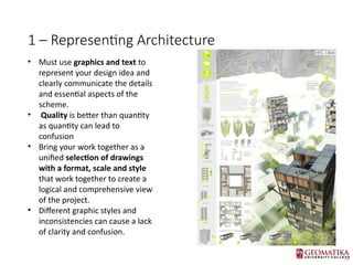
- 2. 1 ¨C Representing Architecture ? Must use graphics and text to represent your design idea and clearly communicate the details and essential aspects of the scheme. ? Quality is better than quantity as quantity can lead to confusion ? Bring your work together as a unified selection of drawings with a format, scale and style that work together to create a logical and comprehensive view of the project. ? Different graphic styles and inconsistencies can cause a lack of clarity and confusion.
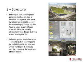
- 3. 2 ¨C Structure ? Before you start creating your presentation boards, take a moment to organise your work. What are you trying to convey? What drawings / images do you have to show as part of your criteria? What are the key elements in your design that you would like to portray? ? Collect together the information ¨C even list out all the images to be included and what text you would like to put it, then you can start planning the structure of your boards..
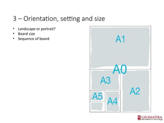
- 4. 3 ¨C Orientation, setting and size ? Landscape or portrait? ? Board size ? Sequence of board
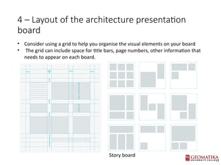
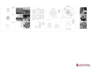
- 5. 4 ¨C Layout of the architecture presentation board ? Consider using a grid to help you organise the visual elements on your board ? The grid can include space for title bars, page numbers, other information that needs to appear on each board. Story board
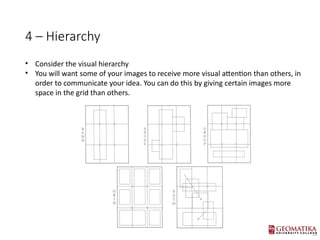
- 6. 4 ¨C Hierarchy ? Consider the visual hierarchy ? You will want some of your images to receive more visual attention than others, in order to communicate your idea. You can do this by giving certain images more space in the grid than others.
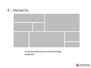
- 7. 4 ¨C Hierarchy Visual hierarchy can be created through proportion
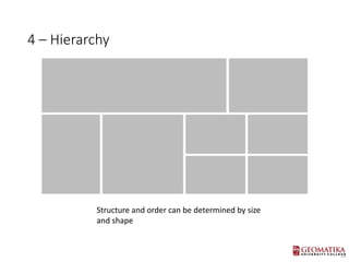
- 8. 4 ¨C Hierarchy Structure and order can be determined by size and shape
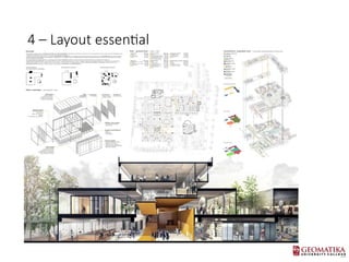
- 9. 4 ¨C Layout essential ? sketching out your layout of your architecture presentation board before you start, so you can get an idea of the possible configurations you can use and what might work best ? Make sure you plan your board so that you can see the relationship between the drawings ? Make sure every instance of a plan is of the same orientation (north point always in same place) ? When showing plans and elevations/sections together, it is beneficial if they are of the same scale and in line ? DonˇŻt forget to explore relationships between each board, and how they will be read together
- 10. 4 ¨C Layout essential
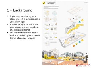
- 11. 5 ¨C Background ? Try to keep your background plain, unless it is featuring one of your key images ? A white background will make your images and text stand out and look professional ? The information comes across well, and the background makes the visuals pop of the page
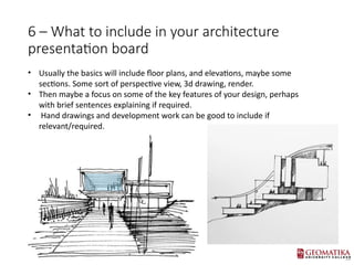
- 12. 6 ¨C What to include in your architecture presentation board ? Usually the basics will include floor plans, and elevations, maybe some sections. Some sort of perspective view, 3d drawing, render. ? Then maybe a focus on some of the key features of your design, perhaps with brief sentences explaining if required. ? Hand drawings and development work can be good to include if relevant/required.
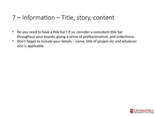
- 13. 7 ¨C Information ¨C Title, story, content ? Do you need to have a title bar? If so, consider a consistent title bar throughout your boards, giving a sense of professionalism, and orderliness. ? DonˇŻt forget to include your details ¨C name, title of project etc and whatever else is applicable.
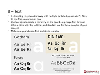
- 14. 8 ¨C Text ? Its tempting to get carried away with multiple fonts but please, donˇŻt! Stick to one font, maximum of two. ? Use font sizes to create a hierarchy on the board ¨C e.g. large font for your titles, a bit smaller for subtitles and standard size for the remainder of your content. ? Make sure your chosen font and size is readable!
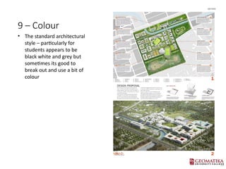
- 15. 9 ¨C Colour ? The standard architectural style ¨C particularly for students appears to be black white and grey but sometimes its good to break out and use a bit of colour
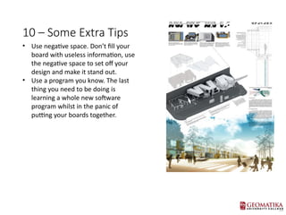
- 16. 10 ¨C Some Extra Tips ? Use negative space. DonˇŻt fill your board with useless information, use the negative space to set off your design and make it stand out. ? Use a program you know. The last thing you need to be doing is learning a whole new software program whilst in the panic of putting your boards together.
- 18. Exercise ? Create a story board proposal for collection of task that has been given before. ? In a2 paper layout
Editor's Notes
- #1: NOTE 11: INTRO TO PRESENTATION DRAWING