


More Related Content
More from dahye Lim (6)
1416118 ل„‹ل…µل†·ل„ƒل…،ل„’ل…¨ color theory proposal final
- 3. TOPIC COLORTHEORY LIGHT COLOR (ë¹›ىک ىƒ‰)
- 4. TOPIC COLORTHEORY LIGHT COLOR (ë¹›ىک ىƒ‰) ى،°ëھ… يک•ê´‘/ >
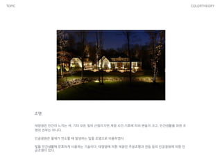
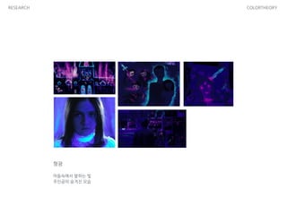
- 5. TOPIC COLORTHEORY ë¹›ىک ىƒ‰ ي–‡ë¹›ى€ ي°ىƒ‰ى²کëں¼ ë³´ى´ى§€ë§Œ ى‚¬ى‹¤ ى—¬ëں¬ ê°€ى§€ 빛들ى´ ى„ى—¬ ىˆë‹¤. ى‚¬ëŒىک 눈ى—گ ë³´ى´ëٹ” ë¹›ëڈ„ ىˆê³ ë³´ى´ى§€ ى•ٹëٹ” ë¹›ëڈ„ ىˆ ëٹ”ëچ°, ىڑ°ë¦¬ê°€ 눈ىœ¼ë،œ ë³¼ ىˆک ىˆëٹ” ë¹›ى„ â€کê°€ى‹œê´‘ى„ ’ى´ë¼ê³ 부른다. ê°€ى‹œê´‘ى„ ى„ ى´ë£¨ëٹ” ى—¬ëں¬ ê°€ى§€ ىƒ‰ىک 빛들ى€ يŒŒى¥ى´ ëھ¨ë‘گ 다르며 빨간ىƒ‰ى—گ 가까ىڑ´ ë¹›ى¼ىˆکë، يŒŒى¥ى´ ê¸¸ê³ , ë³´ë¼ىƒ‰ى—گ 가까ىڑ¸ىˆکë، يŒŒى¥ى´ ى§§ë‹¤. ëھ¨ë“ ىƒ‰ىک ë¹›ى´ 다 ى„ى´ë©´ ي°ىƒ‰ى´ ëگœë‹¤. ي°ىƒ‰ ى†چى—گ ىˆ¨ى–´ ىˆëٹ” ى—¬ëں¬ ê°€ى§€ ىƒ‰ê¹”ىک ë¹› ى¤‘ى—گى„œ 빨강, ى´ˆë،, يŒŒë‘ىک ى„¸ ê°€ى§€ ë¹›ى„ ىڑ°ë¦¬ëٹ” â€کë¹›ىک ى‚¼ى›گىƒ‰â€™ى´ë¼ê³ ي•کë©° ى´ ى„¸ ê°€ى§€ ىƒ‰ى„ ي•©ى„±ي•کë©´ 다ى–‘ي•œ ىƒ‰ê¹”ى„ ë³¼ ىˆک ىˆë‹¤.
- 6. TOPIC COLORTHEORY ى،°ëھ… يƒœى–‘ê´‘ى€ ى¸ê°„ى´ ëٹگëپ¼ëٹ” ىƒ‰, 기يƒ€ ëھ¨ë“ ë¹›ىک ê·¼ى›گى´ى§€ë§Œ,계ى ˆآ·ى‹œê°„آ·ê¸°ي›„ى—گ ë”°ë¼ ë³€ëڈ™ى´ يپ¬ê³ , ى¸ê°„ىƒي™œى„ ىœ„ي•œ ى،° ëھ…ىک ى „부ëٹ” ى•„니다. ى¸ê³µê´‘ى›گى€ 물ى²´ê°€ ى—°ى†Œي• ë•Œ ë°œىƒي•کëٹ” ë¹›ى„ ى،°ëھ…ىœ¼ë،œ ى´ىڑ©ي•کىک€ë‹¤. ë¹›ى„ ى¸ê°„ىƒي™œى—گ ىœ يڑ¨ي•ک게 ى‚¬ىڑ©ي•کëٹ” 기ىˆ ى´ë‹¤. يƒœى–‘ê´‘ى—گ ىکي•œ ى±„ê´‘ى¸ ى£¼ê´‘ى،°ëھ…ê³¼ ى „등 등ىک ى¸ê³µê´‘ى›گى—گ ىکي•œ ى¸ ê³µى،°ëھ…ى´ ىˆë‹¤.
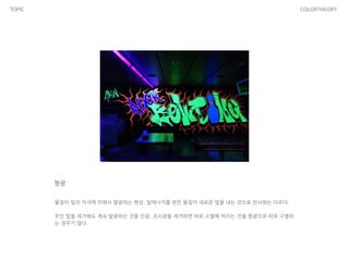
- 7. TOPIC COLORTHEORY يک•ê´‘ 물ى§ˆى´ ë¹›ىک ىگê·¹ى—گ ىکي•´ى„œ 발광ي•کëٹ” يک„ىƒپ. ë¹›ى—گ너ى§€ë¥¼ ë°›ى€ 물ى§ˆى´ ىƒˆë،œىڑ´ ë¹›ى„ ë‚´ëٹ” 것ىœ¼ë،œ ë°کى‚¬ى™€ëٹ” 다르다. ! ىھ¼ى¸ ë¹›ى„ ى œê±°ي•´ëڈ„ 계ى†چ 발광ي•کëٹ” 것ى„ ى¸ê´‘, ى،°ى‚¬ê´‘ى„ ى œê±°ي•کë©´ ë°”ë،œ ى†Œë©¸ي•´ 버리ëٹ” 것ى„ يک•ê´‘ىœ¼ë،œ ë”°ë،œ 구별ي•ک ëٹ” ê²½ىڑ°ê°€ ë§ژ다.
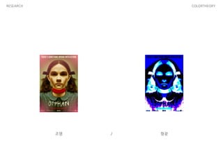
- 8. TOPIC COLORTHEORY LIGHT COLOR (ë¹›ىک ىƒ‰) ى،°ëھ… يک•ê´‘/ ê°™ى€ ىکپي™”, 다른 ë¹›, 다른 ىƒ‰ > >
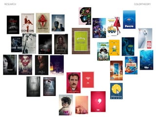
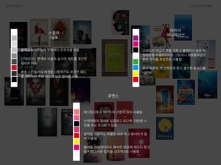
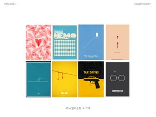
- 9. METHOD COLORTHEORY ىƒ‰ى،°ي•©ى„ ى´ىڑ©ي•œ يڈ¬ىٹ¤ي„°
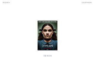
- 11. RESEARCH COLORTHEORY ىœ ى‚°ىœ¼ë،œ ى„¸ 번ى§¸ ى•„ى´ë¥¼ ىƒê³ ê³ ي†µ ë°›ëچک ى¼€ى´يٹ¸ى™€ ى،´ى€ ىƒپى²ک를 ى¹کىœ ي•ک기 ىœ„ي•´ ىƒˆى‹êµ¬ë¥¼ ë§ى´ي•ک기ë،œ ê²°ى‹¬ي•œë‹¤. ى…ى–‘ى„ ىœ„ي•´ ê³ ى•„ى›گ ى—گ ê°„ 부부ëٹ” ëکگëکى—گ 비ي•´ ى°¨ë¶„ي•کê³ ىکپ민ي•œ ى—گىٹ¤ëچ”ى—گ게 ى²کىŒ ë³´ىگ마ىگ ëپŒë¦¬ê²Œ ëگœë‹¤. ى—گىٹ¤ëچ”를 ىƒˆى‹êµ¬ë،œ ë§ى´ي•œ 부부ëٹ” يپ° ى•„들 다니ى—کê³¼ ى–´ë¦° 딸 맥ىٹ¤ë¥¼ يڈ¬ي•¨ي•œ 다ى„¯ ى‹êµ¬ىک ي–‰ë³µي•œ ى‚¶ى„ ê؟ˆê¾¼ë‹¤. ê·¸ëں¬ë‚ک ى—گىٹ¤ëچ”ê°€ ىک¨ ي›„ ى´ë“¤ ê°€ى،±ى—گ게 ى´ىƒپي•œ ى¼ë“¤ى´ ى¼ى–´ë‚ک기 ى‹œى‘ي•œë‹¤. ى•„ى´ë“¤ى€ ë§گي• ىˆک ى—†ëٹ” ë‘گë ¤ى›€ى—گ ë–¨ê³ ىˆëٹ” 것 ê°™ى•کê³ , ى—گ ىٹ¤ëچ”를 ê´´ë،يک”ëچک ê°™ى€ ë°ک ى¹œêµ¬ê°€ 놀ى´ي„°ى—گى„œ ى‚¬ê³ 를 당ي•کë©´ى„œ ى—گىٹ¤ëچ”ê°€ ë²”ى¸ىœ¼ë،œ ى§€ëھ©ëگœë‹¤. ي•œيژ¸ ى…ى–‘ى„ ى£¼ى„ ي•œ ىˆک녀가 ى—گىٹ¤ëچ”ى—گ게 ىˆکىƒپي•¨ى„ ëٹگëپ¼ê³ ى°¾ى•„ى™”ى§€ë§Œ 곧 ى‹¤ى¢…ëگœ ي›„ ى²کى°¸ي•œ ى£¼ê²€ىœ¼ë،œ 발견ëگœë‹¤. ى´ë°–ى—گ ى—گىٹ¤ëچ”를 ë‘کëں¬ى‹¼ 불미ىٹ¤ëں¬ىڑ´ ى¼ë“¤ى´ 계ى†چي•´ى„œ ë°œىƒي•کê³ ë‹¤ë‹ˆى—کê³¼ 맥ىٹ¤ى—گ게까ى§€ ê·¸ ىœ„ي—کى—گ ى²کي•ک게 ëگکىگ ى¼€ى´يٹ¸ëٹ” ى—گىٹ¤ëچ”를 ىکى‹¬ي•ک게 ëگœë‹¤. ى—گىٹ¤ëچ”ىک ي–‰ى پى„ ى،°ى‚¬ي•کëچک ى¼€ى´يٹ¸ëٹ” ىƒê°پى§€ëڈ„ ëھ»ي•œ ى—„ى²ë‚œ ë°کى „ى—گ 놀ë¼ê²Œ ëگکê³ , ى—گىٹ¤ëچ”ë،œë¶€ي„° ê°€ى،±ë“¤ى„ ى§€ي‚¤ë ¤ي•œë‹¤. ى¤„거리
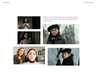
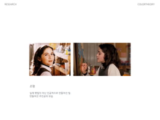
- 12. RESEARCH COLORTHEORY ىکپي™” ى†چ ى£¼ى¸ê³µى€ 무ى±„ىƒ‰, يک¹ى€ ى±„ëڈ„ê°€ ë‚®ى€ ىک·ى„ ë‚´ë‚´ ى…ê³ ë‚کىک¤ëٹ”ëچ° ى´ëٹ” ى£¼ى¸ê³µىک ى–´ë¦°ى• 답ى§€ ى•ٹى€ ë©´ى„ 단면ى پىœ¼ë،œ ë³´ى—¬ى£¼ê³ ىˆë‹¤.
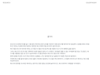
- 13. RESEARCH COLORTHEORY ى،°ëھ… ! ى‹¤ى œ ي–‡ë¹›ى´ ى•„ë‹Œ ى¸ê³µى پىœ¼ë،œ 만들ى–´ى§„ ë¹› 만들ى–´ى§„ ى£¼ى¸ê³µىک ëھ¨ىٹµ
- 14. RESEARCH COLORTHEORY يک•ê´‘ ! ى–´ë‘ ى†چى—گى„œ ë°œي•کëٹ” ë¹› ى£¼ى¸ê³µىک ىˆ¨ê²¨ى§„ ëھ¨ىٹµ
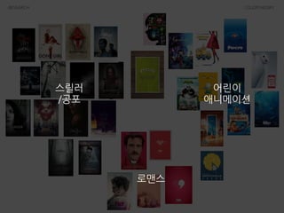
- 18. RESEARCH COLORTHEORY ىٹ¤ë¦´ëں¬ /ê³µيڈ¬ ى–´ë¦°ى´ ى• 니메ى´ى…ک ë،œë§¨ىٹ¤ 블ë™ê³¼ ي™”ى´يٹ¸ë“±ىک 무ى±„ىƒ‰ى´ ى£¼ى،°ىƒ‰ى„ ى´ë£¸ ! ë‚œىƒ‰ë³´ë‹¤ëٹ” ي•œىƒ‰ىک 비ى¤‘ى´ 높ىœ¼ë©° ë ˆë“œë¥¼ يڈ¬ى¸يٹ¸ ى¹¼ë¼ë،œ ى‚¬ىڑ© ! ى¢…ى¢… ىٹ¤ي‚¨ى»¬ëں¬ىک ë°°ê²½ى„ ى‚¬ىڑ©ي•ک기ëڈ„ ي•کى§€ë§Œ ë ˆë“œ 를 ى œى™¸ي•کë©´ ى£¼ë،œ ى±„ëڈ„ê°€ ë‚®ى€ ى»¬ëں¬ë¥¼ ى‚¬ىڑ© ê³ ى±„ëڈ„ىک ىƒ‰ê°گى´ ى£¼ë¥¼ ى´ë£¨ê³ 블ë™ى´ë‚ک ى§™ى€ يŒŒ ë‘ë°°ê²½ى„ ى‚¬ىڑ©ي•کëچ”ë¼ëڈ„ 그린ى´ë‚ک يک•ê´‘블루같ى€ ë°ى€ ى»¬ëں¬ë¥¼ يڈ¬ى¸يٹ¸ë،œ ى‚¬ىڑ©ي•¨ ! ى›گىƒ‰ ىœ„ى£¼ىک ىƒ‰ ى„ يƒىœ¼ë،œ ë°ê³ ى¦گê±°ىڑ´ 분ىœ„기를 ë‚کيƒ€ëƒ„ ë ˆë“œي•‘يپ¬ي†¤ê³¼ ي™”ى´يٹ¸ىک ى،°ي•©ى´ ë§ژى´ ى‚¬ىڑ©ëگ¨ ! ë‚œىƒ‰ê³„ى—´ىک ى»¬ëں¬ë،œ 달ى½¤ي•کê³ يڈ¬ê·¼ي•œ, 따뜻ي•œ ëٹگ ë‚Œى„ ى£¼ëٹ” يڈ¬ىٹ¤ي„°ê°€ ë§ژىŒ ! 블ë™ى„ ى‚¬ىڑ©ي•کëٹ” 비ى¤‘ى€ ى•„ى£¼ ى پê³ ي™”ى´يٹ¸ê°€ ë§ژ ى´ ى‚¬ىڑ©ëگ¨ ! 블ë™ى„ ى´ىڑ©ي•کëچ”ë¼ëڈ„ ي™”ى´يٹ¸ ë°°ê²½ى—گ ë ˆë“œë‚ک ي•‘يپ¬ 등 ى‚¬ë‘ىٹ¤ëں¬ىڑ´ ى»¬ëں¬ë¥¼ ê°•ى،°ىƒ‰ىœ¼ë،œ ى‚¬ىڑ©ي•¨
- 21. RESEARCH COLORTHEORY ى•„ى´ى–¸ë§¨ ى£¼ى¸ê³µىک ىƒپى§•ىƒ‰ى¸ ë ˆë“œى™€ ىکگë،œىڑ°ë¥¼ ë°”يƒ•ىœ¼ë،œ ي™” ى´يٹ¸ ى¹¼ë¼ë¥¼ ى،°ي•©ي•کى—¬ ى‚¬ىڑ© ! ë ˆë“œىک ë³´ىƒ‰ى¸ 블루를 ى‚¬ىڑ©ي•کى—¬ ëھ…ى‹œى„±ى„ 높ى´ê³ ëچ”ىڑ± 다ى±„ë،œى›Œ ë³´ى´ëٹ” يڈ¬ىٹ¤ي„°ë¥¼ ى—°ى¶œي•ک기ëڈ„ ي•¨ ! ىکپي™” ى†چ ىœ ى¾Œي•œ ى£¼ى¸ê³µىک ى„±ê²©ى„ ë ˆë“œë،œ, ë°کë©´ ê³ ى§‘ىˆê³ ى،°ê¸ˆى€ 꽉 막يک€ىˆëٹ” ى„±ê²©ى„ ىکگë،œىڑ°ë،œ ى¬ 미ىˆê²Œ ي‘œيک„ي•¨ ë°°يٹ¸ë§¨ ى£¼ى¸ê³µىک ىƒپى§•ىƒ‰ى¸ 블ë™ë¥¼ ë°”يƒ•ىœ¼ë،œ ىکگë،œىڑ°ë¥¼ ى،° ي•©ي•کى—¬ ى‚¬ىڑ© ! ى„œë،œ ë³´ىƒ‰ى¸ ى»¬ëں¬ê°€ ى‚¬ىڑ©ëگکى–´ يڈ¬ىٹ¤ي„°ى—گ ëڑœë ·ي•œ يکى´ ى‹¤ë¦¬ë©´ى„œ ى•„ى´ëچ´ي‹°ي‹°ê°€ ëڑœë ·ي•¨ ! ë°°يٹ¸ë§¨ىک 블ë™ê³¼ ىکگë،œىڑ°ى—گى„œ ë‚کيƒ€ë‹¤ëٹ” ëڑœë ·ي•œ ëٹگ 낌과 ى،°ى»¤ىک ê³ ى±„ëڈ„ىک ë ˆë“œى™€ 그린 ë³´ىƒ‰ى—گى„œىک 대비가 ê°•ë ¬ي•¨ ! ىکپي™” ى†چ 묵묵ي•œ ى£¼ى¸ê³µىک ى„±ê²©ى„ 무ى±„ىƒ‰ىک ىˆکيٹ¸ ê°€ ىک ë‚کيƒ€ë‚´ê³ ىˆىœ¼ë©° ى–´ë‘ ى†چى—گى„œ 빛난다ëٹ” ىک 미ë،œ ىکگë،œىڑ°ë¥¼ ى‚¬ىڑ©ي•کىک€ىŒ
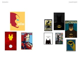
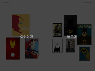
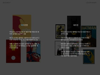
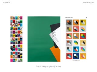
- 22. RESEARCH COLORTHEORY ىٹ¤ىœ„ىٹ¤ ىٹ¤يƒ€ى¼ىک ى»¬ëں¬ ى،°ي•© يڈ¬ىٹ¤ي„°
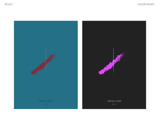
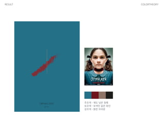
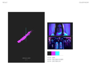
- 25. RESULT COLORTHEORY ى£¼ى،°ىƒ‰ - ى±„ëڈ„ ë‚®ى€ ى²ë، ë³´ى،°ىƒ‰ - ë³´ىƒ‰ى¸ ى§™ى€ ى™€ى¸ ê°•ى،°ىƒ‰ - ë°ى€ 브ë¼ىڑ´
- 26. RESULT COLORTHEORY ى£¼ى،°ىƒ‰ - ë¸”ë™ ë³´ى،°ىƒ‰ - ë°ى€ يک•ê´‘ ë°”ى´ىک¬ë › ê°•ى،°ىƒ‰ - ë°ى€ يک•ê´‘ 민يٹ¸