ºÝºÝߣ

ºÝºÝߣShare a Scribd company logo
MEDIA STUDIES
 EVALUATION
   By Paige Etherington
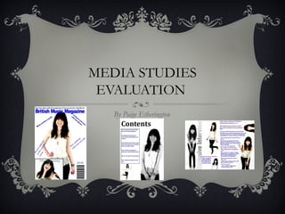
y music magazine is similar to other music magazines:


here is one main image on the magazine


have also used Photoshop on my magazine, just like a real music magazine


hey also have a barcode just like mine


have also used a skyline to attract my audience


hat I don’t have:


y sell lines aren't as bold as a real music magazine


y barcode is on the opposite side of a real music magazine
eenagers and young adults that enjoy varieties of music from
Britain. It represents young adults and teenagers because it
has a young adult/ teenager on the front cover and also
contains young artist in the magazine. It also represents
British music because it has British musicians and is also
called the British music magazine.
he distributers of the magazine would be the printing industry. I
would have my magazine sold in many shops such as big super
markets and also on app stores. I would want my magazine published
by Bauer because they produce successful magazines such as Heat
and the music magazine ‘Q’, with this producers the magazine would
become successful and would be a popular choice, due to Bauer is a
successful producers
think that it would be the age range of 14-25 year olds looking at my
media product who enjoy varieties of music.
used various fonts and pictures in the magazines, I also used
attractive colours that catches there attention.
have learnt how to use different computers such as normal pcs and I
used macs for my work, I also learnt how to use Photoshop
affectively for my magazine photos. I've learnt how to use a camera
and different shots to take, also making sure I have the right exposure
and ISO.
or both I booked a photo-shoot in a studio I used the white back ground
for both because it makes the model stand out, but for the music
magazine I did a front cover, contents and double spread page, in the
college magazine only did a front page and contents page, so I did more
on the music magazine than the college magazine.


 used different models for each magazine, the college one was more
business than the music magazine. I used different fonts, I also arranged
the photos in different positions.


n the college magazine I didn’t use Photoshop, but I used Photoshop in
my music magazine.

More Related Content

4

  • 1. MEDIA STUDIES EVALUATION By Paige Etherington
  • 2. y music magazine is similar to other music magazines: here is one main image on the magazine have also used Photoshop on my magazine, just like a real music magazine hey also have a barcode just like mine have also used a skyline to attract my audience hat I don’t have: y sell lines aren't as bold as a real music magazine y barcode is on the opposite side of a real music magazine
  • 3. eenagers and young adults that enjoy varieties of music from Britain. It represents young adults and teenagers because it has a young adult/ teenager on the front cover and also contains young artist in the magazine. It also represents British music because it has British musicians and is also called the British music magazine.
  • 4. he distributers of the magazine would be the printing industry. I would have my magazine sold in many shops such as big super markets and also on app stores. I would want my magazine published by Bauer because they produce successful magazines such as Heat and the music magazine ‘Q’, with this producers the magazine would become successful and would be a popular choice, due to Bauer is a successful producers
  • 5. think that it would be the age range of 14-25 year olds looking at my media product who enjoy varieties of music.
  • 6. used various fonts and pictures in the magazines, I also used attractive colours that catches there attention.
  • 7. have learnt how to use different computers such as normal pcs and I used macs for my work, I also learnt how to use Photoshop affectively for my magazine photos. I've learnt how to use a camera and different shots to take, also making sure I have the right exposure and ISO.
  • 8. or both I booked a photo-shoot in a studio I used the white back ground for both because it makes the model stand out, but for the music magazine I did a front cover, contents and double spread page, in the college magazine only did a front page and contents page, so I did more on the music magazine than the college magazine. used different models for each magazine, the college one was more business than the music magazine. I used different fonts, I also arranged the photos in different positions. n the college magazine I didn’t use Photoshop, but I used Photoshop in my music magazine.