5 Worst Excel Dashboard Mistakes
- 1. Worst Excel Dashboard Mistakes and how to avoid them
- 2. Mistake # 1 No clear focus
- 3. Fix # 1 Know what the dashboard is designed to show ? What key information should be highlighted? ? Which numbers are most important?
- 4. Fix # 1 Highlight key data at top
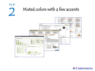
- 6. Fix # 2 Rainbow colors distract from the key information ? Select a muted color scheme ? Use stronger, brighter colors sparingly, to draw attention to key items
- 7. Fix # 2 Muted colors with a few accents
- 9. Fix # 3 DonĪ»t include everything ? Too much data hides the key information ? Limit the items and have links to supplementary sheets
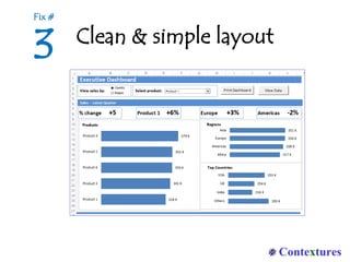
- 10. Fix # 3 Clean & simple layout
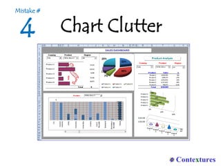
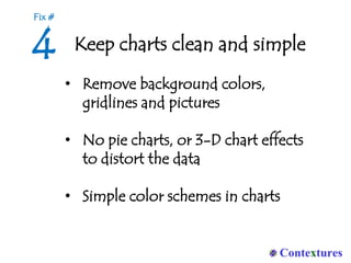
- 12. Fix # 4 Keep charts clean and simple ? Remove background colors, gridlines and pictures ? No pie charts, or 3-D chart effects to distort the data ? Simple color schemes in charts
- 13. Fix # 4 Clear charts, no backgrounds or 3-D
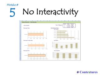
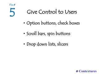
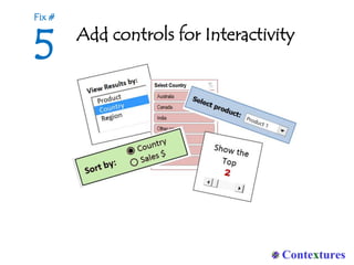
- 15. Fix # 5 Give Control to Users ? Option buttons, check boxes ? Scroll bars, spin buttons ? Drop down lists, slicers
- 16. Fix # 5 Add controls for Interactivity
- 17. 5 Excel Dashboard Tips 1. Highlight key data at top 2. Muted colors with a few accents 3. Clean & simple layout 4. Clear charts 5. Interactive controls
- 18. Want more Excel tips and tutorials, to dazzle your boss, clients and co-workers? Visit Contextures.com http://www.contextures.com/exceldashboardtips.html

