際際滷

際際滷Share a Scribd company logo
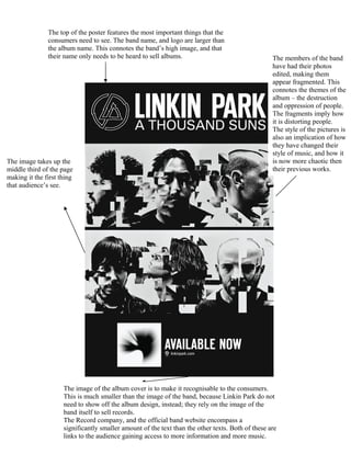
The top of the poster features the most important things that the
               consumers need to see. The band name, and logo are larger than
               the album name. This connotes the bands high image, and that
               their name only needs to be heard to sell albums.                                   The members of the band
                                                                                                   have had their photos
                                                                                                   edited, making them
                                                                                                   appear fragmented. This
                                                                                                   connotes the themes of the
                                                                                                   album  the destruction
                                                                                                   and oppression of people.
                                                                                                   The fragments imply how
                                                                                                   it is distorting people.
                                                                                                   The style of the pictures is
                                                                                                   also an implication of how
                                                                                                   they have changed their
                                                                                                   style of music, and how it
The image takes up the                                                                             is now more chaotic then
middle third of the page                                                                           their previous works.
making it the first thing
that audiences see.


                     The image of the album cover is to make it recognisable to the consumers.
                     This is much smaller than the image of the band, because Linkin Park do not
                     need to show off the album design, instead; they rely on the image of the
                     band itself to sell records.
                     The Record company, and the official band website encompass a
                     significantly smaller amount of the text than the other texts. Both of these are
                     links to the audience gaining access to more information and more music.

More Related Content

A thousand suns poster

  • 1. The top of the poster features the most important things that the consumers need to see. The band name, and logo are larger than the album name. This connotes the bands high image, and that their name only needs to be heard to sell albums. The members of the band have had their photos edited, making them appear fragmented. This connotes the themes of the album the destruction and oppression of people. The fragments imply how it is distorting people. The style of the pictures is also an implication of how they have changed their style of music, and how it The image takes up the is now more chaotic then middle third of the page their previous works. making it the first thing that audiences see. The image of the album cover is to make it recognisable to the consumers. This is much smaller than the image of the band, because Linkin Park do not need to show off the album design, instead; they rely on the image of the band itself to sell records. The Record company, and the official band website encompass a significantly smaller amount of the text than the other texts. Both of these are links to the audience gaining access to more information and more music.