Analysing adverts
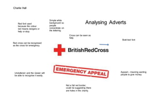
- 1. Charlie Hall Analysing Adverts Bold text font Red cross can be recognised as the cross for emergency. Uncluttered and the viewer will be able to recognise it easily. Cross can be seen as help. Appeal – meaning wanting people to give money. Not a full red border, could be suggesting there are holes in the charity. Red font used because the colour red means dangers or help or stop. Simple white background so people concentrate on the lettering.

