Apple Health Design Challenge
1 like556 views

The document details a redesign proposal for the Apple Health app, emphasizing the need for improved usability and a focus on passive data collection. User interviews revealed that most users prefer automatic tracking over manual data entry and require a simplified dashboard that displays essential health metrics. The proposed changes aim to enhance user engagement by offering clear visualizations and nudges for daily activity without overwhelming users with complexity.


Apple Health Design Challenge
- 1. Apple Health An amazing app that visualizes health data in a useful and informative way!** By Nic Edwards
- 2. **Another one of those apps that just sits there, that I canˇŻt delete and doesnˇŻt do anything for me. An amazing app that visualizes health data in a useful and informative way!** Apple Health
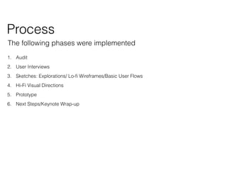
- 3. The following phases were implemented 1. Audit 2. User Interviews 3. Sketches: Explorations/ Lo-? Wireframes/Basic User Flows 4. Hi-Fi Visual Directions 5. Prototype 6. Next Steps/Keynote Wrap-up Process
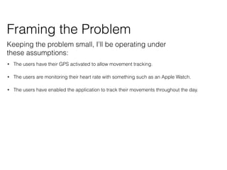
- 4. ? The users have their GPS activated to allow movement tracking. ? The users are monitoring their heart rate with something such as an Apple Watch. ? The users have enabled the application to track their movements throughout the day. Framing the Problem Keeping the problem small, IˇŻll be operating under these assumptions:
- 5. AuditAudit
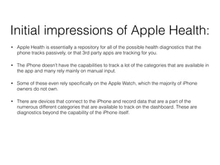
- 6. Initial impressions of Apple Health: ? Apple Health is essentially a repository for all of the possible health diagnostics that the phone tracks passively, or that 3rd party apps are tracking for you. ? The iPhone doesnˇŻt have the capabilities to track a lot of the categories that are available in the app and many rely mainly on manual input. ? Some of these even rely speci?cally on the Apple Watch, which the majority of iPhone owners do not own. ? There are devices that connect to the iPhone and record data that are a part of the numerous different categories that are available to track on the dashboard. These are diagnostics beyond the capability of the iPhone itself.
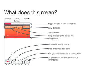
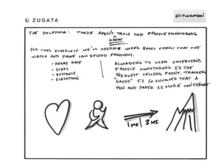
- 7. toggle lengths of time for metrics daily distance daily average (time period =?) time period dashboard view (current) ?nds more trackable items tells you where the data is coming from gives medical information in case of emergency title of metric What does this mean?
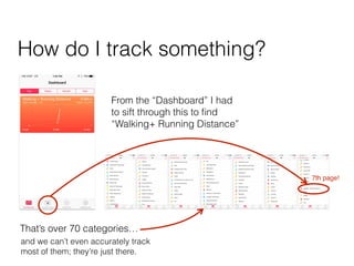
- 8. ThatˇŻs over 70 categoriesˇ and we canˇŻt even accurately track most of them; theyˇŻre just there. From the ˇ°Dashboardˇ± I had to sift through this to ?nd ˇ°Walking+ Running Distanceˇ± How do I track something? 7th page!
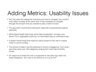
- 9. Adding Metrics: Usability Issues ? Not only were the categories confusing and hard to navigate, you couldnˇŻt even select multiple at the same time; it was necessary to navigate through the list each time you wanted to add a metric to track. ? The app didnˇŻt recommend tracking for data that it automatically collects passively. ? While Apple Health does have some data visualization, itˇŻs basic and doesnˇŻt try to aggregate anything in a meaningful easy to understand way. ? It doesnˇŻt show things that might be useful except for the user to maybe check in out of curiosity. ? The amount of data it has the potential to record is staggering. From what I saw there were over 100 categories ranging from heart rate to fertility cycles. ? ItˇŻs vague as to where the user is supposed to manually input data into these categories. ˇ°Do I rely on the device or is it up to me?ˇ±
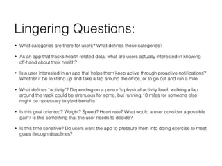
- 10. Lingering Questions: ? What categories are there for users? What de?nes these categories? ? As an app that tracks health related data, what are users actually interested in knowing off-hand about their health? ? Is a user interested in an app that helps them keep active through proactive noti?cations? Whether it be to stand up and take a lap around the of?ce, or to go out and run a mile. ? What de?nes ˇ°activityˇ±? Depending on a personˇŻs physical activity level, walking a lap around the track could be strenuous for some, but running 10 miles for someone else might be necessary to yield bene?ts. ? Is this goal oriented? Weight? Speed? Heart rate? What would a user consider a possible gain? Is this something that the user needs to decide? ? Is this time sensitive? Do users want the app to pressure them into doing exercise to meet goals through deadlines?
- 11. User Interviews
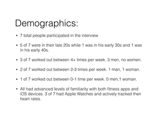
- 12. Demographics: ? 7 total people participated in the interview ? 5 of 7 were in their late 20s while 1 was in his early 30s and 1 was in his early 40s. ? 3 of 7 worked out between 4+ times per week. 3 men, no women. ? 2 of 7 worked out between 2-3 times per week. 1 man, 1 woman. ? 1 of 7 worked out between 0-1 time per week. 0 men,1 woman. ? All had advanced levels of familiarity with both ?tness apps and iOS devices. 3 of 7 had Apple Watches and actively tracked their heart rates.
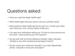
- 13. ? Have you used the Apple Health app? ? What health apps have you used or are you currently using? ? What would an ideal health app do for you? (i.e. monitor your heart rate, track your runs, monitor calorie intake etc.) ? If an app sent noti?cations telling you ˇ°itˇŻs time to move around and be activeˇ±, what would be your ?rst reaction? ? Do you ever look at activity (distance traveled, steps, elevation climbed or any other tracked activity) based metrics? ? Do you record your workouts manually in any way? Speci?cally phone, computer or even pen and paper? Questions asked:
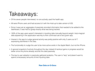
- 14. ? Of the seven people interviewed, no one actively used the health app. ? All were iPhone users and had access to it with the most up to date version of iOS. ? Since it was just an aggregate of passively recorded information that needed to be added to the dashboard, it was hard to grasp exactly what was being tracked. ? 100% of the app users werenˇŻt interested in inputting data manually beyond weight. Auto-magical data appearing in the application was key to their continued use of any given app. ? Interest in the app to nudge general activity was pretty positive with only 2 users out of 7 expressing disinterest in the idea. ? The functionality to nudge the user to be more active exists in the Apple Watch, but not the iPhone. ? A general snapshot of activity throughout the day instead of workout gains or progress would be better since the phone already records this data passively. ? The key to user adoption is passively gathered analytics. The user is ˇ°lazyˇ± and doesnˇŻt want to spend unnecessary amounts of time inputting data. Raw Data on G-Docs Takeaways:
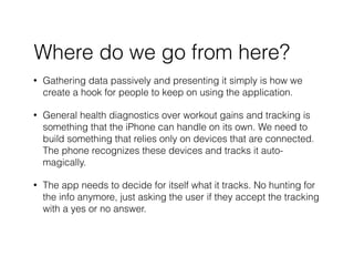
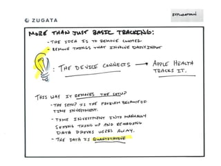
- 15. ? Gathering data passively and presenting it simply is how we create a hook for people to keep on using the application. ? General health diagnostics over workout gains and tracking is something that the iPhone can handle on its own. We need to build something that relies only on devices that are connected. The phone recognizes these devices and tracks it auto- magically. ? The app needs to decide for itself what it tracks. No hunting for the info anymore, just asking the user if they accept the tracking with a yes or no answer. Where do we go from here?
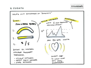
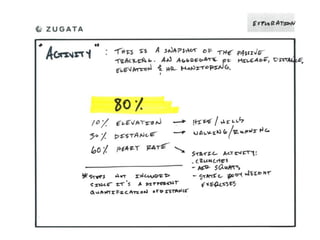
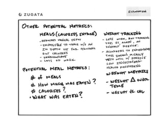
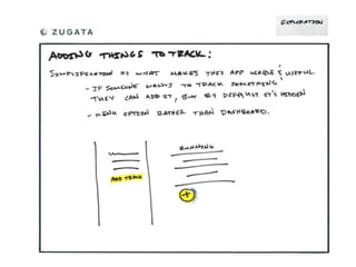
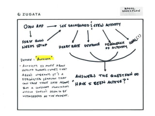
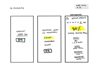
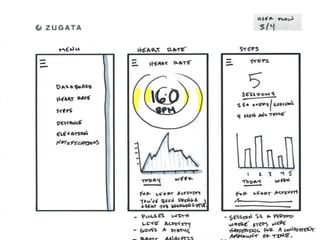
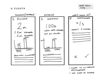
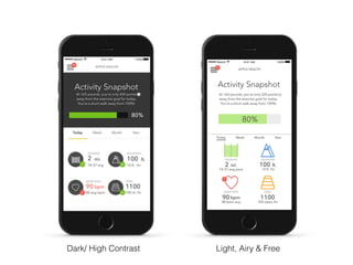
- 30. Design Decisions: ? Based on user research, passive data gathering was needed for adoption. ? A simpli?cation of the information architecture was needed, so IˇŻm implementing only steps, elevation change, distance and heart rate. The phone tracks these automatically and heart rate can be tracked through the Apple Watch and other peripherals. ? Having at a glance numbers on a dashboard is more useful than multiple visualizations stacked like in the old application. This reduces clutter. ? Removing the ability to actively add manually recorded data brings us back to a more manageable product. There are less complications and weˇŻre able to create an environment that focuses on hard data rather than an array of guesses. ? Removing the list display to choose from, is then replaced by the app recognizing smart devices connecting to the iPhone. The metric category would then be automatically added to the tracking area. This could be a smart scale that tracks weight, body fat %, etc. ? Adding in the ability to nudge yourself lightly throughout the day to move around a little is where I envision the progress bar being the most effective. ItˇŻs not meant to be an intense workout driven metric, but it allows for a basic understanding of your physical state throughout the day.
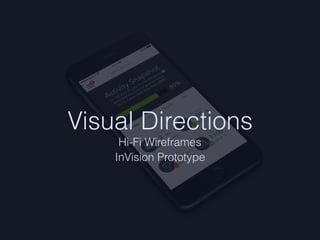
- 31. Visual Directions Hi-Fi Wireframes InVision Prototype
- 32. Dark/ High Contrast Light, Airy & Free
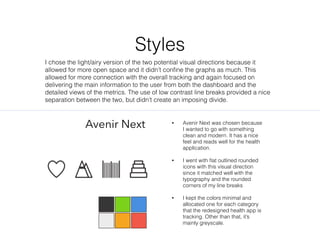
- 34. Styles Avenir Next ? Avenir Next was chosen because I wanted to go with something clean and modern. It has a nice feel and reads well for the health application. ? I went with ?at outlined rounded icons with this visual direction since it matched well with the typography and the rounded corners of my line breaks ? I kept the colors minimal and allocated one for each category that the redesigned health app is tracking. Other than that, itˇŻs mainly greyscale. I chose the light/airy version of the two potential visual directions because it allowed for more open space and it didnˇŻt con?ne the graphs as much. This allowed for more connection with the overall tracking and again focused on delivering the main information to the user from both the dashboard and the detailed views of the metrics. The use of low contrast line breaks provided a nice separation between the two, but didnˇŻt create an imposing divide.
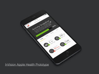
- 35. InVision Apple Health Prototype
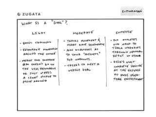
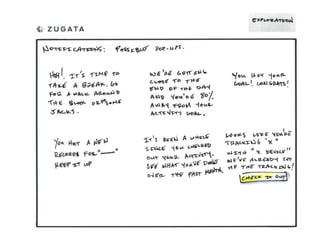
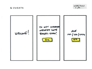
- 36. Next Steps: ? IˇŻd like to take a look into what landscape view does for the graphs and what extra functionality that should add to them. ? Add on boarding to walk the user through adding in other basic tracking, such as weight, which would prompt the user to input it with a reminder, and an input for a general pro?le. ? Add the aforementioned ˇ°pro?leˇ± system in order to make the tracking information more accurate for the different activity levels. i.e. editing age, weight and desired activity level. ? Create a clearer way to add more metrics to the dashboard when smart devices that monitor health related activities connect to the iPhone. ? Create a visualization for the overview of daily goals for ˇ°light, moderate and intenseˇ± activity modes. Explain what this means in the context of walking, running, elevation and heart rate. How much does each of these contribute to the activity progress bar? ? Add in a system for creating iOS noti?cations to prompt some movement throughout the day. ? Error states & zero states, what do those look like?
- 37. Wrap-up Overall, this ?rst iteration and prototype are true to what I set out to accomplish. I wanted to focus on the passive monitoring aspect of the iPhone since there are already hundreds, if not thousands, of health apps that do the same exact thing. Track goals, eating and all of that. What they donˇŻt have is the indestructibility of Apple Health; you canˇŻt delete this thing! So, it stands to reason that if people have the data there, and they can see it without additional effort, theyˇŻll gravitate towards using something they already have rather than downloading a new 3rd party health monitoring app. After talking with some friends and family of varying activity levels, it was clear that people were interested in their statistics, but they didnˇŻt want to put time into recording it manually since it was usually guesses combined with tedious data entry. The data when relying on manual entry isnˇŻt great either. To refocus what Apple Health could be, you see the dashboard with four regularly monitored diagnostics that happen passively through the iPhone in conjunction with the Apple Watch for heart rate. You open the app, see the numbers, then go on with your business. YouˇŻre not trying to look at a graph with a microscope. The focus was at a glance diagnostics that were easy to read as well as digest and this UI accomplishes that.
- 38. Brought to you by Nic Edwards, a Product Designer Thanks!