Audience feedback
Download as pptx, pdf0 likes259 views

The document provides strengths and weaknesses of products promoting a children's TV show. It analyzes the strengths of the DVD cover in grabbing attention and relating to the target audience, and weaknesses in needing brighter images. For the magazine, strengths include varied fonts and colors that appeal to children, while weaknesses are lack of bolder fonts and more images. The opening's strengths are relatable characters and upbeat music, but it could have ended more excitingly and shown more character relationships.
1 of 10
Download to read offline
Ad
Recommended
Magazine cover analysis
Magazine cover analysisAJTReynolds
╠²
The document provides feedback on magazine mastheads and covers. It critiques some designs for being boring and not using color or images effectively, while praising others for using professional layouts, clear titles, and eye-catching color combinations that make the content stand out. Concerns are raised about mastheads that are hard to see or titles obscured by images. Overall it advocates for creative, unique designs that attract readers through varied fonts, clarity, and visual appeal.Final products
Final productscharlottebanister1994
╠²
The front cover of the final product has a slanted splash placement and uses brighter summer colors while keeping the black canvas to make the other colors pop more. The contents page was inspired by Billboard magazine and uses continued colors throughout to give a bright summer feel, and more was added to make it look more professional. The double page spread only had its colors changed to make it pop more while keeping the original placement and detail.Nhan's helping hand saigon flyer review
Nhan's helping hand saigon flyer reviewAISNhan
╠²
This document is a flyer created for college students to create awareness and provide information. The flyer uses various design elements like gradients, autoshapes, images and fonts to make it visually interesting, though the creator later wished some elements were more consistent. It features information about volunteering opportunities for an upcoming event at an orphanage.Research into 2 more digipacks
Research into 2 more digipacks957755
╠²
The document summarizes the design elements of a music album digipack cover and interior. Key points include:
1) The front cover uses a simple white font and large photo of the artist to draw attention to her.
2) The interior features a photo of the artist in a field of roses to give a fairy tale feel and suggest themes in one of the songs.
3) Design elements like the bold red color and aggressive logo are meant to portray the artist as strong and the music as having dark themes.Presentation1
Presentation1changhoon0205
╠²
To encourage people to volunteer at local orphanages, the document's creator designed a poster using various graphic design techniques. They used the paint bucket tool to color the background, selected a font from 1001fonts.com to draw attention, and employed tools like the magic wand and eraser to balance the image, logo, and text on the poster in a visually pleasing manner. The goal was to concisely yet effectively promote volunteerism using color, layout, imagery and other design elements.Media evaluation question 5
Media evaluation question 5bethsquires
╠²
The document discusses strategies for attracting and addressing the intended audience of a music magazine.
The coverlines and images were chosen based on the results of a questionnaire to appeal to the audience. A bold main image on the front cover grabs attention. The color scheme of black, purple and grey were the most popular in the questionnaire.
Inside, four interesting images give the magazine a visual aspect while keeping band names in bold on the contents page helps readers quickly identify which band is featured each month. Only colors mentioned in the questionnaire results were used.How I Created My Front Cover
How I Created My Front Covertyronedevereaux
╠²
The document describes the steps taken to design the front cover of a school magazine. These include adding a grey and white gradient background, inserting a photo of a model and editing it, using grey boxes to position the title, and adding various text elements such as the title, issue details, headlines, and story previews in different fonts, sizes, and colors to create visual interest and draw attention. The final result is the completed school magazine front cover.How i created my dvd cover using photoshop
How i created my dvd cover using photoshopamyhaley
╠²
The document summarizes the 10 step process the author took to create a DVD cover in Photoshop. Step 1 involved opening Photoshop and a new layer with a DVD cover layout template. Step 2 was creating a subtle pink and white gradient background. Step 3 involved planning and cutting out a photo shoot image. Step 4 positioned the main character image in the center of the front cover. Steps 5-7 added design elements like strips, text, and information boxes. Steps 8-9 completed the back cover with a comic strip and character description. The final step customized the title text with stars to represent the magic theme.Conventions of My Media Product
Conventions of My Media Product Georgina Jones
╠²
This document analyzes and compares the DVD covers of two children's television shows - Skyline High School and Saved by the Bell. Both covers use similar design elements to appeal to younger audiences such as bright colors, school uniforms, smiling casts, and taglines emphasizing fun and lighthearted narratives. Key details like the school names and synopses are prominently displayed to draw in consumers. The covers also offer "bonus features" and "specials" respectively to incentivize purchases beyond just the television show. Overall, the document examines how the covers employ comparable conventions to effectively market the shows to children and families.A2 Meida Studies Minor tasks
A2 Meida Studies Minor tasksGeorginaMediaStudies
╠²
The document provides information on website and postcard design conventions for films. It discusses key elements like layout, images, fonts, content, target audiences, and genres. It then outlines the research and design process for a website and postcard for a film called Bardo, including initial draft designs, changes made, and the final designs. The website design focuses on visual appeal for teen audiences through dramatic images and color coordination. The postcard uses a dark color scheme and unsettling image to attract viewers and generate hype for the unknown film. Both pieces aim to look professional while conveying the drama genre and intrigue around the film.Evaluation.
Evaluation. jamie0000000
╠²
The document discusses how Jamie Francis utilized and adapted conventions from popular children's media in creating a new media product. It details the analysis of elements like layout, color, fonts, and camera work from existing products to appeal to the target audience, emphasizing the importance of clear visuals and relatable characters. The summary also highlights specific conventions in children's magazines and DVDs, such as bright colors and short text, while noting deviations in the author's own product design to enhance visibility and engagement.Conventions of a ChildrenŌĆÖs DVD Cover
Conventions of a ChildrenŌĆÖs DVD CoverRobyn Prattis
╠²
The document analyzes conventions found on children's DVD covers in order to inform the production of the author's own DVD cover. Key conventions included logos at the top of the cover, main character images, varied fonts and colors, and a rule-of-thirds layout with a central focus. The author applied these conventions to their cover by placing characters on the left side and the main logo across the middle and right, following the rule-of-thirds.Evaluation q5
Evaluation q5RobEarnden
╠²
The document discusses various design elements of a magazine cover and contents pages and how they were used to attract the intended cyber-generation audience. Bold fonts, futuristic elements, LED-like colors, prominent headlines, attractive celebrity images, and incorporating humor were some of the techniques discussed to make the magazine appealing and engage readers. Emphasis was also placed on creating a sense of community and value for money to attract and retain an audience interested in music, technology, and popular culture.Evaluation questions
Evaluation questionsJackMeadows
╠²
The document discusses techniques used in creating a stop motion video and how the task enabled creativity. It describes using an iPhone camera to take photos that were compiled into a slideshow using PowerPoint and ║▌║▌▀Żshare. Only a bowl was used as a prop since the concept was simple. Brainstorming more ideas beforehand and storyboarding could have improved planning. Technologies allowed a diverse way of creative expression, though the initial idea could have been more complex. Learning from other YouTube videos provided inspiration.Music Magazine - Textual Analysis
Music Magazine - Textual AnalysisEliza09ec
╠²
The document analyzes the design elements of various magazine covers. It discusses features like mastheads, primary and secondary stories, images, fonts, and colors. It notes how these elements are used differently on covers targeting different audiences to portray the publication and stories in a way that will attract readers and convey the right tone. Specific covers are examined to show how photographic style, text treatments, and other techniques help represent the topics and aim to engage audiences.Question 5 ŌĆō how did you attract and appeal to you target audience?
Question 5 ŌĆō how did you attract and appeal to you target audience?abigumery
╠²
The document describes how the magazine creator targeted and addressed their intended audience of 11-17 year old females. They used bright feminine colors on the front cover and contents page to attract this audience. On the front cover they included topics like beauty, gossip and boys that were popular among this group based on a questionnaire. The main image featured a teenage male artist to appeal to the audience's interest in boys. Free gifts of nail varnish and posters were chosen to be inclusive of all ages within the target range. Throughout the magazine, informal language, relatable topics and images of fashionable teenagers were used to engage the intended audience.Cohesion of images
Cohesion of imagessamanthaharvey1995
╠²
All the images of 50 Cent in the XXL magazine follow a dark, moody tone to make the artist appear mysterious and intrigue audiences. The close-up shot on the front cover progresses to mid-shots and long shots on subsequent pages, representing the increasing information about 50 Cent as the camera moves further back. The same costume is worn throughout the images, showing cohesion and signaling the article will focus only on the artist. While the genre of music is not what the document author wants to pursue, the simplistic backgrounds and mysterious tone provide ideas to consider.Top Of The Pops Magazine Analysis
Top Of The Pops Magazine Analysis fordn1
╠²
This magazine is targeted at teenage girls aged 11-14 who enjoy pop music, celebrities, and fashion. It features interviews and gossip about popular boy bands and female artists. The magazine uses bright colors, bold fonts, and informal language to appeal to its young female readership. Images of celebrities, quizzes, posters, and opportunities to win prizes also aim to attract teenage girls interested in pop culture.Evaluation 2
Evaluation 2jordangibson123890
╠²
The document discusses the links between the creator's main video product and accompanying digital pack and advertisements. Key links include:
1) Bright, funky colors and high saturation are used consistently across all materials to match the lighthearted, pop genre of the video.
2) The girls are the central focus in both the video and digital pack, shown through many close-up shots in both.
3) Characters and symbols like Cinderella and apples are featured in both the video narrative and digital pack panels to tie the story and themes together.
4) Similar graphic elements like pink circles and stylized illustrations are repeated across formats to maintain visual cohesion.Question 5 ŌĆō how did you attract and appeal to you target audience?
Question 5 ŌĆō how did you attract and appeal to you target audience?abigumery
╠²
The document describes how the author designed their magazine to attract and address their target audience of 11-17 year old females. Key points included:
1) Using bright, feminine colors on the cover and throughout to appeal to young females. Topics like beauty, gossip and boys were chosen based on a survey.
2) The main cover image featured a teenage male artist to attract readers interested in boys. Free gifts of nail polish and posters were chosen to obviously target females while appealing to a wide age range.
3) Throughout the magazine, informal language, relatable topics, and images of fashionable teenagers in music/arts were used to engage the target audience. Navigation elements like page numbers followed the bright colorCritical evaluation q2ppt
Critical evaluation q2pptJessica Venson
╠²
The document discusses how effective the film poster and two radio trailers are at promoting and selling the main film production. The film poster depicts the two main characters holding a coin to represent the important plot element and uses lighting and positioning to convey jealousy and tension. The radio trailers include sound clips from the film and nominations to appeal to audiences and represent the drama genre in a realistic way without being over the top. Both the poster and radio spots are deemed effective at grabbing attention and hinting at the storyline to interest viewers.5 magazine double page spreads
5 magazine double page spreadsrobyngarcia
╠²
The layout of the double page spread is simple yet effective. It draws the reader's attention to the large main image while also presenting the text in a balanced way. A consistent color theme of blue, black, and sepia tones is used throughout, helping to tie the design together while also making strategic use of color to highlight key elements like the text. Overall, the simple yet cohesive design successfully engages the reader with the image while also communicating the accompanying information in an accessible manner.Evaluation - Conventions
Evaluation - ConventionsMollieHinson
╠²
The document discusses the analysis and application of conventions from children's media products, specifically focusing on magazine and DVD covers, as well as opening sequences for a children's program titled 'Run Around.' It outlines the use of vibrant colors, playful fonts, and character portrayals to appeal to a young audience, while also noting some deviations from convention for simplicity. The overall conclusion is that the products created effectively follow and challenge existing media conventions to engage their target demographic.Film poster analysis
Film poster analysisLaurenCooke95
╠²
This poster analyzes the film poster for "This is England." In 3 sentences:
The poster uses awards, a powerful tagline about real-life events, and patriotic imagery of the Union Jack title to engage audiences. Stylized fonts and placement of the director, reviews, and gang-like characters provide context and intrigue around the film's social realism genre. Contrasts between light and dark backgrounds further set the tone for exploring both positive and negative aspects of growing up in a council estate.Cd cover
Cd coverrovenahoxha1993
╠²
The document discusses the design plans for a band's album cover. The front cover will feature the band's name in bold black font against a colorful, eye-catching background incorporating beams of colored light shooting from the band. Their image will be centered with a bright beam drawing attention. The album title "Canvas" will appear smaller at the bottom in a curly font. The back cover will continue the bright color and black-and-white theme while listing song titles and details simply. The inside sleeve will simply feature a photo of a drum set to appeal to the band's young target audience.Question 1 3
Question 1 3Rowankirby
╠²
This document summarizes how the poster and advertisements for the TV show "The Only Way is Essex" follow conventions of reality television media. It discusses how the posters portray exaggerated personalities of the characters through posed photos and stylistic choices. An example from "Keeping up with the Kardashians" is provided where family members poses represent their roles and relationships. The document also discusses the development of posters for a fictional soap opera "Well Jel" that emulate conventions from "TOWIE" through posed photos, bright colors and text that establish the title, channel and air time.Cd cover
Cd coverrovenahoxha1993
╠²
The document discusses the design plans for a band's album cover. It describes using colorful beams shooting from the band on the front cover to represent their musical ideas. The band will be placed in the middle surrounded by a bright beam to draw attention. Song titles will be in a curly font near the bottom. The back cover will continue the bright color and black/white theme. Simple fonts will list the song titles and institutional details near the bottom. The inner sleeve photo will show a drum set to appeal to the band's young rock/pop fans.Presentation1
Presentation1jemma05
╠²
The magazine addressed its teenage audience through bold, large fonts and eye-catching colors to grab readers' attention. A stylish teenage girl looked confidently at the camera to identify with the target age group. Modern technology and appealing prize opportunities were used to attract teenagers. Sepia and black and white effects along with diverse headings and a simplistic layout aimed to attract an indie audience without overwhelming readers.From Manual to Auto Searching- FME in the Driver's Seat
From Manual to Auto Searching- FME in the Driver's SeatSafe Software
╠²
Finding a specific car online can be a time-consuming task, especially when checking multiple dealer websites. A few years ago, I faced this exact problem while searching for a particular vehicle in New Zealand. The local classified platform, Trade Me (similar to eBay), wasnŌĆÖt yielding any results, so I expanded my search to second-hand dealer sitesŌĆöonly to realise that periodically checking each one was going to be tedious. ThatŌĆÖs when I noticed something interesting: many of these websites used the same platform to manage their inventories. Recognising this, I reverse-engineered the platformŌĆÖs structure and built an FME workspace that automated the search process for me. By integrating API calls and setting up periodic checks, I received real-time email alerts when matching cars were listed. In this presentation, IŌĆÖll walk through how I used FME to save hours of manual searching by creating a custom car-finding automation system. While FME canŌĆÖt buy a car for youŌĆöyetŌĆöit can certainly help you find the one youŌĆÖre after!You are not excused! How to avoid security blind spots on the way to production
You are not excused! How to avoid security blind spots on the way to productionMichele Leroux Bustamante
╠²
We live in an ever evolving landscape for cyber threats creating security risk for your production systems. Mitigating these risks requires participation throughout all stages from development through production delivery - and by every role including architects, developers QA and DevOps engineers, product owners and leadership. No one is excused! This session will cover examples of common mistakes or missed opportunities that can lead to vulnerabilities in production - and ways to do better throughout the development lifecycle.More Related Content
Similar to Audience feedback (20)
Conventions of My Media Product
Conventions of My Media Product Georgina Jones
╠²
This document analyzes and compares the DVD covers of two children's television shows - Skyline High School and Saved by the Bell. Both covers use similar design elements to appeal to younger audiences such as bright colors, school uniforms, smiling casts, and taglines emphasizing fun and lighthearted narratives. Key details like the school names and synopses are prominently displayed to draw in consumers. The covers also offer "bonus features" and "specials" respectively to incentivize purchases beyond just the television show. Overall, the document examines how the covers employ comparable conventions to effectively market the shows to children and families.A2 Meida Studies Minor tasks
A2 Meida Studies Minor tasksGeorginaMediaStudies
╠²
The document provides information on website and postcard design conventions for films. It discusses key elements like layout, images, fonts, content, target audiences, and genres. It then outlines the research and design process for a website and postcard for a film called Bardo, including initial draft designs, changes made, and the final designs. The website design focuses on visual appeal for teen audiences through dramatic images and color coordination. The postcard uses a dark color scheme and unsettling image to attract viewers and generate hype for the unknown film. Both pieces aim to look professional while conveying the drama genre and intrigue around the film.Evaluation.
Evaluation. jamie0000000
╠²
The document discusses how Jamie Francis utilized and adapted conventions from popular children's media in creating a new media product. It details the analysis of elements like layout, color, fonts, and camera work from existing products to appeal to the target audience, emphasizing the importance of clear visuals and relatable characters. The summary also highlights specific conventions in children's magazines and DVDs, such as bright colors and short text, while noting deviations in the author's own product design to enhance visibility and engagement.Conventions of a ChildrenŌĆÖs DVD Cover
Conventions of a ChildrenŌĆÖs DVD CoverRobyn Prattis
╠²
The document analyzes conventions found on children's DVD covers in order to inform the production of the author's own DVD cover. Key conventions included logos at the top of the cover, main character images, varied fonts and colors, and a rule-of-thirds layout with a central focus. The author applied these conventions to their cover by placing characters on the left side and the main logo across the middle and right, following the rule-of-thirds.Evaluation q5
Evaluation q5RobEarnden
╠²
The document discusses various design elements of a magazine cover and contents pages and how they were used to attract the intended cyber-generation audience. Bold fonts, futuristic elements, LED-like colors, prominent headlines, attractive celebrity images, and incorporating humor were some of the techniques discussed to make the magazine appealing and engage readers. Emphasis was also placed on creating a sense of community and value for money to attract and retain an audience interested in music, technology, and popular culture.Evaluation questions
Evaluation questionsJackMeadows
╠²
The document discusses techniques used in creating a stop motion video and how the task enabled creativity. It describes using an iPhone camera to take photos that were compiled into a slideshow using PowerPoint and ║▌║▌▀Żshare. Only a bowl was used as a prop since the concept was simple. Brainstorming more ideas beforehand and storyboarding could have improved planning. Technologies allowed a diverse way of creative expression, though the initial idea could have been more complex. Learning from other YouTube videos provided inspiration.Music Magazine - Textual Analysis
Music Magazine - Textual AnalysisEliza09ec
╠²
The document analyzes the design elements of various magazine covers. It discusses features like mastheads, primary and secondary stories, images, fonts, and colors. It notes how these elements are used differently on covers targeting different audiences to portray the publication and stories in a way that will attract readers and convey the right tone. Specific covers are examined to show how photographic style, text treatments, and other techniques help represent the topics and aim to engage audiences.Question 5 ŌĆō how did you attract and appeal to you target audience?
Question 5 ŌĆō how did you attract and appeal to you target audience?abigumery
╠²
The document describes how the magazine creator targeted and addressed their intended audience of 11-17 year old females. They used bright feminine colors on the front cover and contents page to attract this audience. On the front cover they included topics like beauty, gossip and boys that were popular among this group based on a questionnaire. The main image featured a teenage male artist to appeal to the audience's interest in boys. Free gifts of nail varnish and posters were chosen to be inclusive of all ages within the target range. Throughout the magazine, informal language, relatable topics and images of fashionable teenagers were used to engage the intended audience.Cohesion of images
Cohesion of imagessamanthaharvey1995
╠²
All the images of 50 Cent in the XXL magazine follow a dark, moody tone to make the artist appear mysterious and intrigue audiences. The close-up shot on the front cover progresses to mid-shots and long shots on subsequent pages, representing the increasing information about 50 Cent as the camera moves further back. The same costume is worn throughout the images, showing cohesion and signaling the article will focus only on the artist. While the genre of music is not what the document author wants to pursue, the simplistic backgrounds and mysterious tone provide ideas to consider.Top Of The Pops Magazine Analysis
Top Of The Pops Magazine Analysis fordn1
╠²
This magazine is targeted at teenage girls aged 11-14 who enjoy pop music, celebrities, and fashion. It features interviews and gossip about popular boy bands and female artists. The magazine uses bright colors, bold fonts, and informal language to appeal to its young female readership. Images of celebrities, quizzes, posters, and opportunities to win prizes also aim to attract teenage girls interested in pop culture.Evaluation 2
Evaluation 2jordangibson123890
╠²
The document discusses the links between the creator's main video product and accompanying digital pack and advertisements. Key links include:
1) Bright, funky colors and high saturation are used consistently across all materials to match the lighthearted, pop genre of the video.
2) The girls are the central focus in both the video and digital pack, shown through many close-up shots in both.
3) Characters and symbols like Cinderella and apples are featured in both the video narrative and digital pack panels to tie the story and themes together.
4) Similar graphic elements like pink circles and stylized illustrations are repeated across formats to maintain visual cohesion.Question 5 ŌĆō how did you attract and appeal to you target audience?
Question 5 ŌĆō how did you attract and appeal to you target audience?abigumery
╠²
The document describes how the author designed their magazine to attract and address their target audience of 11-17 year old females. Key points included:
1) Using bright, feminine colors on the cover and throughout to appeal to young females. Topics like beauty, gossip and boys were chosen based on a survey.
2) The main cover image featured a teenage male artist to attract readers interested in boys. Free gifts of nail polish and posters were chosen to obviously target females while appealing to a wide age range.
3) Throughout the magazine, informal language, relatable topics, and images of fashionable teenagers in music/arts were used to engage the target audience. Navigation elements like page numbers followed the bright colorCritical evaluation q2ppt
Critical evaluation q2pptJessica Venson
╠²
The document discusses how effective the film poster and two radio trailers are at promoting and selling the main film production. The film poster depicts the two main characters holding a coin to represent the important plot element and uses lighting and positioning to convey jealousy and tension. The radio trailers include sound clips from the film and nominations to appeal to audiences and represent the drama genre in a realistic way without being over the top. Both the poster and radio spots are deemed effective at grabbing attention and hinting at the storyline to interest viewers.5 magazine double page spreads
5 magazine double page spreadsrobyngarcia
╠²
The layout of the double page spread is simple yet effective. It draws the reader's attention to the large main image while also presenting the text in a balanced way. A consistent color theme of blue, black, and sepia tones is used throughout, helping to tie the design together while also making strategic use of color to highlight key elements like the text. Overall, the simple yet cohesive design successfully engages the reader with the image while also communicating the accompanying information in an accessible manner.Evaluation - Conventions
Evaluation - ConventionsMollieHinson
╠²
The document discusses the analysis and application of conventions from children's media products, specifically focusing on magazine and DVD covers, as well as opening sequences for a children's program titled 'Run Around.' It outlines the use of vibrant colors, playful fonts, and character portrayals to appeal to a young audience, while also noting some deviations from convention for simplicity. The overall conclusion is that the products created effectively follow and challenge existing media conventions to engage their target demographic.Film poster analysis
Film poster analysisLaurenCooke95
╠²
This poster analyzes the film poster for "This is England." In 3 sentences:
The poster uses awards, a powerful tagline about real-life events, and patriotic imagery of the Union Jack title to engage audiences. Stylized fonts and placement of the director, reviews, and gang-like characters provide context and intrigue around the film's social realism genre. Contrasts between light and dark backgrounds further set the tone for exploring both positive and negative aspects of growing up in a council estate.Cd cover
Cd coverrovenahoxha1993
╠²
The document discusses the design plans for a band's album cover. The front cover will feature the band's name in bold black font against a colorful, eye-catching background incorporating beams of colored light shooting from the band. Their image will be centered with a bright beam drawing attention. The album title "Canvas" will appear smaller at the bottom in a curly font. The back cover will continue the bright color and black-and-white theme while listing song titles and details simply. The inside sleeve will simply feature a photo of a drum set to appeal to the band's young target audience.Question 1 3
Question 1 3Rowankirby
╠²
This document summarizes how the poster and advertisements for the TV show "The Only Way is Essex" follow conventions of reality television media. It discusses how the posters portray exaggerated personalities of the characters through posed photos and stylistic choices. An example from "Keeping up with the Kardashians" is provided where family members poses represent their roles and relationships. The document also discusses the development of posters for a fictional soap opera "Well Jel" that emulate conventions from "TOWIE" through posed photos, bright colors and text that establish the title, channel and air time.Cd cover
Cd coverrovenahoxha1993
╠²
The document discusses the design plans for a band's album cover. It describes using colorful beams shooting from the band on the front cover to represent their musical ideas. The band will be placed in the middle surrounded by a bright beam to draw attention. Song titles will be in a curly font near the bottom. The back cover will continue the bright color and black/white theme. Simple fonts will list the song titles and institutional details near the bottom. The inner sleeve photo will show a drum set to appeal to the band's young rock/pop fans.Presentation1
Presentation1jemma05
╠²
The magazine addressed its teenage audience through bold, large fonts and eye-catching colors to grab readers' attention. A stylish teenage girl looked confidently at the camera to identify with the target age group. Modern technology and appealing prize opportunities were used to attract teenagers. Sepia and black and white effects along with diverse headings and a simplistic layout aimed to attract an indie audience without overwhelming readers.Recently uploaded (20)
From Manual to Auto Searching- FME in the Driver's Seat
From Manual to Auto Searching- FME in the Driver's SeatSafe Software
╠²
Finding a specific car online can be a time-consuming task, especially when checking multiple dealer websites. A few years ago, I faced this exact problem while searching for a particular vehicle in New Zealand. The local classified platform, Trade Me (similar to eBay), wasnŌĆÖt yielding any results, so I expanded my search to second-hand dealer sitesŌĆöonly to realise that periodically checking each one was going to be tedious. ThatŌĆÖs when I noticed something interesting: many of these websites used the same platform to manage their inventories. Recognising this, I reverse-engineered the platformŌĆÖs structure and built an FME workspace that automated the search process for me. By integrating API calls and setting up periodic checks, I received real-time email alerts when matching cars were listed. In this presentation, IŌĆÖll walk through how I used FME to save hours of manual searching by creating a custom car-finding automation system. While FME canŌĆÖt buy a car for youŌĆöyetŌĆöit can certainly help you find the one youŌĆÖre after!You are not excused! How to avoid security blind spots on the way to production
You are not excused! How to avoid security blind spots on the way to productionMichele Leroux Bustamante
╠²
We live in an ever evolving landscape for cyber threats creating security risk for your production systems. Mitigating these risks requires participation throughout all stages from development through production delivery - and by every role including architects, developers QA and DevOps engineers, product owners and leadership. No one is excused! This session will cover examples of common mistakes or missed opportunities that can lead to vulnerabilities in production - and ways to do better throughout the development lifecycle.9-1-1 Addressing: End-to-End Automation Using FME
9-1-1 Addressing: End-to-End Automation Using FMESafe Software
╠²
This session will cover a common use case for local and state/provincial governments who create and/or maintain their 9-1-1 addressing data, particularly address points and road centerlines. In this session, you'll learn how FME has helped Shelby County 9-1-1 (TN) automate the 9-1-1 addressing process; including automatically assigning attributes from disparate sources, on-the-fly QAQC of said data, and reporting. The FME logic that this presentation will cover includes: Table joins using attributes and geometry, Looping in custom transformers, Working with lists and Change detection.Crypto Super 500 - 14th Report - June2025.pdf
Crypto Super 500 - 14th Report - June2025.pdfStephen Perrenod
╠²
This OrionX's 14th semi-annual report on the state of the cryptocurrency mining market. The report focuses on Proof-of-Work cryptocurrencies since those use substantial supercomputer power to mint new coins and encode transactions on their blockchains. Only two make the cut this time, Bitcoin with $18 billion of annual economic value produced and Dogecoin with $1 billion. Bitcoin has now reached the Zettascale with typical hash rates of 0.9 Zettahashes per second. Bitcoin is powered by the world's largest decentralized supercomputer in a continuous winner take all lottery incentive network.Techniques for Automatic Device Identification and Network Assignment.pdf
Techniques for Automatic Device Identification and Network Assignment.pdfPriyanka Aash
╠²
Techniques for Automatic Device Identification and Network AssignmentCreating Inclusive Digital Learning with AI: A Smarter, Fairer Future
Creating Inclusive Digital Learning with AI: A Smarter, Fairer FutureImpelsys Inc.
╠²
Have you ever struggled to read a tiny label on a medicine box or tried to navigate a confusing website? Now imagine if every learning experience felt that wayŌĆöevery single day.
For millions of people living with disabilities, poorly designed content isnŌĆÖt just frustrating. ItŌĆÖs a barrier to growth. Inclusive learning is about fixing that. And today, AI is helping us build digital learning thatŌĆÖs smarter, kinder, and accessible to everyone.
Accessible learning increases engagement, retention, performance, and inclusivity for everyone. Inclusive design is simply better design.Enhance GitHub Copilot using MCP - Enterprise version.pdf
Enhance GitHub Copilot using MCP - Enterprise version.pdfNilesh Gule
╠²
║▌║▌▀Ż deck related to the GitHub Copilot Bootcamp in Melbourne on 17 June 2025Wenn alles versagt - IBM Tape sch├╝tzt, was z├żhlt! Und besonders mit dem neust...
Wenn alles versagt - IBM Tape sch├╝tzt, was z├żhlt! Und besonders mit dem neust...Josef Weingand
╠²
IBM LTO10Securing Account Lifecycles in the Age of Deepfakes.pptx
Securing Account Lifecycles in the Age of Deepfakes.pptxFIDO Alliance
╠²
Securing Account Lifecycles in the Age of DeepfakesPyCon SG 25 - Firecracker Made Easy with Python.pdf
PyCon SG 25 - Firecracker Made Easy with Python.pdfMuhammad Yuga Nugraha
╠²
Explore the ease of managing Firecracker microVM with the firecracker-python. In this session, I will introduce the basics of Firecracker microVM and demonstrate how this custom SDK facilitates microVM operations easily. We will delve into the design and development process behind the SDK, providing a behind-the-scenes look at its creation and features. While traditional Firecracker SDKs were primarily available in Go, this module brings a simplicity of Python to the table.FIDO Seminar: Perspectives on Passkeys & Consumer Adoption.pptx
FIDO Seminar: Perspectives on Passkeys & Consumer Adoption.pptxFIDO Alliance
╠²
FIDO Seminar: Perspectives on Passkeys & Consumer AdoptionThe Future of Data, AI, and AR: Innovation Inspired by You.pdf
The Future of Data, AI, and AR: Innovation Inspired by You.pdfSafe Software
╠²
The future of FME is inspired by you. We can't wait to show you what's ahead for FME and Safe Software. AI VIDEO MAGAZINE - June 2025 - r/aivideo
AI VIDEO MAGAZINE - June 2025 - r/aivideo1pcity Studios, Inc
╠²
AI VIDEO MAGAZINE - r/aivideo community newsletter ŌĆō Exclusive Tutorials: How to make an AI VIDEO from scratch, PLUS: How to make AI MUSIC, Hottest ai videos of 2025, Exclusive Interviews, New Tools, Previews, and MORE - JUNE 2025 ISSUE -FIDO Seminar: Evolving Landscape of Post-Quantum Cryptography.pptx
FIDO Seminar: Evolving Landscape of Post-Quantum Cryptography.pptxFIDO Alliance
╠²
FIDO Seminar: Evolving Landscape of Post-Quantum CryptographyOpenPOWER Foundation & Open-Source Core Innovations
OpenPOWER Foundation & Open-Source Core InnovationsIBM
╠²
penPOWER offers a fully open, royalty-free CPU architecture for custom chip design.
It enables both lightweight FPGA cores (like Microwatt) and high-performance processors (like POWER10).
Developers have full access to source code, specs, and tools for end-to-end chip creation.
It supports AI, HPC, cloud, and embedded workloads with proven performance.
Backed by a global community, it fosters innovation, education, and collaboration.AI vs Human Writing: Can You Tell the Difference?
AI vs Human Writing: Can You Tell the Difference?Shashi Sathyanarayana, Ph.D
╠²
This slide illustrates a side-by-side comparison between human-written, AI-written, and ambiguous content. It highlights subtle cues that help readers assess authenticity, raising essential questions about the future of communication, trust, and thought leadership in the age of generative AI.cnc-processing-centers-centateq-p-110-en.pdf
cnc-processing-centers-centateq-p-110-en.pdfAmirStern2
╠²
ū×ū©ūøū¢ ūóūÖūæūĢūōūÖūØ ū¬ūóū®ūÖūÖū¬ūÖ ūæūóū£ 3/4/5 ū”ūÖū©ūÖūØ, ūóūō 22 ūöūŚū£ūżūĢū¬ ūøū£ūÖūØ ūóūØ ūøū£ ūÉūżū®ū©ūĢūÖūĢū¬ ūöūóūÖūæūĢūō ūöūōū©ūĢū®ūĢū¬.╠²ūæūóū£ ū®ūśūŚ ūóūæūĢūōūö ūÆūōūĢū£ ūĢū×ūŚū®ūæ ūĀūĢūŚ ūĢū¦ū£ ū£ūöūżūóū£ūö ūæū®ūżūö ūöūóūæū©ūÖū¬/ū©ūĢūĪūÖū¬/ūÉūĀūÆū£ūÖū¬/ūĪūżū©ūōūÖū¬/ūóū©ūæūÖū¬ ūĢūóūĢūō..
ū×ūĪūĢūÆū£ ū£ūæū”ūó ūżūóūĢū£ūĢū¬ ūóūÖūæūĢūō ū®ūĢūĀūĢū¬ ūöū×ū¬ūÉūÖū×ūĢū¬ ū£ūóūĀūżūÖūØ ū®ūĢūĀūÖūØ: ū¦ūÖūōūĢūŚ ūÉūĀūøūÖ, ūÉūĢūżū¦ūÖ, ūĀūÖūĪūĢū©, ūĢūøū©ūĪūĢūØ ūÉūĀūøūÖ.Security Tips for Enterprise Azure Solutions
Security Tips for Enterprise Azure SolutionsMichele Leroux Bustamante
╠²
Delivering solutions to Azure may involve a variety of architecture patterns involving your applications, APIs data and associated Azure resources that comprise the solution. This session will use reference architectures to illustrate the security considerations to protect your Azure resources and data, how to achieve Zero Trust, and why it matters. Topics covered will include specific security recommendations for types Azure resources and related network security practices. The goal is to give you a breadth of understanding as to typical security requirements to meet compliance and security controls in an enterprise solution.You are not excused! How to avoid security blind spots on the way to production
You are not excused! How to avoid security blind spots on the way to productionMichele Leroux Bustamante
╠²
Ad
Audience feedback
- 1. Audience Feedback: Strengths and Weakness of my Products
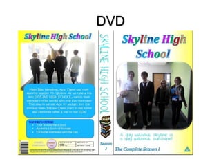
- 2. DVD
- 3. Strengths - Colourful and big mast head, this grabs the viewers attention and shows the show as light hearted - Childish font tells the consumer that it is aimed and suitable for children, it also pulls in the target audience. - The tag line gives the show identity and makes it show seem entertaining - The animated books brings the childish nature out and shows that it is a school setting making it relatable - The images relates to show meaning its easy to create a brand identity - The Bonus Features draw the audience in as they get more and the realism is brought in with the DVD information at the bottom
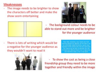
- 4. Weaknesses - The image needs to be brighter to show the characters off better and make the show seem entertaining - The background colour needs to be able to stand out more and be brighter for the younger audience - There is lots of writing which would be a negative for the younger audience as they wouldnŌĆÖt want to read it - To show the cast as being a close friendship group they need to be more together and friendly within the image
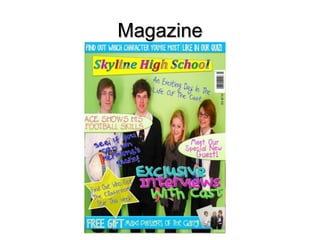
- 5. Magazine
- 6. Strengths - Lots of different fonts to keep it interesting, which are also childish to go with the target audience - Bright colours to draw the audience in a make it appealing - Lots of cover lines making it more exciting to look at - The different shapes used make it engaging and the star is childish and goes with the school theme - A free gift draws the consumers in - The name of the show is at the top and large to make noticeable and it links with the DVD cover creating a brand identity
- 7. Weaknesses - The background colour could be brighter to bring out the light heartedness of the show - Some of the fonts could be bolder to make them stand out more and more readable - More images could be used to appeal to a wider audience and make the cover more exciting - The image could be more exciting to engage the younger target audience.
- 8. Opening
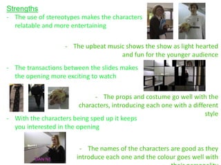
- 9. Strengths - The use of stereotypes makes the characters relatable and more entertaining - The upbeat music shows the show as light hearted and fun for the younger audience - The transactions between the slides makes the opening more exciting to watch - The props and costume go well with the characters, introducing each one with a different style - With the characters being sped up it keeps you interested in the opening - The names of the characters are good as they introduce each one and the colour goes well with
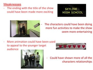
- 10. Weaknesses - The ending with the title of the show could have been made more exciting - The characters could have been doing more fun activities to make the show seem more entertaining - More animation could have been used to appeal to the younger target audience - Could have shown more of all the characters relationships