Basic Visual Design Principles and UI Design Best Practices
ŌĆóDownload as PPTX, PDFŌĆó
5 likesŌĆó540 views

On these slides I have explained visual design principles and UI design best practices. This will help you to improve your visualization and UI Designing skills.


Basic Visual Design Principles and UI Design Best Practices
- 1. Basic Visual Design Principles & UI Design Best Practices
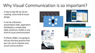
- 2. Why Visual Communication is so important? In day to day life we all are creating some kind of visual design. It can be a Business presentation slide, application dashboard, a simple data table, brochure, leaflet or any kind of visual communication In these slides I am going to tell you the best practice that you can use to improve your visual communication
- 3. 8/22/2016 Bandwidth of Senses Sensory bandwidths reaching sub-conscious and conscious mind, from Tor Norretranders' The User Illusion. Visualization from Stephen FewŌĆÖs Information Dashboard Design According to Tor N├Ėrretranders a Danish author of Popular Science. Among our all senses visual sense plays an important role. Then touch, hearing, smell then voice. So to improve communication we need to understand how the visual system works
- 4. 8/22/2016 Pre-attentive processing 1281736875613897654698450698560498286762 9809858453822450985645894509845098096585 9091030209905959595772564675050678904567 8845789809821677654872664908560932949686 Pre-attentive processing, the early stage of visual perception that rapidly occurs below the level of consciousness, is tuned to detect a specific set of visual attributes. Can you say how many 3ŌĆÖs are there?
- 5. 8/22/2016 Pre-attentive processing 1281736875613897654698450698560498286762 9809858453822450985645894509845098096585 9091030209905959595772564675050678904567 8845789809821677654872664908560932949686 By Reducing the opacity of the numbers. All the 3ŌĆÖs became pre-attentive. And now we can count it easily Can you answer now?
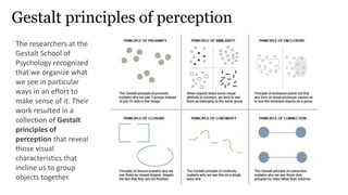
- 6. Gestalt principles of perception The researchers at the Gestalt School of Psychology recognized that we organize what we see in particular ways in an effort to make sense of it. Their work resulted in a collection of Gestalt principles of perception that reveal those visual characteristics that incline us to group objects together.
- 7. Proximity Elements that are close together are perceived to be more related than elements that are farther together
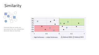
- 8. Similarity Elements that are similar are perceived to be more related than elements that are dissimilar
- 9. Enclosure We perceive objects as belonging together when they are enclosed by anything that forms a visual border around them (for example, a line or a common field of color).
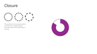
- 10. Closure The principle of closure applies when we tend to see complete figures even when part of the information is missing.
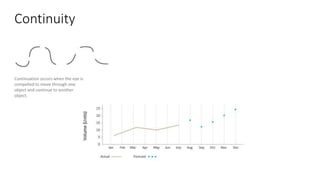
- 11. Continuity Continuation occurs when the eye is compelled to move through one object and continue to another object.
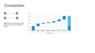
- 12. Connection Objects that are connected in some ways are seen as part of the same group
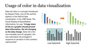
- 13. Usage of color in data visualization Data-Ink ratio is a concept introduced by Edward Tufte, one of the earliest experts in the field of data visualization. In his 1983 book, The Visual Display of Quantitative Information, he says ŌĆ£A large share of ink on a graphic should present data-information, the ink changing as the data change. Data-ink is the non-erasable core of a graphic, the non-redundant ink arranged in response to variation in the numbers represented.ŌĆØ
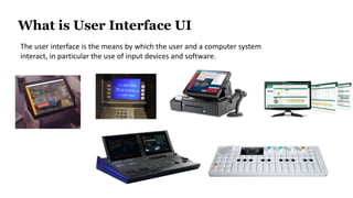
- 14. What is User Interface UI 8/22/2016 The user interface is the means by which the user and a computer system interact, in particular the use of input devices and software.
- 15. A User Interface is like A Joke. If you have to explain it, itŌĆÖs not that good.
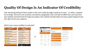
- 16. Quality Of Design Is An Indicator Of Credibility One interesting finding of these studies is that users really do judge a book by its coverŌĆ” or rather, a website by its design. Elements such as layout, consistency, typography, color and style all affect how users perceive your website and what kind of image you project. Your website should project not only a good image but also the right one for your audience. Which one is more credible/ trustworthy? or
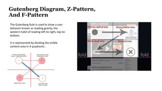
- 17. Gutenberg Diagram, Z-Pattern, And F-Pattern The Gutenberg Rule is used to show a user behavior known as reading gravity, the western habit of reading left-to-right, top-to- bottom. It is represented by dividing the visible content area in 4 quadrants:
- 18. Human Mind is a signle channel Processor DonŌĆśt Confuse with so many options... increasing the number of choices will increase the decision time logarithmically. Hick's law, or the HickŌĆōHyman Law, named after British and American psychologists William Edmund Hick and Ray Hyman, describes ŌĆ£ the time it takes for a person to make a decision as a result of the possible choices he or she has. Users have very little capacity for processing information. Too much information/functionally bunched together does not work.
- 19. Users have very little capacity for processing information. Too much information/functionally bunched together does not work. Use ample space between on-screen object to allow easy visual processing Avoid Information Overload
- 20. Ad more value to content above the page. Nielsen Web users spend 80% of their time looking at information above the page fold. Although users do scroll, they allocate only 20% of their attention below the fold. Source: https://www.nngroup.com/articles/scrolling-and-attention/
- 21. Banner Blindness Jacob Nielsen Users tend to ignore everything that looks like advertisement, what is interesting, they're pretty good at it. Although advertisement is noticed, it is almost ignored. So be careful with these elements In 1997, I chose to suppress a similar finding: users tend to click on banner ads that look like dialog boxes, complete with fake OK and Cancel buttons. Of course, instead of being an actual system message ŌĆö such as "Your Internet Connection Is Not Optimized" ŌĆö the banner is just a picture of a dialog box, and clicking its close box doesn't dismiss it, but rather takes users to the advertiser's site. Deceptive, unethical, and #3 among themost-hated advertising techniques. Still, fake dialog boxes got many more clicks than regular banners, which users had already started to ignore in 1997. Source: https://www.nngroup.com/articles/banner-blindness-old-and-new-findings/
- 22. 45% of users give up if registration is hard In a Study provided by Adaptive Path10, Bank of America conducted research into why they were falling behind their competition. The outcome of this project was a huge success due to a drastic change in usability.
- 23. Too many alignment points also add visual complexity. Reduce alignment to as few as possible, aiding mobile users Minimize Anlignment Points
- 24. Labels Placement "Input elements should be organized in logical groups so that your brain can process the form layout in chunks of related fields.ŌĆ£ Comparison: http://www.lukew.com/ff/entry.asp?1502
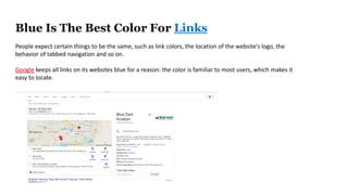
- 25. Blue Is The Best Color For Links People expect certain things to be the same, such as link colors, the location of the websiteŌĆÖs logo, the behavior of tabbed navigation and so on. Google keeps all links on its websites blue for a reason: the color is familiar to most users, which makes it easy to locate.
- 26. people have a very low tolerance for buggy apps. 79 % of users reported that they would only retry an app once or twice if it failed to work the first time v
- 27. 80% of apps are deleted after one use A successful app also needs to meet usersŌĆÖ expectations (in terms of content and value).
- 28. ŌĆó I have no plan to return to the site again, making a one-time purchase or a gift purchase. ŌĆó I donŌĆÖt want a site to save my personal information. ŌĆó I donŌĆÖt like registration process. ŌĆó Frustrated with remembering usernames and passwords for all the sites I visit. DonŌĆÖt FORCE Users to REGISTR WITHOUT OFFERING VALUE Usability Research Findings I donŌĆÖt like to register. If
- 29. when your decisions do not match your UserŌĆÖs expectations.
- 30. Thanks for your time & Happy Designing Avijit Chinara