

Bootstrap for webtechnology_data science.pdf
- 1. What is Responsive Web Design? ŌĆó Responsive web design is about creating web sites which automatically adjust themselves to look good on all devices, from small phones to large desktops. ŌĆó Bootstrap is the most popular HTML, CSS, and JavaScript framework for developing responsive web sites. ŌĆó Bootstrap is completely free to download and use!
- 2. What is Bootstrap? ŌĆó Bootstrap is a free front-end framework for faster and easier web development ŌĆó Bootstrap includes HTML and CSS based design templates for forms, buttons, tables, navigation and many other.. ŌĆó Bootstrap also gives you the ability to easily create responsive designs
- 3. Advantages ŌĆó Advantages of Bootstrap: ŌĆó Easy to use: Anybody with just basic knowledge of HTML and CSS can start using Bootstrap ŌĆó Responsive features: Bootstrap's responsive CSS adjusts to phones, tablets, and desktops ŌĆó Browser compatibility: Bootstrap is compatible with all modern browsers (Chrome, Firefox, Internet Explorer, Safari, and Opera)
- 4. Where to Get Bootstrap? ŌĆó There are two ways to start using Bootstrap on your own web site. ŌĆó Download Bootstrap from getbootstrap.com ŌĆó If you want to download and host Bootstrap yourself, go to getbootstrap.com, and follow the instructions there. ŌĆó Include Bootstrap from a CDN ŌĆó If you don't want to download and host Bootstrap yourself, you can include it from a CDN (Content Delivery Network). ŌĆó MaxCDN provides CDN support for Bootstrap's CSS and JavaScript. You must also include jQuery.
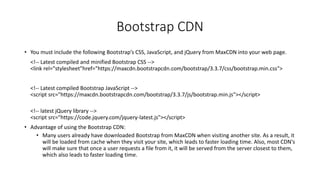
- 5. Bootstrap CDN ŌĆó You must include the following BootstrapŌĆÖs CSS, JavaScript, and jQuery from MaxCDN into your web page. <!-- Latest compiled and minified Bootstrap CSS --> <link rel="stylesheet"href="https://maxcdn.bootstrapcdn.com/bootstrap/3.3.7/css/bootstrap.min.css"> <!-- Latest compiled Bootstrap JavaScript --> <script src=/slideshow/bootstrap-for-webtechnology_data-science-pdf/270490138/"https:/maxcdn.bootstrapcdn.com/bootstrap/3.3.7/js/bootstrap.min.js"></script> <!-- latest jQuery library --> <script src="https://code.jquery.com/jquery-latest.js"></script> ŌĆó Advantage of using the Bootstrap CDN: ŌĆó Many users already have downloaded Bootstrap from MaxCDN when visiting another site. As a result, it will be loaded from cache when they visit your site, which leads to faster loading time. Also, most CDN's will make sure that once a user requests a file from it, it will be served from the server closest to them, which also leads to faster loading time.
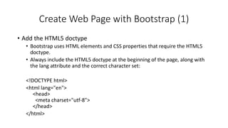
- 6. Create Web Page with Bootstrap (1) ŌĆó Add the HTML5 doctype ŌĆó Bootstrap uses HTML elements and CSS properties that require the HTML5 doctype. ŌĆó Always include the HTML5 doctype at the beginning of the page, along with the lang attribute and the correct character set: <!DOCTYPE html> <html lang="en"> <head> <meta charset="utf-8"> </head> </html>
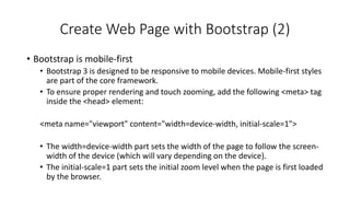
- 7. Create Web Page with Bootstrap (2) ŌĆó Bootstrap is mobile-first ŌĆó Bootstrap 3 is designed to be responsive to mobile devices. Mobile-first styles are part of the core framework. ŌĆó To ensure proper rendering and touch zooming, add the following <meta> tag inside the <head> element: <meta name="viewport" content="width=device-width, initial-scale=1"> ŌĆó The width=device-width part sets the width of the page to follow the screen- width of the device (which will vary depending on the device). ŌĆó The initial-scale=1 part sets the initial zoom level when the page is first loaded by the browser.
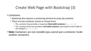
- 8. Create Web Page with Bootstrap (3) ŌĆó Containers ŌĆó Bootstrap also requires a containing element to wrap site contents. ŌĆó There are two container classes to choose from: ŌĆó The .container class provides a responsive fixed width container. (See Sample) ŌĆó The .container-fluid class provides a full width container, spanning the entire width of the viewport. (See Sample) ŌĆó Note: Containers are not nestable (you cannot put a container inside another container).
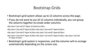
- 9. Bootstrap Grids ŌĆó BootstrapŌĆÖs grid system allows up to 12 columns across the page. ŌĆó If you do not want to use all 12 columns individually, you can group the columns together to create wider columns: <div class="col-md-12">Span 12 columns</div> <div class="col-md-6">Span 6</div><div class="col-md-6">Span 6</div> <div class="col-md-4">Span 4</div><div class="col-md-8">Span 8</div> <div class="col-md-4">Span 4</div><div class="col-md-4">Span 4</div> <div class="col-md- 4">Span 4</div> ŌĆó Bootstrap's grid system is responsive, and the columns will re-arrange automatically depending on the screen size.
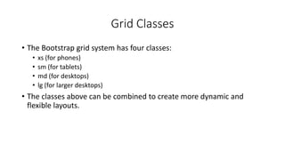
- 10. Grid Classes ŌĆó The Bootstrap grid system has four classes: ŌĆó xs (for phones) ŌĆó sm (for tablets) ŌĆó md (for desktops) ŌĆó lg (for larger desktops) ŌĆó The classes above can be combined to create more dynamic and flexible layouts.
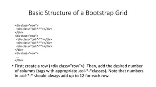
- 11. Basic Structure of a Bootstrap Grid <div class="row"> <div class="col-*-*"></div> </div> <div class="row"> <div class="col-*-*"></div> <div class="col-*-*"></div> <div class="col-*-*"></div> </div> <div class="row"> ... </div> ŌĆó First; create a row (<div class="row">). Then, add the desired number of columns (tags with appropriate .col-*-*classes). Note that numbers in .col-*-* should always add up to 12 for each row.
- 12. Three Equal Columns ŌĆó Three equal columns (desktop version): ŌĆó Three equal columns (tablet version): ŌĆó Three equal columns (smart phone version):
- 13. Two Unequal Columns ŌĆó Two unequal columns (desktop version): ŌĆó Two unequal columns (tablet version): ŌĆó Two unequal columns (smart phone version):
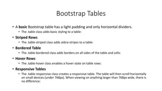
- 14. Bootstrap Tables ŌĆó A basic Bootstrap table has a light padding and only horizontal dividers. ŌĆó The .table class adds basic styling to a table: ŌĆó Striped Rows ŌĆó The .table-striped class adds zebra-stripes to a table: ŌĆó Bordered Table ŌĆó The .table-bordered class adds borders on all sides of the table and cells: ŌĆó Hover Rows ŌĆó The .table-hover class enables a hover state on table rows: ŌĆó Responsive Tables ŌĆó The .table-responsive class creates a responsive table. The table will then scroll horizontally on small devices (under 768px). When viewing on anything larger than 768px wide, there is no difference:
- 15. Bootstrap Images ŌĆó Rounded Corners ŌĆó The .img-rounded class adds rounded corners to an image (IE8 does not support rounded corners): ŌĆó Circle ŌĆó The .img-circle class shapes the image to a circle (IE8 does not support rounded corners): ŌĆó Thumbnail ŌĆó The .img-thumbnail class shapes the image to a thumbnail: ŌĆó Responsive Images ŌĆó Images comes in all sizes. So do screens. Responsive images automatically adjust to fit the size of the screen. ŌĆó Create responsive images by adding an .img-responsive class to the <img> tag. The image will then scale nicely to the parent element. ŌĆó The .img-responsive class applies display: block; and max-width: 100%; and height: auto; to the image:
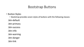
- 16. Bootstrap Buttons ŌĆó Button Styles ŌĆó Bootstrap provides seven styles of buttons with the following classes: .btn-default .btn-primary .btn-success .btn-info .btn-warning .btn-danger .btn-link
- 17. Bootstrap Button Elements ŌĆó The button classes can be used on the following elements: ŌĆó <a> ŌĆó <button> ŌĆó <input>
- 18. Button Sizes ŌĆó Bootstrap provides four button sizes with the following classes: .btn-lg .btn-md .btn-sm .btn-xs
- 19. Block Level Buttons ŌĆó A block level button spans the entire width of the parent element. ŌĆó Add class .btn-block to create a block level button:
- 20. Active/Disabled Buttons ŌĆó A button can be set to an active (appear pressed) or a disabled (unclickable) state: ŌĆó The class .active makes a button appear pressed, and the class .disabled makes a button unclickable:
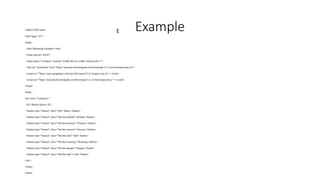
- 21. E Example <!DOCTYPE html> <html lang="en"> <head> <title>Bootstrap Example</title> <meta charset="utf-8"> <meta name="viewport" content="width=device-width, initial-scale=1"> <link rel="stylesheet" href="https://maxcdn.bootstrapcdn.com/bootstrap/3.4.1/css/bootstrap.min.css"> <script src=/slideshow/bootstrap-for-webtechnology_data-science-pdf/270490138/"https:/ajax.googleapis.com/ajax/libs/jquery/3.6.3/jquery.min.js"></script> <script src="https://maxcdn.bootstrapcdn.com/bootstrap/3.4.1/js/bootstrap.min.js"></script> </head> <body> <div class="container"> <h2>Button Styles</h2> <button type="button" class="btn">Basic</button> <button type="button" class="btn btn-default">Default</button> <button type="button" class="btn btn-primary">Primary</button> <button type="button" class="btn btn-success">Success</button> <button type="button" class="btn btn-info">Info</button> <button type="button" class="btn btn-warning">Warning</button> <button type="button" class="btn btn-danger">Danger</button> <button type="button" class="btn btn-link">Link</button> </div> </body> </html>