Bootstrap tour
•
1 like•1,006 views

This document provides an overview of using the Twitter Bootstrap framework to build responsive web interfaces. It discusses common frontend design challenges and how Bootstrap addresses them through pre-built components like navigation bars, buttons, grids and alerts. It demonstrates examples of websites built with Bootstrap and explores key Bootstrap elements. It also covers responsive design principles enabled by Bootstrap like automatic column wrapping and adjusting to different screen sizes.


Bootstrap tour
- 1. A BOOTSTRAP TOUR churn shippable UI using twitter bootstrap framework Ashish Sharma www.stalkninja.com Saturday 17 March 2012
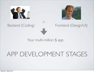
- 2. + Backend (Coding) Frontend (Design/UI) Your multi-million $ app APP DEVELOPMENT STAGES Saturday 17 March 2012
- 3. CODERS’ TRYST WITH UI • Right font, line height, background gradient - ARE YOU KIDDING !!! • Apple era has made the bar high Saturday 17 March 2012
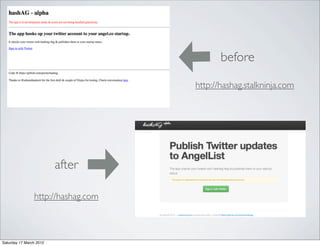
- 5. before http://hashag.stalkninja.com after http://hashag.com Saturday 17 March 2012
- 6. DIGGING DEEPER list of bootstrap elements you would absolutely need Saturday 17 March 2012
- 7. NAVIGATION BAR <div class=‘navbar’> Saturday 17 March 2012
- 8. HERO UNIT <div class=‘hero’> Saturday 17 March 2012
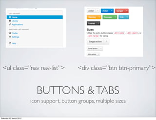
- 9. <ul class=”nav nav-list”> <div class=”btn btn-primary”> BUTTONS & TABS icon support, button groups, multiple sizes Saturday 17 March 2012
- 10. ALERT BOX <div class=‘well’> for inset effect Saturday 17 March 2012
- 11. MORE ..... form, table, icons etc etc Saturday 17 March 2012
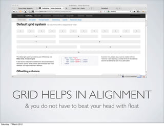
- 12. DID WE MISS GRIDS ? so what is this Grid all about .... Saturday 17 March 2012
- 13. GRID HELPS IN ALIGNMENT & you do not have to beat your head with float Saturday 17 March 2012
- 14. JEEZ ... LOOK AT THIS badly aligned content looks unprofessional Saturday 17 March 2012
- 15. DID YOU KNOW ? what ? bootstrap grids are responsive So ? which means it adapts to screen size So !!! dude !! it means it is umm ... Can I play mobile optimized Nintendo WII on it ? Saturday 17 March 2012
- 16. BUT POOR KYLE DINT KNOW There is a difference between knowing it is mobile optimized & churning out app which is actually mobile optimized Saturday 17 March 2012
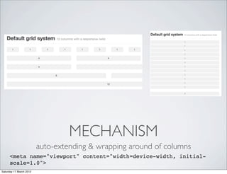
- 17. MECHANISM auto-extending & wrapping around of columns <meta name="viewport" content="width=device-width, initial- scale=1.0"> Saturday 17 March 2012
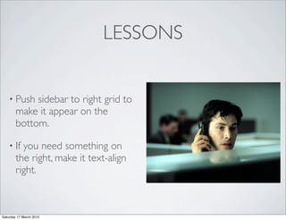
- 18. LESSONS • Push sidebar to right grid to make it appear on the bottom. • If you need something on the right, make it text-align right. Saturday 17 March 2012
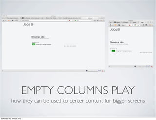
- 19. EMPTY COLUMNS PLAY how they can be used to center content for bigger screens Saturday 17 March 2012
- 20. CAUTION • Image screen fit issue • H1 tag font in hero unit could be too big for mobile • Content that suppose to stay right, might not stay Saturday 17 March 2012
- 21. YUP, I AM DONE !!! Dissect http://cssgrid.net main page for the image fitting, content aligning hacks Saturday 17 March 2012