


More Related Content
What's hot (7)
Similar to Brand Book_Savanna_Student_Polovaya (8)
More from kovriga (6)
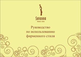
Brand Book_Savanna_Student_Polovaya
- 2. Savanna 2 ąĪąŠą┤ąĄčƹȹ░ąĮąĖąĄ ąÆčüčéčāą┐ą╗ąĄąĮąĖąĄ 3 ąŁą╗ąĄą╝ąĄąĮčéčŗ čäąĖčĆą╝ąĄąĮąĮąŠą│ąŠ čüčéąĖą╗čÅ 4 ąøąŠą│ąŠčéąĖą┐ 5 ą¦ąĄčĆąĮąŠ-ą▒ąĄą╗čŗą╣ ą▓ą░čĆąĖą░ąĮčé 6 ąśčüą┐ąŠą╗čīąĘąŠą▓ą░ąĮąĖąĄ ą╗ąŠą│ąŠčéąĖą┐ą░ ą▓ ą╝ąĖąĮąĖą╝ą░ą╗čīąĮčŗčģ čĆą░ąĘą╝ąĄčĆą░čģ 7 ą¤čĆąŠčåąĄąĮč鹊ą▓ą║ą░ 8 ąśąĮą▓ąĄčĆčüąĖčÅ 9 ążąĖčĆą╝ąĄąĮąĮčŗąĄ čåą▓ąĄčéą░ 10 ą”ą▓ąĄčé ą╗ąŠą│ąŠčéąĖą┐ą░ 10 ąØąĄą┤ąŠą┐čāčüčéąĖą╝čŗąĄ čåą▓ąĄč鹊ą▓čŗąĄ ą▓ą░čĆąĖą░ąĮčéčŗ ą╗ąŠą│ąŠčéąĖą┐ą░ 11 ążąĖčĆą╝ąĄąĮąĮčŗąĄ ąĖ ą┤ąŠą┐ąŠą╗ąĮąĖč鹥ą╗čīąĮčŗąĄ čåą▓ąĄčéą░ 12 ą×ą▒čēąĄą║ąŠčĆą┐ąŠčĆą░čéąĖą▓ąĮčŗąĄ čåą▓ąĄčéą░ 12 ążąĖčĆą╝ąĄąĮąĮčŗąĄ čłčĆąĖčäčéčŗ 13 ąśąĮč鹥ą│čĆą░č鹊čĆ 14 ąĪčéąĖą╗ąĄąŠą▒čĆą░ąĘčāčÄčēąĖąĄ 菹╗ąĄą╝ąĄąĮčéčŗ 14 ą¤čĆąĄą┤čüčéą░ą▓ąĖč鹥ą╗čīčüą║ą░čÅ ą┐ąŠą╗ąĖą│čĆą░čäąĖčÅ 15 ążąĖčĆą╝ąĄąĮąĮą░čÅ ą▓ąĖąĘąĖčéą║ą░ (ą║ąŠčĆą┐ąŠčĆą░čéąĖą▓ąĮą░čÅ) 16 ą¤ąĄčĆčüąŠąĮą░ą╗čīąĮą░čÅ ą▓ąĖąĘąĖčéą║ą░ 17 ążąĖčĆą╝ąĄąĮąĮčŗą╣ ą▒ą╗ą░ąĮą║ 18 ą”ą▓ąĄčéąĮąŠą╣ ą▓ą░čĆąĖą░ąĮčé 18 ążąĖčĆą╝ąĄąĮąĮčŗą╣ ą▒ą╗ą░ąĮą║ 19 ą¦ąĄčĆąĮąŠ-ą▒ąĄą╗čŗą╣ ą▓ą░čĆąĖą░ąĮčé 19 ąÜąŠąĮą▓ąĄčĆčéčŗ 20 ążąĖčĆą╝ąĄąĮąĮą░čÅ ą┐ą░ą┐ą║ą░ 22 ąÜą░ą╗ąĄąĮą┤ą░čĆčī ąÉ1 23 ąØą░čĆčāąČąĮą░čÅ čĆąĄą║ą╗ą░ą╝ą░ 24 ąĪąĖčéąĖą╗ą░ą╣čé 25 ąøą░ą╣čéą▒ąŠą║čü 26 ąÉčéčĆąĖą▒čāčéąĖą║ą░ 27 ąÜčĆčāąČą║ą░ ą┤ą╗čÅ čćą░čÅ ąĖą╗ąĖ ą║ąŠč乥 28 ą¤ąĄčĆčüąŠąĮą░ą╗čīąĮą░čÅ č乊čĆą╝ą░ 29
- 3. Savanna 3 ąÆčüčéčāą┐ą╗ąĄąĮąĖąĄ Savanna ŌĆö ą║ą╗ąĖą╝ą░čéąĖč湥čüą║ąĖąĄ čĆąĄą│ąĖąŠąĮčŗ, čüą▓ąŠą╣čüčéą▓ąĄąĮąĮčŗąĄ ą▒ąŠą╗ąĄąĄ ą▓ąŠąĘą▓čŗčłąĄąĮąĮčŗą╝ čéčĆąŠą┐ąĖč湥čüą║ąĖą╝ čüčéčĆą░ąĮą░ą╝ čü čüčāčģąĖą╝ ą║ąŠąĮčéąĖąĮąĄąĮčéą░ą╗čīąĮčŗą╝ ą║ą╗ąĖą╝ą░č鹊ą╝ ąĪą░ą▓ą░ąĮąĮčŗ ąĖą╝ąĄčÄčé ąĮąĄą╝ą░ą╗ąŠ ąŠą▒čēąĄą│ąŠ čüąŠ čüč鹥ą┐čīčÄ, ą║ąŠč鹊čĆą░čÅ ąĮą░čģąŠą┤ąĖčéčüčÅ ą▓ čāą╝ąĄčĆąĄąĮąĮčŗčģ čłąĖčĆąŠčéą░čģ, ą║ą░ą║ ą┐ąŠ čĆąĄąČąĖą╝čā čāą▓ą╗ą░ąČąĄąĮąĖčÅ, čéą░ą║ ąĖ ą┐ąŠ čāčüą╗ąŠą▓ąĖčÅą╝ ąŠą▒ąĖčéą░ąĮąĖčÅ ąÜą░ą║ ąĖ ą▓ čüč鹥ą┐ąĮąŠą╣ ąĘąŠąĮąĄ, ąŠą▒ąĖčéą░č鹥ą╗čÅą╝ ą┐čĆąĖčģąŠą┤ąĖčéčüčÅ ą┐čĆąĖčüą┐ąŠčüą░ą▒ą╗ąĖą▓ą░čéčīčüčÅ ą║ ą▓čŗčüąŠą║ąŠą╣ č鹥ą╝ą┐ąĄčĆą░čéčāčĆąĄ ą▓ąŠąĘą┤čāčģą░ ą▓ ąŠą┤ąĖąĮ čüąĄąĘąŠąĮ, ąĖ ą╝ą░ą╗ąŠą╝čā ą║ąŠą╗ąĖč湥čüčéą▓čā ąŠčüą░ą┤ą║ąŠą▓ ą▓ čüčāčģąŠą╣ čüąĄąĘąŠąĮ ąØą░čüč鹊čÅčēąĄąĄ čĆčāą║ąŠą▓ąŠą┤čüčéą▓ąŠ čĆą░ąĘčĆą░ą▒ąŠčéą░ąĮąŠ ą┤ą╗čÅ ą┤ą░ą╗čīąĮąĄą╣čłąĄą│ąŠ ąĖčüą┐ąŠą╗čīąĘąŠą▓ą░ąĮąĖčÅ čäąĖčĆą╝ąĄąĮąĮąŠą│ąŠ čüčéąĖą╗čÅ ą×ąĮąŠ ą┐ąŠą╝ąŠąČąĄčé čüąŠčģčĆą░ąĮąĖčéčī čåąĄą╗ąŠčüąĮąŠčüčéčī ąĖ ą┐čĆą░ą▓ąĖą╗čīąĮąŠčüčéčī ą┐čĆąĖą╝ąĄąĮąĄąĮąĖčÅ čäąĖčĆą╝ąĄąĮąĮąŠą│ąŠ čüčéąĖą╗čÅ ą▓ čĆą░ąĘą╗ąĖčćąĮčŗčģ č乊čĆą╝ą░čģ ąĄą│ąŠ ąĖčüą┐ąŠą╗čīąĘąŠą▓ą░ąĮąĖčÅ ąØąĄąŠą▒čģąŠą┤ąĖą╝ąŠ ą▓čüąĄą│ąŠ ą╗ąĖčłčī ą┐čĆąĖą┤ąĄčƹȹĖą▓ą░čéčīčüčÅ ą┐čĆą░ą▓ąĖą╗, čćč鹊ą▒čŗ ą▓ ą▒čāą┤čāčēąĄą╝ čäąĖčĆą╝ąĄąĮąĮčŗą╣ čüčéąĖą╗čī čüą░ą╗ąŠąĮą░ ą║čĆą░čüąŠčéčŗ ą▒čŗą╗ čāąĘąĮą░ą▓ą░ąĄą╝čŗą╝, ąĮą░ą┐ąŠą╝ąĮąĖą╗ ąŠ čüąĄą▒ąĄ, ą┐čĆąĖčéčÅą│ąĖą▓ą░ą╗ ąĮąŠą▓čŗčģ ą║ą╗ąĖąĄąĮč鹊ą▓
- 5. Savanna 5 ąøąŠą│ąŠčéąĖą┐ ąøąŠą│ąŠčéąĖą┐ ą║ąŠą╝ą┐ą░ąĮąĖąĖ čüąŠčüč鹊ąĖčé ąĖąĘ ą┤ą▓čāčģ čćą░čüč鹥ą╣: ąĮą░ąĘą▓ą░ąĮąĖąĄ ŌĆ£SavannaŌĆØ ąĖ ą┐čĆąŠą┤ąŠą╗ąČąĄąĮąĖąĄ ŌĆ£beauty salonŌĆØ ąöą╗čÅ čüąŠąĘą┤ą░ąĮąĖčÅ ą╗ąŠą│ąŠčéąĖą┐ą░ ąĘą░ ąĖą┤ąĄčÄ ąŠą▒čĆą░ąĘą░ ą▒čŗą╗ą░ ą▓čŗą▒čĆą░ąĮą░ ą░čäčĆąĖą║ą░ąĮčüą║ą░čÅ ą┤ąĄą▓čāčłą║ą░, ą║ąŠč鹊čĆą░čÅ ą▓ čüą▓ąŠčÄ ąŠč湥čĆąĄą┤čī ą┐ąŠą║ą░ąĘčŗą▓ą░ąĄčé ąĮą░ą╝ ą║čĆą░čüąĖą▓čŗą╣ čüąŠąŠčéą▓ąĄčéčüčéą▓ąĖąĖ čüą░ą╗ąŠąĮą░ ą║čĆą░čüąŠčéčŗ ąŠą▒čĆą░ąĘ, ą║ąŠč鹊čĆčŗą╣ ą╝ąŠąČąĮąŠ ą┤ąŠčüčéąĖčćčī ą┐ąŠčüąĄčéąĖą▓ čüą░ą╗ąŠąĮ ąś ą▓ čüąŠąŠčéą▓ąĄčéčüčéą▓ąĖąĖ ą▒čŗą╗ ą┐čĆąĖą╝ąĄąĮčæąĮ ą┐ąŠą┤čģąŠą┤čÅčēąĖą╣ čåą▓ąĄčé- čåą▓ąĄčé ą║ąŠąČąĖ ą░čäčĆąĖą║ą░ąĮčüą║ąĖčģ ąĮą░čĆąŠą┤ąŠą▓ ąöą╗čÅ ą┐čĆąĖą┤ą░ąĮąĖčÅ ą╗ąĄą│ą║ąŠčüčéąĖ ąĖ ąĖąĘčŗčüą║ą░ąĮąŠčüčéąĖ ą╗ąŠą│ąŠčéąĖą┐čā ą▒čŗą╗ą░ ą┐čĆąĖą╝ąĄąĮąĄąĮą░ ą┤ąĄą▓čāčłą║ą░, ą║ąŠč鹊čĆą░čÅ ą┐čĆąĖą┤ą░ąĄčé ą╗ąŠą│ąŠčéąĖą┐čā ą╗ąĄą│ą║ąŠčüčéąĖ, čāą▓ąĄčĆąĄąĮąŠčüčéąĖ ąĪą╗ąŠą▓ąŠ ŌĆ£SavannaŌĆØ čüčćąĖčéą░ąĄčéčüčÅ ą░ą▓č鹊čĆčüą║ąĖą╝ ąĮą░ą┐ąĖčüą░ąĮąĖąĄą╝ ą¤ąŠčŹč鹊ą╝čā ąĮąĄąŠą▒čģąŠą┤ąĖą╝ąŠ ąĖčüą┐ąŠą╗čīąĘąŠą▓ą░čéčī 菹╗ąĄą║čéčĆąŠąĮąĮčāčÄ ą▓ąĄčĆčüąĖčÄ ąöą╗čÅ ąĮą░č湥čĆčéą░ąĮąĖčÅ čüą╗ąŠą▓ą░ ŌĆ£čüą░ą╗ąŠąĮ ą║čĆą░čüąŠčéčŗŌĆØ ąĖčüą┐ąŠą╗čīąĘčāąĄčéčīčüčÅ čłčĆąĖčäčé Tw Cen MT Condensed, 16pt, ą╝ąĄąČą▒čāą║ą▓ąĄąĮąĮąŠąĄ čĆą░čüčüč鹊čÅąĮąĖąĄ 124pt
- 6. Savanna 6 ą¦ąĄčĆąĮąŠ-ą▒ąĄą╗čŗą╣ ą▓ą░čĆąĖą░ąĮčé
- 7. Savanna 7 ąśčüą┐ąŠą╗čīąĘąŠą▓ą░ąĮąĖąĄ ą╗ąŠą│ąŠčéąĖą┐ą░ ą▓ ą╝ąĖąĮąĖą╝ą░ą╗čīąĮčŗčģ čĆą░ąĘą╝ąĄčĆą░čģ ą¤čĆąĖ čāą╝ąĄąĮčīčłąĄąĮąĖąĖ ą╗ąŠą│ąŠčéąĖą┐ą░ ą▓ ą╝ąĖąĮąĖą╝ą░ą╗čīąĮčŗčģ čĆą░ąĘą╝ąĄčĆą░čģ 10ą╝ą╝ ąĮąĄąŠą▒čģąŠą┤ąĖą╝ąŠ ąĖčüą┐ąŠą╗čīąĘąŠą▓ą░čéčī ą┤ą░ąĮąĮčāčÄ ą║ąŠąĮčäąĖą│čāčĆą░čåąĖčÄ (ąŠąĮą░ ąŠčéą╗ąĖčćą░ąĄčéčīčüčÅ ąŠčé ąĖąĘąĮą░čćą░ą╗čīąĮąŠą│ąŠ č鹥ą╝, čćč鹊 ąĖčüą┐ąŠą╗čīąĘčāąĄčéčīčüčÅ č鹊ą╗čīą║ąŠ ą╗ąŠą│ąŠčéąĖą┐ ą▒ąĄąĘ ąĖąĘąŠą▒čĆą░ąČąĄąĮąĖčÅ) ąÆ ą┤ą░ąĮąĮąŠą╝ čüą╗čāčćą░ąĄ ąĖą╝ąĄąĄčéčīčüčÅ ą▓ą▓ąĖą┤čā ą╗ąŠą│ąŠčéąĖą┐ą░ ąĮą░ąĮąĄčüąĄąĮąĖąĄ ąĮą░ čĆčāčćą║ąĖ, ą╝ą░čĆą║ąĄčĆčŗ, čćą░čłą║ąĖ, ą▒čĆąĄą╗ą║ąĖ ąĖ ą┤čĆčāą│ąĖąĄ čüčāą▓ąĄąĮąĖčĆčŗ 10mm
- 8. Savanna 8 ą¤čĆąŠčåąĄąĮč鹊ą▓ą║ą░ ąĪą▓ąŠą▒ąŠą┤ąĮąŠąĄ ą┐ąŠą╗ąĄ ą▓ąŠą║čĆčāą│ ąĘąĮą░ą║ą░ ą┤ą░ąĄčé ą▓ąŠąĘą╝ąŠąČąĮąŠčüčéčī ą╗ąŠą│ąŠčéąĖą┐čā ąŠčüčéą░ą▓ą░čéčīčüčÅ ąĘą░ą╝ąĄč湥ąĮčŗą╝ čüčĆąĄą┤ąĖ ą┐čĆąŠč湥ą│ąŠ č鹥ą║čüčéą░ ą¤ąŠčŹč鹊ą╝čā ąĮąĄąŠą▒čģąŠą┤ąĖą╝ąŠ čüąŠą▒ą╗čÄą┤ą░čéčī ąĘą░ą┤ą░ąĮąĮčŗąĄ ą│čĆą░ąĮąĖčåčŗ
- 9. Savanna 9 ąśąĮą▓ąĄčĆčüąĖčÅ ą¤čĆąĖ čĆą░ąĘą╝ąĄčēąĄąĮąĖąĖ čäąĖčĆą╝ąĄąĮąĮąŠą│ąŠ čüčéąĖą╗čÅ ąĮčāąČąĮąŠ čāčćąĖčéčŗą▓ą░čéčī, čćč鹊 ąŠąĮ ą┤ąŠą╗ąČąĄąĮ ą▒čŗčéčī ą║ąŠąĮčéčĆą░čüčéąĮčŗą╝ č乊ąĮčā ą¤čĆąĖ ąĘą░ą╗ąĖą▓ą║ąĄ č乊ąĮą░, čåą▓ąĄčé ą┐ą╗ąŠčéąĮąŠčüčéąĖ ą║ąŠč鹊čĆąŠą│ąŠ ąĮąĄ ą┐čĆąĖą▓čŗčłą░ąĄčé 40%, ą┐čĆąĖą╝ąĄąĮčÅąĄčéčīčüčÅ č湥čĆąĮą░čÅ ą▓ąĄčĆčüąĖčÅ ąĘąĮą░ą║ą░ ąÆąŠ ą▓čüąĄčģ ąŠčüčéą░ą╗čīąĮčŗčģ čüą╗čāčćą░čÅčģ ąĖčüą┐ąŠą╗čīąĘčāąĄčéčīčüčÅ ą▒ąĄą╗ą░čÅ ą▓čŗą▓ąŠčĆąŠčéąĮą░čÅ ą▓ąĄčĆčüąĖčÅ
- 10. Savanna 10 ążąĖčĆą╝ąĄąĮąĮčŗąĄ čåą▓ąĄčéą░ ą”ą▓ąĄčé čüą╗čāąČąĖčé ąŠą╝ąĮąŠą▓ąĮčŗą╝ čüčĆąĄą┤čüčéą▓ąŠą╝ ąĖąĮą┤ąĄąĮčéąĖčäąĖą║ą░čåąĖąĖ ąĖ čÅą▓ą╗čÅąĄčéčīčüčÅ ąĮąĄąŠčéčīąĄą╝ą╗ąĄą╝ąŠą╣ čćą░čüčéčīčÄ čäąĖčĆą╝ąĄąĮąĮąŠą│ąŠ čüčéąĖą╗čÅ ą”ą▓ąĄčéą░ ą┤ą╗čÅ ą┐ąĄčćą░čéąĖ CMYK ą┐ąŠą┤ą▒ąĖčĆą░čÄčéčüčÅ ą┐ąŠ čéą░ą▒ą╗ąĖčåą░ą╝ ą║ąŠąĮą║čĆąĄčéąĮąŠą│ąŠ ą┐ąĄčćą░čéąĮąŠą│ąŠ ąŠą▒ąŠčĆčāą┤ąŠą▓ą░ąĮąĖčÅ ą▓ čüąŠąŠčéą▓ąĄčéčüčéą▓ąĖąĖ čü ąŠą▒ąŠąĘąĮą░č湥ąĮąĮčŗą╝ąĖ čåą▓ąĄčéą░ą╝ąĖ ą┐ąŠ čłą║ą░ą╗ąĄ PANTONE ą”ą▓ąĄčé ą╗ąŠą│ąŠčéąĖą┐ą░ ąöą╗čÅ ąĖąĘąŠą▒čĆą░ąČąĄąĮąĖčÅ ą╗ąŠą│ąŠčéąĖą┐ą░ ą┐ąŠą╝ąĖą╝ąŠ ą║ąŠčĆąĖčćąĮąĄą▓ąŠą│ąŠ ąĖčüą┐ąŠą╗čīąĘčāąĄčéčüčÅ č湥čĆąĮčŗą╣ ąĖą╗ąĖ ą▒ąĄą╗čŗą╣ ąæąĄą╗čŗą╣ ą¦ąĄčĆąĮčŗą╣ ąÜąŠčĆąĖčćąĮąĄą▓čŗą╣ ą¢ąĄą╗čéčŗą╣ CMYK: 0 0 0 0 CMYK:50 50 50 100 CMYK:26 86 100 26 CMYK:0 0 40 0 RGB: 255 255 255 RGB:0 0 0 RGB:150 57 31 RGB:245 241 154 Pantone: color bridge CMYK Pantone: Process Black EC Pantone: metallic coated Pantone: 100 EC EC
- 11. Savanna 11 ążąĖčĆą╝ąĄąĮąĮčŗąĄ ąĖ ą┤ąŠą┐ąŠą╗ąĮąĖč鹥ą╗čīąĮčŗąĄ čåą▓ąĄčéą░ ą×ą▒čēąĄą║ąŠčĆą┐ąŠčĆą░čéąĖą▓ąĮčŗąĄ čåą▓ąĄčéą░ ąÜąŠčĆąĖčćąĮąĄą▓čŗą╣ CMYK:26 86 100 26 RGB:150 57 31 Pantone: metallic coated ąæąĄą╗čŗą╣ CMYK: 0 0 0 0 RGB: 255 255 255 Pantone: color bridge CMYK EC ą¢ąĄą╗čéčŗą╣ CMYK: 5 0 50 0 RGB: 245 241 154 Pantone: 100 UP ą¦ąĄčĆąĮčŗą╣ CMYK:50 50 50 100 RGB:0 0 0 Pantone: Process Black EC
- 12. Savanna 12 ążąĖčĆą╝ąĄąĮąĮčŗąĄ čłčĆąĖčäčéčŗ ąÆ ą┐ąŠčüą╗ąĄą┤čāčÄčēąĄą╣ ąĖąĮč乊čĆą╝ą░čåąĖąŠąĮąĮąŠą╣, čĆąĄą║ą╗ą░ą╝ąĮąŠą╣ ą┐čĆąŠą┤čāą║čåąĖąĖ ą┐čĆąĄą┤ą┐ąŠą╗ą░ą│ą░ąĄčéčīčüčÅ ąĖčüą┐ąŠą╗čīąĘąŠą▓ą░ąĮąĖąĄ čłčĆąĖčäčéą░ - Myr- iad Pro, Regular ą×ąĮ čÅą▓ą╗čÅąĄčéčīčüčÅ ą┤ąŠčüčéčāą┐ąĮčŗą╝ ą╗čÄą▒ąŠą╝čā ą┐ąŠą╗čīąĘąŠą▓ą░č鹥ą╗čÄ ą¤ąÜ ąĖ ą╗ąĄą│ą║ąŠ čćąĖčéą░ąĄčéčīčüčÅ ąśčüą┐ąŠą╗čīąĘčāąĄčéčīčüčÅ čłčĆąĖčäčé - Tw Cen MT Condensed. ąóą░ą║ąĖą╝ čłčĆąĖčäč鹊ą╝ ąŠč乊čĆą╝ą╗čÅčÄčé ą▓ąĖąĘąĖčéą║ąĖ, ą┤ąŠą║čāą╝ąĄąĮčéą░čåąĖčÄ, ą┐ą╗ą░ą║ą░čéčŗ TW Cen MT Condensed Regular. Aa Bb Cc Dd Ee Ff Gg Hh Ii Jj Ll Mm Nn Oo Pp Qq Rr Ss Tt Uu Vv Ww Xx Yy Zz Myriad Pro. ąÉą░ ąæą▒ ąÆą▓ ąōą│ ąöą┤ ąĢąĄ ąüčæ ą¢ąČ ąŚąĘ ąśąĖ ąÖą╣ ąÜą║ ąøą╗ ą£ą╝ ąØąĮ ą×ąŠ ą¤ą┐ ąĀčĆ ąĪčü ąóčé ąŻčā ążčä ąźčģ ą”čå ą©čł ą®čē ą¼čī ą¬čŖ ąŁčŹ ą«čÄ ą»čÅ Aa Bb Cc Dd Ee Ff Gg Hh Ii Jj Ll Mm Nn Oo Pp Qq Rr Ss Tt Uu Vv Ww Xx Yy Zz
- 13. Savanna 13 ąśąĮč鹥ą│čĆą░č鹊čĆ ą×čüąĮąŠą▓ąĮčŗą╝ čüčéąĖą╗ąĄąŠą▒čĆą░ąĘčāčÄčēąĖą╝ 菹╗ąĄą╝ąĄąĮč鹊ą╝ čäąĖčĆą╝ąĄąĮąĮąŠą│ąŠ čüčéąĖą╗čÅ ŌĆ£SavannaŌĆØ čüą╗čāąČą░čé ąĘą░ą▓ąĖčéą║ąĖ, ą║ąŠč鹊čĆčŗąĄ ą┐ąŠą║ą░ąĘčŗą▓ą░čÄčé ą▓ąŠąĘą┤ąĄą╣čüčéą▓ąĖąĄ ą║čĆą░čüąŠčéčŗ ąĖ čāčüą┐ąĄčģą░ ążąĖą│čāčĆą║ąĖ ą╝ąŠą│čāčé ą╝ąĄąĮčÅčéčīčüčÅ ą╝ąĄčüčéą░ą╝ąĖ ąÆ ą║ą░ąČą┤ąŠą╣ ąĖąĘ ąĖčģ ąĄčüčéčī čüą▓ąŠčÅ ąŠč湥čĆąĄą┤ąĮąŠčüčéčī, čćč鹊 čüąŠąĘą┤ą░ąĄčé ą║ąŠą╝ą┐ąŠąĘąĖčåąĖąŠąĮąĮąŠčüčéčī ąĖ čåąĄą╗ąŠčüčéąĮąŠčüčéčī ą┤ą░ąĮąĮąŠą╝čā 菹╗ąĄą╝ąĄąĮčéčā ąĪčéąĖą╗ąĄąŠą▒čĆą░ąĘčāčÄčēąĖąĄ 菹╗ąĄą╝ąĄąĮčéčŗ ą¤čĆąĖ ąĖčüą┐ąŠą╗čīąĘąŠą▓ą░ąĮąĖąĖ ą┤ą░ąĮąĮąŠą│ąŠ ąĖąĮč鹥ą│čĆą░č鹊čĆą░ ąĮą░ ąČąĄą╗č鹊ą╝ č乊ąĮąĄ, ąĘą░ą╗ąĖą▓ą░ąĄą╝ čäąĖą│čāčĆčŗ ą║ąŠčĆąĖčćąĮąĄą▓čŗą╝ čåą▓ąĄč鹊ą╝ ą¤čĆąĖ ąĖčüą┐ąŠą╗čīąĘąŠą▓ą░ąĮąĖąĖ ą┤ą░ąĮąĮąŠą│ąŠ ąĖąĮč鹥ą│čĆą░č鹊čĆą░ ąĮą░ ą║ąŠčĆąĖčćąĮąĄą▓ąŠą╝ č乊ąĮąĄ, ąĘą░ą╗ąĖą▓ą░ąĄą╝ čäąĖą│čāčĆčŗ ąČąĄą╗čéčŗą╝ čåą▓ąĄč鹊ą╝
- 14. ą¤čĆąĄą┤čüčéą░ą▓ąĖč鹥ą╗čīčüą║ą░čÅ ą┐ąŠą╗ąĖą│čĆą░čäąĖčÅ
- 15. Savanna 15 ążąĖčĆą╝ąĄąĮąĮą░čÅ ą▓ąĖąĘąĖčéą║ą░ (ą║ąŠčĆą┐ąŠčĆą░čéąĖą▓ąĮą░čÅ) ążąŠčĆą╝ą░čé ą▓ąĖąĘąĖčéą║ąĖ: 50čģ90 ąöą░ąĮą░čÅ ą▓ąĖąĘąĖč鹊čćąĮą░čÅ ą║ą░čĆč鹊čćą║ą░ ą░ą┤čĆąĄčüčāąĄčé ąĖąĮč鹥čĆąĄčü ą▒čāą┤čāčēąĄą│ąŠ ą║ą╗ąĖąĄąĮčéą░ čüą░ą╗ąŠąĮą░ ą║čĆą░čüąŠčéčŗ ŌĆ£SavannaŌĆØ, ą░ čéą░ą║ąČąĄ ą░ą┤čĆąĄčüčāąĄčé ąĖ čüą░ą╣čé čüą░ą╗ąŠąĮ, čćč鹊 ą┐ąŠą║ą░ąĘčŗą▓ą░ąĄčé ą┐ąŠą╗ąĮčāčÄ ąĖąĮč乊čĆą╝ą░čåąĖčÄ ąŠ ąĘą░ą▓ąĄą┤ąĄąĮąĖąĖ ą¤ąĄčćą░čéčī - čåąĖčäčĆąŠą▓ą░čÅ ąĖ ąŠčäčüąĄčéąĮą░čÅ ą¤čĆąĖ ąĮą░ą┐ąĖčüą░ąĮąĖąĖ čāčüą╗čāą│ čüą░ą╗ąŠąĮą░ ŌĆ£SavannaŌĆØ ą▒čŗą╗ ą┐čĆąĖą╝ąĄąĮčæąĮ čłčĆąĖčäčé - Myriad Pro.
- 16. Savanna 16 ą¤ąĄčĆčüąŠąĮą░ą╗čīąĮą░čÅ ą▓ąĖąĘąĖčéą║ą░ ążąŠčĆą╝ą░čé: 55čģ85 ą¤ąĄčćą░čéčī - čåąĖčäčĆąŠą▓ą░čÅ ąĖ ąŠčäčüąĄčéąĮą░čÅ ąśą╝čÅ ą▓ą╗ą░ą┤ąĄą╗čīčåą░ ą▓ąĖąĘąĖčéą║ąĖ: Myriad Pro., Bold Cond Italic ąöąŠą╗ąČąĮąŠčüčéčī: Myriad Pro., Bold Cond Italic, 10čĆ ąóąĄą╗ąĄč乊ąĮ, ą░ą┤čĆąĄčüčü: Myriad Pro., Bold Cond Italic, 8čĆ
- 17. Savanna 17 ążąĖčĆą╝ąĄąĮąĮčŗą╣ ą▒ąĄą╣ą┤ąČ: (55čģ85ą╝ą╝)
- 18. Savanna 18 ążąĖčĆą╝ąĄąĮąĮčŗą╣ ą▒ą╗ą░ąĮą║ ą”ą▓ąĄčéąĮąŠą╣ ą▓ą░čĆąĖą░ąĮčé
- 19. Savanna 19 ążąĖčĆą╝ąĄąĮąĮčŗą╣ ą▒ą╗ą░ąĮą║ ą¦ąĄčĆąĮąŠ-ą▒ąĄą╗čŗą╣ ą▓ą░čĆąĖą░ąĮčé
- 20. Savanna 20 ąÜąŠąĮą▓ąĄčĆčéčŗ ąÜąŠąĮą▓ąĄčĆčé: ąĪ5 110čģ220mm e-mail.:savannasalon@mail.ru
- 21. Savanna 21 ąÜąŠąĮą▓ąĄčĆčé: C6 220čģ324mm e-mail.:savannasalon@mail.ru
- 22. Savanna 22 ążąĖčĆą╝ąĄąĮąĮą░čÅ ą┐ą░ą┐ą║ą░ (ą▓ čüą╗ąŠąČąĄąĮąŠą╝ ą▓ąĖą┤ąĄ)
- 23. Savanna 23 ążąĖčĆą╝ąĄąĮąĮą░čÅ ą┐ą░ą┐ą║ą░ (ą▓ čĆą░ąĘą▓ąĄčĆąĮčāč鹊ą╝ ą▓ąĖą┤ąĄ)
- 24. Savanna 24 ążąĖčĆą╝ąĄąĮąĮą░čÅ ą┐ą░ą┐ą║ą░ (ą▓ čĆą░ąĘą▓ąĄčĆąĮčāč鹊ą╝ ą▓ąĖą┤ąĄ) e-mail:savanna/salon@mail.ru - -
- 25. Savanna 25 ąæą╗ąŠą║ąĮąŠčé ąÉ5 (148čģ210ą╝ą╝)
- 26. Savanna 26 ąæą╗ąŠą║ąĮąŠčé ąÉ5(ą▓ čĆą░ąĘą▓ąĄčĆąĮčāč鹊ą╝ ą▓ąĖą┤ąĄ)
- 27. Savanna 27 ąÜą░ą╗ąĄąĮą┤ą░čĆčī ąÉ3
- 29. Savanna 29 ąÜčĆčāąČą║ą░ ą┤ą╗čÅ čćą░čÅ ąĖą╗ąĖ ą║ąŠč乥 ąŻą│ąŠčēą░čÅ ą║ą╗ąĖąĄąĮčéą░, ąĮąĄąŠą▒čģąŠą┤ąĖą╝ąŠ ąĮą░ą┐ąŠą╝ąĮąĖčéčī ąĄą╝čā, čćč鹊 ąŠąĮ ąĮą░čģąŠą┤ąĖčéčüčÅ ą▓ čüą░ą╗ąŠąĮąĄ ą║čĆą░čüąŠčéčŗ ŌĆ£SavannaŌĆØ ąĖ ąĖą╝ąĄąĮąĮąŠ ąĘą┤ąĄčüčī ąĄą╝čā ą║ąŠąĮč乊čĆčéąĮąŠ ą¤ąŠčŹč鹊ą╝čā čüąĄčĆą▓ąĖąĘ, ą┐čĆąĄą┤ąĮą░ąĘąĮą░č湥ąĮ ą┤ą╗čÅ ąŠą▒čüą╗čāąČąĖą▓ą░ąĮąĖčÅ ą║ą╗ąĖąĄąĮč鹊ą▓, ą║ąŠč鹊čĆčŗą╣ ą┤ąŠą╗ąČąĄąĮ ąĮąĄčüčéąĖ 菹╝ą▒ą╗ąĄą╝čā čäąĖčĆą╝ąĄąĮąĮąŠą│ąŠ čüčéąĖą╗čÅ čüą░ą╗ąŠąĮą░ ą║čĆą░čüąŠčéčŗ ŌĆ£SavannaŌĆØ
- 30. Savanna 30 ą¤ąĄčĆčüąŠąĮą░ą╗čīąĮą░čÅ č乊čĆą╝ą░ ąöą╗čÅ čāą║čĆą░čłąĄąĮąĖčÅ ą┐ąĄčĆčüąŠąĮą░ą╗čīąĮąŠą╣ č乊čĆą╝čŗ ą▒čŗą╗ ą┤ąŠą▒ą░ą▓ą╗ąĄąĮ ą╗ąŠą│ąŠčéąĖą┐ čüą░ą╗ąŠąĮą░ ą║čĆą░čüąŠčéčŗ ŌĆ£SavannaŌĆØ ąÉ čéą░ą║ąČąĄ ąĖ čüčéąĖą╗ąĄąŠą▒čĆą░ąĘčāčÄčēąĖąĄ 菹╗ąĄą╝ąĄąĮčéčŗ - ąĘą░ą▓ąĖčéą║ąĖ
- 31. Savanna 31 ą¤ąĄčĆčüąŠąĮą░ą╗čīąĮą░čÅ čĆčāčćą║ą░ ąöą╗čÅ ą┐ąĄčĆčüąŠąĮą░ą╗čīąĮąŠą╣ čĆčāčćą║ąĖ čéą░ą║ąČąĄ ą┐čĆąĖą╝ąĄąĮčæąĮ ą╗ąŠą│ąŠčéąĖą┐ čüą░ą╗ąŠąĮą░ ą║čĆą░čüąŠčéčŗ ŌĆ£SavannaŌĆØ
- 33. Savanna 33 ąĪąĖčéąĖą╗ą░ą╣čé ąĪąĖčéąĖą╗ą░ą╣čé - čŹč鹊 ą┤ąŠčüčéą░č鹊čćąĮąŠ 菹║ąŠąĮąŠą╝ąĮčŗą╣ ąĖ čŹč乥ą║čéąĖą▓ąĮčŗą╣ ą▓ąĖą┤ ąĮą░čĆčāąČąĮąŠą╣ čĆąĄą║ą╗ą░ą╝čŗ, ą║ąŠč鹊čĆčŗą╣ čĆą░čüčćąĖčéą░ąĮ ąĮą░ ą┐čĆąŠčģąŠąČąĖčģ ąĖ ąĘąĄą▓ą░ą║ ąöą╗čÅ ą┐ąŠčüč鹥čĆą░ ą▒čŗą╗ąĖ ą▓čŗą▒čĆą░ąĮčŗ čÅčĆą║ąĖąĄ čåą▓ąĄčéą░, čćč鹊 ąĖ čüąŠąŠčéą▓ąĄčéčüčéą▓čāąĄčé ą╗ąŠą│ąŠčéąĖą┐čā ąĖ ą▓čüąĄą│ąŠ ą║ąŠą╝ą┐ą╗ąĄą║čüą░ ąĀą░ąĘą╝ąĄčĆ: 1 2x1 8 ą╝ ą¤ąĄčćą░čéčī: čłąĖčĆąŠą║ąŠč乊čĆą╝ą░čéąĮą░čÅ
- 34. Savanna 34 ąÆąĖą┤ ąĮą░ čāą╗ąĖčåąĄ
- 35. Savanna 35 ąæąĖą│ą▒ąŠčĆą┤ ąæąĖą│ą▒ąŠčĆą┤ - čŹč鹊 ą┤ąŠą╗ą│ąŠčüčĆąŠčćąĮčŗą╣ ą▓ąĖą┤ ąĮą░čĆčāąČąĮąŠą╣ čĆąĄą║ą╗ą░ą╝čŗ, ą║ąŠč鹊čĆčŗą╣ čĆą░čüčćąĖčéą░ąĮ ą┐čĆąŠčģąŠąČąĖčģ ąĖ ąĮą░ čéčĆą░ąĮčüą┐ąŠčĆčéąĮčŗčģ čüčĆąĄą┤čüčéą▓ą░čģ ąĀą░ąĘą╝ąĄčĆ: 6čģ3ą╝ ą¤ąĄčćą░čéčī: čłąĖčĆąŠą║ąŠč乊čĆą╝ą░čéąĮą░čÅ
- 36. Savanna 36 ąÆąĖą┤ ąĮą░ čāą╗ąĖčåąĄ
- 37. Savanna 37 ąĀąĄą║ą╗ą░ą╝ą░ ąĮą░ čéčĆą░ąĮčüą┐ąŠčĆč鹥. ą¤ąĄčćą░čéčī: čłąĖčĆąŠą║ąŠč乊čĆą╝ą░čéąĮą░čÅ ąĮą░ ą┐ą╗čæąĮą║ąĄ ORACAL
- 38. Savanna 38 ąĪą░ą╗ąŠąĮ ą║čĆą░čüąŠčéčŗ ŌĆ£SavannaŌĆØ.
- 39. Savanna 39 ąĀčāą║ąŠą▓ąŠą┤čüčéą▓ąŠ ą┐ąŠ čäąĖčĆą╝ąĄąĮąĮąŠą╝čā čüčéąĖą╗čÄ ą▓čŗą┐ąŠą╗ąĮąĖą╗ą░ čüčéčāą┤ąĄąĮčéą║ą░ ą│čĆčāą┐ą┐čŗ ąĪąōąö10ą▓-1 ą¤ąŠą╗ąŠą▓ą░čÅ ąśą╗ąŠąĮą░ ąĀčāą║ąŠą▓ąŠą┤ąĖč鹥ą╗čī ąÜąŠą▓čĆąĖą│ą░ ąÆ ąÆ 2011ą│