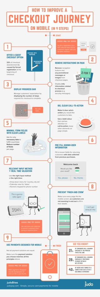
How to improve a checkout journey on mobile (in 9 steps)
- 1. 5 judoBites judopay.com ┬Ę Simple, secure card payments for mobile HOW TO IMPROVE A CHECKOUT JOURNEY ON MOBILE (IN 9 STEPS) I ainŌĆÖt got time for this remove distractions on page Remove navigation buttons and any promotional messages or images from checkout pages. Display only information related to checkout process (e.g. security messages). display progress bar Manage customersŌĆÖ expectation by displaying the number of steps required for checkout to complete. big, clear call-to-action Make it clear which action you would like customers to take. Use a bold colour that catches attention on call-to-action, keep other elements on page simple.minimal form fields with clear labels Ask for only necessary data to ful’¼üll a purchase Reduce number of ’¼üelds per page. pre-fill known user information Fill in known ’¼üelds for returning customers with data collected from previous purchases. relevant input method + real time validation Use the right input method at the right time: ŌĆó Drop down menu for ŌĆścountry, city etcŌĆÖ ŌĆó Calendar view for ŌĆśdatesŌĆÖ ŌĆó Numeric keypad for phone number prevent ŌĆśpinch-and-zoomŌĆÖ Make sure every page ’¼üts the mobile screen, so customers are not zooming in and out to ’¼üll in their details. use payments designed for mobile Not all payment solutions are equal. Make sure the payment solution you choose matches all the principles above. 1-Tap offer a guest checkout option 23% of checkout abandonment is caused by forced registration at the beginning of checkout. Would you like your usual? Yes, please No, thanks Welcome back PRO TIP Pre-’¼üll a registration form with collected data and let customers register with one tap after checkout. GET THIS TOO buy now 2 for 1 FINISH start This is gonna take ages! 1 2 3 4 6 7 8 9 registration process continue with purchase PRO TIP Use real-time error detection to prevent customers from having to resubmit form. PRO TIP DonŌĆÖt make payments stick out like a sore thumb, make them disappear into the background. Name EmailEmail Address Phone number Post code Card type House number OF USERS HAVE TURNED TO A COMPETITORŌĆÖS SITE AFTER A BAD MOBILE EXPERIENCE 40% DID YOU KNOW? 21% OF CONSUMERS WILL ABANDON CHECKOUT IF THE PROCESS TAKES TOO LONG OF CONSUMERS WILL ABANDON PURCHASE IF PREFERRED PAYMENT OPTION IS NOT OFFERED 28% Almost doneŌĆ”

