Case Study: UNC Eshelman School of Pharmacy Web Site
1 like425 views
This document describes a case study of redesigning the website for the UNC Eshelman School of Pharmacy from 2007 to present. The original site had long blocks of text, poor navigation, a buggy content management system, and lacked engagement. The redesign focused on improving visuals, navigation, creating better content like faculty spotlights and multimedia, social media integration, technical upgrades, and engaging faculty. The results were an improved, easier to use site that better showcased the school.
1 of 18
Downloaded 10 times


Ad
Recommended
On the Change in Archivability of Websites Over Time
On the Change in Archivability of Websites Over TimeMichael Nelson
╠²
The document discusses the challenges of archiving websites due to the reliance on JavaScript and dynamic content, highlighting how it affects resource retrieval during web crawling. It also examines case studies of popular sites like YouTube, NASA, and Wikipedia, illustrating trends in their archivability over time. The findings suggest that while JavaScript enhances interactivity, it complicates archiving efforts, leading to a decline in the preservation of certain web content.Who Will Archive the Archives? Thoughts About the Future of Web Archiving
Who Will Archive the Archives? Thoughts About the Future of Web ArchivingMichael Nelson
╠²
The document discusses the challenges of archiving the web at scale. It notes that while much of the web has been archived, temporal drift and gaps remain issues. Memento provides a framework for accessing content across multiple archives. To fully archive the web, more copies stored in diverse archives are needed due to the risk of any single archive becoming unavailable.Who and What Links to the Internet Archive
Who and What Links to the Internet ArchiveMichael Nelson
╠²
This document presents an analysis of access patterns for robots and humans using the Internet Archive's Wayback Machine. It is based on a dataset from February 2012, which includes six million records and highlights the distinctions in browsing behaviors between humans and automated agents. The study employs methodologies such as data cleaning and session identification to understand user origins and link engagements.Galaxy
GalaxyAlex Blagona
╠²
The document lists various internet sites related to language learning, including sites for French, German, and Spanish; sites for vocabulary and verbs; blogs about language teaching; and the personal blogs and websites of several language teachers. It provides the URLs for these resources and are grouped into categories like "ones that everyone knows", "a useful list", and "the world of blogs".Helton power point pictures for philosophy
Helton power point pictures for philosophyDebbie Helton
╠²
The document contains links to images related to various philosophers like Blaise Pascal, Socrates, Plato, Aristotle, Thomas Hobbes, John Locke, Rene Descartes, and Thomas Aquinas. It also includes images related to natural phenomena like a developing baby in the womb, the Grand Canyon, a hummingbird, Darwin's theory of evolution, a bumble bee and the Aurora Borealis.IMPL070928
IMPL070928threecs
╠²
This document introduces several social software tools that can support multi-professional learning, including social bookmarking (e.g. Delicious), RSS feeds, blogs, and wikis. It provides an overview of each tool's functions and benefits, as well as examples. Users are guided through hands-on activities for using each tool, such as bookmarking web pages, subscribing to RSS feeds, starting a blog, and collaborating on a wiki. Potential barriers to using these tools for in-practice learning are also discussed.Web Casting In The Classroom
Web Casting In The ClassroomKaren Brooks
╠²
The document discusses using web conferencing technology in the classroom to connect students to other locations. It provides examples of different types of video conferences including point-to-point, multi-point, and webcasting conferences. It then lists many resources for conducting virtual field trips and connecting classrooms through video conferencing on topics like science experiments, museums, zoos, and more.The Wonderful World of Wikis
The Wonderful World of WikisSteve Katz
╠²
The document discusses wikis and their use in education. Wikis allow for easily editable websites and collaboration. They can be used for resource creation, student participation, group projects, and community building. Popular wiki sites include Wikipedia, Wikispaces, and PBWorks. The document provides tips on setting expectations for student wiki use and managing permissions and styles.ICRI Living Labs Oct 2014
ICRI Living Labs Oct 2014Duncan Wilson
╠²
The document discusses Intel's Collaborative Research Institute for Sustainable Connected Cities (ICRI Cities). ICRI Cities conducts research on how technology can enhance quality of life in cities by exploring areas like health, transportation, energy systems, and the environment. It currently has 25 staff members and has received over $3 million in funding for 20 active projects. Some of these projects include deploying sensors to study air pollution and traffic patterns in various London neighborhoods. The goal is to generate data insights that can help cities and improve lives through urban IoT services and applications.Why Business Process Engineering
Why Business Process EngineeringStafford
╠²
The document discusses business transformation and how it differs from continuous improvement activities. Business transformation involves fundamentally rethinking and redesigning core business processes to achieve dramatic improvements in areas like cost, quality, and speed. It requires taking a clean slate approach, understanding customer needs, and building new systems and policies from there. The document outlines when transformation is needed, what it requires including leadership support and cross-functional teams, and the typical phases of transformation including discovery, inspiration, design, and implementation.╬╝╬▒╬Ė╬Ę╬╝╬▒Žä╬╣╬║╬▒ ╬│╬Ą╬Į╬╣╬║╬ĘŽé ╬ĄŽāŽĆ╬ĄŽü╬╣╬ĮŽē╬Į ╬ĄŽĆ╬▒╬Į╬▒╬╗╬ĘŽĆŽä╬╣╬║╬ĄŽé 2011
╬╝╬▒╬Ė╬Ę╬╝╬▒Žä╬╣╬║╬▒ ╬│╬Ą╬Į╬╣╬║╬ĘŽé ╬ĄŽāŽĆ╬ĄŽü╬╣╬ĮŽē╬Į ╬ĄŽĆ╬▒╬Į╬▒╬╗╬ĘŽĆŽä╬╣╬║╬ĄŽé 2011╬£╬¼╬║╬ĘŽé ╬¦╬▒Žä╬ČŽīŽĆ╬┐Žģ╬╗╬┐Žé
╠²
The Works I
The Works Idschepers
╠²
This document profiles the felt wall art of Dianne Schepers. It includes photos and details of over 30 of her felt wall pieces. Schepers creates abstract designs in felt that allow viewers to find meaning within. She is inspired by nature and aims to create destinations for introspection through her vibrant, sustainable medium of felt. The document provides photos and descriptions of each piece, as well as Schepers' contact information.╬┐╬╣ ╬╗ŽŹŽā╬Ą╬╣Žé ╬ĄŽĆ╬▒╬Į╬▒╬╗╬ĘŽĆŽä╬╣╬║ŽÄ╬Į ╬Ą╬Š╬ĄŽä╬¼Žā╬ĄŽē╬Į ╬│ŽĆ Doc
╬┐╬╣ ╬╗ŽŹŽā╬Ą╬╣Žé ╬ĄŽĆ╬▒╬Į╬▒╬╗╬ĘŽĆŽä╬╣╬║ŽÄ╬Į ╬Ą╬Š╬ĄŽä╬¼Žā╬ĄŽē╬Į ╬│ŽĆ Doc╬£╬¼╬║╬ĘŽé ╬¦╬▒Žä╬ČŽīŽĆ╬┐Žģ╬╗╬┐Žé
╠²
Search and Social Media Content Strategy - PubCon Las Vegas 2015
Search and Social Media Content Strategy - PubCon Las Vegas 2015Bill Hartzer
╠²
The document discusses the role of social signals in SEO, highlighting their historical context, current practices, and their future impact on search rankings. It emphasizes the importance of setting up and maintaining active social media profiles, sharing content, and networking with influencers to improve visibility. Additionally, it provides practical advice for promoting social posts effectively and outlines a case study related to social media engagement.Global warming by DGM G E.Rly
Global warming by DGM G E.RlyRajesh Prasad
╠²
Global warming poses a serious threat to future generations, driven primarily by human activities that increase greenhouse gas emissions. It leads to significant changes in climate, including extreme weather patterns, rising sea levels, and negative impacts on ecosystems and human life. Immediate actions are necessary to mitigate its effects, including energy conservation and the promotion of renewable resources.Theplannersurvey2010
Theplannersurvey2010Robert Ressmann
╠²
The survey collected responses from 1578 marketing and advertising professionals. Most respondents worked at full-service agencies in the US or other countries. Salaries varied significantly depending on role, experience, agency size, and location. Senior roles at large agencies in major cities like New York and San Francisco tended to earn the highest salaries. The survey provides a useful benchmark for compensation across the planning field.341 Pdfsam
341 PdfsamEmanuel Mateus
╠²
This document contains over 1100 error codes (PRKC-####) related to cluster command messages. Each error code provides the cause of the issue and recommended action to resolve it. The causes typically involve network issues, improper configuration, or permissions problems. The recommended actions generally involve checking configurations, permissions, or network connectivity and contacting administrators or support if needed.Indahnya Sahabat[1]
Indahnya Sahabat[1]mydoraz_smg
╠²
Dokumen ini menceritakan tentang seorang anak yang belajar menahan diri dan dampak dari perkataan pada hubungan persahabatan, dengan analogi paku yang dipakukan pada pagar. Ia menyadari bahwa konflik meninggalkan luka yang tidak bisa dihapus, mirip dengan lubang di pagar. Pesan ini juga menekankan pentingnya menghargai teman dan bertanggung jawab atas tindakan kita, serta mengajak untuk meneruskan pesan baik kepada orang lain.Revenue Management And Customer Experience
Revenue Management And Customer Experienceeckes05
╠²
Management World Orlando is a leading global event taking place November 16-20, 2008 in Orlando, Florida. The event will feature over 150 speakers across 3 dedicated summits on digital service transformation, revenue management and customer experience, and digital commerce and advertising. Attendees can learn about key issues like business and IT transformation, monetizing digital content, and the changing digital media landscape. Over 1,500 people from 50 countries attended in 2007.20th C Lang.
20th C Lang.xFayex
╠²
The document discusses language trends in the 20th and 21st centuries across various contexts. It covers:
1) The emergence of non-sexist terms like "Ms." in the 1970s and their acceptance today.
2) The creation of new words for gender neutrality and replacing gendered suffixes in professions.
3) The liberalization of attitudes towards sexuality and offensive words in the late 20th century.
4) The development of texting language in the 1990s and internet language on platforms like MSN featuring abbreviations, acronyms, and emoticons.SEO Fundamentals, PubCon Las Vegas 2015
SEO Fundamentals, PubCon Las Vegas 2015Bill Hartzer
╠²
The document outlines key SEO fundamentals for 2015, covering current ranking factors, on-page and off-page SEO, and the impact of social media on search rankings. It discusses important Google algorithm updates including Panda and Penguin, their histories, and recovery strategies for websites affected by them. Additionally, it provides insights into various Google manual actions and advice for maintaining high-quality content and site structure to enhance SEO performance.First Semester at King's
First Semester at King'sYangki Imade Suara
╠²
The document outlines Yangki Imade Suara's first semester at King's College London, detailing courses taken, final essays written, and academic engagement in conferences and seminars focused on emerging economies. Additionally, it highlights his leadership roles as president of the Indonesian Society and co-chair of a conference on conflict and security, alongside volunteer work in various initiatives. Suara was also recognized as the 'Advisor of the Month' by Mendeley in November 2014.╬¼╬╗╬│╬Ą╬▓Žü╬▒ ŽĆŽü╬┐╬▒╬│Žē╬│╬╣╬║ŽÄ╬Į ╬Ą╬Š╬ĄŽä╬¼Žā╬ĄŽē╬Į ╬╝╬Ą ╬╗ŽŹŽā╬Ą╬╣Žé 2011 ╬ĄŽģ╬▒╬│╬│╬Ą╬╗╬╣╬║╬« ŽāŽć╬┐╬╗╬«
╬¼╬╗╬│╬Ą╬▓Žü╬▒ ŽĆŽü╬┐╬▒╬│Žē╬│╬╣╬║ŽÄ╬Į ╬Ą╬Š╬ĄŽä╬¼Žā╬ĄŽē╬Į ╬╝╬Ą ╬╗ŽŹŽā╬Ą╬╣Žé 2011 ╬ĄŽģ╬▒╬│╬│╬Ą╬╗╬╣╬║╬« ŽāŽć╬┐╬╗╬«╬£╬¼╬║╬ĘŽé ╬¦╬▒Žä╬ČŽīŽĆ╬┐Žģ╬╗╬┐Žé
╠²
Zumba
Zumbastantone
╠²
I was 7 years old and excited to perform the penguin cha cha dance at my school's talent show. Although I was nervous at first, I focused on having fun dancing and waddling like a penguin across the stage. By the end of my performance, I had a big smile and the audience applauded loudly, making me feel proud of my dancing.TomorrowŌĆÖs SEO Today ŌĆō Social Search and Beyond - Pubcon SFIMA 2014
TomorrowŌĆÖs SEO Today ŌĆō Social Search and Beyond - Pubcon SFIMA 2014Bill Hartzer
╠²
The document discusses the evolution of social signals and their impact on SEO, emphasizing Google's increasing reliance on social factors for search ranking. It outlines strategies for setting up and optimizing social media profiles, sharing content effectively, and engaging with influencers to enhance visibility. The future of SEO is presented as one where the authority and interaction on social platforms increasingly influence search rankings, even if direct metrics like likes and shares are not counted by Google in the traditional sense.Social Signals and SEO
Social Signals and SEOBill Hartzer
╠²
This document discusses the relationship between social signals and SEO, including the history of social signals, the importance of social media profiles, and strategies for effective sharing. It highlights Google's evolving perspective on social factors as a ranking element, stressing the significance of active engagement and quality content. Additionally, it offers practical advice on leveraging social media to enhance SEO outcomes and build authority.Axx discovery doc
Axx discovery docfoliopages
╠²
The document provides recommendations for a microsite for the American Society of Anesthesiologists' campaign. It analyzes user types that may visit the site, including patients and health-conscious individuals. It outlines user scenarios and motivations for seeking information. Tactical recommendations include maximizing content value through RSS feeds and social sharing, enabling actions like downloading checklists, and making personal connections through stories and imagery. The messaging aims to educate about anesthesia and position anesthesiologists as experts.Gmk advisory board presentation 2012
Gmk advisory board presentation 2012sunmiyoo
╠²
This document provides an overview and update from Global Medical Knowledge (GMK) to its Advisory Board. GMK seeks to improve medical education in low-resource areas through technology. It has partnered with Malawi College of Medicine to develop an e-learning portal and research database. Current programs include expanding the portal's content and developing a maternal health clinical program. GMK needs fundraising to continue its work and recruit staff. The Advisory Board will provide expertise, connections, and support to help GMK with its strategy, fundraising, and clinical programs.More Related Content
Viewers also liked (20)
ICRI Living Labs Oct 2014
ICRI Living Labs Oct 2014Duncan Wilson
╠²
The document discusses Intel's Collaborative Research Institute for Sustainable Connected Cities (ICRI Cities). ICRI Cities conducts research on how technology can enhance quality of life in cities by exploring areas like health, transportation, energy systems, and the environment. It currently has 25 staff members and has received over $3 million in funding for 20 active projects. Some of these projects include deploying sensors to study air pollution and traffic patterns in various London neighborhoods. The goal is to generate data insights that can help cities and improve lives through urban IoT services and applications.Why Business Process Engineering
Why Business Process EngineeringStafford
╠²
The document discusses business transformation and how it differs from continuous improvement activities. Business transformation involves fundamentally rethinking and redesigning core business processes to achieve dramatic improvements in areas like cost, quality, and speed. It requires taking a clean slate approach, understanding customer needs, and building new systems and policies from there. The document outlines when transformation is needed, what it requires including leadership support and cross-functional teams, and the typical phases of transformation including discovery, inspiration, design, and implementation.╬╝╬▒╬Ė╬Ę╬╝╬▒Žä╬╣╬║╬▒ ╬│╬Ą╬Į╬╣╬║╬ĘŽé ╬ĄŽāŽĆ╬ĄŽü╬╣╬ĮŽē╬Į ╬ĄŽĆ╬▒╬Į╬▒╬╗╬ĘŽĆŽä╬╣╬║╬ĄŽé 2011
╬╝╬▒╬Ė╬Ę╬╝╬▒Žä╬╣╬║╬▒ ╬│╬Ą╬Į╬╣╬║╬ĘŽé ╬ĄŽāŽĆ╬ĄŽü╬╣╬ĮŽē╬Į ╬ĄŽĆ╬▒╬Į╬▒╬╗╬ĘŽĆŽä╬╣╬║╬ĄŽé 2011╬£╬¼╬║╬ĘŽé ╬¦╬▒Žä╬ČŽīŽĆ╬┐Žģ╬╗╬┐Žé
╠²
The Works I
The Works Idschepers
╠²
This document profiles the felt wall art of Dianne Schepers. It includes photos and details of over 30 of her felt wall pieces. Schepers creates abstract designs in felt that allow viewers to find meaning within. She is inspired by nature and aims to create destinations for introspection through her vibrant, sustainable medium of felt. The document provides photos and descriptions of each piece, as well as Schepers' contact information.╬┐╬╣ ╬╗ŽŹŽā╬Ą╬╣Žé ╬ĄŽĆ╬▒╬Į╬▒╬╗╬ĘŽĆŽä╬╣╬║ŽÄ╬Į ╬Ą╬Š╬ĄŽä╬¼Žā╬ĄŽē╬Į ╬│ŽĆ Doc
╬┐╬╣ ╬╗ŽŹŽā╬Ą╬╣Žé ╬ĄŽĆ╬▒╬Į╬▒╬╗╬ĘŽĆŽä╬╣╬║ŽÄ╬Į ╬Ą╬Š╬ĄŽä╬¼Žā╬ĄŽē╬Į ╬│ŽĆ Doc╬£╬¼╬║╬ĘŽé ╬¦╬▒Žä╬ČŽīŽĆ╬┐Žģ╬╗╬┐Žé
╠²
Search and Social Media Content Strategy - PubCon Las Vegas 2015
Search and Social Media Content Strategy - PubCon Las Vegas 2015Bill Hartzer
╠²
The document discusses the role of social signals in SEO, highlighting their historical context, current practices, and their future impact on search rankings. It emphasizes the importance of setting up and maintaining active social media profiles, sharing content, and networking with influencers to improve visibility. Additionally, it provides practical advice for promoting social posts effectively and outlines a case study related to social media engagement.Global warming by DGM G E.Rly
Global warming by DGM G E.RlyRajesh Prasad
╠²
Global warming poses a serious threat to future generations, driven primarily by human activities that increase greenhouse gas emissions. It leads to significant changes in climate, including extreme weather patterns, rising sea levels, and negative impacts on ecosystems and human life. Immediate actions are necessary to mitigate its effects, including energy conservation and the promotion of renewable resources.Theplannersurvey2010
Theplannersurvey2010Robert Ressmann
╠²
The survey collected responses from 1578 marketing and advertising professionals. Most respondents worked at full-service agencies in the US or other countries. Salaries varied significantly depending on role, experience, agency size, and location. Senior roles at large agencies in major cities like New York and San Francisco tended to earn the highest salaries. The survey provides a useful benchmark for compensation across the planning field.341 Pdfsam
341 PdfsamEmanuel Mateus
╠²
This document contains over 1100 error codes (PRKC-####) related to cluster command messages. Each error code provides the cause of the issue and recommended action to resolve it. The causes typically involve network issues, improper configuration, or permissions problems. The recommended actions generally involve checking configurations, permissions, or network connectivity and contacting administrators or support if needed.Indahnya Sahabat[1]
Indahnya Sahabat[1]mydoraz_smg
╠²
Dokumen ini menceritakan tentang seorang anak yang belajar menahan diri dan dampak dari perkataan pada hubungan persahabatan, dengan analogi paku yang dipakukan pada pagar. Ia menyadari bahwa konflik meninggalkan luka yang tidak bisa dihapus, mirip dengan lubang di pagar. Pesan ini juga menekankan pentingnya menghargai teman dan bertanggung jawab atas tindakan kita, serta mengajak untuk meneruskan pesan baik kepada orang lain.Revenue Management And Customer Experience
Revenue Management And Customer Experienceeckes05
╠²
Management World Orlando is a leading global event taking place November 16-20, 2008 in Orlando, Florida. The event will feature over 150 speakers across 3 dedicated summits on digital service transformation, revenue management and customer experience, and digital commerce and advertising. Attendees can learn about key issues like business and IT transformation, monetizing digital content, and the changing digital media landscape. Over 1,500 people from 50 countries attended in 2007.20th C Lang.
20th C Lang.xFayex
╠²
The document discusses language trends in the 20th and 21st centuries across various contexts. It covers:
1) The emergence of non-sexist terms like "Ms." in the 1970s and their acceptance today.
2) The creation of new words for gender neutrality and replacing gendered suffixes in professions.
3) The liberalization of attitudes towards sexuality and offensive words in the late 20th century.
4) The development of texting language in the 1990s and internet language on platforms like MSN featuring abbreviations, acronyms, and emoticons.SEO Fundamentals, PubCon Las Vegas 2015
SEO Fundamentals, PubCon Las Vegas 2015Bill Hartzer
╠²
The document outlines key SEO fundamentals for 2015, covering current ranking factors, on-page and off-page SEO, and the impact of social media on search rankings. It discusses important Google algorithm updates including Panda and Penguin, their histories, and recovery strategies for websites affected by them. Additionally, it provides insights into various Google manual actions and advice for maintaining high-quality content and site structure to enhance SEO performance.First Semester at King's
First Semester at King'sYangki Imade Suara
╠²
The document outlines Yangki Imade Suara's first semester at King's College London, detailing courses taken, final essays written, and academic engagement in conferences and seminars focused on emerging economies. Additionally, it highlights his leadership roles as president of the Indonesian Society and co-chair of a conference on conflict and security, alongside volunteer work in various initiatives. Suara was also recognized as the 'Advisor of the Month' by Mendeley in November 2014.╬¼╬╗╬│╬Ą╬▓Žü╬▒ ŽĆŽü╬┐╬▒╬│Žē╬│╬╣╬║ŽÄ╬Į ╬Ą╬Š╬ĄŽä╬¼Žā╬ĄŽē╬Į ╬╝╬Ą ╬╗ŽŹŽā╬Ą╬╣Žé 2011 ╬ĄŽģ╬▒╬│╬│╬Ą╬╗╬╣╬║╬« ŽāŽć╬┐╬╗╬«
╬¼╬╗╬│╬Ą╬▓Žü╬▒ ŽĆŽü╬┐╬▒╬│Žē╬│╬╣╬║ŽÄ╬Į ╬Ą╬Š╬ĄŽä╬¼Žā╬ĄŽē╬Į ╬╝╬Ą ╬╗ŽŹŽā╬Ą╬╣Žé 2011 ╬ĄŽģ╬▒╬│╬│╬Ą╬╗╬╣╬║╬« ŽāŽć╬┐╬╗╬«╬£╬¼╬║╬ĘŽé ╬¦╬▒Žä╬ČŽīŽĆ╬┐Žģ╬╗╬┐Žé
╠²
Zumba
Zumbastantone
╠²
I was 7 years old and excited to perform the penguin cha cha dance at my school's talent show. Although I was nervous at first, I focused on having fun dancing and waddling like a penguin across the stage. By the end of my performance, I had a big smile and the audience applauded loudly, making me feel proud of my dancing.TomorrowŌĆÖs SEO Today ŌĆō Social Search and Beyond - Pubcon SFIMA 2014
TomorrowŌĆÖs SEO Today ŌĆō Social Search and Beyond - Pubcon SFIMA 2014Bill Hartzer
╠²
The document discusses the evolution of social signals and their impact on SEO, emphasizing Google's increasing reliance on social factors for search ranking. It outlines strategies for setting up and optimizing social media profiles, sharing content effectively, and engaging with influencers to enhance visibility. The future of SEO is presented as one where the authority and interaction on social platforms increasingly influence search rankings, even if direct metrics like likes and shares are not counted by Google in the traditional sense.Social Signals and SEO
Social Signals and SEOBill Hartzer
╠²
This document discusses the relationship between social signals and SEO, including the history of social signals, the importance of social media profiles, and strategies for effective sharing. It highlights Google's evolving perspective on social factors as a ranking element, stressing the significance of active engagement and quality content. Additionally, it offers practical advice on leveraging social media to enhance SEO outcomes and build authority.╬╝╬▒╬Ė╬Ę╬╝╬▒Žä╬╣╬║╬▒ ╬│╬Ą╬Į╬╣╬║╬ĘŽé ╬ĄŽāŽĆ╬ĄŽü╬╣╬ĮŽē╬Į ╬ĄŽĆ╬▒╬Į╬▒╬╗╬ĘŽĆŽä╬╣╬║╬ĄŽé 2011
╬╝╬▒╬Ė╬Ę╬╝╬▒Žä╬╣╬║╬▒ ╬│╬Ą╬Į╬╣╬║╬ĘŽé ╬ĄŽāŽĆ╬ĄŽü╬╣╬ĮŽē╬Į ╬ĄŽĆ╬▒╬Į╬▒╬╗╬ĘŽĆŽä╬╣╬║╬ĄŽé 2011╬£╬¼╬║╬ĘŽé ╬¦╬▒Žä╬ČŽīŽĆ╬┐Žģ╬╗╬┐Žé
╠²
╬┐╬╣ ╬╗ŽŹŽā╬Ą╬╣Žé ╬ĄŽĆ╬▒╬Į╬▒╬╗╬ĘŽĆŽä╬╣╬║ŽÄ╬Į ╬Ą╬Š╬ĄŽä╬¼Žā╬ĄŽē╬Į ╬│ŽĆ Doc
╬┐╬╣ ╬╗ŽŹŽā╬Ą╬╣Žé ╬ĄŽĆ╬▒╬Į╬▒╬╗╬ĘŽĆŽä╬╣╬║ŽÄ╬Į ╬Ą╬Š╬ĄŽä╬¼Žā╬ĄŽē╬Į ╬│ŽĆ Doc╬£╬¼╬║╬ĘŽé ╬¦╬▒Žä╬ČŽīŽĆ╬┐Žģ╬╗╬┐Žé
╠²
╬¼╬╗╬│╬Ą╬▓Žü╬▒ ŽĆŽü╬┐╬▒╬│Žē╬│╬╣╬║ŽÄ╬Į ╬Ą╬Š╬ĄŽä╬¼Žā╬ĄŽē╬Į ╬╝╬Ą ╬╗ŽŹŽā╬Ą╬╣Žé 2011 ╬ĄŽģ╬▒╬│╬│╬Ą╬╗╬╣╬║╬« ŽāŽć╬┐╬╗╬«
╬¼╬╗╬│╬Ą╬▓Žü╬▒ ŽĆŽü╬┐╬▒╬│Žē╬│╬╣╬║ŽÄ╬Į ╬Ą╬Š╬ĄŽä╬¼Žā╬ĄŽē╬Į ╬╝╬Ą ╬╗ŽŹŽā╬Ą╬╣Žé 2011 ╬ĄŽģ╬▒╬│╬│╬Ą╬╗╬╣╬║╬« ŽāŽć╬┐╬╗╬«╬£╬¼╬║╬ĘŽé ╬¦╬▒Žä╬ČŽīŽĆ╬┐Žģ╬╗╬┐Žé
╠²
Similar to Case Study: UNC Eshelman School of Pharmacy Web Site (9)
Axx discovery doc
Axx discovery docfoliopages
╠²
The document provides recommendations for a microsite for the American Society of Anesthesiologists' campaign. It analyzes user types that may visit the site, including patients and health-conscious individuals. It outlines user scenarios and motivations for seeking information. Tactical recommendations include maximizing content value through RSS feeds and social sharing, enabling actions like downloading checklists, and making personal connections through stories and imagery. The messaging aims to educate about anesthesia and position anesthesiologists as experts.Gmk advisory board presentation 2012
Gmk advisory board presentation 2012sunmiyoo
╠²
This document provides an overview and update from Global Medical Knowledge (GMK) to its Advisory Board. GMK seeks to improve medical education in low-resource areas through technology. It has partnered with Malawi College of Medicine to develop an e-learning portal and research database. Current programs include expanding the portal's content and developing a maternal health clinical program. GMK needs fundraising to continue its work and recruit staff. The Advisory Board will provide expertise, connections, and support to help GMK with its strategy, fundraising, and clinical programs.LibGuides Poster
LibGuides PosterCynthia Kahn
╠²
LibGuides is a platform that Himmelfarb Health Sciences Library adopted to organize its vetted internet resources into subject guides. The library developed guides for each department in the School of Public Health and Health Sciences. Librarians created the guides using best practices like standardized tab names and links between guides. Faculty provided input and approved the initial guides. An unexpected benefit was the ability to create unpublished guides for internal collaboration. The library plans continued collaboration and guide development.Reactive Writing Techniques for Rewarding and Retaining Users
Reactive Writing Techniques for Rewarding and Retaining Usersgrebstock
╠²
This document discusses reactive writing techniques for rewarding and retaining users. It defines reactive content as documentation produced in direct response to a specific user problem. While reactive content satisfies immediate needs, it can be disorganized, outdated, and lacking context. The document recommends that writers identify user personas and pain points, deliver targeted help, direct users to the appropriate documentation, and use an accessible writing style. It provides examples of applying these techniques and concludes with exercises for audience members.Bigelow Feb 2010
Bigelow Feb 2010Association of Medical Media
╠²
Jon Bigelow discussed 8 trends in medical communications that matter including: 1) physicians practicing in a 24/7 world, 2) the recession resetting healthcare, 3) pharma restructuring, 4) a focus on specialty markets and emerging nations, 5) a reinvigorated FDA, 6) reforming healthcare through regulation and legislation, 7) increasing pharmaskepticism, and 8) the need for a call to action to address challenges in medical communications. He emphasized the importance of proactively presenting the value and best practices of medical communicators to multiple stakeholders.Bigelow feb2010
Bigelow feb2010Association of Medical Media
╠²
Jon Bigelow discussed 8 trends in medical communications that matter including: 1) physicians practicing in a 24/7 world, 2) the recession resetting healthcare, 3) pharma restructuring, 4) a focus on specialty markets and emerging nations, 5) a reinvigorated FDA, 6) reforming healthcare through regulation and legislation, 7) increasing pharmaskepticism, and 8) the need for a call to action to address challenges in medical communications. He emphasized the importance of proactively presenting the value and best practices of medical communicators to multiple stakeholders.CPR Capabilities Presentation
CPR Capabilities PresentationCPRComm
╠²
CPR is a full-service strategic marketing communications firm specializing in healthcare, life sciences, medical travel, technology, entertainment, environmental, and not-for-profit sectors. They provide public relations, marketing, branding, and event planning services to publicly traded companies, private entities, and not-for-profits. With over 25 years of experience, CPR develops targeted messaging campaigns to drive market awareness and increase revenues for its clients.Elsevier Smart Content LDR SemTech 2012
Elsevier Smart Content LDR SemTech 2012Alan Yagoda
╠²
Elsevier is the largest publisher in science and healthcare, focusing on delivering authoritative, comprehensive medical content for clinical decision-making. The presentation highlights 'smart content' that enhances content discoverability through semantic searching and advanced tagging systems, aiming to improve the clinical setting by linking medical taxonomy with actionable insights. The initiative involves the use of structured data and technology to transform medical information into easily accessible knowledge for healthcare professionals.Creating Hospital Websites that Drive Value: M. D. Anderson Case Study
Creating Hospital Websites that Drive Value: M. D. Anderson Case StudyNavigationArts
╠²
This document summarizes an effort by M.D. Anderson Cancer Center, Tower Strategies, and NavigationArts to redesign M.D. Anderson's website to be more user-centered and drive organizational goals. User research identified key audience types and priorities. A new governance model was established to prioritize projects. The redesigned site launched in 2009 and led to increased traffic and self-referrals while balancing user and business needs. Challenges included overcoming resistance to change and integrating new systems. Lessons included the importance of executive support, building alliances, and maintaining flexibility during complex projects.Ad
Recently uploaded (20)
Grade-9-COT.pptxGrade-9-COT.pptxGrade-9-COT.pptxGrade-9-COT.pptx
Grade-9-COT.pptxGrade-9-COT.pptxGrade-9-COT.pptxGrade-9-COT.pptxMaKristinaBuenaventu1
╠²
Grade-9-COT.pptxQuectel M10 AT commands Arduino Microcontroller
Quectel M10 AT commands Arduino MicrocontrollerAdamSunusiHaruna1
╠²
Quectel M10 AT commands Arduino Microcontroller Back To School Template for PowerPoint and Google ║▌║▌▀Żs
Back To School Template for PowerPoint and Google ║▌║▌▀Żs║▌║▌▀ŻsBrain
╠²
¤ÄƤōÜ Back to School Template for PowerPoint and Google ║▌║▌▀Żs ŌĆō Free Download!
Make the transition from vacation to classroom exciting and engaging with our Back to School PowerPoint and Google ║▌║▌▀Żs Template, designed by ║▌║▌▀ŻsBrain! Whether you're a teacher preparing for a new academic year, a student working on class projects, or a school administrator crafting important presentationsŌĆöthis creative, colorful, and fully editable template is made for you.
This free presentation template includes a variety of eye-catching slide layouts, playful school-themed illustrations, and dynamic elements that bring your content to life. From introducing new classroom rules and schedules to showcasing learning goals and creative projects, this template provides everything you need to start the school year right.
¤Ä© WhatŌĆÖs Inside?
Ō£ö’ĖÅ Professionally designed slides with fun, school-themed visuals
Ō£ö’ĖÅ Easy-to-edit content for both PowerPoint & Google ║▌║▌▀Żs
Ō£ö’ĖÅ Colorful backgrounds and icons: books, pencils, backpacks, and more
Ō£ö’ĖÅ Perfect for teachers, students, schools, and education professionals
Ō£ö’ĖÅ Layouts for timelines, schedules, infographics, and team introductions
Ō£ö’ĖÅ Fully customizable to match your schoolŌĆÖs branding or presentation style
¤¦æŌĆŹ¤Å½ Who Can Use This Template?
Teachers: Welcome students back to class or create lesson plans
Students: Prepare for projects, book reviews, or academic presentations
School Admins: Share academic calendars, events, or guidelines
Tutors & Coaches: Make learning sessions visually engaging
¤Äü Why Choose ║▌║▌▀ŻsBrain?
At ║▌║▌▀ŻsBrain, we believe impactful presentations should be accessible to everyone. ThatŌĆÖs why we offer a wide range of free PowerPoint templates and Google ║▌║▌▀Żs themes that save you time and elevate your designŌĆöno login required. Need something unique? We also provide custom design services tailored to your branding and audience.
¤ō® Have Questions or Want Custom Designs?
Reach out to us at info@slidesbrain.com ŌĆō weŌĆÖre here to help bring your ideas to life.
¤ÆĪ Download, customize, and make your ŌĆ£back to schoolŌĆØ moments memorable. Whether you're preparing for the first day or organizing school-wide initiatives, this template ensures you start the school year strong with creativity and clarity.
#BackToSchool #PowerPointTemplate #Google║▌║▌▀ŻsTemplate #EducationPresentation #║▌║▌▀ŻsBrain #FreePPT #Classroom║▌║▌▀Żs #SchoolTemplate #StudentPresentation #TeacherResources #Custom║▌║▌▀Żs #PresentationDesign #AcademicTools #║▌║▌▀ŻDesign #LearningTools #FirstDayOfSchool #FreeGoogle║▌║▌▀Żs #CustomPresentation #TeachingTools(18+ CLIP!) Sophie Rain Spiderman Viral Video Clip Sophie Rain Original Video
(18+ CLIP!) Sophie Rain Spiderman Viral Video Clip Sophie Rain Original Videojamesfolkner123
╠²
DOWNLOAD LINK¤æē¤æē¤æē https://rebrand.ly/656e26/¤æł¤æł¤æł
Full Download link: ¤ōé¤īÉhttps://rebrand.ly/656e26/ ŌŚĆ¤æł
Sophie Rain Spiderman Viral Video Original Viral video took the internet by storm and amazed viewers on various social media platforms. Sophie Rain Spiderman Video, a young and talented digital creator, recently became famous thanks to this interesting video.Exploratory Experiences Built by Design (UXPA25)
Exploratory Experiences Built by Design (UXPA25)Design for Context
╠²
DiscoveryŌĆ” itŌĆÖs more than just finding a piece of information to complete a specific task. ItŌĆÖs more than just searchŌĆ” it is uncovering the unexpected, the ŌĆ£aha!ŌĆØ moment, or the deeper story behind a familiar subject. It is an experience ŌĆō the user experience ŌĆō within a digital space.
This presentation begins by looking at some design examples within the cultural heritage domain that are crafted to foster and encourage curiosity, leading to discovery. Examples draw on different subjects, particularly ones that blend content from different genres and countries. We will unpack design approaches that deliberately invite curiosity and ŌĆ£horizontal navigationŌĆØ through different information paths. Then, we will look more closely at some techniques that UX designers can use to shape these experiences, such as how to leverage the userŌĆÖs context of use, how to integrate cultural contexts, and how to gracefully find meaning in large scale data sets.Simone Laubscher ABC: Redefining Sustainable Luxury in the UAE Fashion Scene
Simone Laubscher ABC: Redefining Sustainable Luxury in the UAE Fashion SceneSimone Laubscher ABC
╠²
Visionary designer Simone Laubscher ABC is making waves in the United Arab Emirates with her groundbreaking approach to fashion that combines haute couture with conscious living. Known for her eco-luxury ethos and innovative textile work, Simone is fast becoming a household name in the UAEŌĆÖs rapidly evolving fashion industry.
Rooted in her global upbringing and commitment to sustainability, Simone Laubscher ABC brings a fresh perspective to the Middle Eastern fashion landscape. Her label seamlessly fuses the refinement of European tailoring with the rich cultural vibrancy of the Gulf, creating collections that are not only elegant but environmentally responsible.
Speaking at the launch of her latest collection in Dubai, Simone said:
ŌĆ£Fashion should empower both the wearer and the world around us. My designs reflect a deep respect for craftsmanship, sustainability, and individuality ŌĆö values that resonate deeply with the modern UAE consumer.ŌĆØ
From runway showcases in Abu Dhabi to private fashion experiences in DubaiŌĆÖs luxury districts, Simone has cultivated a loyal following among high-profile clients, eco-conscious influencers, and industry insiders. Her brand has become synonymous with timeless design, ethical sourcing, and inclusive silhouettes tailored for confident, forward-thinking women.
Simone Laubscher ABC journey began in London, where she trained in both design and nutrition ŌĆö an unusual combination that now defines her holistic brand philosophy: style with substance. In the UAE, she has found a perfect platform to expand her influence and elevate conversations around conscious luxury in a region known for opulence and innovation.
As the UAE emerges as a hub for sustainable innovation, Simone is proud to be at the forefront of this movement, collaborating with local artisans and utilizing biodegradable fabrics, plant-based dyes, and zero-waste production methods.
Her upcoming showcase, ŌĆ£The Desert Renaissance,ŌĆØ is slated to take place at Dubai Design District later this year, promising a sensorial journey through eco-futuristic fashion rooted in ancient Arabian elegance.
About Simone Laubscher ABC
Simone Laubscher ABC is a fashion designer and thought leader based in the UAE, known for her sustainable luxury label that champions ethical design and holistic living. Her collections are available through exclusive showrooms and private appointments across the GCC.FLOURISHING THROUGH SENSES: FROM AbŌĆśSENSEŌĆÖ to PreŌĆśSENSEŌĆÖ to EsŌĆśSENSEŌĆÖ to Re-...
FLOURISHING THROUGH SENSES: FROM AbŌĆśSENSEŌĆÖ to PreŌĆśSENSEŌĆÖ to EsŌĆśSENSEŌĆÖ to Re-...Samuel Thuo
╠²
A presentation By Samuel Thuo, The Senses Architect to FxD Community for a PechaKucha Format titled: Flourishing Through Senses: From AbŌĆśsenseŌĆÖ to PreŌĆśsenseŌĆÖ to EsŌĆśsenseŌĆÖ to Re-sensing the World
In a world where skyscrapers rise and senses fall, this presentation explores how architecture can either numb or nourish our humanity.
¤ö╣ Act I ŌĆō AbŌĆśsenseŌĆÖ: The Crisis of Sensory Deprivation
We begin in the concrete jungle, a habitat built for function, but not for feeling. Glass, steel, white walls. Children indoors, glued to screens. Cities that silence rain and sterilize smell. We've lost touch with the sensory essence of living. We're living in a pandemic of nonsense environments.
¤ö╣ Act II ŌĆō PreŌĆśsenseŌĆÖ: The Power of Sensory Grounding
We rediscover presence in barefoot steps on soil, bark under fingertips, beams of sunlight through timber, whispers of wind and scent of wet earth. Flourishing starts when all senses are awake, not just sight. ItŌĆÖs a return to how we once knew the world, intimately, bodily.
¤ö╣ Act III ŌĆō EsŌĆśsenseŌĆÖ: Remembering Our Sensory Nature
Flourishing is rooted in our essence, as sensing, emotional beings. We learn from natureŌĆÖs flow, from indigenous African architecture, from animals in tune with their environment, and even from cooking. These are acts of multisensory design, where wisdom is embodied, not abstract. Beauty is not in the eyes of the beholder, but all the senses of the beholder.
¤ö╣ Act IV ŌĆō Re-sensing: A Vision for the Future
ItŌĆÖs time to re-sense the world. Pallasmaa said that architecture is the art of reconciliation between ourselves and the world, and this mediation happens through the senses. We must go back to creating senseful environments that allow this dialogue between us and the world. Homes like Falling water that merge with land. Playful spaces for children. Healing cities filled with texture, sound, and smell. Bodies that root into nature. We must shift from building cold structures to designing sensescapes that foster wellbeing.3D-IC Design Kits for Drop-in Chiplets MDK, ADK, TDK - 20250121_PreConH_Wong_...
3D-IC Design Kits for Drop-in Chiplets MDK, ADK, TDK - 20250121_PreConH_Wong_...huyth14
╠²
3D-IC Design Kits for Drop-in Chiplets MDK, ADK, TDKMULTI SENSORY EXPERIENCE DESIGN RESEARCH
MULTI SENSORY EXPERIENCE DESIGN RESEARCHSamuel Thuo
╠²
Excited to share insights from my Dissertation Thesis on Multisensory Experience Design in Art Museums, focusing on Nairobi, Kenya! I have to say that this is the work that set me on my current trajectory and led me to my current design philosophy of design for all senses.
Have you been to a #museum, wanted to touch an exhibit and there you saw an injunction, "Please don't touch"....or "Please speak softly",,,,or "Please no eating in the museum".....or "Please don't use strong perfume".... these injunctions have made museums to be mono-sensory experience oriented, alienating the visitors. These injunctions speak volumes of our innate and inherent desire to want to engage holistically with all our #senses with objects. This is a major problem especially in Kenya's museums, which is a paradox with its rich cultural, and anthropological exhibits that require engagement with all the senses.
Inspired by David Howes' insights from Concordia University, my thesis challenges this status quo by exploring historical precedents. Did you know that in the 18th century, museums encouraged multisensory interaction? Today, there's a global shift towards enhancing museum experiences through multisensory #design, yet Kenya's museums often lag behind international standards.
This research isn't just about aesthetics....it's about fostering meaningful, educational, and socially enriching experiences. By embracing multisensory design, museums can bridge cultural divides and create environments where every visitor feels welcomed and engaged. And want to go back.
Let's spark a conversation about the future of museum experiences. How can we leverage design to make cultural institutions more accessible and inspiring for all? FLOURISHING THROUGH SENSES: FROM AbŌĆśSENSEŌĆÖ to PreŌĆśSENSEŌĆÖ to EsŌĆśSENSEŌĆÖ to Re-...
FLOURISHING THROUGH SENSES: FROM AbŌĆśSENSEŌĆÖ to PreŌĆśSENSEŌĆÖ to EsŌĆśSENSEŌĆÖ to Re-...Samuel Thuo
╠²
Ad
Case Study: UNC Eshelman School of Pharmacy Web Site
- 1. Case study Just What the Doctor Prescribed Client: UNC Eshelman School of Pharmacy Date: 2007ŌĆōPresent http://www.john-zhu.com
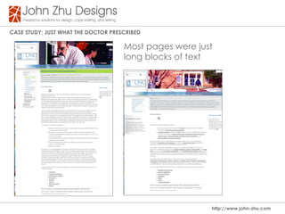
- 2. Case study: Just WHat tHe dOCtOR PResCRIBed Most pages were just long blocks of text http://www.john-zhu.com
- 3. Case study: Just WHat tHe dOCtOR PResCRIBed Poor content and confusing navigation http://www.john-zhu.com
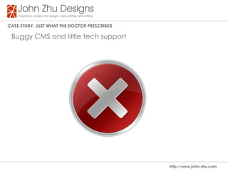
- 4. Case study: Just WHat tHe dOCtOR PResCRIBed Buggy CMS and little tech support http://www.john-zhu.com
- 5. Case study: Just WHat tHe dOCtOR PResCRIBed Apathy from people in the School http://www.john-zhu.com
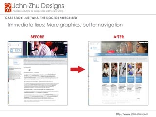
- 6. Case study: Just WHat tHe dOCtOR PResCRIBed Immediate fixes: More graphics, better navigation BeFORe aFteR http://www.john-zhu.com
- 7. Case study: Just WHat tHe dOCtOR PResCRIBed Found money for tech support http://www.john-zhu.com
- 8. Case study: Just WHat tHe dOCtOR PResCRIBed Made a list of top-priority technical fixes, focusing on items with high ROI http://www.john-zhu.com
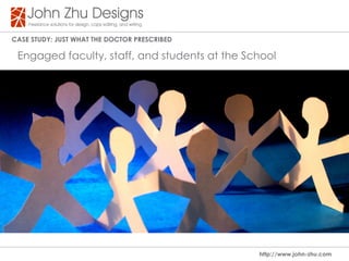
- 9. Case study: Just WHat tHe dOCtOR PResCRIBed Engaged faculty, staff, and students at the School http://www.john-zhu.com
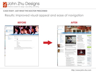
- 10. Case study: Just WHat tHe dOCtOR PResCRIBed Results: Improved visual appeal and ease of navigation BeFORe aFteR http://www.john-zhu.com
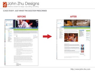
- 11. Case study: Just WHat tHe dOCtOR PResCRIBed BeFORe aFteR http://www.john-zhu.com
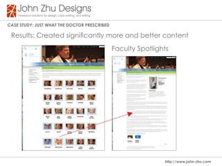
- 12. Case study: Just WHat tHe dOCtOR PResCRIBed Results: Created significantly more and better content Faculty Spotlights http://www.john-zhu.com
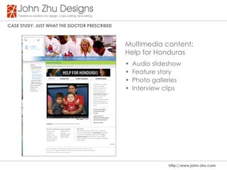
- 13. Case study: Just WHat tHe dOCtOR PResCRIBed Multimedia content: Help for Honduras ŌĆó Audio slideshow ŌĆó Feature story ŌĆó Photo galleries ŌĆó Interview clips http://www.john-zhu.com
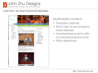
- 14. Case study: Just WHat tHe dOCtOR PResCRIBed Multimedia content: ŌĆó YouTube channel ŌĆó Short clips to accompany news releases ŌĆó Livestreamed events with accompanying live chat ŌĆó Flickr slideshows http://www.john-zhu.com
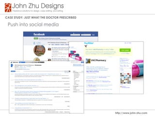
- 15. Case study: Just WHat tHe dOCtOR PResCRIBed Push into social media http://www.john-zhu.com
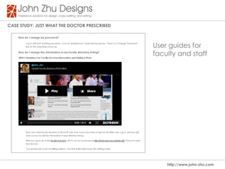
- 16. Case study: Just WHat tHe dOCtOR PResCRIBed User guides for faculty and staff http://www.john-zhu.com
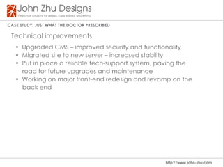
- 17. Case study: Just WHat tHe dOCtOR PResCRIBed Technical improvements ŌĆó Upgraded CMS ŌĆō improved security and functionality ŌĆó Migrated site to new server ŌĆō increased stability ŌĆó Put in place a reliable tech-support system, paving the road for future upgrades and maintenance ŌĆó Working on major front-end redesign and revamp on the back end http://www.john-zhu.com
- 18. Case study: Just WHat tHe dOCtOR PResCRIBed http://pharmacy.unc.edu http://www.john-zhu.com