Celtra builder features - Presentation
ŌĆó
0 likesŌĆó3,770 views

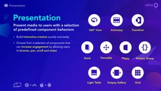
Celtra Builder provides various interactive presentation components that allow users to browse, pan, scroll, and swipe through brand content in order to increase user engagement. Some of the key components include Transition Component to create animated transitions between images and videos, 360o View to showcase objects from all sides, Animatey to display animated GIF-like images, Grid to exhibit image collections, Swipey Gallery for image browsing, Light Table for thumbnail navigation galleries, Pannable for scrolling larger images, Stack and Flippy for flipping cards, and Swipey Group for grouping swipeable items. All components can be built interactively within Celtra Builder for creating engaging visual presentations.


Celtra builder features - Presentation
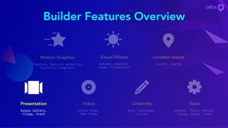
- 2. Builder Features Overview Presentation Swipey Gallery, Flippy, Stack
- 3. Presentation Interactive features that beautifully display brand content for increased user engagement
- 4. ŌĆó Build interactive creative quickly and easily ŌĆó Choose from a selection of components that can increase engagement by allowing users to browse, pan, scroll and swipe Present media to users with a selection of predefined component behaviors Presentation Light Table 360┬║ View TransitionAnimatey GridSwipey Gallery PannableStack Swipey GroupFlippy
- 5. Transition Component Elevate your creatives with animated transitions ŌĆó Create cinematic transitions between multiple images and videos ŌĆó Choose from 15 preset transitions to transform static images into visually appealing creatives ŌĆó Trigger transition automatically through user scroll* or time activated animation ŌĆó Preview as you go with in-Builder preview * Available only on web.
- 6. Building with Transition Component
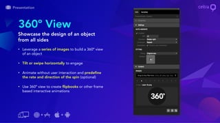
- 8. 360┬║ View Showcase the design of an object from all sides ŌĆó Leverage a series of images to build a 360┬║ view of an object ŌĆó Tilt or swipe horizontally to engage ŌĆó Animate without user interaction and predefine the rate and direction of the spin (optional) ŌĆó Use 360┬║ view to create flipbooks or other frame based interactive animations
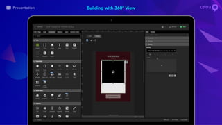
- 9. Building with 360┬║ View
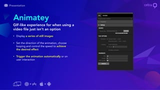
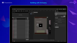
- 11. Animatey GIF-like experience for when using a video file just isnŌĆÖt an option ŌĆó Display a series of still images ŌĆó Set the direction of the animation, choose looping and control the speed to achieve the desired effect ŌĆó Trigger the animation automatically or on user interaction
- 13. Animatey Example
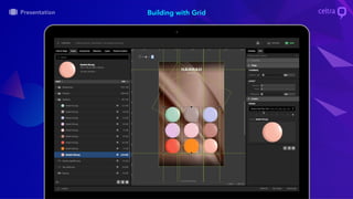
- 14. Grid Easy way to exhibit a collection of images within a table display ŌĆó Thumbnail size is calculated automatically based on set number of rows and columns ŌĆó Thumbnails can be tapped to trigger an event, which is useful for creating a visual navigation menu ŌĆó The look can be adjusted by changing the padding (cell-spacing) and shadowing
- 16. Grid Example
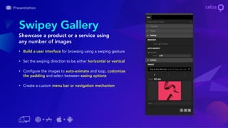
- 17. Swipey Gallery Showcase a product or a service using any number of images ŌĆó Build a user interface for browsing using a swiping gesture ŌĆó Set the swiping direction to be either horizontal or vertical ŌĆó Configure the images to auto-animate and loop, customize the padding and select between easing options ŌĆó Create a custom menu bar or navigation mechanism
- 18. Building with Swipey Gallery
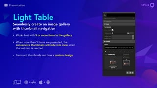
- 20. Light Table Seamlessly create an image gallery with thumbnail navigation ŌĆó Works best with 5 or more items in the gallery ŌĆó When more then 5 items are presented, the consecutive thumbnails will slide into view when the last item is reached ŌĆó Items and thumbnails can have a custom design
- 21. Building with Light Table
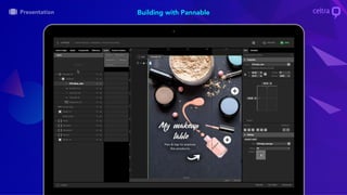
- 23. Pannable Efficiently use the screen real estate to show a larger image ŌĆó Pan or scroll across a larger masked item ŌĆó Add interactivity to your pannable object by adding Buttons or Hotspots ŌĆó Auto-scroll the masked item to move in any direction
- 25. Pannable Example
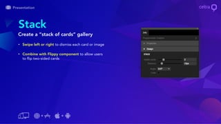
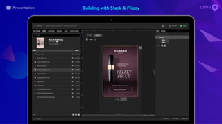
- 26. Stack Create a ŌĆ£stack of cardsŌĆØ gallery ŌĆó Swipe left or right to dismiss each card or image ŌĆó Combine with Flippy component to allow users to flip two-sided cards
- 27. Flippy Create an interactive ŌĆ£cardŌĆØ that can be flipped from side to side ŌĆó Set card to flip in configured direction (north, south, east, west) ŌĆó Trigger the flip automatically or on user interaction such as tapping the card or tapping another object on the screen
- 28. Building with Stack & Flippy
- 29. Stack Example
- 30. Swipey Group Enables users to swipe through a set of grouped items ŌĆó Users can swipe horizontally or vertically ŌĆó Create ŌĆ£subpagesŌĆØ using containers on a single creative page and place multiple components on a single page
- 31. Building with Swipey Group