C:\Fakepath\Masthead Analysis
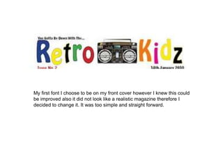
- 1. My first font I choose to be on my front cover however I knew this could be improved also it did not look like a realistic magazine therefore I decided to change it. It was too simple and straight forward.
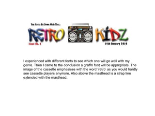
- 2. I experienced with different fonts to see which one will go well with my genre. Then I came to the conclusion a graffiti font will be appropriate. The image of the cassette emphasises with the word ˇ®retroˇŻ as you would hardly see cassette players anymore. Also above the masthead is a strap line extended with the masthead.

