

Children's Book Research
- 1. ChildrenŌĆÖs Book Research Jamie Ellis
- 2. ŌĆ£Zigby Camps OutŌĆØ by Brian Paterson This book is very vibrant and uses bold, simple shapes and blocks of colour for the main images. The illustrator has used a thick black outline around the majority of the characters and objects within the story, but has not included much detail such as shading, tones or texture. However, to make the images more interesting he has used patterns, such as spots and stripes on characters clothing and objects. The images cover the whole of the page through the majority of the book, apart from two pages where small scenarios are shown in four individual images. The illustrations, also made by the author Brian Paterson, seem to have been drawn digitally either through a form of computer software or on a graphics tablet. The font used is simplistic and is written in black. The author has used a font which uses serifŌĆÖs, to guide the eye along with the writing, making it easier to read. Throughout the book the size of the font is consistent, and is placed around the illustrations with the exception of a noise or a character in the book shouting something. When this happens, the text is made much more bold, and the font size is increased with some text put into capital letters. There is a total of 32 pages in this book, which has been produced as a paperback with the dimensions of 25.8 x 22.8 x 0.4 cm Brian Paterson is both the author and illustrator of this book, although he is best known for his work with Foxwood Tales. Zigby Camps Out was published by the very well known company of Harper Collins.
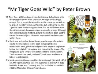
- 3. ŌĆ£Mr Tiger Goes WildŌĆØ by Peter Brown Mr Tiger Goes Wild has been created using very dull colours, with the exception of the main character, Mr Tiger who is bright orange. This is to put the attention on the character, as well as to project the storyline about having a dull and boring life. Mr Tiger has been made orange to show that he is different from the other animals, however a tiger is naturally orange. Although dull, the colours are still bold. Simple shapes have been used to create the main objects. However more detail has been used within them. The illustrator and author, Peter Brown, used a range of media to create the illustrations in this book including India Ink, watercolour paint, gouache and pencil and paper to begin with before then digitally composing and colouring the images. The images are quite simple, with detail added to the characters. The font was in Rockwell, and serifŌĆÖs have been used on the letters to aid reading. The book contains 48 pages, and has dimensions of 25.4 x 0.7 x 25.5 cm. Mr Tiger Goes Wild was first published in the USA in 2013 by Little, Brown and Company, and first published in the UK in 2013 by Macmillan ChildrenŌĆÖs care books.