Climate change visualization_tools
- 1. Cluster One Virtual Globes Maps - Virtual Globes ŌĆóThree-dimensional software models representing the Earth ŌĆóUse satellite imagery and aerial photographs ŌĆóAllow users to zoom, rotate, and otherwise navigate areas of the model.
- 2. Cluster One Maps- Virtual Globes List of Tools in Cluster Climate Hot Map (http://www.climatehotmap.org/) 4C Global Rise in Temperature map (http://www.fco.gov.uk/google-earth-4degrees.kml) Earth Browser (http://www.earthbrowser.com) GLOBE (http://vis.globe.gov/GLOBE)
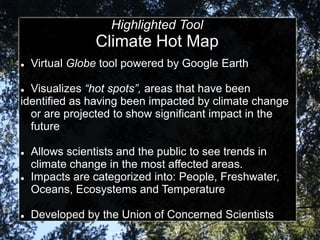
- 3. Highlighted Tool Climate Hot Map ’ü¼ Virtual Globe tool powered by Google Earth ’ü¼ Visualizes ŌĆ£hot spotsŌĆØ, areas that have been identified as having been impacted by climate change or are projected to show significant impact in the future ’ü¼ Allows scientists and the public to see trends in climate change in the most affected areas. ’ü¼ Impacts are categorized into: People, Freshwater, Oceans, Ecosystems and Temperature ’ü¼ Developed by the Union of Concerned Scientists
- 4. Climate Hot Map ŌĆō web portal
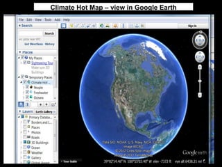
- 5. Climate Hot Map ŌĆō view in Google Earth
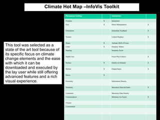
- 6. Climate Hot Map ŌĆōInfoVis Toolkit Highlighted Features Perceptual Coding Position X Interaction Interaction Size X Direct Manipulation X Orientation Immediate Feedback X Texture Linked Displays X Shape X Animate Shift of Focus This tool was selected as a Color X Dynamic ║▌║▌▀Żrs state of the art tool because of Shading Semantic Zoom its specific focus on climate Depth Cues Focus Plus Context X change elements and the ease with which it can be Surface X Details on Demand X downloaded and executed by Motion X Output/Input X the lay user while still offering Stereo X advanced features and a rich visual experience. Proximity Information Density Similarity Maximize Data-Ink Ratio X Continuity Maximize Data Density Connectedness Minimize Lie Factor X Closure Containment
- 7. Cluster Two Virtual Globes Maps ŌĆō Interactive Web Maps ’ü¼ Two dimensional applications ’ü¼ Allow for the input of data values to be displayed on a map ’ü¼ Also often provide option to view data in graphs and charts. ’ü¼ Use color-coding, shapes, time sliders and other features to define data.
- 8. Cluster Two Maps - Interactive Web Maps List of Tools in Cluster ClimateWizard (http://www.climatewizard.org/) Climate Data Online (http://www.ncdc.noaa.gov/cdo-web/) GeoCommons (http://www.geocommons.com) CI:Grasp (http://cigrasp.pik-potsdam.de/worldmap) SERVIR-Viz (https://servirglobal.net/Global/MapsData/InteractiveMapper.aspx) FERRET/Live Access Server (http://ferret.wrc.noaa.gov/Ferret) Remote Sensing Information Gateway (http://ofmpub.epa.gov/rsig/rsigserver?index.html) GODIVA2 (http://behemoth.nerc-essc.ac.uk/ncWMS/godiva2.html)
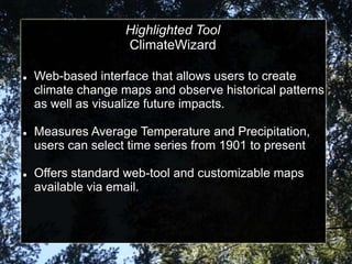
- 9. Highlighted Tool ClimateWizard ’ü¼ Web-based interface that allows users to create climate change maps and observe historical patterns as well as visualize future impacts. ’ü¼ Measures Average Temperature and Precipitation, users can select time series from 1901 to present ’ü¼ Offers standard web-tool and customizable maps available via email.
- 10. ClimateWizard Custom input page & map
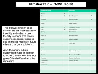
- 11. ClimateWizard ŌĆō InfoVis Toolkit Perceptual Coding Interaction Position X Size X Direct Manipulation X Orientation Immediate Feedback X Texture Linked Displays This tool was chosen as a Shape X Animate Shift of Focus Color X Dynamic ║▌║▌▀Żrs X state of the art tool because of Shading Semantic Zoom its utility and value, a user- friendly interface that allows Depth Cues Focus Plus Context even inexperienced users to Surface Details on Demand X see animated models of future Motion Output/Input X climate change predictions. Stereo Also, the ability to build Proximity Information Density customized maps in addition Similarity Maximize Data-Ink Ratio X to working with the online tool gives ClimateWizard an extra Continuity Maximize Data Density Connectedness Minimize Lie Factor X dimension. Closure Containment
- 12. Cluster Three ŌĆō Integrated Portal List of Tools in Cluster Climate-ADAPT ŌĆō (http://climate-adapt.eea.europa.eu/web/guest/general) World Bank Climate Change Knowledge Portal ŌĆō (http://sdwebx.worldbank.org/climateportal/index.cfm)
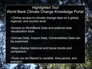
- 13. Highlighted Tool Virtual Globes World Bank Climate Change Knowledge Portal ŌĆó Online access to climate change data on a global, regional, and country level ŌĆóAccess to WorldBank Data and external data visualization tools ŌĆóClimate Data, Impact Data, Vulnerabilities Data can be examined ŌĆóMaps display historical and future trends and comparison ŌĆóTools can be filtered to variable, time period, and scenario.
- 14. WB Climate Change Knowledge Portal ŌĆō query result
- 15. WB Climate Change Knowledge Portal ŌĆō InfoVis Toolkit Perceptual Coding Interaction Position X Interaction Size X Direct Manipulation X Orientation Immediate Feedback X Texture Linked Displays X Shape X Animate Shift of Focus This tool was chosen as a Color X Dynamic ║▌║▌▀Żrs X state of the art tool because of Shading X Semantic Zoom volume of information that can Depth Cues Focus Plus Context X be visualized. The tool is suitable for novice users but Surface Details on Demand X also serves the needs of Motion Output/Input X experienced users who can Stereo examine historical changes, compare regions, and Proximity Information Density understand potential impacts Similarity Maximize Data-Ink Ratio X all from one visualization Continuity Maximize Data Density portal. Connectedness Minimize Lie Factor X Closure Containment
- 16. Cluster Four Virtual Globes Time-Series Animations ŌĆóUse time range data as a specific variable, in addition to any other values that are to be measured. ŌĆóData is animated to show changes over time ŌĆóOutput in bubble charts, scatter plots, or other displays.
- 17. Cluster Four Time Series Animations List of Tools in Cluster Climate Analysis Indicator Tool (CAIT)(http://www.wri.org/tools/cait/?page=/World-FlowChart) VERDI (http://www.verdi-tool.org/index.cfm) Google Motion Chart (https://developers.google.com/chart/interactive/docs/gallery/motionch art?hl=de-AT) StatPlanet ŌĆō (http://www.statsilk.com/software/statplanet)
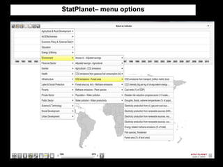
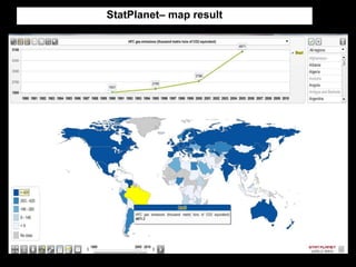
- 18. Highlighted Tool StatPlanet ŌĆó Downloadable application used by government agencies and international organizations to visualize climate data ŌĆó Datasets can be uploaded, generating color-coded maps. Graphs can also be generated and maps can be published online.
- 21. StatPlanetŌĆō InfoVis Toolkit Perceptual Coding Interaction Position X Interaction Size X Direct Manipulation X Orientation Immediate Feedback X Texture Linked Displays X Shape Animate Shift of Focus This tool was chosen as a Color Dynamic ║▌║▌▀Żrs X state-of-the-art tool because of Shape X Semantic Zoom its clear display, ease of use Color X Focus Plus Context and unique integration of map and time-series graph, which Shading Details on Demand allows the eye to quickly Depth Cues Output/Input X process simultaneous pieces Surface of information. Motion Information Density Stereo Maximize Data-Ink Ratio X Proximity Maximize Data Density Similarity X Minimize Lie Factor X Continuity X Connectedness Closure Containment
- 22. Cluster Five Infographics ’ü¼ Static visual representations of a particular topic or data set. ’ü¼ Breaks down complex data or information and displays it in easy, digestible form. ’ü¼ Visually engaging to generate and hold interest in the covered topic. ’ü¼ Can be used as educational tool or as persuasive communication.
- 23. Cluster Five Infographics List of Tools in Cluster Vital Climate Graphics ŌĆō (http://www.grida.no/publications/vg/climate) CLIMGRAPH ŌĆō (http://www.esrl.noaa.gov/gsd/outreach/education/climgraph/)
- 24. Highlighted Tool Vital Climate Graphics ŌĆó Information package of forty infographics related to climate change and the environment. ŌĆó Variety of infographs presented, including tables, charts, line graphs, etc. ŌĆó Particularly focused on the socioeconomic impacts of climate change.
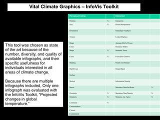
- 25. Vital Climate Graphics ŌĆō InfoVis Toolkit Perceptual Coding Interaction Position X Interaction Size X Direct Manipulation Orientation Immediate Feedback Texture Linked Displays Shape Animate Shift of Focus This tool was chosen as state Color Dynamic ║▌║▌▀Żrs of the art because of the Shape X Semantic Zoom number, diversity, and quality of Color X Focus Plus Context available infographs, and their specific usefulness for Shading Details on Demand individuals interested in all Depth Cues Output/Input areas of climate change. Surface Because there are multiple Motion Information Density infographs included, Only one Stereo Maximize Data-Ink Ratio X infograph was evaluated with the InfoVis Toolkit, ŌĆ£Projected Proximity X Maximize Data Density X Similarity X Minimize Lie Factor X changes in global temperature.ŌĆØ Continuity X Connectedness Closure Containment
