Collecting and Presenting Data
•
1 like•1,099 views

This document provides instructions for collecting and presenting data using Excel and PowerPoint. It guides the reader through downloading GDP data from a government website, cleaning and projecting the data in Excel, and creating a line chart comparing actual GDP to a 4% projected growth rate. The chart is then copied into a PowerPoint presentation. Key steps include downloading GDP tables from the ONS website, adding a column in Excel to project GDP growth at 4% annually, and formatting the line chart in PowerPoint to clearly show actual GDP lagging the projected growth path with a message highlighting this gap.

Collecting and Presenting Data
- 1. Collecting and Presenting Data A step-by-step exercise using Excel and Powerpoint Anthony J. Evans Professor of Economics, ESCP Europe www.anthonyjevans.com (cc) Anthony J. Evans 2018 | http://creativecommons.org/licenses/by-nc-sa/3.0/
- 2. Getting started 1. Download "aje_template.potx” – Creating a template in Powerpoint is a good way to save time and ensure consistency – Create the design you want, select “save as”, and choose the template format – When you open Powerpoint make sure you select “New from Template” rather than “New Presentation” – All templates are saved as .potx files in a designated folder • Word templates are .dotx • Excel templates are .xltx – Alternatively, you could open an existing presentation that you’re happy with and use that as a basis 2
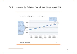
- 3. Task 1: replicate the following (but without the patterned fill) 3
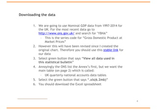
- 4. Downloading the data 1. We are going to use Nominal GDP data from 1997-2014 for the UK. For the most recent data go to http://www.ons.gov.uk/ and search for "YBHA” – This is the series code for “Gross Domestic Product at Market Prices” 2. However this will have been revised since I created the original chart. Therefore you should use this stable link for our data 3. Select green button that says “View all data used in this statistical bulletin” 4. Annoyingly the ONS list the Annex’s first, but we want the main table (on page 2) which is called: – UK quarterly national accounts data tables 5. Select the green button that says “.xls(6.2mb)” 6. You should download the Excel spreadsheet 4
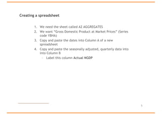
- 5. Creating a spreadsheet 1. We need the sheet called A2 AGGREGATES 2. We want “Gross Domestic Product at Market Prices” (Series code YBHA) 3. Copy and paste the dates into Column A of a new spreadsheet 4. Copy and paste the seasonally adjusted, quarterly data into into Column B – Label this column Actual NGDP 5
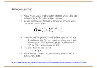
- 6. Adding a projection 1. Actual NGDP was at it’s highest in 2008 Q1. We need to add a 4% growth rate from the peak of the boom 2. We use the following formula to convert an annual growth rate into a quarterly one: 3. Insert the desired growth rate into Cell C3 (in our case 4%) – If you Format the Cell you can either categorise it as a number (0.04) or as a percentage (4). If you enter a “%” sign Excel should recognise this 4. Insert the formula into Cell C2 – (1+C3)^(1/4)-1 5. This allows us to apply a 4% year-on-year growth rate to our quarterly data 6 Q = (1+Y)1/4 −1 See: http://www.experiglot.com/2006/06/07/how-to-convert-from-an-annual-rate-to-an-effective-periodic-rate-javascript-calculator/
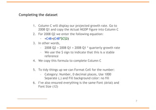
- 7. Completing the dataset 1. Column C will display our projected growth rate. Go to 2008 Q1 and copy the Actual NGDP figure into Column C 2. For 2008 Q2 we enter the following equation: – =C48+(C48*$C$2) 3. In other words, – 2008 Q2 = 2008 Q1 + 2008 Q1 * quarterly growth rate – We use the $ sign to indicate that this is a stable reference 4. We copy this formula to complete Column C 5. To tidy things up we can Format Cell for the number: – Category: Number, 0 decimal places, Use 1000 Separate (,) and Fill background color: no fill 6. I’ve also ensured everything is the same Font (Arial) and Font Size (12) 7
- 8. Creating the graph 1. We can now insert a line chart comparing the Actual NGDP and the 4% projection 2. I’ve moved the chart into a new sheet so that it’s easier to work with – Change Font to Arial – Place the Legend at the Bottom – Format the 4% series so that the Line is 1.5pt weight and dashed – Add “£ million” to the Y axis title – I’ve also renamed the sheets and switched their order 3. Copy and paste the chart into Powerpoint – Resize so that width = 20 (but make sure the height is proportionally resized as well) • Save the file as a PDF 8
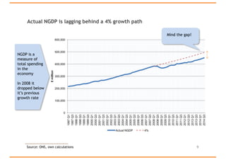
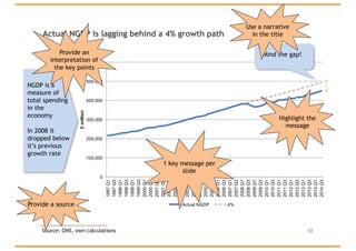
- 9. Actual NGDP is lagging behind a 4% growth path 9 0 100,000 200,000 300,000 400,000 500,000 600,000 1997Q1 1997Q3 1998Q1 1998Q3 1999Q1 1999Q3 2000Q1 2000Q3 2001Q1 2001Q3 2002Q1 2002Q3 2003Q1 2003Q3 2004Q1 2004Q3 2005Q1 2005Q3 2006Q1 2006Q3 2007Q1 2007Q3 2008Q1 2008Q3 2009Q1 2009Q3 2010Q1 2010Q3 2011Q1 2011Q3 2012Q1 2012Q3 2013Q1 2013Q3 2014Q1 2014Q3 £million Actual NGDP 4% NGDP is a measure of total spending in the economy In 2008 it dropped below it’s previous growth rate Mind the gap! Source: ONS, own calculations
- 10. Actual NGDP is lagging behind a 4% growth path 10Source: ONS, own calculations 0 100,000 200,000 300,000 400,000 500,000 600,000 1997Q1 1997Q3 1998Q1 1998Q3 1999Q1 1999Q3 2000Q1 2000Q3 2001Q1 2001Q3 2002Q1 2002Q3 2003Q1 2003Q3 2004Q1 2004Q3 2005Q1 2005Q3 2006Q1 2006Q3 2007Q1 2007Q3 2008Q1 2008Q3 2009Q1 2009Q3 2010Q1 2010Q3 2011Q1 2011Q3 2012Q1 2012Q3 2013Q1 2013Q3 2014Q1 2014Q3 £million Actual NGDP 4% 1 key message per slide Highlight the message Provide a source NGDP is a measure of total spending in the economy In 2008 it dropped below it’s previous growth rate Provide an interpretation of the key points Mind the gap! Use a narrative in the title
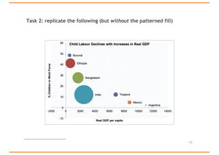
- 11. Task 2: replicate the following (but without the patterned fill) 11
- 12. Graphing three variables • This example is taken from the excellent textbook: • Cowen, T., and Tabarrok, A., Modern Principles: Macroeconomics, (Worth, 2013) – see Appendix A-9 1. Download "aje_data_2.xlsx" – A line chart shows us that child labour declines with increases in real GDP – But we also want to understand the total amount of child labour in each country 2. Create a Bubble graph (under “Other”) with: – Real GDP on the X axis – % Children in Workforce on the Y axis – Total Children in the Workforce as the “size” 3. Instead of a legend chose “Data Labels” and “Series Name” 4. Add a title, increase the font size to 16 and remove gridlines 5. Save as Picture (select PNG) 12