Color theorist presi.
ŌĆó
0 likesŌĆó425 views

Moses Harris (1730-c.1788) was an English entomologist and engraver who studied color theory. In his 1766 book "Natural System of Colours", Harris built upon earlier work to develop a color system based on subtractive mixing of three primary colors - red, yellow, and blue. Harris introduced the first printed color circle specifying the three primaries and showed how intermediate and compound colors could be produced by mixing the primaries. His system organized colors in a circular arrangement according to intensity based on the subtraction of wavelengths when colors are combined. Harris' work provided an alternative to Newton's additive color theory based on light.


More Related Content
Similar to Color theorist presi. (20)
Color theorist presi.
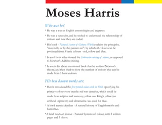
- 1. Moses Harris 15 April 1730 ŌĆō c. 1788 Who was he? * He was a was an English entomologist and engraver. * He was a naturalist, and he wished to understand the relationship of colours and how they are coded. * His book - Natural System of Colours (1766) explains the principles, "materially, or by the painters art", by which all colours can be produced from 3 basic colours - red, yellow and blue. * It was Harris who showed the Subtractive mixing of colours, as opposed to NewtonŌĆÖs Additive mixing. * It was in his above mentioned book that he analised NewtonŌĆÖs theory, and then tried to show the number of colours that can be made from 3 basic colours. His best known works are: * Harris introduced the first printed colour-circle in 1766, specifying his primary colours very exactly: red was cinnabar, which could be made from sulphur and mercury; yellow was KingŌĆÖs yellow (an artificial orpiment); and ultramarine was used for blue. * A book named Aurilian - A natural history of English moths and butterflies. *A brief work on colour - Natural Systems of colour, with 8 written pages and 3 charts.
- 2. Moses HarrisŌĆÖ Colour Theory Basis of the Theory Harris builds upon the discovery by the Frenchman Jacques Christophe Le Blon (1667-1742). Le Bon is credited with the invention of colour printing. In his book Natural Systems of colour, he has shown a well organised and well ordered arrangement of three premitave colours which are: 1. Red 2. Blue 3. Yellow He has shown the relationship of how these colours form all the various colours and their dependence on these colours which he termed as ŌĆ£PrismaticŌĆØ colours and these formed the ŌĆ£Prismatic Colour Wheel.ŌĆØ
- 3. Prismatic Circle Prismatic Colours Compond Colours unmixed pigments (grand or principal intermediate colours (mediates) colours) and not Light 1. Orange 1. Red 2. Green 2. Blue 3. Purple 3. Yellow Mixing Prismatic Colours Give you Compound Colours 1. Red + Yellow = Orange 2. Blue + Yellow = Green 3. Blue + Red = Violet Explaining the Theory - Subtraction and Intensity According to Harris mixing any two of these colours together will get 18 different colours according to the predominance of any one of the two colours. The circle would go in a sequence of the following, each having 20 levels of intensity following the subtraction method. Red, Red-Orange, Orange- Red, Orange, Yellow-Orange, Orange-Yellow, Yellow, Yellow-Green, Green- Yellow, Green, Blue-Green, Green-Blue, Blue, Blue-Purple, Purple- Blue, Purple, Red-Purple, Purple-Red and then Red again.
- 4. The Prismatic Circle Red Or ple an Pur ge e Blu Ye ow ll Green
- 5. Orange, Green and Purple are the mixed colours, these are further mixed to form three Tertiary Colours: 1.Brown 2. Olive 3. Slate Harris further mixes the compound colours and produces 18 more colours which inturn result in 300 new colours which altogether leads to 660 colours! But only 33 names are defined as the rest may be termed as dirty or unmeaningfull colour. It is also seen that opposed to NewtonŌĆÖs light theory, All the colours and their correct and equal proportions give the colour Black.
- 6. The Compund colour, Tertiary Circle Orange ple Pur een Gr
- 7. Theory of Subtraction Contrary to NewtonŌĆÖs theory which is based on addition, HarissŌĆÖ theory is based on subtraction of colours. Thre lights blue, Green and Red have different wavelenghts. Blue- short wavelength, Green- Medium and Red- long. Now if we superimpose yellow with blue we get Green according to subtraction. Here is how: Yellow + Blue = Green Green + blue Medium + Short + Short = Medium Here it is seen that the ŌĆ£commonŌĆØ Wavelenght is ŌĆ£subtractedŌĆØ which gives you a medium wavelenghth and hene you obtain the colour Gree.
- 8. References 1.http://www.colorsystem.com/?page_id=743&lang=en 2. http://en.wikipedia.org/wiki/Moses_Harris 3.http://books.google.com/books?id=2vfOyOrRdvAC&pg=PA59&dq=harris+moses+color+ systems&hl=en&sa=X&ei=CdYiUdWzMsyN0QHar4HYBg&ved=0CDkQ6AEwAg#v=onep age&q=harris%20moses%20color%20systems&f=false 4. The Natural System of colours - ebook