ºÝºÝߣ

ºÝºÝߣShare a Scribd company logo
! of !1 3
MARYROSE THALER
Type, Colour & Conceptual Process
Colour Relationships - Complimentary
Complimentary Colours
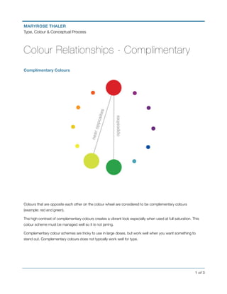
Colours that are opposite each other on the colour wheel are considered to be complementary colours
(example: red and green).
The high contrast of complementary colours creates a vibrant look especially when used at full saturation. This
colour scheme must be managed well so it is not jarring.
Complementary colour schemes are tricky to use in large doses, but work well when you want something to
stand out. Complementary colours does not typically work well for type.
! of !2 3
MARYROSE THALER
Type, Colour & Conceptual Process
Colour Identity - Analogous Colours
Analogous Colours
Analogous colour schemes use colours that are next to each other on the colour wheel. They usually match well
and create serene and comfortable designs. Analogous colour schemes are often found in nature and are
harmonious and pleasing to the eye.
Make sure you have enough contrast when choosing an analogous colour scheme. Choose one colour to
dominate, a second to support. The third colour is used (along with black, white or grey) as an accent.
! of !3 3
MARYROSE THALER
Type, Colour & Conceptual Process
Colour Identity - Triadic Colours
Triadic Colours
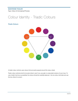
A triadic colour scheme uses colours that are evenly spaced around the colour wheel.
Triadic colour schemes tend to be quite vibrant, even if you use pale or unsaturated versions of your hues. To
use a triadic harmony successfully, the colours should be carefully balanced - let one colour dominate and use
the two others for accent.
More Related Content

Colour relationships

  • 1. ! of !1 3 MARYROSE THALER Type, Colour & Conceptual Process Colour Relationships - Complimentary Complimentary Colours Colours that are opposite each other on the colour wheel are considered to be complementary colours (example: red and green). The high contrast of complementary colours creates a vibrant look especially when used at full saturation. This colour scheme must be managed well so it is not jarring. Complementary colour schemes are tricky to use in large doses, but work well when you want something to stand out. Complementary colours does not typically work well for type.
  • 2. ! of !2 3 MARYROSE THALER Type, Colour & Conceptual Process Colour Identity - Analogous Colours Analogous Colours Analogous colour schemes use colours that are next to each other on the colour wheel. They usually match well and create serene and comfortable designs. Analogous colour schemes are often found in nature and are harmonious and pleasing to the eye. Make sure you have enough contrast when choosing an analogous colour scheme. Choose one colour to dominate, a second to support. The third colour is used (along with black, white or grey) as an accent.
  • 3. ! of !3 3 MARYROSE THALER Type, Colour & Conceptual Process Colour Identity - Triadic Colours Triadic Colours A triadic colour scheme uses colours that are evenly spaced around the colour wheel. Triadic colour schemes tend to be quite vibrant, even if you use pale or unsaturated versions of your hues. To use a triadic harmony successfully, the colours should be carefully balanced - let one colour dominate and use the two others for accent.