Comm wkshop jqfin3
Download as pptx, pdf1 like774 views

The document provides tips to improve graphic design skills in 60 minutes. It discusses key principles of design such as contrast, repetition, alignment and proximity (CRAP). Examples are given of how to apply these principles to create visual hierarchy and guide the viewer's eye through a design. Specific design elements like grid structure, white space, color, and typesetting are also examined in detail with examples of proper and improper applications. The overall message is that understanding and applying basic design principles is key to creating effective visual communication.
![44
ˇ°I donˇŻt think that type
should be expressive at
all. I can write the word
ˇ®dogˇŻ with any typeface
and it doesnˇŻt have to
look like a dog.
But there are people
that [think that] when
they write ˇ®dogˇŻ it
should bark.ˇ±
Massimo Vignelli
http://www.vignelli.com/can
on.pdf](https://image.slidesharecdn.com/commwkshopjqfin3-141013090048-conversion-gate02/85/Comm-wkshop-jqfin3-44-320.jpg)


Comm wkshop jqfin3
- 1. YouˇŻve got the tools, now get the chops. TIPS TO IMPROVE YOUR GRAPHIC DESIGN IN JUST 60 MINUTES J O A N N E Q U I N N T E A M L E A D E R / C O M M U I C A T I O N S & S E R V I C E P R O M O T I O N F A L V E Y M E M O R I A L L I B R A R Y V I L L A N O V A U N I V E R S I T Y L I B R A R Y C O M M U N I C A T I O N S C O N F E R E N C E 2 0 1 4
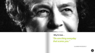
- 2. 2 ˇ°Do one thing everyday that scares you.ˇ± - ELEANOR ROOSEVELT Why IˇŻm hereˇ
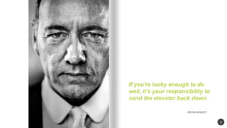
- 3. 3 If you're lucky enough to do well, it's your responsibility to send the elevator back down - KEVIN SPACEY
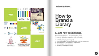
- 4. WEˇŻRE HERE 4 Why weˇŻre all hereˇ How to Brand a Library WHY (ˇand how design helps.) Your companyˇŻs brand is Its most important asset. It must be cultivated, protected and reinforced. ? Builds trust, loyalty and longevity ? Distinguishes your company or product from the competition ? Showcases your organization's core values ? Creates top of mind awareness ? Delivers on the brand promise.
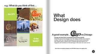
- 5. or Or the BAND? 5 What Design does ˇ the CITY A good exampleˇ vs.. Chicago http://albumcovergallery.blogspot.com/2010/06/chicago-cover-gallery.html e.g.: What do you think of firstˇ Chicago the band has a remarkably strong brand identity. While their sound has changed a lot, their design aesthetic has remained constant. Both their most defining feature and their curse of anonymity, their lengthy series of albums with numbered titles (like editions of a magazine) and variations on the band logo on the cover are iconic as hell.
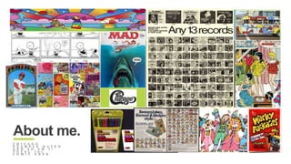
- 6. advertising. print. advertising. Internet marketing. digital animation. About me. C H I C A G O E X A M P L E D A T E D A N D S O A M I ! T O T A L 7 0 s C O M I C G E E K
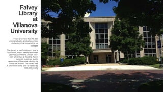
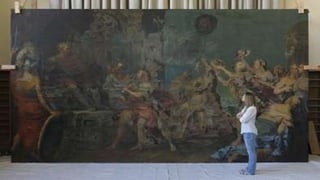
- 7. Falvey Library at Villanova University There are more than 10,000 undergraduate, graduate and law students in the UniversityˇŻs six colleges . The library is two buildings ¨C one is four floors, with a newlly renovated Learning Commons, and an ˇ®Oldˇ± hall, which has a Reading Room currently hosting a public restoration of Baroque painting by Pietro daCortona. The library has 1.2+ million items, and is visitied by 500,000 yearlly
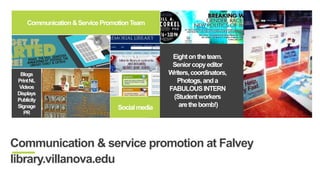
- 9. Eight on the team. Senior copy editor Writers, coordinators, Photogs, and a FABULOUS INTERN (Student workers are the bomb!) Displays Communication & Service Promotion Team Blogs Print NL Videos Displays Publicity Signage PR Social media Communication & service promotion at Falvey library.villanova.edu
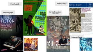
- 10. Event Publicity Print Newsletter Service Promotion Support Team Exhibit Signage Instagram/Tumblr
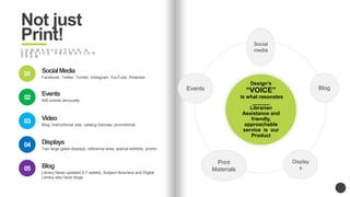
- 16. Not just Print! C O M M U N I C A T I O N & S E R V I C E P R O M O T I O N T E A M Social media Events Blog Print Materials Display s DesignˇŻs ˇ°VOICEˇ± is what resonates ______ Librarian Assistance and friendly, approachable service is our Product Social Media Facebook, Twitter, Tumblr, Instagram, YouTube, Pinterest 01 02 03 04 05 Events 400 events annuually Video Blog, instructional vids, catalog tutorials, promotional. Displays Two large glass displays, reference area, special exhibits, promo Blog Library News updated 5-7 weekly; Subject librarians and Digital Library also have blogs
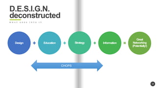
- 17. 17 Design Education Strategy Information Great Networking (Potentially!) D.E.S.I.G.N. deconstructed W H A T G O E S I N T O I T CHOPS
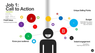
- 18. 18 h B c 1 a < : > h Job 1: Call to Action J A C K D A V I S : A R T O F T H E L O G O O N C R E A T I V E L I V E Know your audience Instant engagement Storytelling ¨C beginning,middle and end Fresh ideas Breaking through the clutter Unique Selling Points Budget Great ideas donˇŻt need a big budget ¨C distribution does. Be creative!
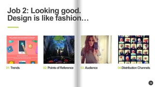
- 19. 19 Job 2: Looking good. Design is like fashionˇ 01. Trends 02. Points of Reference 03. Audience 04.Distribution Channels
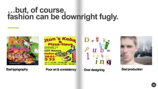
- 20. 20 ˇbut, of course, fashion can be downright fugly. Bad typography Poor art & consistency Over designing Bad production
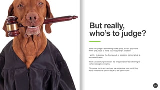
- 21. 21 But really, whoˇŻs to judge? Most can judge if something looks good, but do you know WHY one piece is more successful than another? I will try to expose the framework or skeleton behind what is successful work. Most successful pieces can be stripped down to adhering to certain design principles. Of course, art is art, and can be subjective, but youˇŻll find most commercial pieces stick to the same rules.
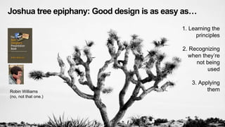
- 22. 22 Joshua tree epiphany: Good design is as easy asˇ 1. Learning the principles 2. Recognizing when theyˇŻre not being used 3. Applying Robin Williams them (no, not that one.)
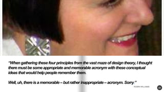
- 23. 23 ˇ°When gathering these four principles from the vast maze of design theory, I thought there must be some appropriate and memorable acronym with these conceptual ideas that would help people remember them. Well, uh, there is a memorable ¨C but rather inappropriate ¨C acronym. Sorry.ˇ± - ROBIN WILLIAMS
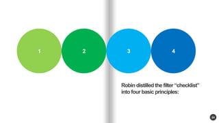
- 24. Multiple sclerosis day care centre 24 K U A L A L U M P U R - 1 9 9 0 1 2 3 4 Robin distilled the filter ˇ°checklistˇ± into four basic principles:
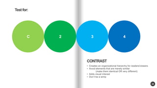
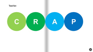
- 25. Multiple sclerosis day care centre 25 K U A L A L U M P U R - 1 9 9 0 C 2 3 4 CONTRAST ? Creates an organizational hierarchy for readers/viewers ? Avoid elements that are merely similar (make them identical OR very different) ? Adds visual interest ? DonˇŻt be a wimp Test for:
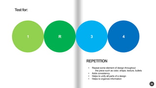
- 26. Multiple sclerosis day care centre 26 K U A L A L U M P U R - 1 9 9 0 1 R 3 4 REPETITION Test for: ? Repeat some element of design throughout the piece such as color, shape, texture, bullets ? Adds consistency ? Helps to unify all parts of a design ? Helps to organize information
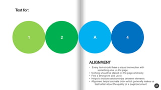
- 27. Multiple sclerosis day care centre 27 K U A L A L U M P U R - 1 9 9 0 1 2 A 4 ALIGNMENT ? Every item should have a visual connection with something else on the page ? Nothing should be placed on the page arbitrarily ? Find a strong line and use it ? Helps to indicate relationships between elements ? Alignment helps to create order which generally makes us feel better about the quality of a page/document Test for:
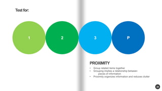
- 28. Multiple sclerosis day care centre 28 K U A L A L U M P U R - 1 9 9 0 1 2 3 P PROXIMITY ? Group related items together ? Grouping implies a relationship between pieces of information ? Proximity organizes information and reduces clutter Test for:
- 29. Multiple sclerosis day care centre 29 Test for: K U A L A L U M P U R - 1 9 9 0 C R A P
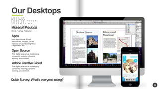
- 30. 30 Our Desktops L O T S O F O P T I O N S , L O T S O F T O O L S , L O T S O F A U T O M A T I O N , T E M P L A T E S A N D P R E S E T S Microsoft Products Word, Frames, Publisher Apps Mac apps/phone & ipad alternatives: Phoster, or old versions of Quark DesignPad, Pagemaker, etc. Open Source The digital space is a challenging, constantly evolving, dynamic working environment. Adobe Creative Cloud The digital space is a challenging, constantly evolving, dynamic working environment. Quick Survey: WhatˇŻs everyone using?
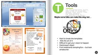
- 31. 31 Tools A S G R A N D P A P P Y S A Y S , A N Y J O B I S E A S I E R W H E N Y O U H A V E T H E R I G H T T O O L S ! V E Y O U R S E L F A F I G H T I N G C H A N C E ! T Maybe some folks can make this sing, butˇ ? Hard to break the templates ? Kills the art of it ? Difficult to get your vision to happen ? Hackneyed clipart ? Font treatments tempting/fun ¨C but look amateurish.
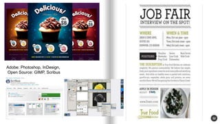
- 32. 32 Adobe: Photoshop, InDesign, Open Source: GIMP, Scribus
- 33. 33
- 34. 34 No guarantees/not condoning, butˇ After about 5 minutes of looking, I foundˇ
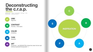
- 35. Deconstructing the c.r.a.p. W H A T T O L O O K F O R I N G O O D D E S I G N a ) w INSPIRATION w ) GRID Alignment, 01 02 03 04 05 CONTRAST Proximity ¨C white space COLOR Consitency TYPE Repetition ART Sensitivinty ¨C and INSPIRATION. Where the rubber hits the road & why you get paid the big bucks!! :-) C R P A S
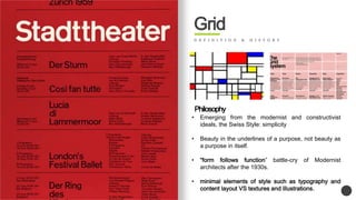
- 36. Grid D E F I N I T I O N & H I S T O R Y Philosophy ? Emerging from the modernist and constructivist ideals, the Swiss Style: simplicity ? Beauty in the underlines of a purpose, not beauty as a purpose in itself. ? ˇ°form follows functionˇ± battle-cry of Modernist architects after the 1930s. ? minimal elements of style such as typography and content layout VS textures and illustrations.
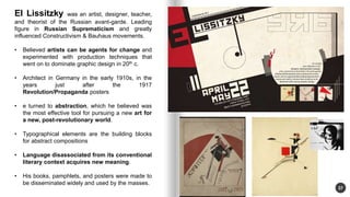
- 37. 37 El Lissitzky was an artist, designer, teacher, and theorist of the Russian avant-garde. Leading figure in Russian Suprematicism and greatly influenced Constructivism & Bauhaus movements. ? Believed artists can be agents for change and experimented with production techniques that went on to dominate graphic design in 20th c. ? Architect in Germany in the early 1910s, in the years just after the 1917 Revolution/Propaganda posters ? e turned to abstraction, which he believed was the most effective tool for pursuing a new art for a new, post-revolutionary world. ? Typographical elements are the building blocks for abstract compositions ? Language disassociated from its conventional literary context acquires new meaning. ? His books, pamphlets, and posters were made to be disseminated widely and used by the masses.
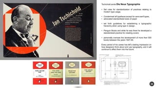
- 38. 38 Tschichold wrote Die Neue Typographie ? Set rules for standardization of practices relating to modern type usage. ? Condemned all typefaces except for sans-serif types, ? advocated standardized sizes of paper ? set forth guidelines for establishing a typographic hierarchy when using type in design. ? Penguin Books and while he was there he developed a standardized practice for creating covers ? personally oversaw the development of more than 500 books between the years 1947-49. Every period of his career has left a lasting impression on how designers think about and use typography, and it will continue to affect them into the future.
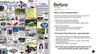
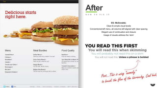
- 40. Before W H E R E A R E T H E E R R O R S ? Messy, Overcomplicated Grids Grid refers to a systematic design that is thought out in advance to create a pleasing, intuitive layout of page elements. A well-designed grid will make the final page ? easy to scan, understand, and interact with. ? A lack of grid structure can have the opposite, negative effect! Notice how in the example: ? Nothing really seems to ˇ°line upˇ± with anything else. ? None of the call to action buttons are aligned.. ? Slows viewer down Think about Visual Hierarchy: gaze heatmaps ? ˇ°Visual Hierarchyˇ± refers to how designers use design language proximity,size, color, motion, etc. communicate which elements on a page are most important. ? Directs the prospectˇŻs gaze along an ˇ°eye pathˇ± that helps them accomplish their goals, ? Persuades them to take a desired action. DonˇŻt draw your prospectˇŻs gaze away from the main point and the primary call to action
- 41. 41 After H O W T O F I X I T EG: McDonalds: Clean & simple visual levels Conventionial left menu, all columns left aligned with clear spacing Elegant use of continuation and closure Usage of visuals address the ˇ®skimˇŻ
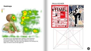
- 42. 42 Heatmaps Use faces to your advantage when creating a visual hierarchy. Humans typically prefer faces than other objects or pieces of information. Further, if we see a face that appears to be looking at an object, we tend to look at that object too. PAULA SCHER
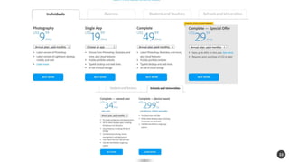
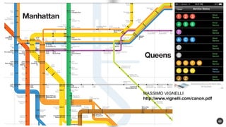
- 43. 43 MASSIMO VIGNELLI http://www.vignelli.com/canon.pdf
- 44. 44 ˇ°I donˇŻt think that type should be expressive at all. I can write the word ˇ®dogˇŻ with any typeface and it doesnˇŻt have to look like a dog. But there are people that [think that] when they write ˇ®dogˇŻ it should bark.ˇ± Massimo Vignelli http://www.vignelli.com/can on.pdf
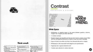
- 45. 45 Contrast D E F I N I T I O N & H I S T O R Y White Space ? Whitespace, or negative space is, the space between graphics, columns, images, text, margins and other elements. ? It creates contrast. ? Simpler designs are beautiful and that we donˇŻt need to create a layout filled with text and graphical elements to deliver a clear and direct message. ? Does not have to be white, but free of any elements like text or images. ? Whitespace is also associated with elegance and sophistication ? Organizes text, organize elements and ? Guides users attention to certain elements.
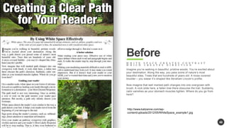
- 46. 46 Before W H I T E S P A C E C R E A T E S C O N T R A S T W H I C H C R E A T E S D I R E C T I O N Imagine youˇŻre walking in beautiful, pristine woods. YouˇŻre excited about your destination. Along the way, you pass some of natureˇŻs most beautiful sites. Trees that are hundreds of years old. A moss covered boulder ¨C you swear itˇŻs shaped like Abraham LincolnˇŻs profile. Now imagine that well marked path changes into one overgrown with brush. A rock slide here, a fallen tree there obscures the trail. Suddenly, calm vanishes as your stomach muscles tighten. Where do you go from here? http://www.katzanne.com/wp-content/ uploads/2012/05/WhiteSpace_example1.jpg
- 47. 47 After ? Open it up ? Edit,edit,edit ? Typographic controls
- 48. 48
- 49. 49 After
- 50. 50
- 51. 51
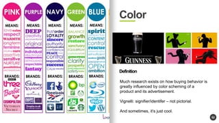
- 52. 52 Color Definition Much research exists on how buying behavior is greatly influenced by color scheming of a product and its advertisement. Vignelli: signifier/identifer ¨C not pictorial. And sometimes, itˇŻs just cool.
- 53. 53 Before
- 54. 54 After
- 55. 55
- 56. 56
- 57. 57
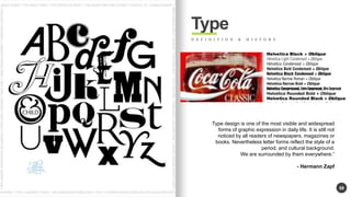
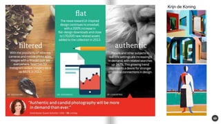
- 58. 58 Type D E F I N I T I O N & H I S T O R Y Type design is one of the most visible and widespread forms of graphic expression in daily life. It is still not noticed by all readers of newspapers, magazines or books. Nevertheless letter forms reflect the style of a period, and cultural background. We are surrounded by them everywhere.ˇ± - Hermann Zapf
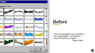
- 59. 59 Before Type and typography are supposed to be a crystal goblet ˇŞ transparent ˇŞ seen and read but not heard. - Steven Heller
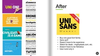
- 60. 60 After ? Buy one good font family ? Sans serif ? DoesnˇŻt have to be expensive ? Watch for deals - mightydeals.com, etc. ? DoesnˇŻt have to be Helvetica ? Use it and only it.
- 61. 61
- 62. 62
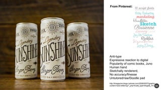
- 63. 63 From Pinterest: Anti-type Expressive reaction to digital Popularity of comic books, Juno Human hand Sketchally rendererd, No accuracy/finesse Untutored/raw/Doodle pad http://tmagazine.blogs.nytimes.com/2009/05/07/graphic-content- hand-lettering/?_php=true&_type=blogs&_r=0
- 64. 64
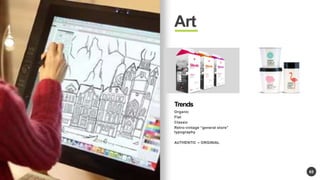
- 65. 65 Art Trends Organic Flat Classic Retro-vintage ˇ°general storeˇ± typography AUTHENTIC ¨C ORGINIAL
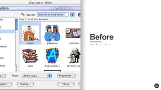
- 66. 66 Before F R O M A T O Z
- 67. 67
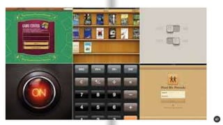
- 68. 68 After
- 69. 69 Krijn de Koning
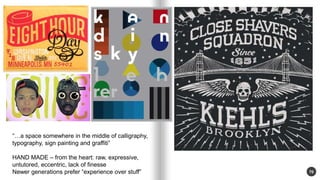
- 70. 70 ˇ°ˇa space somewhere in the middle of calligraphy, typography, sign painting and graffitiˇ± HAND MADE ¨C from the heart: raw, expressive, untutored, eccentric, lack of finesse Newer generations prefer ˇ°experience over stuffˇ±
- 71. 71
- 72. 72
- 73. 73
- 74. 74
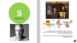
- 75. 75 S ˇ°ˇwhy certain basic human longings for freedom, or heroes, or cleanliness attach themselves so easily to travel guides, bicycle races, plastics, and laundry detergent. ˇ° Marco Roth in The New Yorker on the new edition of Roland BarthesˇŻ Mythologies, 4/18/12 SENSITIVITY
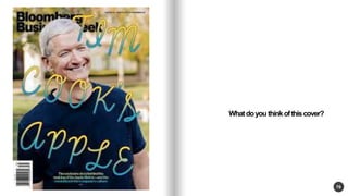
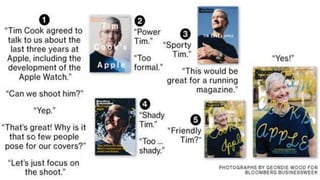
- 76. 76 What do you think of this cover?
- 77. 77
- 78. Steve, who once spent three days in jelly bean factory to find just the 78 right blue for the iMac.
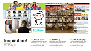
- 79. advertising. print. advertising. Internet marketing. LIBRARIES! 01.Trends: Buzz 02. Marketing 03. Take time to play Inspiration! I think really great products come from melding two points of view the technology point of view and the customer point of view. I think really great products come from melding two points of view the technology point of view and the customer point of view. I think really great products come from melding two points of view the technology point of view and the customer point of view. W H E R E D O E S I T C O M E F R O M ?
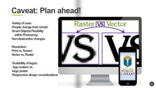
- 81. 81 Caveat: Plan ahead! Variety of uses: People change their minds! Smart Objects Flexibility within Photoshop Non-destructive changes Resolution: Print vs. Screen Vector vs. Raster Scalability of logos: App avatars vs. large poster Responsive design considerations
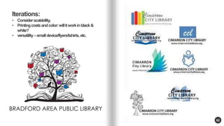
- 82. 82 Iterations: ? Consider scalability, ? Printing costs and color: will it work in black & white? ? versatility ¨Csmall device/flyers/tshirts, etc.
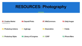
- 83. RESOURCES: Photography A N A L Y S I S & S T A T I S T I C S 07.WikiCommons 10. Getty Images 08. Dreamstime 11. Fotolia 09. 123RF 12. iPhone filters 01.Creative Market 04. Deposit Photo Creativemarket.com 02. Photoshop Actions 05. IngImage 03. Photoshop Styles 06. Library of Congress
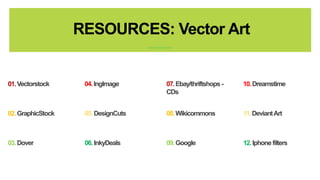
- 84. RESOURCES: Vector Art 07.Ebay/thriftshops - CDs 10. Dreamstime 08. Wikicommons 11. Deviant Art 09. Google 12. Iphone filters 01.Vectorstock 04. IngImage 02. GraphicStock 05. DesignCuts 03. Dover 06. InkyDeals
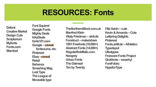
- 88. Dafont Creative Market Design Cuts Scriptorium Myfonts Fonts.com Blambot RESOURCES: Fonts A Font Squirrel N A L Y S I S & S T A T I S T I C S Google Fonts Mighty Deals InkyDeals fonts101.com Google ¨Ccaveat fontsource, etc. Pinterest Ebay-caveat Retail Behance Smashing Mag Lost Type The League of Moveable type TheNorthernBlock.com.uk Manfred Klein VitalyFriedman ¨Calvit.de Fonstruct ¨Cmake/share 1001 Freefonts(10,000+) Abstract Fonts (14,000+) RegularBoldItalic.com Neogrey Urban Fonts The Oatmeal Ten by Twenty FilizSahin¨Ccute Kevin & Amanda ¨CCute Lettering Delights Pinterest Fonts.artill.de ¨CAthletico Typedepot Ultratypes Freeware Fonts Project Glukfonts¨Cswashy! FontFabric HypeforType
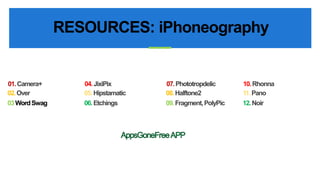
- 94. RESOURCES: iPhoneography 07.Phototropdelic 10. Rhonna 08. Halftone2 11. Pano 09. Fragment, PolyPic 12. Noir 01.Camera+ 04. JixiPix 02. Over 05. Hipstamatic 03 Word Swag 06. Etchings
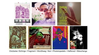
- 95. Clockwise: Etchings ? Fragment ? WordSwag ? Noir ? Phototropedelic ? Halftone2 ? MokuHanga
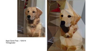
- 96. Apps Gone Free ¨C 10/5/14 Trimaginator
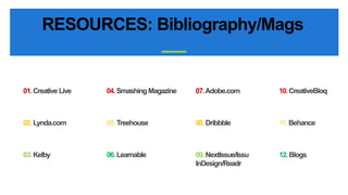
- 97. RESOURCES: Bibliography/Mags 07.Adobe.com 10. CreativeBloq 08. Dribbble 11. Behance 09. NextIssue/Issu InDesign/Readr 12. Blogs 01.Creative Live 04. Smashing Magazine 02. Lynda.com 05. Treehouse 03. Kelby 06. Learnable
- 100. CONFERENCES: PepCon, InDesign CONFERENCES: Photoshop World, City tours ¨C Corey Barker, Scott Kelby, Dave Cross - $89
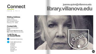
- 101. 101 Connect F R O M A T O Z Mailing Address Falvey Library Villanova University 800 Lancaster Avenue Villanova, PA 19085 Contact Info Phone: 610-519-3871 Email: joanne.quinn@villanova.edu Web: library.villanova.edu/news Look for us on Social Media Facebook.FalveyLibrary Twitter @falveylibrary Instagram Pinterest LinkedIn Google Plus YouTube RebelMouse TUmblr
- 103. Questions?
Editor's Notes
- #60: ----- Meeting Notes (10/5/14 17:58) ----- Just say no!