Content page anaylsis 2
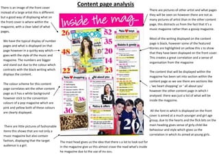
- 1. There is an image of the front cover Content page analysis There are pictures of other artist and what pages instead of a large artist this is different they will be seen on however there are not as but a good way of displaying what on many pictures of artist than in the other content the front cover is where within the page, this distracts us from the fact that it’s a magazine, with a clear label of what music magazine rather than a gossip magazine. pages, Most of the writing displayed on the content We have the typical display of number page is black, however some of the featured pages and what is displayed on that stories are highlighted on yellow this s to show page however in a quirky way which that they have been displayed on the front cover. goes with the style of the music and This creates a great correlation and a sense of magazine. The numbers are bigger organisation from the magazine and stand out due to the colour which contrasts with the black writing which The content that will be displayed within the displays the content. magazine has been set into section within the content page as we see there are sections like The colour scheme for this content ; ‘we heart shopping’ or ‘ all about you’ page correlates wit the other content however the other content page in which I page as it has a white background analysed there was just a list of what will be however stick to the convention inside the magazine. colours of a pop magazine which are pink and yellow both of these colours All the font in which is displayed on the front are clearly displayed. cover is aimed at a much younger and girl age group, due to the hearts and the flick bits on the There are little pictures of fashionable main heading gives sense of girly child like items this shows that are not only a behaviour and style which gives us the music magazine but also contain correlation in which its aimed at young girls. fashion, displaying that the target The mast head gives us the idea that there s a lot to look out for audience is a girl. in the magazine give us this almost crave the read what’s inside he magazine due to the use of the dots.

