Content strategy for mobile
тАв
32 likesтАв2,558 views

Talk given at Appspirina barcamp on March 29th, 2012 in Warsaw organized by http://mobiledeveloper.pl/.


Content strategy for mobile
- 1. Content strategy for mobile & WHY THE HECK SHOULD I CARE? by @karolinaszczur
- 2. WhoтАЩs that girl? Front-end dev and designer with 7 years of experience. Earlier worked at AdTaily and Applicake. Currently @XHTMLized. karolinaszczur
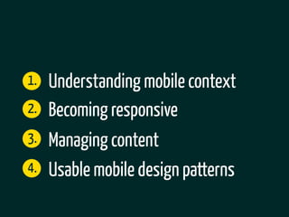
- 3. 1. Understanding mobile context 2. Becoming responsive 3. Managing content 4. Usable mobile design patterns
- 4. 1. Understanding mobile context
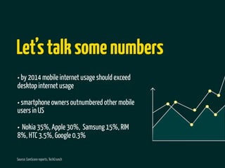
- 5. LetтАЩs talk some numbers тАв by 2014 mobile internet usage should exceed desktop internet usage тАв smartphone owners outnumbered other mobile users in US тАв Nokia 35%, Apple 30%, Samsung 15%, RIM 8%, HTC 3.5%, Google 0.3% Source: ComScore reports, TechCrunch
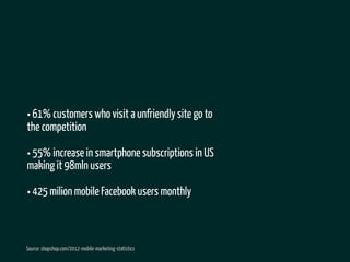
- 6. тАв 61% customers who visit a unfriendly site go to the competition тАв 55% increase in smartphone subscriptions in US making it 98mln users тАв 425 milion mobile Facebook users monthly Source: shapshop.com/2012-mobile-marketing-statistics
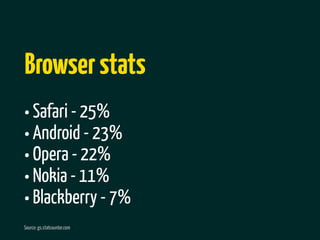
- 7. Browser stats тАв Safari - 25% тАв Android - 23% тАв Opera - 22% тАв Nokia - 11% тАв Blackberry - 7% Source: gs.statcounter.com
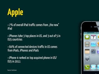
- 8. Apple тАв 7% of overall iPad traffic comes from тАЮthe newтАЭ iPad тАв iPhones take 3 top places in US, and 3 out of 5 in EU5 countries тАв 60% of connected devices traffic in US comes from iPods, iPhones and iPads тАв iPhone 4 ranked as top acquired phone in US/ EU5 in 2011 Source: ComScore
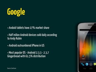
- 9. Google тАв Andoid tablets have 27% market share тАв Half milion Android devices sold daily according to Andy Rubin тАв Android outnumbered iPhone in US тАв Most popular OS - Android 2.3.3 - 2.3.7 Gingerbread with 61.5% distribution Source: ComScore
- 10. Size DOES matter
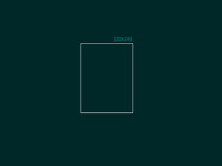
- 12. 320x240
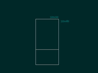
- 13. 320x240 320x480
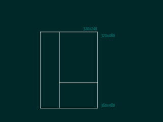
- 14. 320x240 320x480 360x480
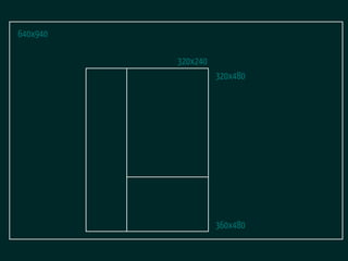
- 15. 640x940 320x240 320x480 360x480
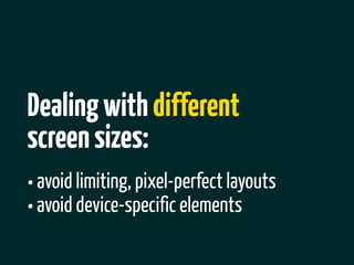
- 16. Dealing with different screen sizes: тАв avoid limiting, pixel-perfect layouts тАв avoid device-specific elements
- 17. Start with the content, not the device.
- 18. There are some myths about mobile context
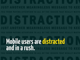
- 19. Mobile users are distracted and in a rush.
- 20. Taps != clicks
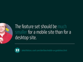
- 21. The feature set should be much smaller for a mobile site than for a desktop site. тАЭ Jakob Nielsen, useit.com/alertbox/mobile-ux-guidelines.html
- 22. Mobile is about apps.
- 24. But whatтАЩs content (strategy) anyway?
- 25. In the web industry, anything that conveys meaningful information to humans is called тАЮcontentтАЭ. тАЭ Erin Kissane, The Elements of Content Strategy (A Book Apart)
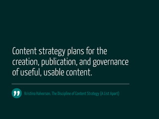
- 26. Content strategy plans for the creation, publication, and governance of useful, usable content. тАЭ Kristina Halvorson, The Discipline of Content Strategy (A List Apart)
- 27. 2. Becoming responsive
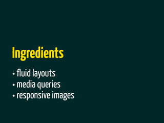
- 28. Ingredients тАв fluid layouts тАв media queries тАв responsive images
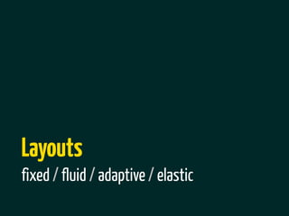
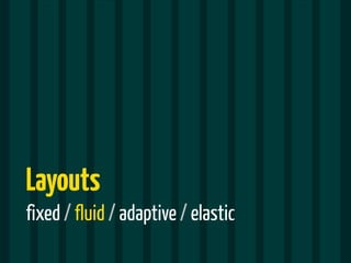
- 29. Layouts fixed / fluid / adaptive / elastic
- 30. Layouts fixed / fluid / adaptive / elastic
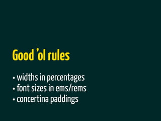
- 31. Good тАЩol rules тАв widths in percentages тАв font sizes in ems/rems тАв concertina paddings
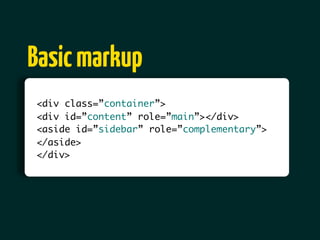
- 32. Basic markup <div class=тАЭcontainerтАЭ> <div id=тАЭcontentтАЭ role=тАЭmainтАЭ></div> <aside id=тАЭsidebarтАЭ role=тАЭcomplementaryтАЭ> </aside> </div>
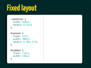
- 33. Fixed layout .container { width: 960px; margin: 0 auto; } #content { float: left; width: 700px; margin: 0 20px 0 0; } #sidebar { float: right; width: 340px; }
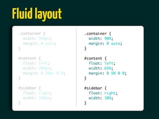
- 34. Fluid layout .container { .container { width: 960px; width: 90%; margin: 0 auto; margin: 0 auto; } } #content { #content { float: left; float: left; width: 700px; width: 65%; margin: 0 20px 0 0; margin: 0 5% 0 0; } } #sidebar { #sidebar { float: right; float: right; width: 340px; width: 30%; } }
- 35. Say тАЮhiтАЭ to relative font-sizing тАв set body font-size to 100% тАв use target/context rule
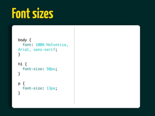
- 36. Font sizes body { font: 100% Helvetica, Arial, sans-serif; } h1 { font-size: 50px; } p { font-size: 13px; }
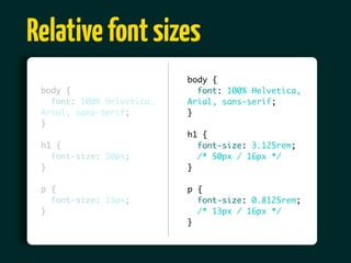
- 37. Relative font sizes body { body { font: 100% Helvetica, font: 100% Helvetica, Arial, sans-serif; Arial, sans-serif; } } h1 { h1 { font-size: 3.125rem; font-size: 50px; /* 50px / 16px */ } } p { p { font-size: 13px; font-size: 0.8125rem; } /* 13px / 16px */ }
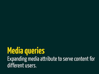
- 38. Media queries Expanding media attribute to serve content for different users.
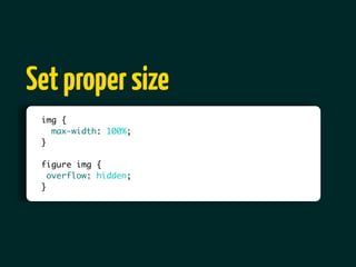
- 40. Set proper size img { max-width: 100%; } figure img { overflow: hidden; }
- 41. 3. Managing content
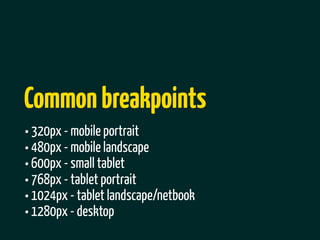
- 43. Common breakpoints тАв 320px - mobile portrait тАв 480px - mobile landscape тАв 600px - small tablet тАв 768px - tablet portrait тАв 1024px - tablet landscape/netbook тАв 1280px - desktop
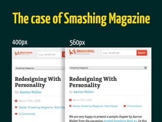
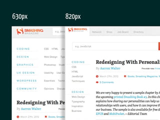
- 44. The case of Smashing Magazine 400px 560px
- 45. 630px 820px
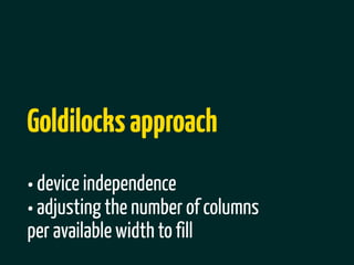
- 46. EMs for resolution independence
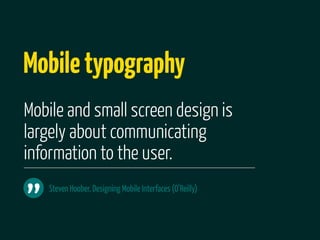
- 47. Goldilocks approach тАв device independence тАв adjusting the number of columns per available width to fill
- 48. Mobile typography Mobile and small screen design is largely about communicating information to the user. тАЭ Steven Hoober, Designing Mobile Interfaces (OтАЩReilly)
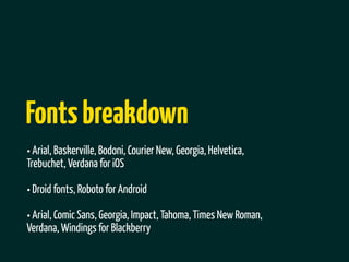
- 49. Fonts breakdown тАв Arial, Baskerville, Bodoni, Courier New, Georgia, Helvetica, Trebuchet, Verdana for iOS тАв Droid fonts, Roboto for Android тАв Arial, Comic Sans, Georgia, Impact, Tahoma, Times New Roman, Verdana, Windings for Blackberry
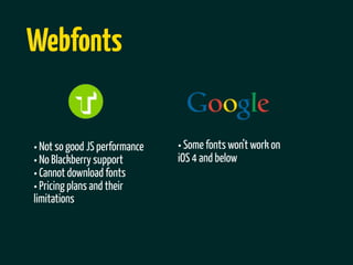
- 50. Webfonts тАв Not so good JS performance тАв Some fonts wonтАЩt work on тАв No Blackberry support iOS 4 and below тАв Cannot download fonts тАв Pricing plans and their limitations
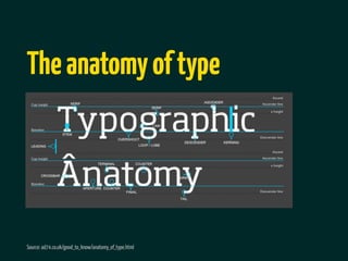
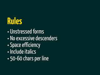
- 51. The anatomy of type Source: ad74.co.uk/good_to_know/anatomy_of_type.html
- 52. Rules тАв Unstressed forms тАв No excessive descenders тАв Space efficiency тАв Include italics тАв 50-60 chars per line
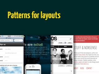
- 53. 4. Mobile usability and design patterns
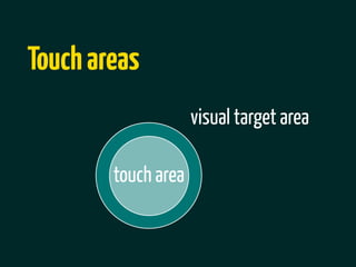
- 54. Designing for touch
- 55. Touch areas visual target area touch area
- 56. 16-22mm 25mm
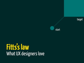
- 57. target start FittsтАЩs law What UX designers love
- 59. Guidelines for devs & designers Android http://developer.android.com/guide/index.html iOS http://developer.apple.com/library/ios/navigation/ Microsoft http://msdn.microsoft.com/en-us/library/cc872774.aspx
- 61. Top navigation
- 63. Select menu
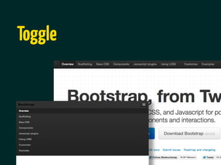
- 64. Toggle
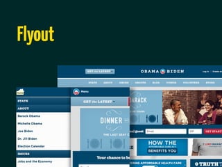
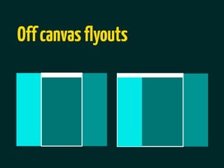
- 65. Flyout
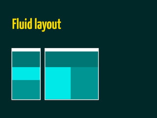
- 67. Fluid layout
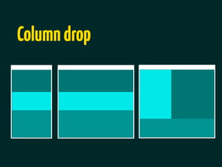
- 68. Column drop
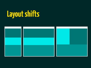
- 69. Layout shifts
- 71. Recommended reading тАв Cloud Four blog тАв Quirksmode тАв Brad Frost blog тАв Designing Mobile Interfaces from OтАЩReilly тАв Filament group blog тАв Luke Wroblewski blog