際際滷

際際滷Share a Scribd company logo
Conventions of CD
  album covers
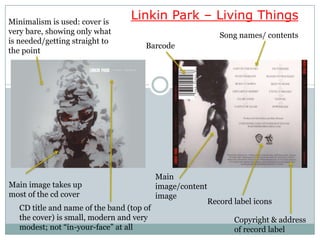
Minimalism is used: cover is
                                  Linkin Park  Living Things
very bare, showing only what                                  Song names/ contents
is needed/getting straight to
                                      Barcode
the point


                                           Main
Main image takes up                        image/content
most of the cd cover                       image
                                                           Record label icons
   CD title and name of the band (top of
   the cover) is small, modern and very                           Copyright & address
   modest; not in-your-face at all                              of record label
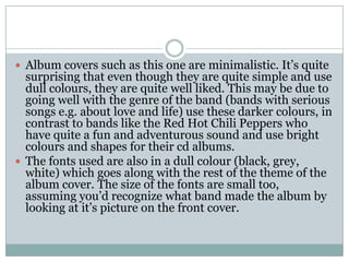
 Album covers such as this one are minimalistic. Its quite
  surprising that even though they are quite simple and use
  dull colours, they are quite well liked. This may be due to
  going well with the genre of the band (bands with serious
  songs e.g. about love and life) use these darker colours, in
  contrast to bands like the Red Hot Chili Peppers who
  have quite a fun and adventurous sound and use bright
  colours and shapes for their cd albums.
 The fonts used are also in a dull colour (black, grey,
  white) which goes along with the rest of the theme of the
  album cover. The size of the fonts are small too,
  assuming youd recognize what band made the album by
  looking at its picture on the front cover.
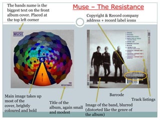
The bands name is the
 biggest text on the front
                                          Muse  The Resistance
 album cover. Placed at                           Copyright & Record company
 the top left corner                              address + record label icons


Main image takes up                                            Barcode
most of the                                                                 Track listings
                             Title of the
cover, brightly                                 Image of the band, blurred
                             album, again small
coloured and bold                               (distorted like the genre of
                             and modest
                                                the album)
 This album cover is the opposite of the one analysed
  before; it uses lots of different colours and shapes to
  catch the audiences attention, yet the majority of the
  songs on the album have a serious theme (e.g.
  politics, apocalyptic events).
 The font colours are quite dark on this album cover
  too and the size/fonts are small and modest.
 These are two contrasting examples: the first is
  minimalistic, using bland colours and photo of a single
  person (with some effects going on) whereas the second
  uses bright colours to draw peoples attention.
 Both were very successful commercially, indicating that
  this colour scheme/layout worked (to some extent at
  least).
 On both covers, the album titles and band names are in
  quite small font. This is probably because they are two
  well known bands and dont need to advertise their name
  as much to gain attention.

More Related Content

What's hot (20)

DOCX
Seafret album cover
JadeHillier
PPTX
DIGIPAK ANALYSIS
rmackrory10
PPT
Research into digipacks
mattelrick24
PPTX
Analysing digipaks
051MARY
PPTX
Ancillary product analysis
TSmith2010
PPTX
pendulum immersion ancillary
TSmith2010
PDF
Catfish and the bottlemen
Taggar97
PPTX
Album cover analysis
JamesGamesStudios
PPTX
Analysis of digi packs
Edward Towers
PPTX
Summer homework task 2
Wezman3000
PPTX
Magazine advert analysis
Sam_C_Ryder
PPTX
G324- Researching existing media products.
elissa_a
PPTX
Researching Existing Products- Rock Albums
elissa_a
PPTX
Alaysis of albums
meganomearaaa
PPTX
Analysis
meganomearaaa
PPTX
Different indie digipacks
whslaura
PPTX
Magazine cd adverts
Shiplake college
PPTX
Existing Back Covers
talitha-roberts
ODP
Analysis of 10 album covers
Tomspratley
PPTX
Magazine Adverts Analysis
lolaleparapluie
Seafret album cover
JadeHillier
DIGIPAK ANALYSIS
rmackrory10
Research into digipacks
mattelrick24
Analysing digipaks
051MARY
Ancillary product analysis
TSmith2010
pendulum immersion ancillary
TSmith2010
Catfish and the bottlemen
Taggar97
Album cover analysis
JamesGamesStudios
Analysis of digi packs
Edward Towers
Summer homework task 2
Wezman3000
Magazine advert analysis
Sam_C_Ryder
G324- Researching existing media products.
elissa_a
Researching Existing Products- Rock Albums
elissa_a
Alaysis of albums
meganomearaaa
Analysis
meganomearaaa
Different indie digipacks
whslaura
Magazine cd adverts
Shiplake college
Existing Back Covers
talitha-roberts
Analysis of 10 album covers
Tomspratley
Magazine Adverts Analysis
lolaleparapluie

Similar to Conventions of cd album covers (20)

PPT
Digipak and advert
cosmicretribution
PPTX
Digipack decon 2
emmagranfield
PPTX
Digipak
chelseaharper
PPTX
Album cover analysis
JamesGamesStudios
PPT
Ancillary task - media - Josh Manley
joshmanley98
PPTX
Digipak analysis 2
Sharmin Hoque
PPT
Digipack Presentation
Jade_16
PPTX
Digipak analysis
Terry-W
PPTX
Digipack analysis 3
baki123
PPTX
Magazine Advert Analysis
shiplakecollege
PPTX
Digipak and contents analysis As Media coursework
elliotballasmedia
PPTX
Cd cover design
cakeylol
PPTX
CD cover analysis
Browner97
DOCX
Music Digipak Research
JoshRobinson12
PPTX
The Wombats Digipack
Holly Payne
PPTX
The Wombats Digipack
Holly Payne
PPTX
Digipak Research
chelseaharper
PPTX
Digipak analysis
ryan99jenkins
PPT
Nando powerpoint ancillary
fernando_rocha
PPTX
In Love and Death Analysis
emily54889
Digipak and advert
cosmicretribution
Digipack decon 2
emmagranfield
Digipak
chelseaharper
Album cover analysis
JamesGamesStudios
Ancillary task - media - Josh Manley
joshmanley98
Digipak analysis 2
Sharmin Hoque
Digipack Presentation
Jade_16
Digipak analysis
Terry-W
Digipack analysis 3
baki123
Magazine Advert Analysis
shiplakecollege
Digipak and contents analysis As Media coursework
elliotballasmedia
Cd cover design
cakeylol
CD cover analysis
Browner97
Music Digipak Research
JoshRobinson12
The Wombats Digipack
Holly Payne
The Wombats Digipack
Holly Payne
Digipak Research
chelseaharper
Digipak analysis
ryan99jenkins
Nando powerpoint ancillary
fernando_rocha
In Love and Death Analysis
emily54889
Ad

More from Tom Mulholland (20)

PPTX
Survey analysis for evaluation q 3
Tom Mulholland
PPTX
Ancillary task 1 album upload version
Tom Mulholland
PPTX
Survey analysis for evaluation q 3
Tom Mulholland
PPTX
Ancillary task 2 magazine advert
Tom Mulholland
PPTX
Ancillary task 2 magazine advert
Tom Mulholland
PPTX
Ancillary task 1 album upload version
Tom Mulholland
PPTX
Ancillary task 2 magazine advert upload version
Tom Mulholland
PPTX
Ancillary task 2 magazine advert upload version
Tom Mulholland
PPTX
Ancillary task 2 magazine advert
Tom Mulholland
PPTX
Ancillary task 1 album upload version
Tom Mulholland
DOCX
Shotlist
Tom Mulholland
DOCX
Shotlist
Tom Mulholland
DOCX
Shotlist
Tom Mulholland
PPTX
Risk assessment upload version
Tom Mulholland
DOCX
Magazine advert draft 1 upload version
Tom Mulholland
DOCX
Magazine advert draft 2 upload version
Tom Mulholland
PPTX
Production planning table
Tom Mulholland
PPTX
Draft 2 of my album cover powerpoint
Tom Mulholland
PPTX
Product planning
Tom Mulholland
PPTX
Product planning
Tom Mulholland
Survey analysis for evaluation q 3
Tom Mulholland
Ancillary task 1 album upload version
Tom Mulholland
Survey analysis for evaluation q 3
Tom Mulholland
Ancillary task 2 magazine advert
Tom Mulholland
Ancillary task 2 magazine advert
Tom Mulholland
Ancillary task 1 album upload version
Tom Mulholland
Ancillary task 2 magazine advert upload version
Tom Mulholland
Ancillary task 2 magazine advert upload version
Tom Mulholland
Ancillary task 2 magazine advert
Tom Mulholland
Ancillary task 1 album upload version
Tom Mulholland
Shotlist
Tom Mulholland
Shotlist
Tom Mulholland
Shotlist
Tom Mulholland
Risk assessment upload version
Tom Mulholland
Magazine advert draft 1 upload version
Tom Mulholland
Magazine advert draft 2 upload version
Tom Mulholland
Production planning table
Tom Mulholland
Draft 2 of my album cover powerpoint
Tom Mulholland
Product planning
Tom Mulholland
Product planning
Tom Mulholland
Ad

Conventions of cd album covers

  • 1. Conventions of CD album covers
  • 2. Minimalism is used: cover is Linkin Park Living Things very bare, showing only what Song names/ contents is needed/getting straight to Barcode the point Main Main image takes up image/content most of the cd cover image Record label icons CD title and name of the band (top of the cover) is small, modern and very Copyright & address modest; not in-your-face at all of record label
  • 3. Album covers such as this one are minimalistic. Its quite surprising that even though they are quite simple and use dull colours, they are quite well liked. This may be due to going well with the genre of the band (bands with serious songs e.g. about love and life) use these darker colours, in contrast to bands like the Red Hot Chili Peppers who have quite a fun and adventurous sound and use bright colours and shapes for their cd albums. The fonts used are also in a dull colour (black, grey, white) which goes along with the rest of the theme of the album cover. The size of the fonts are small too, assuming youd recognize what band made the album by looking at its picture on the front cover.
  • 4. The bands name is the biggest text on the front Muse The Resistance album cover. Placed at Copyright & Record company the top left corner address + record label icons Main image takes up Barcode most of the Track listings Title of the cover, brightly Image of the band, blurred album, again small coloured and bold (distorted like the genre of and modest the album)
  • 5. This album cover is the opposite of the one analysed before; it uses lots of different colours and shapes to catch the audiences attention, yet the majority of the songs on the album have a serious theme (e.g. politics, apocalyptic events). The font colours are quite dark on this album cover too and the size/fonts are small and modest.
  • 6. These are two contrasting examples: the first is minimalistic, using bland colours and photo of a single person (with some effects going on) whereas the second uses bright colours to draw peoples attention. Both were very successful commercially, indicating that this colour scheme/layout worked (to some extent at least). On both covers, the album titles and band names are in quite small font. This is probably because they are two well known bands and dont need to advertise their name as much to gain attention.