


convergence.vc
- 2. COLORS SIGNATURE INTRODUCTION MISUSES TYPOGRAPHY SOCIAL MEDIA 03 02 01 04 05 06 15 06 03 19 21 23
- 4. We are a global community exploring and enabling the convergence of blockchains and other decentralisation technologies with AI, robotics, IoT, 3D printing, & mixed reality. We do this by bringing together experts from each ’¼üeld to connect and break out of silos with a community of early adopters and large corporations. ABOUT KEYWORDS EXPLORE TOGETHER CONVERGE CONNECT ATTRACT
- 5. EVENTS We bring people together from across disciplines at a series of local and global events throughout the year. RESEARCH & MEDIA Throughout the year we carry out research with leading experts into areas of convergence speci’¼üc to certain sectors. INVESTING We take 50% of money raised from event tickets and research to invest into the best startups in the convergence space. WHAT WE DO
- 6. SIGNATURE02
- 8. CLEAR ZONES The following is the clear zone rule for the wordmark. In order to gain maximum visibility, it should always appear with a minimum area of clear space around the typography. This area should be free of any type or graphic element. Using the O letter dimension reduced to 80%, the clear space is a 1x area around the entire signature. X 80% X
- 9. CLEAR ZONES The following is the clear zone rule for the icon. In order to gain maximum visibility, it should always appear with a minimum area of clear space around the logo. This area should be free of any type or graphic element. Using the icon reduced to 20%, the clear space is a 1x area around the entire signature. 20% X X
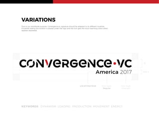
- 10. VARIATIONS Due to our worldwide purpose, Convergence.vc signature should be adapted to its different localities. A subtitle stating the location is placed under the logo and the icon gets the local matching colors when appears separated. KEYWORDS DYNAMISM LOADING PRODUCTION MOVEMENT ENERGY America 2017 X 45% X Font Style UltraLight Font Style Regular LOCATION/YEAR
- 12. COLORS03
- 13. COLOR PALLETE Color is a powerful way of identi’¼ücation. The consistent use of Convergence.vc colors will help build visibility and recognition for the company. BLACK #000000 R0 G0 B0 C100 M100 Y100 K100 Pantone Black 6C RED #C72127 R199 G33 B39 C15 M100 Y100 K5 Pantone 3546 C LIGHT GRAY #D9D9D6 R217 G217 B210 C14 M10 Y15 K0 Pantone Cool Gray 1 C DARK GRAY #96999B R150 G153 B155 C45 M35 Y35 K0 Pantone Cool Gray 7 C
- 14. BLACK BACKGROUND Across applications, every effort should be made to adapt the full-color signature to different backgrounds.
- 15. GRAYSCALE However, in instances where color is limited for printing, use the grayscale option below.
- 16. MISUSES04
- 17. MISUSES The signature's integrity should be respected at all times, in all places. Please do not stretch, condense, increase or distort its form. Changing any graphic element of it will weaken its impact and detract from the consistent image we seek to project. The illustrations below describe some, but not all, of the more common misunderstandings and inappropriate uses of the signature. Please use only approved electronic art when reproducing Convergence.vc signature. Do not play with the scale of the logo. The proportions should not be altered in any way. Do not change the colors of the logo. Do not change the orientation of the logo by rotating it any way. Do not add any kind of effects like a drop shadow to the logo. Do not stroke the logo. Do not crop the logo in any way. Do not lay any kind of transparency over the logo. Do not overlap anything on the logo. Do not alter the spacing of the logo in any way. Do not change the color of the details.
- 18. TYPOGRAPHY05
- 19. Montserrat An open source font available from Google Fonts (8 font styles) by Julieta Ulanovsky ABCDEFGHIJKLMNOPQRSTUVWXYZ abcdefghijklmnopqrstuvwxyz 0123456789!?@#$%& Hairline ABCDEFGHIJKLMNOPQRSTUVWXYZ abcdefghijklmnopqrstuvwxyz 0123456789!?@#$%& Ultra Light ABCDEFGHIJKLMNOPQRSTUVWXYZ abcdefghijklmnopqrstuvwxyz 0123456789!?@#$%& Light ABCDEFGHIJKLMNOPQRSTUVWXYZ abcdefghijklmnopqrstuvwxyz 0123456789!?@#$%& Regular ABCDEFGHIJKLMNOPQRSTUVWXYZ abcdefghijklmnopqrstuvwxyz 0123456789!?@#$%& Semi Bold ABCDEFGHIJKLMNOPQRSTUVWXYZ abcdefghijklmnopqrstuvwxyz 0123456789!?@#$%& Bold ABCDEFGHIJKLMNOPQRSTUVWXYZ abcdefghijklmnopqrstuvwxyz 0123456789!?@#$%& Extra Bold ABCDEFGHIJKLMNOPQRSTUVWXYZ abcdefghijklmnopqrstuvwxyz 0123456789!?@#$%& Black
- 20. SOCIAL MEDIA06
- 23. ADJUSTMENT LAYER HUE/SATURATION SATURATION 80 LIGHTNESS - 50 BLACK LAYER COLOR FILL #000000 20% MULTIPLY ORIGINAL PHOTO FILTER ADOBE PHOTOSHOP CC