Creative Design Process and Best Practices
- 1. Creative Design & Usability Engineering
- 2. Overview Methodical, practical & systematic way of creating user interfaces and framework through which users interact with applications/websites Usability Engineering/Human Computer Interaction/ Interaction Design/User Experience Design
- 3. User Experience Design - Methodology
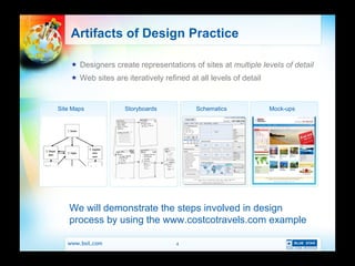
- 4. Artifacts of Design Practice Designers create representations of sites at multiple levels of detail Web sites are iteratively refined at all levels of detail Site Maps Storyboards Schematics Mock-ups We will demonstrate the steps involved in design process by using the www.costcotravels.com example
- 5. Schematics Page structure with respect to information & navigation
- 6. Mock-ups High-fidelity, precise representation of page
- 7. Mock-ups
- 8. Research and Best Practices
- 9. How the Eyes Move Series of movements and pauses, called saccades (ave. 100 msec) and fixations (ave. 250 msec) Eyes follow a scanpath [Eyetrack III, Poynter Inst. 2003]
- 10. How Users Look at News Web Sites Start in upper left quadrant Users look at text first Users look at the first few words of headlines Users read five headlines before clicking ˇ° Banner blindnessˇ± - users donˇŻt look at ads or quickly look away Text ads viewed more than graphic ads [Eyetrack III, Poynter Inst. 2003]
- 11. Response Times The 3 Important Limits 0.1 second is the limit for having user feel system is reacting instantaneously 1.0 second is the limit for user ˇŻs flow of thought to stay uninterrupted (no feedback necessary, but user will lose feeling of operating directly on data) 10 seconds is limit for keeping user ˇŻs attention focused on page (for longer delays, percent-done progress indicator should be used) [Nielsen 1997, Miller 1968, Card et al. 1991]
- 12. Color Schemes Monochromatic Analogous Complementary Triadic [Skaalid 1999, Classic Graphic Design Theory]
- 13. Costco Implementation Brand colors used across the Design ( Red and Blue as in Logo ) Colors play important role to set the mood and touch upon the feelings of the User
- 14. Text and Background Maximize difference of intensity Don ˇŻt use patterned background Light on dark, dark on light?
- 15. How to Make Web Pages Readable Use scannable text Highlighted keywords Meaningful sub-headings Bulleted lists One idea per paragraph Inverted pyramid style of writing (conclusion first) Half the word count of conventional writing No ˇ°marketeseˇ± Credibility is important [Nielsen, 2006]
- 16. Costco Implementation Smart usage of text through Different Font Style, size and color, to create Emphasis on what the user has to Focus
- 17. Skill Sets Illustration Corel Draw Adobe Freehand Adobe Illustrator Image Processing Expression Design Adobe Photoshop Adobe Fireworks Animation Adobe Flash 3D Studio Max Swish Web World Expression Blend Adobe Dreamweaver Microsoft FrontPage
- 18. Skill Sets Digital Audio/Video Adobe Premier Windows Media Producer Real Media Producer Sound Forge Content Management Tool MS-CMS2002 Ektron Kentico
- 19. Online Design work www.vayama.com www.onhotels.com www.sotctours.com www.costcotravel.com www.alaska.org www.classicvacations.com www.ftc-i.net www.endurancegroup.com mahades.maharashtra.gov.in www.door2tour.com www.proflowers.com reservations.wynnlasvegas.com www.voyage.tv electronics.bluestarindia.com For more details visit creative.bsil.com
- 20. Thank You Engineering Business Outcomes For more details email [email_address]
Editor's Notes
- We realize that what matters most are not just great technology solutions, but building great presentation systems that shape the user experience and create positive brand interactions, which ultimately translate to greater value for the client and better-engineered solutions at the back-end.
- Usability Engineering is a planned & methodical approach to developing any products & websites that works for the users and deliver the results that they are looking for. It ˇŻ s a practical and systematic way of creating user interfaces and the framework through which a user would interact with the product or the website
- Interaction: Determine the goals for the solution from the perspective of the user and the business Determine the user profile, user needs, user behaviour & concerns and target usability requirements Determine feature functionality Evaluate existing versions of the product (If any) Perform a competitive analysis ? Ideation: Sketch out information architecture & navigational flow at an abstract level Create and project an identity that ˇŻ s true to the core brand properties and can be owned by no one else Develop and streamline content Ideating concept & theme Design interface layout keeping the brand orientation and usability aspect in mind. Interactive visual presentation (conceptual prototype) for the client ˇŻ s approval. Repeat this process (production iteration) until the business goals and user needs are met. ? Implementation: Create templates and perform validation, compatibility, optimization testing. Development of UID - user interface design (Functional prototype). Evaluate performance through testing, quality assurance, usability testing, compatibility & scalability testing Repeat this process (production iteration) until the business goals are met. The final deliverable of this process is relevant functionality, strong branding, user-centric design and consistent look & feel demonstrated through UID. ? ?
- Mention that these are ˇ°real artifacts.ˇ±
- Represents the information and navigation content of a page. Graphic elements are used such as shading, typography, line, layout ¨C but these are not meant to be taken literally from a graphic design standpoint. These would often be roughed out using pen and paper and then created using a graphics program like Illustrator. Sometimes in HTML, sometimes in Word, sometimes in Visio.
- Sometimes roughed out on paper, though if working from schematics perhaps not. Usually created in Photoshop, sometimes would evolve to ˇ°deadˇ± or ˇ°semi-activeˇ± HTML.


![How the Eyes Move Series of movements and pauses, called saccades (ave. 100 msec) and fixations (ave. 250 msec) Eyes follow a scanpath [Eyetrack III, Poynter Inst. 2003]](https://image.slidesharecdn.com/creativedesignprocessandbestpractices-110419044612-phpapp02/85/Creative-Design-Process-and-Best-Practices-9-320.jpg)
![How Users Look at News Web Sites Start in upper left quadrant Users look at text first Users look at the first few words of headlines Users read five headlines before clicking ˇ° Banner blindnessˇ± - users donˇŻt look at ads or quickly look away Text ads viewed more than graphic ads [Eyetrack III, Poynter Inst. 2003]](https://image.slidesharecdn.com/creativedesignprocessandbestpractices-110419044612-phpapp02/85/Creative-Design-Process-and-Best-Practices-10-320.jpg)
![Response Times The 3 Important Limits 0.1 second is the limit for having user feel system is reacting instantaneously 1.0 second is the limit for user ˇŻs flow of thought to stay uninterrupted (no feedback necessary, but user will lose feeling of operating directly on data) 10 seconds is limit for keeping user ˇŻs attention focused on page (for longer delays, percent-done progress indicator should be used) [Nielsen 1997, Miller 1968, Card et al. 1991]](https://image.slidesharecdn.com/creativedesignprocessandbestpractices-110419044612-phpapp02/85/Creative-Design-Process-and-Best-Practices-11-320.jpg)
![Color Schemes Monochromatic Analogous Complementary Triadic [Skaalid 1999, Classic Graphic Design Theory]](https://image.slidesharecdn.com/creativedesignprocessandbestpractices-110419044612-phpapp02/85/Creative-Design-Process-and-Best-Practices-12-320.jpg)


![How to Make Web Pages Readable Use scannable text Highlighted keywords Meaningful sub-headings Bulleted lists One idea per paragraph Inverted pyramid style of writing (conclusion first) Half the word count of conventional writing No ˇ°marketeseˇ± Credibility is important [Nielsen, 2006]](https://image.slidesharecdn.com/creativedesignprocessandbestpractices-110419044612-phpapp02/85/Creative-Design-Process-and-Best-Practices-15-320.jpg)


![Thank You Engineering Business Outcomes For more details email [email_address]](https://image.slidesharecdn.com/creativedesignprocessandbestpractices-110419044612-phpapp02/85/Creative-Design-Process-and-Best-Practices-20-320.jpg)