


Data Visualisation Design Workshop #UXbne
- 2. Cam Taylor @heycamtaylor Product & UX @ 3CS software
- 3. 1. The Problem 2. Data 3. Audience 4. Visuals 5. Pro Tips 6. Team Exercise TodayˇŻs Topics
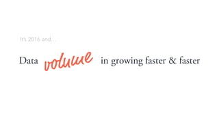
- 4. Data in growing faster & faster ItˇŻs 2016 andˇ
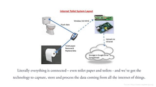
- 5. Literally everything is connected ¨C even toilet paper and toilets - and weˇŻve got the technology to capture, store and process the data coming from all the internet of things. Source: https://www.raspberrypi.org
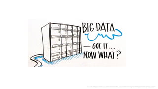
- 6. Meaningˇ ThereˇŻs to use & understand it
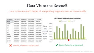
- 8. Data Vis to the Rescue!? ˇour brains are much better at interpreting large amounts of data visually Easier, faster to understandHarder, slower to understand Same data but in visual form Source: http://www.slideshare.net/idigdata/data-visualization-best-practices-2013/6-Audience_Considerations_What_information_does
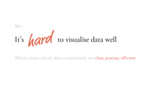
- 9. Butˇ ItˇŻs to visualise data well Which means not all data visualisationˇŻs are clear, precise, efficient
- 10. That doesnˇŻt seem to blunt anyoneˇŻs enthusiasm thoughˇ Source: google image search ˇ°info graphicsˇ±
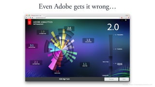
- 11. Even Adobe gets it wrongˇ Source: https://myanalyticsscore.com
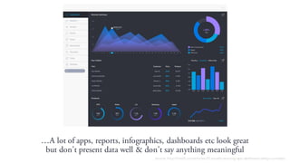
- 12. ˇA lot of apps, reports, infographics, dashboards etc look great but donˇŻt present data well & donˇŻt say anything meaningful Source: http://line25.com/articles/25-visually-stunning-app-dashboard-design-concepts
- 13. WeˇŻre unwittingly making it harder to find the needles of useful information in rapidly growing mounds of hay. Stephen Few ¨C Perpetual Edge
- 15. Every time someone makes a dashboard or infographicˇ Another way of thinking about it
- 16. Even as UXˇŻers sometimes weˇŻre just as guiltyˇ
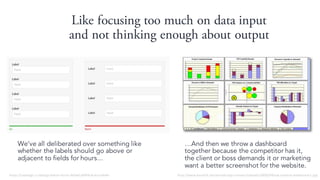
- 17. Like focusing too much on data input and not thinking enough about output WeˇŻve all deliberated over something like whether the labels should go above or adjacent to fields for hours... ˇAnd then we throw a dashboard together because the competitor has it, the client or boss demands it or marketing want a better screenshot for the website. https://uxdesign.cc/design-better-forms-96fadca0f49c#.wuctxle4h http://www.kaushik.net/avinash/wp-content/uploads/2008/04/sub-optimal-dashboard-1.jpg
- 18. So todayˇŻs a good time to learn a few new things and refresh the stuff we already knowˇ. ...about good data visualation practices
- 19. 1. The Problem 2. Data 3. Audience 4. Visuals 5. Pro Tips 6. Team Exercise TodayˇŻs Topics
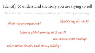
- 20. Identify & understand the story you are trying to tell How are our sales tracking? What clothes should I pack for my holiday? WhatˇŻs our conversion rate? Should I buy this stock? Where is global warming at its worst? This will inform research, analysis and design to deliver your message
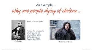
- 21. Why are people dying of choleraˇ *Not this Jon Snow Meet Dr John Snow* https://en.wikipedia.org/wiki/John_Snow Traced the source of a cholera outbreak which killed 600 in Soho, London in September 1854. https://HBO.com An exampleˇ
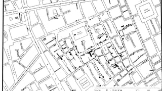
- 22. Taking the data heˇŻd captured from his street corner detective work... ˇHe commissioned lithographer Charles Cheffins to illustrate the clusters of cholera cases
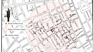
- 24. Broad St Water Pump Radius of Cholera Deaths http://blogs.plos.org/publichealth/files/2013/03/John-Snows-cholera-map-of-009.jpg Cholera Deaths
- 26. 100 years after the event, a pub near the site of the old water pump was named in Jon SnowˇŻs honour. http://www.edwardtufte.com/bboard/q-and-a-fetch-msg?msg_id=0002Je
- 27. 1. The Problem 2. Data 3. Audience 4. Visuals 5. Pro Tips 6. Team Exercise TodayˇŻs Topics
- 28. Who are we designing the Data for?
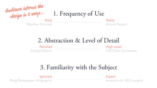
- 29. 1. Frequency of Use 3. Familiarity with the Subject 2. Abstraction & Level of Detail Daily Weather Forecast Yearly Annual Report Expert Analytics for SEO experts Ignorant Blog/Newspaper Infographic High Level CEO Exec Sumamary Detailed Analyst Report
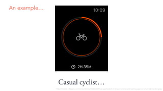
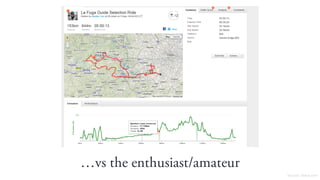
- 31. ˇvs the enthusiast/amateur Source: Stava.com
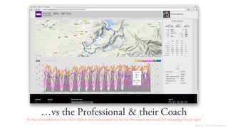
- 32. ˇvs the Professional & their Coach To the uninitiated this is too much data & too complicated but for the the expert who looks at it everyday itˇŻs just right. Source: TrainingPeaks.com
- 33. 1. The Problem 2. Data 3. Audience 4. Visuals 5. Pro Tips 6. Team Exercise TodayˇŻs Topics
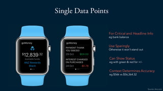
- 34. Single Data Points For Critical and Headline Info eg bank balance Use Sparingly Otherwise it wonˇŻt stand out Can Show Status eg with green & red for +/- Context Determines Accuracy eg $56k vs $56,364.32 Source: Anz.com
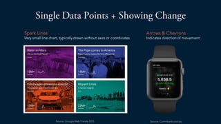
- 35. Single Data Points + Showing Change Spark Lines Very small line chart, typically drawn without axes or coordinates Arrows & Chevrons Indicates direction of movement Source: Commbank.com.auSource: Google Web Trends 2015
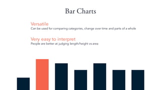
- 36. Bar Charts Versatile Can be used for comparing categories, change over time and parts of a whole Very easy to interpret People are better at judging length/height vs area
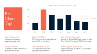
- 37. Bar Chart Tips Start Y-Axis at 0 Generally, truncating bars distorts the truth. Order the Data With common sense (alphabetical, sequentially or by value) Use Horizontal Labels Vertical or slanted labels are harder to read. Turn the chart horizontal if labels are long. Use Minimal Colour Save alternate colours for highlighting exceptions Jan Feb Mar Apr May June July 30 60 0 90 Coffees IˇŻve Consumed in 2016 so Far* Space the Bars ? the barˇŻs width between is a good starting point Add Targets and Goals To show tracking of actuals vs planned or target amounts Goal = 50
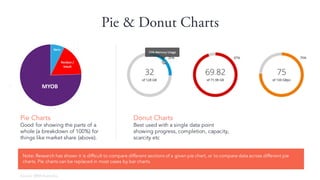
- 38. Pie & Donut Charts Donut Charts Best used with a single data point showing progress, completion, capacity, scarcity etc Pie Charts Good for showing the parts of a whole (a breakdown of 100%) for things like market share (above). Note: Research has shown it is difficult to compare different sections of a given pie chart, or to compare data across different pie charts. Pie charts can be replaced in most cases by bar charts. Source: BRW Australia
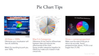
- 39. Pie Chart Tips All Data = 100% Otherwise your visualisation will lose all credibility. Watch for rounding to push you over 100%. Max 5-6 Categories Otherwise itˇŻs too hard to differentiate between data and reduces the effectiveness of the chart. Group smaller categories together (ie. Other) but make sure it doesnˇŻt hide critical info. Slices = correct proportion Make sure the sizes of the pie or donut are accurate. Avoid perspective (see above, 19.5% is not bigger than 21.2%) Source: Des Traynor 193%!
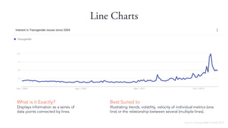
- 40. Line Charts What is it Exactly? Displays information as a series of data points connected by lines. Best Suited to Illustrating trends, volatility, velocity of individual metrics (one line) or the relationship between several (multiple lines). Source: Google Web Trends 2015
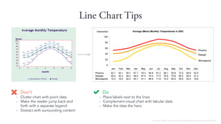
- 41. Line Chart Tips Do - Place labels next to the lines - Complement visual chart with tabular data - Make the data the hero DonˇŻt - Clutter chart with point data - Make the reader jump back and forth with a separate legend - Distract with surrounding content Source: http://www.perceptualedge.com/example2.php
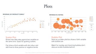
- 42. Plots Scatter Plot Shows how data rates against two variables at the same time. Good for spotting outliers. Can show a third variable with dot colour and add lines to show positive or negative trends. Bubble Plot Same as a scatter plot but shows a forth variable with bubble size. Watch for overlap and check big bubbles donˇŻt obscure smaller bubbles behind. http://www.slideshare.net/Visage/data-visualization-101-how-to-design-chartsandgraphs
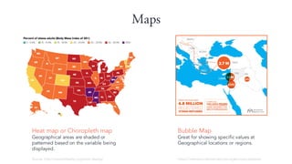
- 43. Maps Heat map or Choropleth map Geographical areas are shaded or patterned based on the variable being displayed. Source: http://stateofobesity.org/adult-obesity/ Bubble Map Great for showing specific values at Geographical locations or regions. https://internationalmedicalcorps.org/europe-response
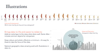
- 44. Illustrations Brings data to life and easier to relate to Adds an extra layer to the story when done well. Quite often include common objects for comparison. Keep colours and artistic effects to a minimum ¨C itˇŻs easy for these to take the focus of the data. National geographic does amazing work with illustrations in data vis. Vultures Endangered Which ones, how big are they and how endangered? Asteroid Diameter Compared to New York City
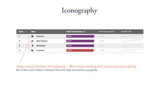
- 45. Iconography Helps Imply Context Immediately ¨C Minimises reading and maximises scan-ability But make sure it doesnˇŻt distract from the data and serves a purpose.
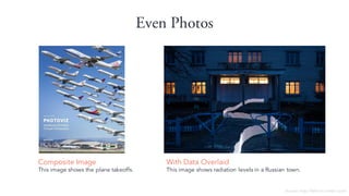
- 46. Even Photos Composite Image This image shows the plane takeoffs. Source: http://feltron.tumblr.com/ With Data Overlaid This image shows radiation levels in a Russian town.
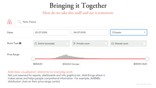
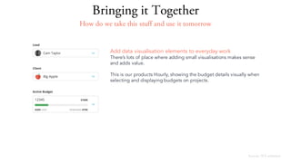
- 47. http://airbnb.com Add data visualisation elements to everyday work Not just reserved for reports, dashboards and info graphics etc. Add things where it makes sense and helps people comprehend information. For example, AirBNBˇŻs distribution chart on their price range control. Bringing it Together How do we take this stuff and use it tomorrow
- 48. Source: 3CS software Add data visualisation elements to everyday work ThereˇŻs lots of place where adding small visualisations makes sense and adds value. This is our products Hourly, showing the budget details visually when selecting and displaying budgets on projects. Bringing it Together How do we take this stuff and use it tomorrow
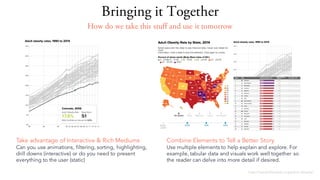
- 49. Bringing it Together http://stateofobesity.org/adult-obesity/ Combine Elements to Tell a Better Story Use multiple elements to help explain and explore. For example, tabular data and visuals work well together so the reader can delve into more detail if desired. Take advantage of Interactive & Rich Mediums Can you use animations, filtering, sorting, highlighting, drill downs (interactive) or do you need to present everything to the user (static) How do we take this stuff and use it tomorrow
- 50. 1. The Problem 2. Data 3. Audience 4. Visuals 5. Pro Tips 6. Team Exercise TodayˇŻs Topics
- 51. Comprehension - Make it easier not harder If your data visualisation has the same effect on users as an Escher diagram, then you havenˇŻt done your job wellˇ
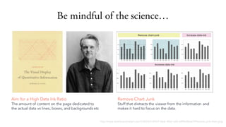
- 52. Be mindful of the scienceˇ http://www.dashboardinsight.com/CMS/b5144547-0ecb-40c0-aaf2-a5f96c8b6e7f/Remove-junk-chart.png Remove Chart Junk Stuff that distracts the viewer from the information and makes it hard to focus on the data. Aim for a High Data Ink Ratio The amount of content on the page dedicated to the actual data vs lines, boxes, and backgrounds etc
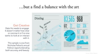
- 53. ˇbut a find a balance with the art Get Creative Data Vis needs to engage. It doesnˇŻt matter how clear or concise it is if no one wants to look at or interact with it. This sample is one from Nicholas FeltonˇŻs annual Feltron reports blending both accuracy and beauty. Source: Feltron Report
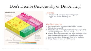
- 54. DonˇŻt Deceive (Accidentally or Deliberately) Avoid 3D ? It messes with sizing and makes things look bigger and smaller than they are http://www.perceptualedge.com/blog/wp-content/uploads/2014/01/deaths-by-cause-treemap.jpg Also Watch out for ? Bad grouping (eg. important data hidden in other) ? Not starting axes at 0 ? Flipped axes (something looks like itˇŻs improving but itˇŻs actually getting worse and vice-versa) ? Curved, smoothed line charts that imply detail you donˇŻt have (Lines should be straight between data points) ? Area charts making data shape affect other attributes ? Using shapes or icons on bubble charts
- 55. In summaryˇ ItˇŻs ? Workout what story to tell or question to answer (Data) ? Understand who youˇŻre designing for (Audience) ? Know your visual elements and how to use them (Visuals) ? Integrate visualisations into everyday work ? Remember to take advantage of interactive mediums ? DonˇŻt make the user work to extract the data ? Balance the art & science ? DonˇŻt deceive to visualise data well Remember the kittensˇ Up nextˇ Team Exercise
- 56. 1. The Problem 2. Data 3. Audience 4. Visuals 5. Pro Tips 6. Team Exercise TodayˇŻs Topics
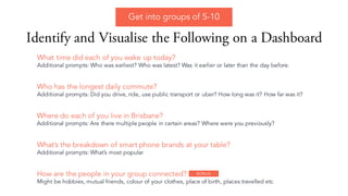
- 57. Identify and Visualise the Following on a Dashboard How are the people in your group connected? Might be hobbies, mutual friends, colour of your clothes, place of birth, places travelled etc Who has the longest daily commute? Additional prompts: Did you drive, ride, use public transport or uber? How long was it? How far was it? Where do each of you live in Brisbane? Additional prompts: Are there multiple people in certain areas? Where were you previously? WhatˇŻs the breakdown of smart phone brands at your table? Additional prompts: WhatˇŻs most popular What time did each of you wake up today? Additional prompts: Who was earliest? Who was latest? Was it earlier or later than the day before. Get into groups of 5-10 BONUS
- 58. To get in touch: Cam@3cssoftware.com.au Thank You