
data_science_introduction_for beginners.pptx
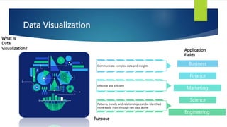
- 2. Data Visualization What is Data Visualization? Communicate complex data and insights Effective and Efficient Patterns, trends, and relationships can be identified more easily than through raw data alone. Business Finance Marketing Science Engineering Purpose Application Fields
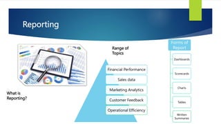
- 3. Reporting What is Reporting? Financial Performance Sales data Marketing Analytics Customer Feedback Operational Efficiency Range of Topics Forms of Report Dashboards Scorecards Charts Tables Written Summaries
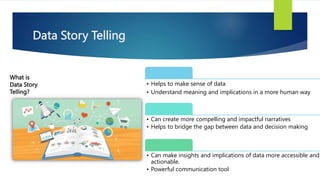
- 4. Data Story Telling What is Data Story Telling? ÔÇó Helps to make sense of data ÔÇó Understand meaning and implications in a more human way ÔÇó Can create more compelling and impactful narratives ÔÇó Helps to bridge the gap between data and decision making ÔÇó Can make insights and implications of data more accessible and actionable. ÔÇó Powerful communication tool
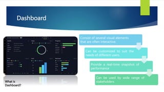
- 5. Dashboard What is Dashboard? Consist of several visual elements that are often interactive. Can be customized to suit the needs of different users. Provide a real-time snapshot of performance Can be used by wide range of stakeholders
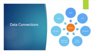
- 6. TABLEAU
- 7. Overview Connect, visualize and share data Help easily analyse and visualize Highly intuitive and user-friendly Create visualizations that can be easily shared Connects to wide variety of data sources Offers advanced features Interactive dashboards
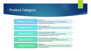
- 8. Product Category ÔÇó Self-service ÔÇó Create interactive visualizations, reports and dashboards ÔÇó Connect to various data sources Tableau Desktop ÔÇó Data preparation tool ÔÇó Perform data cleaning, profiling, transformation and validation tasks Tableau Prep ÔÇó Enterprise-level analytics platform ÔÇó Securely share data and insights across an organization. ÔÇó Can be deployed on-premise or in cloud Tableau Server ÔÇó Cloud-based version of Tableau Server ÔÇó Allow to access and share data visualizations, reports and dashboards from anywhere Tableau Online ÔÇó Mobile app ÔÇó Enables to view and share dashboards, reports and visualizations from mobile devices. Tableau Mobile
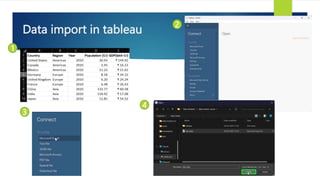
- 10. Data import in tableau 1 2 3 4
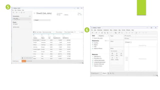
- 11. 5 6
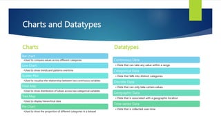
- 12. Charts and Datatypes Charts Bar chart ÔÇóUsed to compare values across different categories Line Chart ÔÇóUsed to show trends and patterns overtime Scatter Plot ÔÇóUsed to visualize the relationship between two continuous variables Heat Map ÔÇóUsed to show distribution of values across two categorical variables Tree Map ÔÇóUsed to display hierarchical data Pie Chart ÔÇóUsed to show the proportion of different categories in a dataset Datatypes Continuous Data ÔÇó Data that can take any value within a range. Categorical Data ÔÇó Data that falls into distinct categories Discrete Data ÔÇó Data that can only take certain values Geographic Data ÔÇó Data that is associated with a geographic location Time-series Data ÔÇó Data that is collected over-time
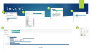
- 13. Basic chart 1 2 3 5 4 6
- 14. 7 8 9 10 11
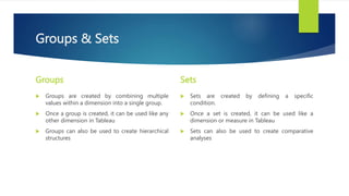
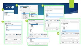
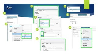
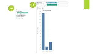
- 16. Groups & Sets Groups ´üÁ Groups are created by combining multiple values within a dimension into a single group. ´üÁ Once a group is created, it can be used like any other dimension in Tableau ´üÁ Groups can also be used to create hierarchical structures Sets ´üÁ Sets are created by defining a specific condition. ´üÁ Once a set is created, it can be used like a dimension or measure in Tableau ´üÁ Sets can also be used to create comparative analyses
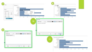
- 18. 7 8 9 10
- 20. 10 11
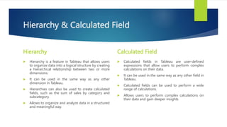
- 21. Hierarchy & Calculated Field Hierarchy ´üÁ Hierarchy is a feature in Tableau that allows users to organize data into a logical structure by creating a hierarchical relationship between two or more dimensions. ´üÁ It can be used in the same way as any other dimension in Tableau. ´üÁ Hierarchies can also be used to create calculated fields, such as the sum of sales by category and subcategory. ´üÁ Allows to organize and analyze data in a structured and meaningful way. Calculated Field ´üÁ Calculated fields in Tableau are user-defined expressions that allow users to perform complex calculations on their data. ´üÁ It can be used in the same way as any other field in Tableau. ´üÁ Calculated fields can be used to perform a wide range of calculations. ´üÁ Allows users to perform complex calculations on their data and gain deeper insights
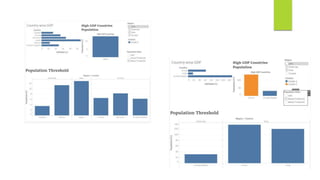
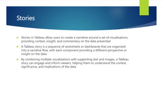
- 23. 9 10 11 12
- 25. 7 8 9 10
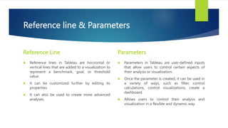
- 26. Reference line & Parameters Reference Line ´üÁ Reference lines in Tableau are horizontal or vertical lines that are added to a visualization to represent a benchmark, goal, or threshold value. ´üÁ It can be customized further by editing its properties. ´üÁ It can also be used to create more advanced analyses. Parameters ´üÁ Parameters in Tableau are user-defined inputs that allow users to control certain aspects of their analysis or visualization. ´üÁ Once the parameter is created, it can be used in a variety of ways, such as filter, control calculations, control visualizations, create a dashboard. ´üÁ Allows users to control their analysis and visualization in a flexible and dynamic way.
- 28. 6
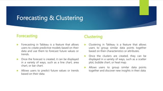
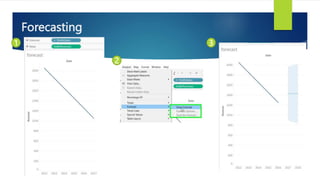
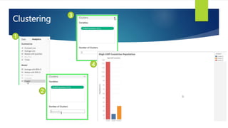
- 29. Forecasting & Clustering Forecasting ´üÁ Forecasting in Tableau is a feature that allows users to create predictive models based on their data and use them to forecast future values or trends. ´üÁ Once the forecast is created, it can be displayed in a variety of ways, such as a line chart, area chart, or bar chart. ´üÁ Allows users to predict future values or trends based on their data. Clustering ´üÁ Clustering in Tableau is a feature that allows users to group similar data points together based on their characteristics or attributes. ´üÁ Once the clusters are created, they can be displayed in a variety of ways, such as a scatter plot, bubble chart, or heat map. ´üÁ Allows users to group similar data points together and discover new insights in their data
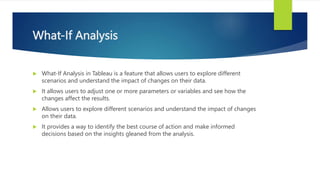
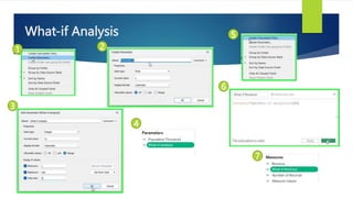
- 32. What-If Analysis ´üÁ What-If Analysis in Tableau is a feature that allows users to explore different scenarios and understand the impact of changes on their data. ´üÁ It allows users to adjust one or more parameters or variables and see how the changes affect the results. ´üÁ Allows users to explore different scenarios and understand the impact of changes on their data. ´üÁ It provides a way to identify the best course of action and make informed decisions based on the insights gleaned from the analysis.
- 35. 16 17 18 19
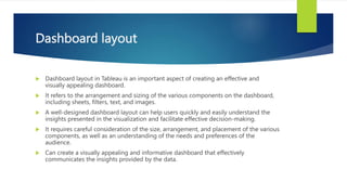
- 36. Dashboard layout ´üÁ Dashboard layout in Tableau is an important aspect of creating an effective and visually appealing dashboard. ´üÁ It refers to the arrangement and sizing of the various components on the dashboard, including sheets, filters, text, and images. ´üÁ A well-designed dashboard layout can help users quickly and easily understand the insights presented in the visualization and facilitate effective decision-making. ´üÁ It requires careful consideration of the size, arrangement, and placement of the various components, as well as an understanding of the needs and preferences of the audience. ´üÁ Can create a visually appealing and informative dashboard that effectively communicates the insights provided by the data.
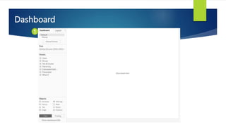
- 37. Dashboard 1
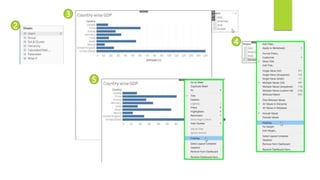
- 38. 2 3 5 4
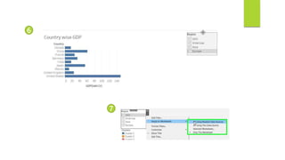
- 39. 6 7
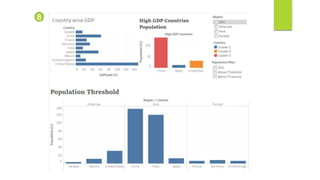
- 40. 8
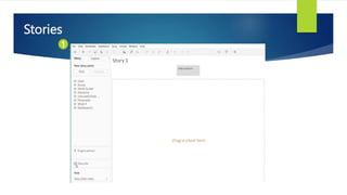
- 42. Stories ´üÁ Stories in Tableau allow users to create a narrative around a set of visualizations, providing context, insight, and commentary on the data presented. ´üÁ A Tableau story is a sequence of worksheets or dashboards that are organized into a narrative flow, with each component providing a different perspective or insight on the data. ´üÁ By combining multiple visualizations with supporting text and images, a Tableau story can engage and inform viewers, helping them to understand the context, significance, and implications of the data.
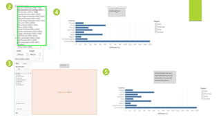
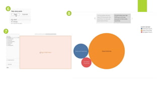
- 43. Stories 1
- 44. 2 3 4 5
- 45. 6 7 8
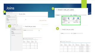
- 46. Joins ´üÁ Joins in Tableau are used to combine data from two or more tables into a single view or visualization. ´üÁ Tableau supports several types of joins, including: ´âáinner joins, ´âáleft outer joins, ´âáright outer joins, and ´âáfull outer joins.
- 47. Joins 1 2 3 4
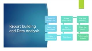
- 48. Report building and Data Analysis Connect to data source Create new worksheet Create visualizations Add filters Add calculations Create dashboards Use data blending Share the report Perform data Analysis
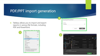
- 49. PDF/PPT import generation ´üÁ Tableau allows you to import and export reports in various file formats, including PDF and PowerPoint. 1 2 3
- 50. Thank You