Design Is In The Details
- 1. Bryan Veloso & Dan Rubin DESIGN IS IN THE DETAILS S01
- 3. Introduction S03
- 5. Introduction S05
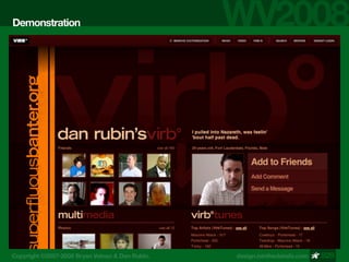
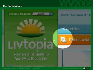
- 12. Demonstration S12
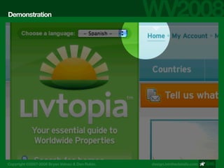
- 13. Demonstration S13
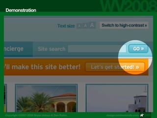
- 14. Demonstration S14
- 15. Demonstration S15
- 16. Demonstration S16
- 17. Demonstration S17
- 18. Demonstration S18
- 19. Demonstration S19
- 20. Demonstration NOW LETˇŻS COMPARE S20
- 21. Demonstration S21
- 22. Demonstration S22
- 23. Demonstration S23
- 24. Demonstration USE RANGE KERNING S24
- 25. Demonstration S25
- 26. Demonstration S26
- 27. Demonstration SIGNAL AND NOISE S27
- 28. Demonstration SIGNAL AND NOISE S28
- 29. Demonstration S29
- 30. Demonstration WHEN BLACK ISNˇŻT S30
- 31. Demonstration USE YOUR EYES S31
- 32. Demonstration SRSLY, USE UR EYES S32
- 33. Demonstration S33
- 34. Demonstration FLAT IS BORING S34
- 35. Demonstration DEPTH HAPPENS S35
- 36. Demonstration LIGHT VS. DARK S36
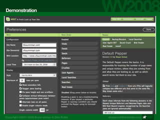
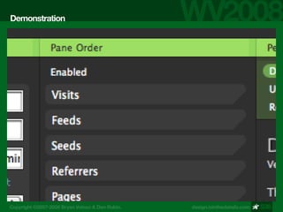
- 37. Demonstration MINT SCREEN S37
- 38. Demonstration MINT SCREEN S38
- 39. Demonstration MINT SCREEN S39
- 40. Demonstration S40
- 41. Demonstration PIXEL **CKING S41
- 42. Demonstration PIXEL HACKING S42
- 43. Demonstration MOAR SCREENS S43
- 44. Demonstration S44
- 45. Demonstration S45
- 46. Demonstration S46
- 47. Demonstration MOAR SCREENS S47
- 48. Demonstration MOAR SCREENS S48
- 49. Demonstration MOAR SCREENS S49
- 50. Demonstration KNOW WHEN TO QUIT S50
- 51. Education SPACING, SPACING S51
- 52. Education BORDER PATROL S52
- 53. Education SIMPLE CONTENT SPACING S53
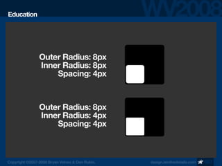
- 54. Education THE RULE OF TEN S54
- 55. Education SUPER- FLUOUS DETAILS S55
- 56. Education TIPS & SHORT - CUTS S56
- 57. Education S57
- 59. Education LAYER BLENDING MODES S59
- 60. Education MOAR LAYER HACKING S60
- 61. Education ?+?+C= COPY MERGED S61
- 62. Education THE REVEAL S62
- 63. Education S63
- 64. Education S64
- 65. Education THE REVEAL S65
- 66. Education THE REVEAL S66
- 68. Education THANKS! ^_^v S68

