This document analyzes 11 different camera angles and evaluates their suitability for use in a music magazine. It discusses medium shots, long shots, close-ups, extreme close-ups, eye-level shots, point-of-view shots, reverse shots, low angle shots, high angle shots, oblique angles, and establishing shots. Based on the analysis, eye-level medium shots are determined to be most effective for the front cover to engage readers, while establishing shots may be useful for double page spreads to set the context of an artist's background and location. Examples are provided of test shots taken with a teddy bear to practice different angles.
The document outlines 11 potential shots for a magazine focused on alternative R&B music. Each proposed shot includes details like the location, camera angle, and pose. Shot 1 would be a double page spread of the model meditating in a recording studio. Shot 2 shows the model looking at the camera in front of a brick wall and could be used for the front cover. Shot 3 is a side profile of the model using a stool in the recording studio and may feature on the contents page.
This document discusses planning and revisions for a table of contents (TOC) page for a magazine. It includes:
- Two initial photo shoot images considered for the TOC
- A first draft design and feedback calling for it to be darker and less cluttered
- An additional chosen photo seen as a better fit that could be manipulated
- Details on the final darker design combining elements from previous versions to better fit the magazine's style
The document discusses planning for photos for the front cover and double page spread of a hip hop magazine. It notes that front cover images are typically mid-close ups while double page spreads use mid shots. Location, artist, costumes, props, and lighting must all be carefully considered to effectively represent the hip hop genre through iconography and convey the intended message without confusing readers. Front lighting cannot be too bright or too dark to ensure high image quality while maintaining associations with hip hop culture.
The document discusses conventions used in various ancillary products for a horror film, including a magazine cover, poster, trailer, and compares them to professional examples. It analyzes conventions in areas like mastheads, headlines, images, slogans, and finds that while some elements follow conventions of the genre and form, others could be improved. For example, the magazine cover masthead is too long, the trailer could use more music variation, and the poster slogan would work better in the top third like the professional example. In general, it evaluates how well the ancillary pieces adhere to or diverge from typical conventions for horror film marketing collateral.
The document discusses the conventions and inspirations for a student's horror film trailer and ancillary texts. The student researched conventions of real horror trailers like Peeping Tom, Cloverfield, and The Blair Witch Project to inform the shots and style of their own trailer. Inspiration was also drawn from the Friday the 13th movie poster and Empire magazine for the film poster and magazine. While borrowing elements from other works, the student's trailer and texts challenge some conventions through an ambiguous plot, faster editing, and a shocking ending scream.
The photographer plans a photoshoot for an indie magazine featuring models Kieran, Olivia, Emily and Courtney. Three locations are selected - an outdoor brick wall, an art photography studio, and a plain studio background. Costumes will be normal, dark, casual and scruffy styles. Makeup will be natural with nothing extreme. A guitar prop is chosen to fit the indie genre. Photos will include a medium shot for the cover, a full body shot on the contents page, and at least one close up. Varied photo styles like unusual poses are aimed to attract readers.
This document discusses and analyzes several potential images for use in a magazine focused on rock/metal music. It considers images of a band, evaluating factors like atmosphere, style, focus, and suitability for different pages. While one image is deemed too distracting for a cover, others are praised for their rebellious feel, alternative style, and potential to attract attention on a double page spread through an inspiring location and model positioning. Minor criticisms are also noted to improve future photoshoots.
The document provides planning details for images to be used in a music magazine, including a schedule. It describes shooting plans for a front cover featuring a model looking at the camera in red lipstick against white and black backgrounds. For the contents page, a long shot of a person leaning on a guitar is proposed, shown as a current pop artist. A close-up of the front cover model's face with an open mouth for a double page spread interview is also outlined. Locations, equipment, and timing are scheduled over several days for the three main photos.
This document summarizes how the media product uses and challenges conventions of real magazines. It begins with using the recognizable "Total Film" masthead to draw readers in, as magazines typically have mastheads. The main cover image transforms a model into a living skeleton using makeup and editing, challenging conventions by not having direct eye contact. A skeleton was chosen to represent the film's genre of death. While an atypical image, it creates mystery. The barcode, typically bottom right or under the masthead, is at the bottom to avoid disrupting the cover image. In short, it follows magazine conventions like the masthead but challenges others with an unusual cover image.
The photographer outlines plans for several photos for a magazine spread. The first photo will feature a model looking at the camera in black and white to convey a suppressed, dark impression. The second photo will be a contents page photo of a model with open arms to invite readers to a competition. The third photo will be a close-up of a model sitting to take up half the page while leaving space for an article. Additional photos include an outdoor photoshoot image of models dressed colorfully against a dark sky and research on magazine cover styles.
The document discusses potential locations, clothes, and accessories for a hip-hop magazine photo shoot. It describes four different location options, including an urban run-down area, an open field with good lighting, a dark slightly depressing area with natural lighting, and a shadowy spiral staircase giving an artistic touch. It also lists clothes and accessories for a model including a popular snapback hat, black skinny jeans to show from head to toe, trendy Nike shoes, a complimentary stylish jumper, and a subtly popular watch.
The document provides guidance for creating different media types - a trailer, poster, and magazine cover - for a horror film project. It emphasizes following genre conventions, such as using fast pacing, dark tones, and images/sounds that build tension. Continuity across the different pieces is also important, using familiar characters, scenes and design elements to maintain audience interest. Fonts, layout, and effective use of space should appeal to the target audience and follow typical conventions for each media type.
The document discusses ideas for visual elements to include in a music video and digital album packaging. Several location shots are considered but deemed not urban enough or too cluttered. New ideas include featuring the artist DJ Cretin in an alley to look powerful. Blurred pictures that convey the feeling of being on drugs are selected as the basis for the four sides of the digital packaging. The artist plans to feature DJ Cretin prominently to imply his music violently inserts itself into the mind. With photo selections and ideas finalized, work on designing the digital packaging and promotional poster will begin.
Location, location, location end of unit powerpoijntConnerMcmorrin
Ìý
This document discusses the photographer's pastiche research task. It includes summaries of photographers they chose to emulate, including discussions of specific photos. It also documents their own test photo shoots on topics related to mental health, including anxiety, self-harm, suicidal thoughts, and depression. The photographer reflects on the edits they made to the photos and ideas for how to improve future shoots. They created a mock magazine cover focused on anxiety to represent their project. Overall, the document shows the photographer's process in researching photographers, planning test shoots on mental health topics, and editing the photos from those shoots as they work to complete the pastiche research task.
The document discusses ideas for creating a Saul Bass-inspired poster for the student's film "Loving You". It analyzes posters Bass created for films like "Saint Joan", "Back to the Future", and "Her" focusing on effective design elements. The student considers two ideas for their poster - featuring a woman's neck and shoulders with a cloud background, or featuring keys as female symbols representing the film's same-sex relationship theme. Based on feedback, the student chooses the first idea and may incorporate aspects of the second. A pink base color is selected to convey the film's themes of passion and romance.
Rhiannon Jenkins discusses how she adhered to film poster conventions in creating her own poster. She based the color scheme and layout on posters for The Woman in Black and House at the End of the Street. The image she used depicts a close-up of a female protagonist looking away from the camera to create intrigue. She also included a background image and text formatting that conforms to typical conventions. For her magazine cover, she followed color scheme, layout, and imaging conventions from the magazine Empire to make her cover look authentic.
This double page spread from NME focuses on an interview with Graham Coxon. One page is a close-up photo of Coxon looking gloomy. The adjacent text snippet from the interview has a dark color scheme matching the somber tone. Font size and layout emphasize the "sex, drugs, and rock n roll" themes discussed. The dark visuals and familiar NME design create a cohesive brand identity that draws in the target audience.
The document discusses a photo being considered for the front cover of a magazine. It notes that the photo stands out due to the large contrast in colors between the man's clothing and the background. Bright lighting enhances this contrast and eliminates shadows. However, there is one shadow under the man's right arm due to lack of lighting from all angles, which is atypical for magazine covers. The man's relaxed body language fits the magazine's laidback theme. The shadow would need to be removed through photo editing if this photo is selected.
The document outlines the writer's proposal for their Unit 57 Photography project. They plan to capture urban landscape photographs in Stockport to show the contrast between old and new areas. They also plan portrait photographs of their cousin in the college studio with a plain background, focusing on facial expressions and body language to convey emotion. The photographs will be edited professionally and shared online and in an exhibition.
The document provides an analysis comparing the trailer for the film Insidious to the film The Woman in Black (TWIB). It notes that both films have jumpy parts and a dark, mysterious tone created through lighting and minimal locations. Specific similarities pointed out include the use of a ticking soundtrack that increases in pace as the trailer progresses, as well as the use of a rocking horse prop. The document analyzes how the trailer for Insidious uses similar techniques to those in the trailer for TWIB to build fear and intrigue in the audience.
This document discusses the initial research done for a film poster project. It includes four fonts considered for the title, with a preference for the simpler first three. A black and white color scheme is chosen, with potential addition of red. The poster will feature a black and white picture of the actress with her eyes retained in color. Research on other horror posters found most use similar characteristics and the Scream poster in particular created an eye-catching design through these conventions.
The billboard design will feature three images - a black and white photo of an old filmmaker on the left, a color photo of a young filmmaker on crutches on the right, and the magazine cover in the center. Below the magazine cover, the red masthead "Northern Film" will stretch across. The pull quote "Love film? Get Reading!" is intended to be short, memorable, and aggressive to promote the magazine. The color scheme contrasts black and white on the left with color on the right, while the red masthead stands out for readability.
The document discusses photograph locations for a magazine. The studio will be used for cover shots of a model against a plain white background to complement the model and make editing easier. Outdoor photographs in run-down urban areas will be taken for a double-page spread, with the model posing to highlight their fame and ability to stand out above society through the contrast with the surroundings.
For the front cover of their film magazine, the author wants to:
1) Feature a dominant central image of a fictional film director that covers the masthead to convey professionalism.
2) Include background images of posters for four made-up films to make the cover more visually interesting.
3) Have the main sell line celebrate the fictional director Adam Tyson and the four films, while secondary lines promote other film-related events in the Northeast region.
4) Use differing fonts sized and styles to distinguish the masthead, main sell line, and other sell lines based on importance.
This document discusses ideas for creating a movie poster and magazine cover to promote a film. For the movie poster, the author considers using a single background color and photos from the film. They choose the second idea of using photos, feeling it will catch attention and show parts of the comedy-drama story. For the magazine cover, the first idea uses photos of the actors to draw fans, while the second uses characters. The author selects the first idea, thinking teenage girls - the target audience - will respond more to the actors. In both cases, the author analyzes font, color schemes, and character placement to best represent the film.
The magazine front cover layout follows specific conventions to guide the reader's eyes across the page. Key elements like the masthead, main image, and sell lines are always placed in signature locations. The masthead is at the top, the main character image in the center takes up most space, and the main sell line is centered below. Additional text, secondary images, and offers are placed strategically to entice readers while maintaining consistent branding across issues. Elements like costumes and facial expressions in the main images use mise-en-scene to represent the film's genre and tone.
This document provides information on various camera angles, movements, and composition techniques used in filmmaking. It defines different camera shots including close-ups, establishing shots, extreme wide shots, and point-of-view shots. It also describes camera movements such as tracking, tilting, and zooming. Additionally, it discusses rules of framing such as leading room and headroom. Finally, it introduces the rule of thirds for compositional guidance in shot placement.
The document discusses the composition and style of images to be used in a magazine. It describes using the rule of thirds to compose shots. Images will be of models representing musicians. Medium and close-up shots will be used to show facial expressions. Studio backdrops and minimal props will create a calm, simplistic aesthetic. Outfits and lighting will enhance the feminine attributes of the models to engage the audience. Location shots may also be taken to give an urban feel while maintaining a relaxed, casual impression.
This document provides descriptions and examples of various camera angles and movements that are used in filmmaking. It discusses close-up shots to focus on emotions, establishing shots to set the scene, extreme wide shots to show surroundings, and other shots like mid shots and two-shots to frame conversations. It also explains how camera movements like tracking, tilting, and zooming are used to change viewers' perspectives and imply meanings. Framing and the rule of thirds are discussed as techniques for shot composition.
This document provides descriptions and examples of various camera angles and movements that are used in filmmaking. It includes close-ups, establishing shots, extreme wide shots, wide shots, mid shots, medium close-ups, extreme close-ups, cutaways, two-shots, over the shoulder shots, point of view shots, tracking, tilting, zooming, framing, and the rule of thirds. Each technique is defined and its purpose in telling visual stories through cinema is explained in one to three sentences.
Magazine Shooting Calender and Shot Types alyblue98
Ìý
This document is a shooting calendar and description for a student photographer documenting a band. The student plans to take photos of the band during their half-term break in October, including at a pub performance and band rehearsal. The document then lists 10 different shot types the student plans to use, such as long shots, medium close-ups, and cutaways, along with descriptions of when and how each shot will be used in the student's magazine article on the band.
The document describes the process of creating a film poster and magazine cover. Key details include:
- Pictures were taken of a model in a torn black shirt to reflect the film's themes of crime, betrayal, and rape.
- A close-up shot of the model's face was selected to draw the audience in and convey emotion.
- Photoshop was used to edit the image, adding effects to make it look dark and distorted in line with the film's narrative.
- Conventions like the film title, actor names, and production details were added to complete the poster.
The document provides details on the creation of a media film magazine by the author. It includes planning documents like layout ideas, terminology research, a photoshoot plan, and images from the photoshoot. The author refined their magazine design through further development and editing, comparing their work to publishing trends. Their final magazine design features a colorful masthead, a central cover image using direct address, and consistent formatting in line with house style conventions.
The document provides details on creating a film poster and magazine for a crime thriller film called "Duplicity".
The creator took photos of a model in a torn black shirt to represent the film's themes of crime, betrayal, and rape. They selected a close-up shot of the model's face to draw attention and emotion. In Photoshop, they edited the image to look dark and distorted to match the film's theme of a detective distorting people's minds.
For the magazine, the creator initially chose a character-based cover but later switched to an actor-based cover using a shirtless photo of the male lead to draw female readers, exemplifying the "male gaze". Details like mastheads
Micro Technical Analysis and Comparison to Focal Filmspaigeneilson
Ìý
The document discusses various cinematography techniques used in the filmmaker's short film and Terrence Malick films. It describes how extreme close-ups, close-ups, medium shots, and long shots were used to focus attention and provide context. It also discusses the use of natural lighting, shadows, and camera angles. The filmmaker aimed to reflect Malick's style through the use of wide-angle lenses, locations representing freedom and nature, and montage editing sequences. Only diegetic sound from a song was used to reflect the influences of silent films.
The document discusses various camera angles and movements used in filmmaking. It provides examples and descriptions of close-ups, establishing shots, extreme wide shots, wide shots, mid shots, medium close-ups, extreme close-ups, cutaways, two-shots, over the shoulder shots, point of view shots, tracking, tilting, and zooming. It also covers the rules of framing and the rule of thirds for proper image composition. The document is intended as research for a student assignment on visualizing and describing different camera techniques.
The document discusses the process of choosing images for the front cover of a music magazine. It begins by discussing inspiration drawn from simplicity in Vibe magazine covers and use of black and white photography. Further inspiration is drawn from images in Vibe of Jay-Z representing the urban music genre. The final inspiration comes from Chris Brown's music video pose using a peace sign. Six potential cover images are then analyzed, with the sixth image chosen for its portrait orientation, space for the masthead, and intriguing model gaze away from the camera. Alternate model gazes from Esquire magazine are shown as further examples.
The document provides details on photography planning for magazine covers and articles. It discusses camerawork and mise-en-scene considerations for a cover photo featuring a medium close-up of a solo female artist, as well as for photos of a band and album covers representing different genres to be used on the contents page. Details are also given for a double-page interview spread photo showing a medium shot of a solo male artist to promote his debut album. The goal is to attract readers by creating intimate, natural-looking images that represent the subjects and their music styles.
The media product uses, develops, and challenges some forms and conventions of real media products. It develops conventions through its use of close-ups, scary settings, low-key lighting, and color usage, which advance themes and genres similarly used in films like Side Effects and The Woman in Black. However, it also challenges conventions through its disjointed magazine cover comprising multiple images rather than a single one, mirroring the plot's themes of schizophrenia. While most elements develop real conventions, the intent is to thoughtfully challenge expectations.
Calum planned and evaluated several photographs for a music magazine advertisement. The photographs included close-up shots of microphones, group shots against graffiti backgrounds, and portraits with hoods and hand gestures. For each photo, Calum described the composition decisions, intended meanings, and evaluations of quality and suitability for the magazine. Some photos leaked color into the background or had low quality, so Calum determined they may need to be re-taken to improve the final magazine production.
Alice is exploring color schemes and themes for her photography project on theatre by analyzing photos with different color palettes. She analyzed 3 photos relevant to theatre and extracted color swatches from each using Photoshop to gather applicable colors. She will use the color schemes as inspiration for her own photos. She also discussed potential photo ideas at various theatre locations, including shots from the stage and auditorium, as well as backstage areas. She created call sheets and schedules for a planned photo shoot at York College featuring a model in costume.
The film poster, film review, and film work together to promote a film. The poster introduces potential viewers to the main characters and story. A review in a magazine like "Little White Lies" provides an honest assessment of the film's strengths and weaknesses to help readers decide if they want to watch it. When done effectively, these promotional elements can attract the intended audience and create interest in the film.
Essays On Inspiration, Creativity & Vision In PhotographyAzman Hj. Ayup
Ìý
This document contains an introduction and 10 essays by Scott Bourne on inspiration, creativity, and vision in photography. The essays provide advice and techniques for photographers to improve their storytelling abilities, find new perspectives through panoramic photography, see creatively by looking at familiar subjects in new ways, focus on storytelling over gear, boost creativity by removing self-imposed limits and focusing on authenticity, and experiment freely to discover new creative ideas. The goal is to help photographers improve their craft beyond just learning new techniques.
The document discusses how the media creator used conventions from real media products like teaser trailers and magazine covers to make their own media work more professional. They analyzed trailers like Valentine's Day to understand conventions like being snappy, not revealing too much of the plot, and keeping the audience interested. The creator challenged some conventions by giving the female character a higher status than typical. They used techniques like camera shots, music, and poster design elements to engage audiences in a way inspired by analyzing professional works.
Evaluation of the 3 main photos (music press)Emre BektaÅž
Ìý
The document discusses the planning and evaluation of three photographs taken for a youth magazine. For each photo, decisions were made regarding shot type, angle, lighting, props, and costume to represent youth in a positive way. Mise-en-scene was used to portray the subject as sophisticated and focused through facial expressions and props. While most elements worked well to engage the target audience, one recommendation was to take photos in a more vibrant location for better lighting and saturation.
Laura Mulvey developed the male gaze theory, which argues that in film and media, the audience is positioned to view scenes from a heterosexual male perspective. This reinforces patriarchal ideals by portraying women as objects to be looked at. The male gaze reduces women's roles to supporting characters defined by their sexuality and relationships to men. While some criticism argues that the male gaze can empower women, Mulvey and others contend it reflects and perpetuates the subordination of women in society.
Wiktoria Wabnyc provides her contact details and background information including her age, location, education and training in theatre, film and webseries roles. She lists her skills as being fluent in English and Polish with additional skills in special effect makeup, editing, media and blogging.
The Goodwin Theory from 1992 analyzes key elements that must be present in music videos. It views the music video as symbolizing the Bible in how it contains genre characteristics, relationships between music/lyrics and visuals, demands for close-ups of artists, references to looking, and being performance, narrative or concept-based. Andrew Goodwin identified 7 key ideas for music videos, which are demonstrated in analyses of Demi Lovato's "Made in the USA" and Ne-Yo's "Forever Now". Both videos show relationships between music/lyrics and visuals, meet record label demands, and reference other works through techniques like those found in films.
Representation of women rihanna we found lovethevickyxxx
Ìý
The 'We Found Love' music video portrays women in several ways:
1) At the beginning, Rihanna's character is depicted as weak and passive through her facial expressions and being in a bathtub, aiming to make her character relatable to the target audience.
2) Throughout the video, Rihanna engages in stereotypical behaviors like stripping, drinking, gambling, and doing drugs, representing women as followers incapable of making their own decisions.
3) The video also uses old stereotypes from shows of the 1920s depicting Rihanna as a stripper or commodity to be watched, focusing only on her body and limiting her identity.
4) However, towards
The document discusses choosing the song "Flashlight" by Jessie J for a music video project. It notes that the song is inspiring and about strong friendships, which the target audience of young people would be able to relate to from their own experiences with close friends. It also comments that the song has a simple pop structure that would allow the main character to lip sync to it.
1. Different camera angles
Here are my pictures that I had taken with 11 different
camera angles. In this post I will analyse each shot and
evaluate it whether it will be suitable to use an image
with this particular angle shot for my front cover,
contents page or double spreadsheet.
This will help me with my camera work and will ensure
that I will take clear shots which are suitable and
effective for my target audience.
2. Camera angle 1: Medium shot
This is a medium shot from 'Walk to remember' film.
This medium shot allows the audience to see the
actresses in more detail, while still allowing the
audience to see the whole setting. I think this shot is
successful and effective for a front cover picture
because it will allow the readers to focus on the artist
whilst allow the editor to add puffs, anchorage text and
a masthead. For my front cover I will use a medium
shot to present my main artist. Alternatively, I might
use it in some of my images for a contents page or a
double spreadsheet.
At home, I had used my teddy bear as a prop, to practise
different angels. This is because I wanted to practise taking
clear camera shots so that my pictures won't come up
blurry, regardless of the angle the picture is taken. Here's an
example of a medium shot that I had taken:
3. Camera angle 2: Long shot
This is a long shot from the same movie 'walk to
remember'. This long shot presents the two
actors sitting together, which allows the
audience to see the setting of the theatre as well
as to see the whole length of the actors. A long
shot can be used effectively in fashion
magazines to presents the outfit of the model so
that the main focal focus is the outfit. Therefore,
I will use a long shot in the fashion section in my
music magazine.
This is another example, of
a long shot which I had
taken at home. This shot
denotes that the teddy bear
is sitting on my desk.
4. Camera angle 3: close up
A close up shot draws the audience attention to a certain detail
that the director/editor deliberately wants them to focus. It's
usually used to present a specific facial expression/emotion
when two characters have a conversation to create a mood and
a certain atmosphere.
From my music magazine research I had found out that almost
no music magazine have a close up picture to feature on their
front cover, regardless of their music genre. Therefore, I will not
use a close up on a front cover as this is not appropriate and it's
unusual. However, I will still consider using a close up shot for
images included in my contents page and the double page.
ÌýÌýÌýÌýHere'sÌýmyÌýtrialÌýofÌýtakingÌýaÌýcloseÌýup:
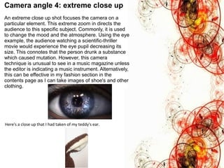
5. Camera angle 4: extreme close up
An extreme close up shot focuses the camera on a
particular element. This extreme zoom in directs the
audience to this specific subject. Commonly, it is used
to change the mood and the atmosphere. Using the eye
example, the audience watching a scientific-thriller
movie would experience the eye pupil decreasing its
size. This connotes that the person drunk a substance
which caused mutation. However, this camera
technique is unusual to see in a music magazine unless
the editor is indicating a music instrument. Alternatively,
this can be effective in my fashion section in the
contents page as I can take images of shoe's and other
clothing.
Here'sÌýaÌýcloseÌýupÌýthatÌýIÌýhadÌýtakenÌýofÌýmyÌýteddy'sÌýear.
6. Camera angle 5: eye level shot
AnÌýeyeÌýlevelÌýcameraÌýshotÌýisÌýoneÌýofÌýtheÌýmostÌýeffectiveÌýcameraÌýshotsÌýasÌýitÌýengagesÌýtheÌý
audience.ÌýThisÌýisÌýbecauseÌýtheÌýcameraÌýshotÌýgivesÌýtheÌýimpressionÌýofÌýtheÌýaudienceÌýstandingÌýinÌý
frontÌýofÌýtheÌýperson.ÌýThisÌýcreatesÌýaÌýrealisticÌýatmosphereÌýasÌýtheÌýaudienceÌýfeelÌýasÌýtheyÌýareÌý
thereÌýinÌýtheÌýscene.
On the other hand, this shot can be very intimidating for the audience as it denotes a model
looking at the readers directly. This attracts the audience attentions as the audience feel like
they are actually looking at the person. Often, this camera shot is used to portray confidence
in the model artist and to attract new readers. This is because the eye level camera shot is
strongly effective when used in prints and ads. Therefore, I will emerge an eye level shot with
a medium shot for my central image of my front cover.
7. Camera angle 6: Point of view shot
This is a point of view camera angle which allows the
audience to see what the actor sees. Usually, its used
to show that the character is inferior and intimated by
others. However, this is not a successful camera angle
for a music magazine as I want my audience to see my
model not to see what they see in the picture.
Alternateivly, in my articles and interviews I want my
readers to see the how my artist sees the world, but
that will be done through the use of specific language
that will allow my readers to put themselves into my
artist's position.
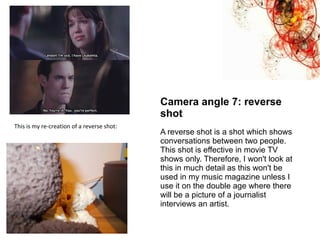
8. This is my re-creation of a reverse shot:
Camera angle 7: reverse
shot
A reverse shot is a shot which shows
conversations between two people.
This shot is effective in movie TV
shows only. Therefore, I won't look at
this in much detail as this won't be
used in my music magazine unless I
use it on the double age where there
will be a picture of a journalist
interviews an artist.
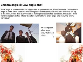
9. Camera angle 8: Low angle shot
A low angel is used to make the subject look superior than the reader/audience. This camera
angel is some times used in a music magazine to make the artist look as if she/he is on top
of the world, better than everyone else, making the readers feel powerless. However, I don't
want my readers to feel inferior therefore I will not have a low angle shot featuring on my
front cover.
An example of
a low angle
shot, that I had
taken:
10. Here's an example of a high
angle shot that I had taken:
Camera angle 9: High angle
shot
High angle shots are mostly used to make
the artist look innocent and smaller than
the audience or the character the artist is
looking up on. However, I don't want my
readers to look down on my model as it
suggests that my model is a rebel or
someone who isn't important in a music
show. Therefore, I am now convinced to
use an eye-level shot so that my readers
can be levelled up with my artist, meaning
that they can achieve as much as they did
as long as my readers read my magazine.
This is because my magazine will have
articles and competitions which will help
my audience break into their music
careers.
11. Camera angle 10: Oblique angle
This is an oblique angle-an angle, which is
slightly tilted to suggest imbalance, transition
and instability. Often used in horror and action
movies such as Taken. This is unusual to see
in a music magazine therefore, I will not use
this shot in my magazine.
12. Camera angle 11: establishing shot
An establishing shot is a shot which establishes the location/setting. This is a good shot to use for
my double page in my music magazine as it will allow the readers to establish the location the artist
has come from. This is effective as often the location we are from describes our personalities and
creates positive and negative stereotypes about us. Also, it allows the readers who live or lived in a
similar or the same location that the artist have to relate with the article or the interview.
For example, Landon Carter (Played by Shane West in Walk to Remember film) is shown to be in a
rural; isolated area where he is looking at the lake. This isolation indicates that his character is
endorsing himself into his thoughts. This suggest that he is over-thinking a particular situation,
which makes the audience stereotype the character as having problems with expressing himself
using words, but rather a down-to-earth character which prefers to deal with his own problems by
himself.
The image below, is an image of Central London. The use of an urban-city location in a music
magazine, on the double page suggest that the character is living "on the edge" or in a street.
These assumption allows the teenage audience to relate to an article. Therefore, if I use an
establishing shot in my double page, it will be of a city as most of my target audience live there.
This means that it will be easier for them to relate with the magazine as well as it will be more
attractive and appealing.