際際滷

際際滷Share a Scribd company logo
Digipak Analysis


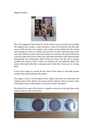
This is the digipak of Oasis Stop The Clock which contain two CDs and one DVD.
The digipak cover image is a part someones room, the wardrobe and disk with
circus stuffs onsuch as the puppet, and a poster of two dartboards. We cannot
tell is belong to a man or a women, because there is males shoes but toys at the
same time which is creative and excite audiences curiosity. The name of the band
is one the upper left corner of the cover with black and white color whichis easily
discriminate and outstanding. Idont think the image and the text is perfect
suitable, the reason of this is those two features are two different styles. The
name of the band looks like a company and it looks like it been put in a wrong
place.

In the cover image, we cannot see the name of the album, it will make people
confuse when they looking for the album.

The image is used is not the photo of the singers, from this we could know the
sealing points of this album is the music not the singer(s). Hence we have a idea
of the type of music of this album, it could be an indie rock album.

The label of the name of the band is a signifier exclusive to the band that could
remind audience their band Oasis.
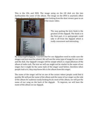
This is the CDs and DVD. The image using on the CD disk are the two
dartboardon the cover of the album. The image on the DVD is anartistic effect
photo of a room that looks like someone looking from the door viewer, gave us an
idea this picture may be is a scene of the music video.


                                           The way putting the lyric book is the
                                           greatest of this digipak. The book is in
                                           the first part, it is sprit,people could
                                           take it off from the digipak which is
                                           really convenient and interesting.


By analyzingthisdigipak, I learned that for our digipakwe need to make sure the
images and text must be related. We will use the same type of image for our cover
and the disk. Our digipaks images will be simple which is a typicalfeature of the
album of indie rock. The text we will use might not be similar to the name of our
singer, but it might be the same style of the singer used before, therefore when
people look at it, they may know this is the album from this singer.

The name of the singer will be on one of the corner where people could find it
quickly. We will put the name of the album and the name of our singer on the side
of the album for audience easily looking for.As most of the album, we will put the
name of our song on the back of the digipak. To improve, we will have the
name of the album on our digipak.

More Related Content

Digipak analysis

  • 1. Digipak Analysis This is the digipak of Oasis Stop The Clock which contain two CDs and one DVD. The digipak cover image is a part someones room, the wardrobe and disk with circus stuffs onsuch as the puppet, and a poster of two dartboards. We cannot tell is belong to a man or a women, because there is males shoes but toys at the same time which is creative and excite audiences curiosity. The name of the band is one the upper left corner of the cover with black and white color whichis easily discriminate and outstanding. Idont think the image and the text is perfect suitable, the reason of this is those two features are two different styles. The name of the band looks like a company and it looks like it been put in a wrong place. In the cover image, we cannot see the name of the album, it will make people confuse when they looking for the album. The image is used is not the photo of the singers, from this we could know the sealing points of this album is the music not the singer(s). Hence we have a idea of the type of music of this album, it could be an indie rock album. The label of the name of the band is a signifier exclusive to the band that could remind audience their band Oasis.
  • 2. This is the CDs and DVD. The image using on the CD disk are the two dartboardon the cover of the album. The image on the DVD is anartistic effect photo of a room that looks like someone looking from the door viewer, gave us an idea this picture may be is a scene of the music video. The way putting the lyric book is the greatest of this digipak. The book is in the first part, it is sprit,people could take it off from the digipak which is really convenient and interesting. By analyzingthisdigipak, I learned that for our digipakwe need to make sure the images and text must be related. We will use the same type of image for our cover and the disk. Our digipaks images will be simple which is a typicalfeature of the album of indie rock. The text we will use might not be similar to the name of our singer, but it might be the same style of the singer used before, therefore when people look at it, they may know this is the album from this singer. The name of the singer will be on one of the corner where people could find it quickly. We will put the name of the album and the name of our singer on the side of the album for audience easily looking for.As most of the album, we will put the name of our song on the back of the digipak. To improve, we will have the name of the album on our digipak.