Doc3
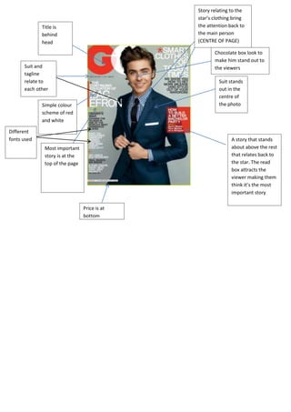
- 1. Title is behind head Simple colour scheme of red and white Most important story is at the top of the page Suit stands out in the centre of the photo Chocolate box look to make him stand out to the viewersSuit and tagline relate to each other Price is at bottom Different fonts used A story that stands about above the rest that relates back to the star. The read box attracts the viewer making them think it’s the most important story Story relating to the star’s clothing bring the attention back to the main person (CENTRE OF PAGE)
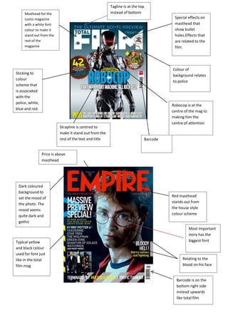
- 2. Masthead for the iconic magazine with a white font colour to make it stand out from the rest of the magazine Robocop is at the centre of the mag to making him the centre of attention Sticking to colour scheme that is associated with the police, white, blue and red. Special effects on masthead that show bullet holes.Effects that are related to the film. Strapline is centred to make it stand out from the rest of the text and title Red masthead stands out from the house style colour scheme Barcode is on the bottom right side instead upwards like total film Typical yellow and black colour used for font just like in the total film mag Barcode Relating to the blood on his face Dark coloured background to set the mood of the photo. The mood seems quite dark and gothic Price is above masthead Most important story has the biggest font Colour of background relates to police Tagline is at the top instead of bottom


