1 of 4
Download to read offline


Recommended
Double page spread screen shots
Double page spread screen shotsAaliyah195
Ěý
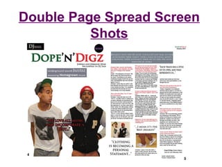
The document describes the process of designing a double page spread for a magazine article in three steps. In step one, the designer crops and enlarges a photo to fill most of the page according to the rule of thirds. In step two, the designer adds the article text in different colors and includes pull quotes and additional photos. In step three, the designer adds identifying information for the artists, an exclusive label, page numbers, and information about an upcoming album. The final spread resembles real magazine articles and uses consistent colors and layout to draw attention to the focal article.Double page spread examples
Double page spread examplesJanet Lunkusé
Ěý
There are three main types of double page spreads: interviews, photography spreads, and informative articles. Interviews are question and answer formats that provide personal insight. Photography spreads emphasize large images with little text to make the photo the focus. Informative articles educate readers on a topic but may not be as interesting as other formats.Double page spread screen shots
Double page spread screen shotsAaliyah195
Ěý
The document describes the process of designing a double page spread for a magazine article in 3 steps. In step 1, a photo was edited and enlarged to fill most of the page to grab attention following the 'rule of thirds'. In step 2, the article text was added in colored boxes and pull quotes to break up the text. Relevant photos were also added. In step 3, artist names and credits were added along with page numbers and editor information. The final spread resembled real magazine articles and used consistent colors to link to the front cover.Double page spread screen shots
Double page spread screen shotsAaliyah195
Ěý
The document describes the process of designing a double page spread for a magazine article in 3 steps. In step 1, a photo was edited and enlarged to fill most of the page to grab attention following the 'rule of thirds'. In step 2, the article text was added in colored boxes and pull quotes were used to preview the content. Additional photos broke up the text. In step 3, artist names and credits were added along with page numbers and editor information. The final spread resembled real magazine articles and used consistent colors and layout to draw the reader in.Question seven1
Question seven1Aaliyah195
Ěý
The document compares the front covers and contents pages of two magazines - "DJ Talk", a music magazine, and "BAMM". For the front cover of "DJ Talk", a sophisticated font was used for the main title, and the masthead was placed above the image, making it eye-catching. Short, catchy cover lines were used instead of wordy ones. The contents page of "DJ Talk" included more images to break up the text, used clear subheadings and boxes, and had larger page numbers for easy navigation.Question two
Question twoAaliyah195
Ěý
The magazine represents young adults aged 16-24, particularly those from an urban, black ethnicity background. It uses language and references topics like student life, fashion, and music gigs that this age group can relate to. The magazine also features black models and artists like DJs from popular radio stations among young people interested in black music to attract and inspire this target demographic.Student risk assessment
Student risk assessmentAaliyah195
Ěý
This risk assessment document identifies several potential hazards students may face when filming or taking photos in college: [1] bags blocking pathways, [2] blocking disabled access areas, [3] drinking near electrical equipment, [4] slipping on wet floors, [5] blocking staircases, [6] unsafe outdoor conditions, and [7] falling from ladders. Control measures are outlined to mitigate these risks, such as clearing pathways, prohibiting food/drink near devices, posting wet floor signs, and checking weather and equipment safety. Further actions are recommended where needed.Question two
Question twoAaliyah195
Ěý
This media product represents young adults aged 16-24. It uses language this social group can relate to and includes references to student life, fashion, and gigs, topics that would attract this age group as they are now able to attend clubs and concerts legally.Question one
Question oneAaliyah195
Ěý
This document summarizes how the media product challenges and develops conventions of real music magazines. It discusses conventions around the front cover, masthead, images, cover lines, barcode, contents page, rule of thirds, pull quotes, titles, and page numbers. Key conventions that were challenged include tilting the main cover line, centering the main image, placing the barcode at the top rotated 90 degrees, including additional images on the cover, and scaling down the masthead on the contents page. Conventions that were followed include using a variation in font sizes and styles for cover lines, including the issue date/number, repeating the masthead, and using a consistent house style font.Questionnaire results
Questionnaire resultsAaliyah195
Ěý
The document appears to be the results of a questionnaire about a music magazine prototype. It includes questions and charts showing the responses to questions about the front cover, contents page, and a double page article spread. For the most part, respondents liked the visual design elements like layouts and colors, though some suggested improvements like more cover lines and images or changes to layouts and text amounts.Questionnaire
QuestionnaireAaliyah195
Ěý
The document contains a questionnaire for 10 people in the target audience of a new music magazine. It asks for feedback on the front cover, contents page, and a sample double page article spread. For each element, it asks if the layout, colors, images, and other design features are suitable and resemble a hip hop/R&B music magazine. It also asks what could be improved, such as adding or removing cover lines, images, or changing the layout.Questionnaire
QuestionnaireAaliyah195
Ěý
The document contains a questionnaire to collect feedback from 10 people in the target audience on different elements of a music magazine prototype for the hip-hop/R&B genre. The questionnaire evaluates the front cover, contents page, and a double page article spread, asking questions about design, layout, colors, images, and suggestions for improvements.Eval question six
Eval question sixAaliyah195
Ěý
The document discusses technologies used to create a music magazine, including:
Blogger.com to publish tasks and view the production process. Presentation programs like Scribd and şÝşÝߣshare were used to share documents and add visuals. Adobe InDesign was used to layout the magazine and Adobe Photoshop to edit images and design the cover. Microsoft Word, PowerPoint and Excel created documents and tables. A college camera took photos and video for the magazine. Overall the technologies allowed for an engaging online presentation and professional final product.Photographs
PhotographsAaliyah195
Ěý
I took various photographs that I felt would be suitable for my hip-hop/R&B magazine, paying attention to lighting, models, clothing, and poses. I was inspired by the front cover of XXL magazine featuring Nicki Minaj and Drake taking up most of the frame. I wanted to recreate a similar style with my two models resembling a hip-hop duo. I also took a photo of another model to feature in an article and give readers more insight into the magazine's content. The contents page uses smaller images to allow easy reading of text and navigation. The double-page spread continues the style from the front cover to provide flow and identify the magazine's genre through the models' poses and attitude.Question four
Question fourAaliyah195
Ěý
The audience for this media product would be Cassie, a 20-year-old university student studying media, and Marcus, a 17-year-old sixth form student. Cassie enjoys listening to her iPod, going to concerts of artists like Drake, Rihanna, Kanye West, and Nicki Minaj. Marcus enjoys helping his friend with his music career, dancing, and relies on 1Xtra radio for hip hop, R&B, and UK music. They would both appreciate a media product focused on these genres of music.Evaluation question three
Evaluation question threeAaliyah195
Ěý
Bauer Media would be a suitable institution to distribute the magazine because they are Europe's largest privately owned publishing group and own top music magazines like Kerrang and Q. While Bauer Media does not currently publish a magazine focused on hip-hop/R&B, the proposed magazine could fill that gap in their market. As Bauer Media already has a successful R&B/hip-hop radio station, Kiss 100, partnering with them could help the magazine reach relevant audiences and not directly compete with their other music magazines.Contents page screen shots
Contents page screen shotsAaliyah195
Ěý
1) The creator designed the contents page to resemble the front cover and use similar colors and design elements to link the two pages.
2) Section titles and article descriptions are listed, with artist/personality names enlarged to draw attention. Page numbers are included.
3) Three images are placed at the top to preview articles and link to their page numbers. Additional elements like a flasher help promote other articles.
4) The final contents page maintains the front cover's theme while incorporating images to break up the text and make information easy to access.


Questionaire a task8
Questionaire a task8Aaliyah195
Ěý
The document summarizes the results of a questionnaire given to 20 people aged 18-28 about their preferences for a new R&B/Hip-Hop music magazine. Key findings include:
- The most popular artists mentioned were Nicki Minaj, J Cole, Drake, Kanye West, and Wiz Khalifa.
- 100% said the lyrics of songs attract them to the genre, and many also cited the image of R&B/Hip-Hop.
- Most respondents said they would pay ÂŁ2-3 for the magazine and wanted it to include competitions, exclusive news/interviews, and gig dates.
- Bright colors, images of artists, fashion, and headphones wereQuestionaire task8
Questionaire task8Aaliyah195
Ěý
This document contains a survey about creating a music magazine focused on R&B and hip-hop music. It asks respondents questions to gather information about their music interests, preferences for magazine content and design, and willingness to purchase a music magazine. The target audience is males and females aged 16-28 interested in R&B and hip-hop. It collects information on artists they listen to, what attracts them to the genres, how much they would pay and if they currently read music magazines. It also asks what would encourage purchases and preferences for cover images, interior content and feature articles.Task 7
Task 7Aaliyah195
Ěý
XXL is a hip-hop magazine published by Harris Publications. Founded in 1977, Harris Publications publishes over 75 titles including XXL and other urban-focused magazines. Harris uses Adobe tools like Dreamweaver and Photoshop to quickly develop websites for their magazines to promote brand loyalty and drive newsstand sales. Their sites provide rich multimedia content to complement the print magazines and connect with readers. This integrated print-digital strategy has increased advertising revenue and audiences for both their magazines and websites.
Photographs
PhotographsAaliyah195
Ěý
I took various photographs that I felt would be suitable for my hip-hop/R&B magazine, paying attention to lighting, models, clothing, and poses. I was inspired by the front cover of XXL magazine featuring Nicki Minaj and Drake taking up most of the frame. I wanted to recreate this to capture attention, and also recreate the look of the artist New Boyz using two models that resembled a hip-hop duo. I took another photo of a model to feature in another article and give readers more insight into the magazine's content. For the contents page, I used smaller images to allow easy reading of text and navigation. The double-page spread continued using the front cover artists and stylingTask 9
Task 9Aaliyah195
Ěý
The focus group provided feedback on creating an R&B/Hip-Hop music magazine that would appeal to their demographic. For the front cover, they recommended using a bold image of an artist that represents the genre and relates to the main article. Sell lines should promote music, artists, urban fashion, and culture. Appropriate colors include red, grey, blue, and black. The contents page should feature 2-3 images related to articles and include a variety of content about music, fashion, interviews, and concerts. Double page spreads should have edgy images of artists to attract readers and include articles about an artist's music, personal life, achievements, and future plans, written in a colloBillboard Magazine Analysis
Billboard Magazine AnalysisAaliyah195
Ěý
The document provides an analysis of the September/October 2008 issue of Billboard magazine. It summarizes the target audience as primarily being based in the US and focused on the music industry. It then analyzes various elements of the front cover, including the main image of singer Rihanna, cover lines, and use of colors/layout. It also summarizes the contents page, noting the charts, artist images, and easy-to-read contents listing. Finally, it analyzes a double-page article spread about Rihanna, focusing on her large main image and the rule of thirds layout.Billboard Magazine Analysis
Billboard Magazine AnalysisAaliyah195
Ěý
The document provides an analysis of the September/October 2008 issue of Billboard magazine. It summarizes the target audience as primarily being based in the US and focused on the music industry. It then analyzes various elements of the front cover, including the main image of singer Rihanna, cover lines, and use of colors/layout. It also summarizes the contents page, noting the charts, artist images, and easy-to-read contents listing. Finally, it analyzes a double-page spread featuring a fun image of Rihanna on stage.RRB ALP CBT 2 Mechanic Motor Vehicle Question Paper (MMV Exam MCQ)
RRB ALP CBT 2 Mechanic Motor Vehicle Question Paper (MMV Exam MCQ)SONU HEETSON
Ěý
RRB ALP CBT 2 Mechanic Motor Vehicle Question Paper. MMV MCQ PDF Free Download for Railway Assistant Loco Pilot Exam.Chapter 2. Strategic Management: Corporate Governance.pdf
Chapter 2. Strategic Management: Corporate Governance.pdfRommel Regala
Ěý
This course provides students with a comprehensive understanding of strategic management principles, frameworks, and applications in business. It explores strategic planning, environmental analysis, corporate governance, business ethics, and sustainability. The course integrates Sustainable Development Goals (SDGs) to enhance global and ethical perspectives in decision-making.More Related Content
More from Aaliyah195 (20)
Question one
Question oneAaliyah195
Ěý
This document summarizes how the media product challenges and develops conventions of real music magazines. It discusses conventions around the front cover, masthead, images, cover lines, barcode, contents page, rule of thirds, pull quotes, titles, and page numbers. Key conventions that were challenged include tilting the main cover line, centering the main image, placing the barcode at the top rotated 90 degrees, including additional images on the cover, and scaling down the masthead on the contents page. Conventions that were followed include using a variation in font sizes and styles for cover lines, including the issue date/number, repeating the masthead, and using a consistent house style font.Questionnaire results
Questionnaire resultsAaliyah195
Ěý
The document appears to be the results of a questionnaire about a music magazine prototype. It includes questions and charts showing the responses to questions about the front cover, contents page, and a double page article spread. For the most part, respondents liked the visual design elements like layouts and colors, though some suggested improvements like more cover lines and images or changes to layouts and text amounts.Questionnaire
QuestionnaireAaliyah195
Ěý
The document contains a questionnaire for 10 people in the target audience of a new music magazine. It asks for feedback on the front cover, contents page, and a sample double page article spread. For each element, it asks if the layout, colors, images, and other design features are suitable and resemble a hip hop/R&B music magazine. It also asks what could be improved, such as adding or removing cover lines, images, or changing the layout.Questionnaire
QuestionnaireAaliyah195
Ěý
The document contains a questionnaire to collect feedback from 10 people in the target audience on different elements of a music magazine prototype for the hip-hop/R&B genre. The questionnaire evaluates the front cover, contents page, and a double page article spread, asking questions about design, layout, colors, images, and suggestions for improvements.Eval question six
Eval question sixAaliyah195
Ěý
The document discusses technologies used to create a music magazine, including:
Blogger.com to publish tasks and view the production process. Presentation programs like Scribd and şÝşÝߣshare were used to share documents and add visuals. Adobe InDesign was used to layout the magazine and Adobe Photoshop to edit images and design the cover. Microsoft Word, PowerPoint and Excel created documents and tables. A college camera took photos and video for the magazine. Overall the technologies allowed for an engaging online presentation and professional final product.Photographs
PhotographsAaliyah195
Ěý
I took various photographs that I felt would be suitable for my hip-hop/R&B magazine, paying attention to lighting, models, clothing, and poses. I was inspired by the front cover of XXL magazine featuring Nicki Minaj and Drake taking up most of the frame. I wanted to recreate a similar style with my two models resembling a hip-hop duo. I also took a photo of another model to feature in an article and give readers more insight into the magazine's content. The contents page uses smaller images to allow easy reading of text and navigation. The double-page spread continues the style from the front cover to provide flow and identify the magazine's genre through the models' poses and attitude.Question four
Question fourAaliyah195
Ěý
The audience for this media product would be Cassie, a 20-year-old university student studying media, and Marcus, a 17-year-old sixth form student. Cassie enjoys listening to her iPod, going to concerts of artists like Drake, Rihanna, Kanye West, and Nicki Minaj. Marcus enjoys helping his friend with his music career, dancing, and relies on 1Xtra radio for hip hop, R&B, and UK music. They would both appreciate a media product focused on these genres of music.Evaluation question three
Evaluation question threeAaliyah195
Ěý
Bauer Media would be a suitable institution to distribute the magazine because they are Europe's largest privately owned publishing group and own top music magazines like Kerrang and Q. While Bauer Media does not currently publish a magazine focused on hip-hop/R&B, the proposed magazine could fill that gap in their market. As Bauer Media already has a successful R&B/hip-hop radio station, Kiss 100, partnering with them could help the magazine reach relevant audiences and not directly compete with their other music magazines.Contents page screen shots
Contents page screen shotsAaliyah195
Ěý
1) The creator designed the contents page to resemble the front cover and use similar colors and design elements to link the two pages.
2) Section titles and article descriptions are listed, with artist/personality names enlarged to draw attention. Page numbers are included.
3) Three images are placed at the top to preview articles and link to their page numbers. Additional elements like a flasher help promote other articles.
4) The final contents page maintains the front cover's theme while incorporating images to break up the text and make information easy to access.Questionaire a task8
Questionaire a task8Aaliyah195
Ěý
The document summarizes the results of a questionnaire given to 20 people aged 18-28 about their preferences for a new R&B/Hip-Hop music magazine. Key findings include:
- The most popular artists mentioned were Nicki Minaj, J Cole, Drake, Kanye West, and Wiz Khalifa.
- 100% said the lyrics of songs attract them to the genre, and many also cited the image of R&B/Hip-Hop.
- Most respondents said they would pay ÂŁ2-3 for the magazine and wanted it to include competitions, exclusive news/interviews, and gig dates.
- Bright colors, images of artists, fashion, and headphones wereQuestionaire task8
Questionaire task8Aaliyah195
Ěý
This document contains a survey about creating a music magazine focused on R&B and hip-hop music. It asks respondents questions to gather information about their music interests, preferences for magazine content and design, and willingness to purchase a music magazine. The target audience is males and females aged 16-28 interested in R&B and hip-hop. It collects information on artists they listen to, what attracts them to the genres, how much they would pay and if they currently read music magazines. It also asks what would encourage purchases and preferences for cover images, interior content and feature articles.Task 7
Task 7Aaliyah195
Ěý
XXL is a hip-hop magazine published by Harris Publications. Founded in 1977, Harris Publications publishes over 75 titles including XXL and other urban-focused magazines. Harris uses Adobe tools like Dreamweaver and Photoshop to quickly develop websites for their magazines to promote brand loyalty and drive newsstand sales. Their sites provide rich multimedia content to complement the print magazines and connect with readers. This integrated print-digital strategy has increased advertising revenue and audiences for both their magazines and websites.Photographs
PhotographsAaliyah195
Ěý
I took various photographs that I felt would be suitable for my hip-hop/R&B magazine, paying attention to lighting, models, clothing, and poses. I was inspired by the front cover of XXL magazine featuring Nicki Minaj and Drake taking up most of the frame. I wanted to recreate this to capture attention, and also recreate the look of the artist New Boyz using two models that resembled a hip-hop duo. I took another photo of a model to feature in another article and give readers more insight into the magazine's content. For the contents page, I used smaller images to allow easy reading of text and navigation. The double-page spread continued using the front cover artists and stylingTask 9
Task 9Aaliyah195
Ěý
The focus group provided feedback on creating an R&B/Hip-Hop music magazine that would appeal to their demographic. For the front cover, they recommended using a bold image of an artist that represents the genre and relates to the main article. Sell lines should promote music, artists, urban fashion, and culture. Appropriate colors include red, grey, blue, and black. The contents page should feature 2-3 images related to articles and include a variety of content about music, fashion, interviews, and concerts. Double page spreads should have edgy images of artists to attract readers and include articles about an artist's music, personal life, achievements, and future plans, written in a colloBillboard Magazine Analysis
Billboard Magazine AnalysisAaliyah195
Ěý
The document provides an analysis of the September/October 2008 issue of Billboard magazine. It summarizes the target audience as primarily being based in the US and focused on the music industry. It then analyzes various elements of the front cover, including the main image of singer Rihanna, cover lines, and use of colors/layout. It also summarizes the contents page, noting the charts, artist images, and easy-to-read contents listing. Finally, it analyzes a double-page article spread about Rihanna, focusing on her large main image and the rule of thirds layout.Billboard Magazine Analysis
Billboard Magazine AnalysisAaliyah195
Ěý
The document provides an analysis of the September/October 2008 issue of Billboard magazine. It summarizes the target audience as primarily being based in the US and focused on the music industry. It then analyzes various elements of the front cover, including the main image of singer Rihanna, cover lines, and use of colors/layout. It also summarizes the contents page, noting the charts, artist images, and easy-to-read contents listing. Finally, it analyzes a double-page spread featuring a fun image of Rihanna on stage.Recently uploaded (20)
RRB ALP CBT 2 Mechanic Motor Vehicle Question Paper (MMV Exam MCQ)
RRB ALP CBT 2 Mechanic Motor Vehicle Question Paper (MMV Exam MCQ)SONU HEETSON
Ěý
RRB ALP CBT 2 Mechanic Motor Vehicle Question Paper. MMV MCQ PDF Free Download for Railway Assistant Loco Pilot Exam.Chapter 2. Strategic Management: Corporate Governance.pdf
Chapter 2. Strategic Management: Corporate Governance.pdfRommel Regala
Ěý
This course provides students with a comprehensive understanding of strategic management principles, frameworks, and applications in business. It explores strategic planning, environmental analysis, corporate governance, business ethics, and sustainability. The course integrates Sustainable Development Goals (SDGs) to enhance global and ethical perspectives in decision-making.
Hannah Borhan and Pietro Gagliardi OECD present 'From classroom to community ...
Hannah Borhan and Pietro Gagliardi OECD present 'From classroom to community ...EduSkills OECD
Ěý
Hannah Borhan, Research Assistant, OECD Education and Skills Directorate and Pietro Gagliardi, Policy Analyst, OECD Public Governance Directorate present at the OECD webinar 'From classroom to community engagement: Promoting active citizenship among young people" on 25 February 2025. You can find the recording of the webinar on the website https://oecdedutoday.com/webinars/
Full-Stack .NET Developer Interview Questions PDF By ScholarHat
Full-Stack .NET Developer Interview Questions PDF By ScholarHatScholarhat
Ěý
Full-Stack .NET Developer Interview Questions PDF By ScholarHat
Blind spots in AI and Formulation Science, IFPAC 2025.pdf
Blind spots in AI and Formulation Science, IFPAC 2025.pdfAjaz Hussain
Ěý
The intersection of AI and pharmaceutical formulation science highlights significant blind spots—systemic gaps in pharmaceutical development, regulatory oversight, quality assurance, and the ethical use of AI—that could jeopardize patient safety and undermine public trust. To move forward effectively, we must address these normalized blind spots, which may arise from outdated assumptions, errors, gaps in previous knowledge, and biases in language or regulatory inertia. This is essential to ensure that AI and formulation science are developed as tools for patient-centered and ethical healthcare.Administrative bodies( D and C Act, 1940
Administrative bodies( D and C Act, 1940P.N.DESHMUKH
Ěý
These presentation include information about administrative bodies such as D.T.A.B
CDL AND DCC, etc.ASP.NET Interview Questions PDF By ScholarHat
ASP.NET Interview Questions PDF By ScholarHatScholarhat
Ěý
ASP.NET Interview Questions PDF By ScholarHat
Year 10 The Senior Phase Session 3 Term 1.pptx
Year 10 The Senior Phase Session 3 Term 1.pptxmansk2
Ěý
Year 10 The Senior Phase Session 3 Term 1.pptxOne Click RFQ Cancellation in Odoo 18 - Odoo şÝşÝߣs
One Click RFQ Cancellation in Odoo 18 - Odoo şÝşÝߣsCeline George
Ěý
In this slide, we’ll discuss the one click RFQ Cancellation in odoo 18. One-Click RFQ Cancellation in Odoo 18 is a feature that allows users to quickly and easily cancel Request for Quotations (RFQs) with a single click.
Effective Product Variant Management in Odoo 18
Effective Product Variant Management in Odoo 18Celine George
Ěý
In this slide we’ll discuss on the effective product variant management in Odoo 18. Odoo concentrates on managing product variations and offers a distinct area for doing so. Product variants provide unique characteristics like size and color to single products, which can be managed at the product template level for all attributes and variants or at the variant level for individual variants.Comprehensive Guide to Antibiotics & Beta-Lactam Antibiotics.pptx
Comprehensive Guide to Antibiotics & Beta-Lactam Antibiotics.pptxSamruddhi Khonde
Ěý
📢 Comprehensive Guide to Antibiotics & Beta-Lactam Antibiotics
🔬 Antibiotics have revolutionized medicine, playing a crucial role in combating bacterial infections. Among them, Beta-Lactam antibiotics remain the most widely used class due to their effectiveness against Gram-positive and Gram-negative bacteria. This guide provides a detailed overview of their history, classification, chemical structures, mode of action, resistance mechanisms, SAR, and clinical applications.
📌 What You’ll Learn in This Presentation
âś… History & Evolution of Antibiotics
âś… Cell Wall Structure of Gram-Positive & Gram-Negative Bacteria
âś… Beta-Lactam Antibiotics: Classification & Subtypes
âś… Penicillins, Cephalosporins, Carbapenems & Monobactams
âś… Mode of Action (MOA) & Structure-Activity Relationship (SAR)
âś… Beta-Lactamase Inhibitors & Resistance Mechanisms
âś… Clinical Applications & Challenges.
🚀 Why You Should Check This Out?
Essential for pharmacy, medical & life sciences students.
Provides insights into antibiotic resistance & pharmaceutical trends.
Useful for healthcare professionals & researchers in drug discovery.
👉 Swipe through & explore the world of antibiotics today!
đź”” Like, Share & Follow for more in-depth pharma insights!
Meeting the needs of modern students?, Selina McCoy
Meeting the needs of modern students?, Selina McCoyEconomic and Social Research Institute
Ěý
NAPD Annual Symposium
“Equity in our Schools: Does the system deliver for all young people?”Entity Framework Interview Questions PDF By ScholarHat
Entity Framework Interview Questions PDF By ScholarHatScholarhat
Ěý
Entity Framework Interview Questions PDF By ScholarHatOdoo 18 Accounting Access Rights - Odoo 18 şÝşÝߣs
Odoo 18 Accounting Access Rights - Odoo 18 şÝşÝߣsCeline George
Ěý
In this slide, we’ll discuss on accounting access rights in odoo 18. To ensure data security and maintain confidentiality, Odoo provides a robust access rights system that allows administrators to control who can access and modify accounting data. Azure Data Engineer Interview Questions By ScholarHat
Azure Data Engineer Interview Questions By ScholarHatScholarhat
Ěý
Azure Data Engineer Interview Questions By ScholarHatDouble page spread screen shots
- 1. Double Page Spread Screen Shots
- 2. Step One
- 3. Step Two
- 4. Step Three