Expert Usability Review: OSHA.gov
- 2. ABOUT THIS EXPERT USABILITY REVIEW ŌĆó Initiated May 2016 ŌĆó Prepared for Occupational Safety and Health Administration (OSHA) ŌĆó Assessed using current standards from industry leaders ŌĆó Human Factors International (HFI) ŌĆó Nielsen Norman Group (NN/g) ŌĆó Usability.gov ŌĆó Conducted by Wes Lewis of Booz Allen Hamilton ŌĆó User Experience (UX) Lead for OSHA.gov Drupal Migration ŌĆó 12 years of experience in UX design & usability analysis ŌĆó HFI Certified Usability Analyst (CUA)
- 3. GOALS OF EXPERT USABILITY REVIEW ŌĆó Uncover and assess the severity of usability issues on the desktop and mobile sites. ŌĆó Evaluate the usability of osha.gov against current industry standards. ŌĆó Find opportunities to improve and optimize usability for the intended users.
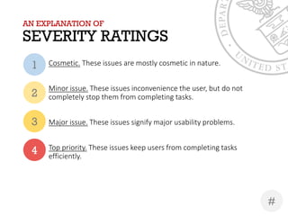
- 4. AN EXPLANATION OF SEVERITY RATINGS Cosmetic. These issues are mostly cosmetic in nature. Minor issue. These issues inconvenience the user, but do not completely stop them from completing tasks. Major issue. These issues signify major usability problems. Top priority. These issues keep users from completing tasks efficiently. 1 2 3 4 #
- 6. RECOMMENDATION #1 Ensure global consistency Recommendation 1.1: Inherit DOL.govŌĆÖs global stylesheet & general flat aesthetic. ŌĆó Remove gradients from page elements, most notably the global header and buttons. ŌĆó Gradients impact readability of text placed on elements using them ŌĆó Generally considered a dated UI design trend. ŌĆó Implement mega menu style & functionality as demonstrated in the DOL.gov global header. ŌĆó Easy to use, accessible, and already exists for easy incorporation. 3
- 7. RECOMMENDATION #1 Ensure global consistency Recommendation 1.1: Inherit DOL.govŌĆÖs global stylesheet & general flat aesthetic. (contŌĆÖd) ŌĆó Utilize whitespace, bolding of key phrases & words, alternating row colors, bulleted lists, and clear H1-H6 header styles to make page content easy for users to digest. ŌĆó Reserve underlines for hyperlinks. ŌĆó Remove low-resolution images or otherwise non-standard graphical elements ŌĆó Lean more towards minimalist design, ensuring that every element adds value 3
- 8. RECOMMENDATION #1 Ensure global consistency Recommendation 1.2: Ensure all landing pages within OSHA.gov have a uniform appearance and function. ŌĆó There is very little consistency throughout OSHA.gov., especially on landing pages. ŌĆó Aesthetically jarring at times ŌĆó Potentially impacts memory load in terms of having to reacquaint to a new user interface. ŌĆó Inconsistent design also impacts the userŌĆÖs trust in the site and the site provider. ŌĆó Each landing page seems to utilize a different variation of a content slider. ŌĆó Implement a simple and accessible content slider. 3
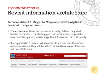
- 9. RECOMMENDATION #2 Revisit information architecture Recommendation 2.1: Merge blue ŌĆ£frequently-visitedŌĆØ navigation in header with navigation menu. ŌĆó The existence of these buttons unnecessarily clutters the global header of the site ŌĆō the starting place for most visitors, especially new ones. Navigation, search, page title information is in this vicinity. ŌĆó If reorganized in a manner which more closely matches the mental models of visitors, they will be able to locate these areas of the site with very little issue. 2
- 10. RECOMMENDATION #2 Revisit information architecture Recommendation 2.2: Ensure that the path shown in breadcrumbs is accurate. ŌĆó Several instances exist in OSHA.gov where the path shown in the breadcrumbs is either inaccurate or reflects an alternate path. ŌĆó Example: From the home page, select For Employers > Employer Responsibilities. The breadcrumbs indicate that this page should be under Worker Rights, which is underneath the For Workers navigation category. ŌĆó This is disorienting to users as breadcrumbs are a textual representation of a websiteŌĆÖs structure. They help site visitors understand and navigate a websiteŌĆÖs hierarchy. A location-based breadcrumb trail should begin with a link to the websiteŌĆÖs home page and end with the current page. 4
- 11. RECOMMENDATION #2 Revisit information architecture Recommendation 2.3: Extract links from the global navigation menu which take the user outside the scope of OSHA.gov. ŌĆó There is no visual indicator that, upon clicking a link, a user will be navigated outside of OSHA.gov ŌĆó This can be disorienting to users and may be a cause of frustration and increased bounce/exit rates. ŌĆó These links, if too important to remove completely, can be placed in another more intuitive location of the site. 3
- 12. RECOMMENDATION #2 Revisit information architecture Recommendation 2.4: Organize and label navigation elements so that sections such as ŌĆ£How ToŌĆØ on home page and quick links are not necessary. ŌĆó The links in the How To section are long and do not lend themselves to be easily scanned by users ŌĆó Valuable real estate can be better utilized to highlight fresher, more relevant content for users 4
- 13. RECOMMENDATION #2 Revisit information architecture Recommendation 2.5: Choose up to two navigation schemes: task and topic (remove audience-based navigation). ŌĆó Users can navigate the by topic, task, and user in the same menus. As it stands now, the navigation forces users to go through miscellaneous categories to access content. ŌĆó Websites with audience-based navigation often have overlapping content, which creates a greater workload for users (and content maintainers). ŌĆó Average 6.1% of users go 1 page deep from the top ten landing pages and then refer to some sort of FAQ or Help page. 4
- 14. RECOMMENDATION #2 Revisit information architecture Recommendation 2.5: Choose up to two navigation schemes: task and topic (remove audience-based navigation) (contŌĆÖd). ŌĆó Users might feel anxious that the information they see might be incomplete or incorrect. ŌĆó Forcing people to self-identify tends to create an additional step and take people out of their task mindset. ŌĆó Users may question whether the category will have information about that group or for that group. 4
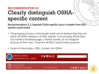
- 15. RECOMMENDATION #3 Clearly distinguish OSHA- specific content Recommendation 3.1: Separate OSHA-specific icons in header from DOL- specific social media ŌĆó The grouping of icons in the header leads one to believe that they are either all OSHA-related or all DOL-related. In all actuality, OSHA does not market a Facebook page, a Twitter handle, or an Instagram account of their own. These are all DOLŌĆÖs social media accounts. ŌĆó Career & Internships = DOL, Contact Us= OSHA. 2
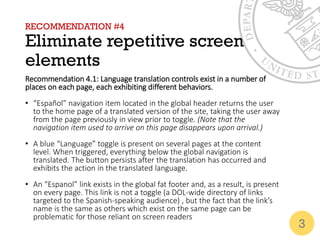
- 16. RECOMMENDATION #4 Eliminate repetitive screen elements Recommendation 4.1: Language translation controls exist in a number of places on each page, each exhibiting different behaviors. ŌĆó ŌĆ£Espa├▒olŌĆØ navigation item located in the global header returns the user to the home page of a translated version of the site, taking the user away from the page previously in view prior to toggle. (Note that the navigation item used to arrive on this page disappears upon arrival.) ŌĆó A blue ŌĆ£LanguageŌĆØ toggle is present on several pages at the content level. When triggered, everything below the global navigation is translated. The button persists after the translation has occurred and exhibits the action in the translated language. ŌĆó An ŌĆ£EspanolŌĆØ link exists in the global fat footer and, as a result, is present on every page. This link is not a toggle (a DOL-wide directory of links targeted to the Spanish-speaking audience) , but the fact that the linkŌĆÖs name is the same as others which exist on the same page can be problematic for those reliant on screen readers 3
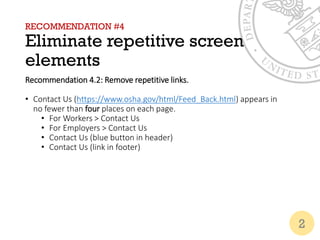
- 17. RECOMMENDATION #4 Eliminate repetitive screen elements Recommendation 4.2: Remove repetitive links. ŌĆó Contact Us (https://www.osha.gov/html/Feed_Back.html) appears in no fewer than four places on each page. ŌĆó For Workers > Contact Us ŌĆó For Employers > Contact Us ŌĆó Contact Us (blue button in header) ŌĆó Contact Us (link in footer) 2
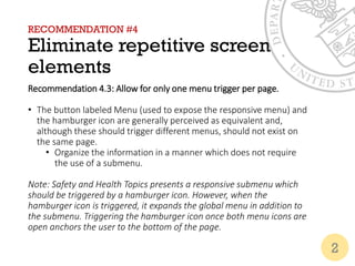
- 18. RECOMMENDATION #4 Eliminate repetitive screen elements Recommendation 4.3: Allow for only one menu trigger per page. ŌĆó The button labeled Menu (used to expose the responsive menu) and the hamburger icon are generally perceived as equivalent and, although these should trigger different menus, should not exist on the same page. ŌĆó Organize the information in a manner which does not require the use of a submenu. Note: Safety and Health Topics presents a responsive submenu which should be triggered by a hamburger icon. However, when the hamburger icon is triggered, it expands the global menu in addition to the submenu. Triggering the hamburger icon once both menu icons are open anchors the user to the bottom of the page. 2
- 19. RECOMMENDATION #5 Revise OSHA.gov homepage Recommendation 5.1: Prioritize fresh content. # of workers who died in 2014 is at the top of the page. Much fresher news and blog content is lowered in priority with the blog content being located at the very bottom right of the page. According to our Google analytics findings, the OSHA.gov landing page is BY FAR the most heavily visited page within its domain. The impression delivered when the statistics being shown are two years old may not be the impression that OSHA wants to convey. 2
- 20. RECOMMENDATION #5 Revise OSHA.gov homepage Recommendation 5.2: Make notable calls to action more prominent. Currently, calls to action such as ŌĆ£File a Complaint, ŌĆØReport Fatalities & Severe Injuries,ŌĆØ ŌĆ£Find an OSHA Office,ŌĆØ and others are buried in the ŌĆ£How ToŌĆØ section and in the navigation among other informational sections of the site. The call to action for visitors to subscribe to the newsletter is in two primary places: ŌĆó The envelope icon in the global header of DOL (note: this icon is generally used with the expectation that the user will be sending a message instead of signing up for a newsletter), and ŌĆó Beneath the fold on the homepage as an image-link to ŌĆ£OSHA QuickTakes.ŌĆØ 3
- 21. RECOMMENDATION #5 Revise OSHA.gov homepage Recommendation 5.3: Rethink the presentation of OSHA-focused Twitter feed. Currently, the Twitter feed commands a large portion of real estate on the home page, but only shows two posts. 2
- 22. RECOMMENDATION #6 Revise OSHA Newsroom Recommendation 6.1: Adopt DOL.govŌĆÖs convention for filtering articles and publications. ŌĆó Investigate the need for a separate newsroom since DOL.gov has its own and allows users to filter by agency. ŌĆó OSHA currently exists as a filter option 2
- 23. RECOMMENDATION #6 Revise OSHA Newsroom Recommendation 6.2: Minimize the prominence of the filter/article type selection area once DOL.gov convention is adopted ŌĆó Users may very likely filter eventually, but the filter does not have to be the very first visible section on the newsroom home. ŌĆó Currently, users are unable to see the updated list of articles because the filter and the newsletter subscription field take up more vertical space than necessary. ŌĆó This impacts the userŌĆÖs ability to determine system status. Has their request to filter been satisfied? They must scroll down to determine this after every submission as no additional feedback is provided above the fold. 2
- 24. RECOMMENDATION #7 Revise forms (global) Recommendation 7.1: When filling out forms, it is very easy to encounter errors and make mistakes. ŌĆó Implement masks and character limits to help users properly format information with specific rules ŌĆó When preventing mistakes is not possible, allow users to view/correct their mistakes before submitting their form. 3
- 25. RECOMMENDATION #7 Revise forms (global) Recommendation 7.2: Minimize the usersŌĆÖ cognitive load by placing helpful error messages within the context of the form which persist until action is taken to rectify the error. ŌĆó Inconsistent behavior across the site. Errors on the form used to file a complaint are placed on another screen in a bulleted list, forcing the user to remember what errors were made when returning to the form to correct them. ŌĆó Errors in the form used to report Serious Events are displayed in the context of the form, but disappear before a user had a chance to process the information displayed and are not specifically worded. 3
- 26. RECOMMENDATION #7 Revise forms (global) Recommendation 7.3: For long forms, allow a user to review their responses prior to submission. ŌĆó The Filing a Complaint form allows the user to review their submission, but only after it has already been submitted to OSHA. 3
- 27. RECOMMENDATION #8 Ensure global accessibility Recommendation 8.1: Ensure global accessibility. ŌĆó Users cannot currently tab and select through the elements on the home page content slider. ŌĆó Closed caption text does not accurately match verbiage in videos posted from YouTube. ŌĆó For example, someone answering an OSHA Help Desk phone says ŌĆ£Hello. This is OSHA. How may I help you?ŌĆØ but the closed captioning says ŌĆ£This is Russia. How may I help you?ŌĆØ 4
- 28. RECOMMENDATION #8 Ensure global accessibility Recommendation 8.1: Ensure global accessibility. ŌĆó Many pages are missing titles to inform the user as to where they currently are. This is required. ŌĆó Users are unable to skip repetitive navigation. ŌĆó In several instances, page content does not meet Section 508 contrast standards. 4
- 29. RECOMMENDATION #9 Evaluate the quality of help Recommendation 9.1: Assess the value of embedding certain videos to OSHA.gov from YouTube. ŌĆó Example: Conveying the content shown in the ŌĆ£Know Your RightsŌĆØ video on the homepage could be easily achieved in a more concise manner ŌĆó In this 1:25 minute video, the only messages aside from a non- verbal call to action to visit osha.gov/workers are: ŌĆó You have the right to a safe workplace. ŌĆó You have the right to ask questions if something seems unsafe. ŌĆó You have the right to report work-related injuriesŌĆ”without being fired! 3
- 30. RECOMMENDATION #9 Evaluate the quality of help Recommendation 9.2: ŌĆ£How ToŌĆØ section label is misleading. ŌĆó This group is more of a ŌĆ£Quick LinksŌĆØ section than an instructional on how to achieve certain functions on OSHA.gov. ŌĆó The links do not direct the user to specific instructions to accomplish functions, but rather the actual functions themselves ŌĆō the existence of instructions varies per page in the section. 2
- 31. RECOMMENDATION #10 Revise Contact Page Recommendation 10.1: Address responsive menu bug. ŌĆó Responsive navigation menu does not stay open long enough to review contents or to make a selection. ŌĆó This is an issue which might exist in other areas of the website, which impede access to other areas of the website and trap a user. 4
- 32. RECOMMENDATION #10 Revise Contact Page Recommendation 10.2: Expose contact form on the contact page instead of forcing users to navigate to yet another page from the contact page in order to submit a message. ŌĆó Currently, user must select Email link to expose form. ŌĆó When navigating to a contact page, users expect immediate access to a form. ŌĆó The first option on the Contact OSHA page is a phone number. ŌĆó The second available option is to click a link to access the Submit a Workplace Safety & Health Question form. 2
- 33. FOR QUESTIONS OR COMMENTS Regarding this reviewŌĆ” Wes Lewis UX Lead, OSHA.gov Drupal Migration Booz | Allen | Hamilton Lewis_Wes@bah.com

