Final presentation.ashx
ŌĆóDownload as PPTX, PDFŌĆó
0 likesŌĆó680 views

This document discusses guerrilla marketing strategies to promote the organization "Peace One Day". It provides examples of existing guerrilla campaigns, such as replacing the Google logo with the Peace One Day logo. The document then analyzes potential guerrilla marketing ideas for Peace One Day, including modifying public transportation signage, interactive elevator displays, and symbolic art installations. A mind map is included to help develop additional concepts.


Final presentation.ashx
- 1. ŌĆśPeace One DayŌĆÖ By Charley, Boris, Alex, Zak, Maryam and Aiza.
- 2. Guerrilla Marketing Guerrilla Marketing is a low cost advertising strategy, which promotes a product or a concept in an unconventional manner. Relying more on innovative and effective ideaŌĆÖs than a big marketing budget. The objective of a guerrilla strategy is to generate a thought-provoking idea that will turn viral and gain recognition. Elements of this: Undercover marketing - subtle product placement Experiential marketing - interaction with product Tissue-pack marketing - hand-to-hand marketing Reverse graffiti- clean pavement advertising Viral marketing - through social networks Buzz marketing- work of mouth Grassroots marketing - tapping into the collective efforts of brand enthusiasts Wild Posting Campaigns Wait marketing - when and where consumers are waiting
- 4. Analysed guerilla marketing advertisements Nintendo Post-it Note This is an excellent example of guerrilla advertisement, not only does it allow passers-by to see the promotion, but individuals can go and interact with it. In this instance the public can take off the sticky-notes and read what is written underneath ŌĆō probably more information on the product ŌĆō and then put is back for others to use. Also because there is so many of them quite a few people can interact at a time. This to is a great example of cost-effective advertisement, something that is usually a key-theme within guerilla marketing. A downside of this specific idea is that some individuals may abuse the design, sticky-notes usually have quite weak adhesive so someone taking several (or even all) of them off wouldnŌĆÖt be a challenge, not to mention other variables like weather (such as rain) could ruin this. Though depending on the size of the image, several of these could be done in little time, making it quite convenient to redo them.
- 5. Resident Evil Elevator This is another great example of guerrilla marketing, although different from the previous one, this still encompasses a level of interactivity. Individuals would initially see the design on the out side of the elevator, this would provoke interest as when the doors are closed it doesnŌĆÖt show what the advertisement is to do with. When opened, you can see the design on the inside giving context as to what the promotion is about. People who are also taking the elevator can then stand inside, allowing them to become a part of the marketing, this could evoke a further level of interest. A disadvantage of this kind of advertisement is that - especially in a busy environment ŌĆō people may not see the poster inside the elevator, as members of the public would be blocking it from view. It is important this doesnŌĆÖt happen as people wonŌĆÖt understand what the outside design is linked to. To prevent this from happening it would be best to place it in an area that isnŌĆÖt so hectic; somewhere like a shopping mall would be considerably better than an Underground Station.
- 6. Nintendo Post-it Note An advantage of this kind of advertisement is that it has become a part of peoples everyday life. Although it offers no chance for individuals to interact with, it has been placed in a location that many people will visit on a daily basis, and will eventually stick in their memory over time. Another element that contributes to this notion is how the point is put across; using actual water as a visual aid compared to just a picture of it, is not something you see everyday. People that see this promotion on a regular basis will see how it progresses over time ŌĆō in this instance they witness the water level increasing. This A disadvantage ŌĆō as previously mentioned ŌĆō is the lack of opportunity unconventional method to interact with the design. ItŌĆÖs a true statement that the more sense is what people will that are engaged with an event, the longer it will stay in your mind; remember after the although ones like taste and smell will be difficult to advertisement is long implement, touch, sight and hearing are more practical. gone.
- 7. Research Into Existing POD Advertising An example of ŌĆśPeace one dayŌĆÖ on the Google logo Peace One Day logo on a set of revolving doors Clicking on the ŌĆśGoogleŌĆÖ logo will take you to this page, where individuals can sign a ŌĆśTruceŌĆÖ document. The Peace One Day logo on a bicycleŌĆÖs spokes number of signatories is shown, along with a count-down to the ŌĆśPeace One DayŌĆÖ date ŌĆō 21st September.
- 8. Mind-map
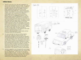
- 9. Initial Ideas 1) ŌĆśThe LiftŌĆÖ was one of our very first suggestions on how to best advertise ŌĆśPeace On DayŌĆÖ. We gained this idea from looking at already existing forms of guerilla marketing, we felt the design could be easily adapted and improved to fit our task. Individuals would initially see ŌĆō when lift doors are closed ŌĆō two soldiers in a war scenario engaged in conflict; both men would be from different nationalities to show how not just one kind of person can act in a belligerent manner. At this point people would be interested as to what the image is representing, seeing as no information is give surrounding this. This would then lead onto the next step where the doors open, revealing a similar image of the same soldiers again but this time embracing each other. The campaign name and date would be included to exemplify the graphics. This level of juxtaposition is what we hope will gain recognition and attention from the public, helping it to stay in their minds. This does include an amount of interactivity, as the design on the inside could be stretched all around the elevator, allowing people to step inside, and be immersed within the atmosphere. 2) The next concept we had was taking regular London Bus ŌĆō seeing as these are seen as a stereotype of England and are easily recognized ŌĆō and replacing both the end-destination and route number with ŌĆśPeace 219ŌĆÖ. This would mainly catch the attention of those who frequently commute on buses, as this subtle but distinct difference would be something they will notice. We aim to keep the font and colour as similar as possible to ensure a higher level of recognition. This was also adapted onto other modes of transport such as taxiŌĆÖs and trains/trams, in an attempt to reach more people. 3) Another suggestion was changing the usual design of a lollipop stick, and replacing it with ŌĆśPeace One Day 21st SeptemberŌĆÖ. This would not only be an idea that effects adults ŌĆō as many would see this either in passing or driving ŌĆō but also allow children to become aware of Peace One Day, due to where School crossing patrols are stationed.
- 10. Initial Ideas (2) 1) Another suggestion was incorporating the ŌĆśPeace One DayŌĆÖ title and date into road markings. Seeing as these are something drivers will see often, putting them in busy built up areas would be a good choice, as the also wouldnŌĆÖt become a hindrance prolonging they don't cover any important signs. A similar alternative is creating our own type of sign that is much like the official ones put up by the government, again like the bus idea, this would be keeping with the idea of subtlety but also something that individuals will notice. 2) The next input was a different take on the generic ŌĆśposterŌĆÖ form of advertising. The idea was to have to overlapping sheets, the first would display a scene of conflict with some text questioning the reader as to whether they support war or not, if they do not agree then they will be encouraged to tear the piece of paper off. Doing so will reveal a second image that is more firmly attached to whatever it has been placed on; the new graphic will be one of resolve and amity. This not only offers a high level of interaction, as the individual is responsible for how the advertisement works, but the poster will still remain their once they are gone, for others to look at and gain an interest in. A situation may also occur when a person has seen the ŌĆśpeacefulŌĆÖ poster previously, and is now witnessing the one of war for the first time; there will be a level of recognition that may make them notice the posters more and therefore interactive with them. Hopefully after a long enough period there will only be the ŌĆśpeacefulŌĆÖ image displayed. We discussed that using the same images as the ones on ŌĆśThe LiftŌĆÖ idea may be a good choice, as people will because to distinguish both more easily.
- 11. Initial ideas (3) 1) Our 6th suggestion was somehow impacting commuters on the underground. Learning that an average of 3.22 million people use it daily alone, this would be an amazing opportunity to put some advertising. We concluded that creating our own roundel logo similar to the Underground one, and replacing the station name with ŌĆśPeace One DayŌĆÖ would be an easy to do, and achievable concept. There was also the idea of putting posters on the inside of the tunnels, due to the speed at which trains travel, people looking out of the windows would see the words ŌĆśPeace One DayŌĆÖ going past at a normal speed; similar to the way a flipbook animation works. 2) Our final idea was the ŌĆśGlass BoxŌĆÖ, in which there would be two individuals of different nations and ethnicities, laying down their arms - which would be present within the box - and shaking with their hands inside the gloves. This is a visual representation as peace should be present among all walks of life, and how everyone is equal to one another.
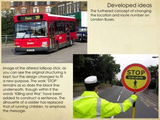
- 12. Developed ideas The furthered concept of changing the location and route number on London Buses. Image of the altered lollipop stick, as you can see the original structuring is kept; but the design changed to fit a new purpose. The work ŌĆśSTOPŌĆÖ remains as so does the black line underneath, though within it the words ŌĆśKilling and WarŌĆÖ have been added to construct a sentence. The silhouette of a soldier has replaced that of running children, to emphasis the message.
- 13. The word ŌĆśPeaceŌĆÖ planted onto taxiŌĆÖs from different nationalities. Though a problem with this would be the lack of context; as individuals would see this and then ask if it is to-do with a bigger campaign, but would have no means of investigating further.
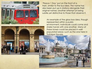
- 14. ŌĆśPeace 1 DayŌĆÖ put on the front of a train, similar to the bus idea. The name has also been put up in stations alongside their original names; another attempt at being subtle yet distinctive to those that observe it. An example of the glass box idea, though represented within a public environment, individuals could come and shake hands with one-another. Many of these boxes could be placed in well- populated areas; such as the one here in Trafalgar Square.