Finalmediaeval2
ŌĆóDownload as PPTX, PDFŌĆó
0 likesŌĆó235 views

John Wood evaluated his media magazine project. He followed conventions of real magazines in his front cover, contents page, and double page spread. For the front cover, he used a masthead, cover lines, and placed the barcode and price in the bottom right corner, taking inspiration from magazines like Vibe. He kept his color scheme consistent throughout. His contents page included page numbers, a chart list on the side, and a subscribe box. The double page spread featured an image on one side and text on the other. Overall, he strove to make his mock magazine look as professional and realistic as possible by adhering to standard magazine formats and designs.


Finalmediaeval2
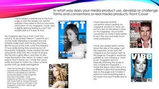
- 2. IN WHAT WAY DOES YOUR MEDIA PRODUCT USE, DEVELOP OR CHALLENGE FORMS AND CONVENTIONS OR REAL MEDIA PRODUCTS: FRONT COVER My Music Magazine follows many codes and conventions like any other magazine that is being sold today. The first code and convention I have used is the ŌĆśMast HeadŌĆÖ which is the ŌĆśT10TŌĆÖ title at the top of my page. It is very important when creating my Mast Head because it gives my magazine its identity. I had to make it so it is eye catching yet simple so that people will remember it the next time they see it. To test and see which ŌĆśMast HeadŌĆÖ looked best I tried different fonts. The type of fonts I used where Arial but I felt it wasnŌĆÖt bold enough for my mast head. I also tried Calibri which also looked to thin. I then spotted the ŌĆśFranklin Gothic HeavyŌĆÖ text and felt that this worked best as it is easily readable, it looks good and it is very bold and stands out. I have used the ŌĆśWhiteŌĆÖ colour text for my Mast Head as It stands out from my blue themed background of the image. I took inspiration from the ŌĆśVIBEŌĆÖ magazine as shown above (top left of this slide), As the white text worked really well against the blue theme setting and it looks very good and it will attract the teenage age audience as of which I am trying to achieve. I also took inspiration from it as I have made the person in my image ŌĆśblack and whiteŌĆÖ as It looks good and it also stands out from the blue background.
- 3. I have used another code and convention when creating my magazine front cover, this is a thing called ŌĆśLureŌĆÖ this means that I have put something on my page that will persuade people to buy the magazine, for example on my magazine I have added ŌĆśLisa Rankin Give Us some inspirational tipsŌĆÖ this may then persuade people to buy this. An example of where this has been used is in the NME magazine shown below, it tells us that there are 6 free posters in this magazine, this is slightly different to what my magazine is offering but it is still selling you something and my text on the front page will persuade the person to buy the magazine. Another convention that I have used when creating my magazine is that I have added a barcode and price at the bottom ride hand-side of the page, this is so that the shop keeper can scan it to check how much the magazine is when a customer is buying it off them. An example from a magazine who also put the bar code in the bottom right-hand side corner of the page is the VIBE magazine shown above. IN WHAT WAY DOES YOUR MEDIA PRODUCT USE, DEVELOP OR CHALLENGE FORMS AND CONVENTIONS OR REAL MEDIA PRODUCTS: FRONT COVER
- 4. In what way does your media product use, develop or challenge forms and conventions or real media products: Front Cover I have followed another convention when creating my magazine and that is I have not put any text on the personŌĆÖs face on my magazine. I stuck by this convention as I think it looks better to do it this way and looks much more professional. I have also added artists names down the side of the page, I got the inspiration of this from the magazine on the bottom right of this page as I thought it would be suitable as I am creating a ŌĆśchart musicŌĆÖ magazine and it is basically informing the buyer of who is inside this magazine. I chose the black colour text as it is a different colour from everything else on the page and it makes it stand out from everything else so the buyer may spot it easily due to this. I have added a website link to the front page so that the reader can visit the website if they need to find out any extra information on my magazine, I have used a slightly glowing texting to catch the readers eye so it is easy to find. My magazine also has a main cover line which is ŌĆśR-Jay & Waz-T ReturnŌĆÖ I used this as it sounds really interesting to readers and will instantly make them want to buy this if they like the sound of this main cover line whereas if it was really boring they would be put off buying the magazine. I have created this text using photo shop CS5, this is to first of all give the top line a glow affect, and then to also make the bottom line ŌĆśreturnŌĆÖ to make it very bold so that it stands out, I chose the colour white and blue to match my colour scheme as they both go really well together. I tried facing the girl in the image the opposite way as theories say that it is meant to look better but I felt that facing the person in the image this way look a lot better. I took inspiration of this from a magazine with Taylor Swift on facing the exact same way. Shown on the right is the magazine cover that I used to get this inspiration.
- 5. IN WHAT WAY DOES YOUR MEDIA PRODUCT USE, DEVELOP OR CHALLENGE FORMS AND CONVENTIONS OR REAL MEDIA PRODUCTS: CONTENTS PAGE ŌĆó My Contents page theme is very similar to my main magazine theme, I did not make many changes to the colour scheme but I did add more colour such as ŌĆśred and pinkŌĆÖ due to that on a grey background these colours stood out really well and felt that they worked better than the blueŌĆÖs or black colour text. I have followed codes and conventions of other magazines by adding the page numbers to each contents to inform readers where everything is in the magazine so that they can navigate themselves around it easily. I used other conventions in my contents page such as the ŌĆśChart listŌĆÖ down the side of the page, I took inspiration from the magazine NME where they have a band index down the side of the page, but since I am creating a chart music magazine I have replaced that for a ŌĆśchart listŌĆÖ instead as I think it would be more suitable for this magazine. I have also added a ŌĆśsubscribeŌĆÖ box to make this contents page seem more realistic, I took the inspiration from the NME magazine on the left, I have made it look very similar yet using my colour scheme so that it fits in with my magazine.
- 6. IN WHAT WAY DOES YOUR MEDIA PRODUCT USE, DEVELOP OR CHALLENGE FORMS AND CONVENTIONS OR REAL MEDIA PRODUCTS: DOUBLE PAGE SPREADOnce again I have kept my colour scheme when creating my double page spread also, this is to make it seem very professional throughout. I have used conventions in this magazine as I have put an image of the left hand side of the page and I have put mostly all of the text on the other side. I took inspiration from the Kerrang magazine shown below. I have used conventions of a real magazine also by adding a ŌĆśmain headingŌĆÖ on this page to inform the readers what all of the text on this page is going to be about, I havenŌĆÖt used that much text for my article as I didnŌĆÖt want to bore the reader, I have given them enough information to keep them interested. I have used a drop capital which indicates the start of my article, I used this as it makes the magazine seem most realistic and professional. I asked media students in my class and there opinions of this was that it made it look very professional.
- 7. HOW DOES YOUR MEDIA PRODUCT REPRESENT DIFFERENT SOCIAL GROUPS? ŌĆó My magazine is aims at the younger audience of people who are interested in all the different types of music in the charts. Roughly the young teenage audience to the young adult audience so around 11-22 year olds. For my front cover I have tried to make the person in magazine look like Rihanna or a typical famous female singer. I have tried to give the whole magazine a new modern look, as the charts are always producing the newest and best songs up-to-date so I have tried to keep up with this. I have tried to make the person in my magazine look as good as possible as it will fit in with the chart music genre as on most magazine such as ŌĆśvibe/billboardŌĆÖ they have also done the same thing to impress the buyer.My magazine clearly proves that the genre is ŌĆśchart musicŌĆÖ as for start it mention all artists on the front page who are in the charts and secondly on my contents page it had a ŌĆśtop of the chartsŌĆÖ top 10 list which makes it pretty obvious that it is a chart music magazine.
- 8. WHAT KIND OF MEDIA INSTITUTION MIGHT DISTRIBUTE YOUR MAGAZINE PRODUCT AND WHY? ŌĆó The media institution I would like to publish magazine would have to be Intermedia as they also own the magazine ŌĆśVibeŌĆÖ which mine is quite similar to. They also own radio stations which they show on their website. They advertise the vibe magazine on there website giving people offers to encourage them to buy the magazine. They also advertise it to many shops. This would be good for me as the more advertisement I can get the better as I am bound to sell more copies of it and build a wider audience every day and end up having a world wide audience. When this starts to happen ŌĆśT10TŌĆÖ magazine will go from just being a magazine to a brand, this means that it is a very world wide known magazine and everybody will know what it is, like the magazine ŌĆśVibeŌĆÖ most teenage magazine readers will know what this magazine is.
- 9. WHO WOULD BE THE AUDIENCE FOR YOUR MEDIA PRODUCT? ŌĆó The target audience for my media product will 11-22 year olds aimed at both males and female as they both tend to listen to chart music. I have created a colour scheme that will be liked by both genderŌĆÖs but also matches the new modern chart music theme. The genre as stated many times is chart music so I looked at many bands to find inspiration such as; one direction, Beyonc├®, Ed Sheeran and Rihanna etc. This gave me an idea on what type of people I wanted for my magazine. The price of magazine is going to be ┬Ż3.99 as I think this is a very suitable price, it is not cheap but not to expensive, it believe itŌĆÖs a price that gives it a value and makes it seem like it is worth more than it is. The name of my magazine is going to be called ŌĆśT10TŌĆÖ as I feel that it very easy to remember and links to chart music as it is short for ŌĆśtop 10 tunesŌĆÖ and I feel that it is a very clever idea using that as the name.
- 10. HOW DID YOU ATTRACT AND ADDRESS YOUR AUDIENCE? ŌĆó As the front cover is the first page of the magazine it has to be eye-catching and look really good so that the reader will want to instantly buy this magazine. I have purposely chosen a good looking girl for my front cover as if it was someone not so good looking they may be put off buying it. This can be linked to attracting males as if I used an ugly girl/woman for my front cover they may not want to buy it. But since I have used this girl for my cover they will hopefully be more attracted to it. I have made the girl on the front cover in black and white to make her stand out completely from by blue themed background, I feel this was a good idea as apart from the mast head, this is one of the first things that they will see when buying this magazine. I have also used quotes on my front cover to persuade females to buy this magazine. This is because on the quotes I put on it, it will make girls think that hey can make themselves look better and get tips from famous female singers. This will instantly persuade them into buying this magazine as it is giving them exactly what they want to see in this magazine.I have also included the main heading ŌĆśR-JAY & WAZ-T RETURNŌĆÖ which may make the audience very interested into reading more about the magazine reading the new latest gossip.
- 11. HOW DID YOU ATTRACT AND ADDRESS YOUR AUDIENCE? I also attracted my audience by picking a good price for my magazine which is not to cheap, but not to expensive so it is affordable for most people to buy and so they do not think that it is a ŌĆśrip-offŌĆÖ and give it bad reviews, this all took a lot of thinking throughŌĆ” I have done this to try and give my magazine a good value for its music and make it seem like it is worth something so that people will actually buy my magazine.
- 12. HOW DID YOU ATTRACT AND ADDRESS YOUR AUDIENCE? It wasnŌĆÖt till looking at my second draft of my magazine that I realised, will people know what ŌĆśT10TŌĆÖ actually stands for? I thought it through and came up with an idea. The idea was that at the top of my front page I should write at the top of magazine somewhere ŌĆśTop 10 TunesŌĆÖ so they will know what it means. As you can see on my draft of my front cover I never did this, but on my final copy I did and I believe it looks far better. I realised that my opinion wasnŌĆÖt enough though, so I asked media students in my class what they thought of it and they all thought it looks far better and much more professional. DRAFT ^^ FINAL COPY ^^
- 13. WHAT HAVE YOU LEARNT ABOUT THE NEW TECHNOLOGIES ŌĆó As mostly all of my project was created over the computer I used many different programmes and tools to create my final over all front cover, double page spread and contents page magazine covers. The first programme I used when creating my whole project was blogger. Blogger is the place will I will be posting all of my work so I feel this is most important. It will help show throughout my work my introduction, my research and planning, my final outcome and now this evaluation which I will be posting on when it is finished. It allows me to post anything I want that will help me with my final product in the end which have no been completed.
- 14. ANOTHER PROGRAMME I HAVE USED IS ADOBE PHOTOSHOP CS5 ŌĆó I have used this programme to basically edit all of the images used in both my prelim task and my final magazine covers. We were taught how to use Photoshop in our media lessons in school so that we new how to use all of the tools when it came to editing our photoŌĆÖs so that they looked as good and professional as possible. This software lets me use the type of following tools: ŌĆó The tools I used to edit this image was firstly the polygon lasso tool where I would highlight around the person in the image then I would then go to image then click black and white and would give that affect. I would then go to select and click on inverse to it would then instead highlight the background which I then went on to image then colour balance and change the background to this blue colour. I tried other blues but I felt this was the best. ŌĆó I also used the crop tool which I used to crop off any unnecessary parts of the image off for example anything else in the background of the image. ŌĆó Also the ŌĆśtext toolŌĆÖ which is the ŌĆśTŌĆÖ button, when clicking on this then clicking on the age allows you to write text on the page, this involves editing the text in size, colour and style that you want it in for your work. You can do this by selecting the its tab then edits what it looks like on there. ŌĆó I also used the ŌĆśmoveŌĆÖ tool which is a cursor that you click on which allows you to move things around on your document such as images and text into a position which you think looks best etc.
- 15. LASTLY, I HAVE USED ŌĆśPUBLISHERŌĆÖ ŌĆó Publisher is a programme in Microsoft Office. It allows you to create leaflets, posters, magazine and booklets etc. It is used by many business to create leaflets etc. for advertising their business and many, many other things. I have used Microsoft publisher to create my magazine. It was a main tool in the whole process as I create my mock ups, prelim task and now my final magazine covers. I felt that it was very easy and simple to use and is very easy to get the hang of. I did however have to use Photoshop when creating the text for my magazine but when creating the layout and everything else this is the programme I used. I feel that it went very well as it has helped me to produce my over outcome of the 3 magazine pages. As shown on the right is an example of me using publisher when using it to create my contents page.
- 16. LOOKING BACK AT YOUR PRELIMINARY TASK, WHAT DO YOU FEEL YOU HAVE LEARNT IN THE PROGRESSION TO THE FULL FINISHED PRODUCT? ŌĆó I feel that since my preliminary task, I have learnt many new things. Since creating my Deyes High School magazine I have had more experience editing images on Photoshop. This experience helped me to understand how much time I needed to spend on my overall product in order to make it look professional and good enough for people to buy. I felt that my preliminary task was extremely basic and looks like I didnŌĆÖt have a clue what I was doing when creating the product. So before creating my final product I had a bit more practice and have ended up producing a magazine cover of a much higher standard. I have used a lot more of Photoshop that I used for my preliminary task, I feel that this was a good idea as I got to explore and have a look at many different text ideas to produce my over text for my pages, thatŌĆÖs including giving my texts a ŌĆśglowŌĆÖ or even just making it really both, like my mast head on my front cover. I also referred back to publisher a lot using the guides on the page to make sure everything was very tidy and looked professional when on my preliminary task I never did this, I think now my overall outcome it far better as it has proven to look much more professional than my first task. After researching more magazine getting tips and ideas it helped aid my final overall outcome of my 3 pages of my magazine. When I created my magazine I did not really do much research, I analysed another school magazine cover but that was also very basic and did not give me many tips when it came to creating a new modern music magazine.
- 17. MORE PROGRESSION FROM MY PRELIMINARY TASK TO MY FINAL MAGAZINE ŌĆó When creating my preliminary task I used a very basic mast head created on publisher. For my final magazine front cover I created my mast head using Photoshop, I used the text tool then picked the text style ŌĆśFranklin Gothic HeavyŌĆÖ and made it extra bold and white and a perfect size whereas I could not do this on my preliminary task. I think that my overall mast head looks professional and really good and will now give my magazine its identity of a new modern up to date ŌĆśchart musicŌĆÖ magazine. I also learnt that it looked better to put my mast head in the middle of the page in bold writing instead of squashing it all on one side like my preliminary task. I have made it seem like it is a world wide known magazine by putting the image over my mast head where as I did not do this on my preliminary task. A suggestion was given to me by my class mates that I should have an image covering my whole background of my magazine as I did not do this on my preliminary task. I have now done this with my final front cover and it looks very professional and really good.
- 18. MORE PROGRESSION FROM MY PRELIMINARY TASK TO MY FINAL MAGAZINE Another suggestion was given to me to have quotes on my front page as I did not do this on my preliminary task. I have added 2 quotes on this page to show what people are saying inside my magazine to attract them to buy it so that they can read what is inside. Another suggestion to me was I should have a big bold heading on my front cover that will instantly catch the readers eye and want to make them buy the magazine as I did not do this on my preliminary task. On my final front cover I did this and gave it s glow affect using Photoshop tools to make it look very professional etc. My last suggestion for my final outcome was to add a barcode to my front cover. I did not use one on my deyes high magazine as I felt that it was not needed, but I have gone and put one on my magazine and it looks very professional like a real magazine. I have put it in the bottom corner of the page as that is where most magazines would put there barcode.
- 19. MORE PROGRESSION FROM MY PRELIMINARY TASK TO MY FINAL MAGAZINE ŌĆó The difference in creating these to magazines was that with my preliminary task I only used publisher to create it whereas on my music magazine contents page I used Photoshop as well which I believe has made it look much more professional than my deyes high version of the contents page. For example of the mast head I only used the publisher font creator, whereas on the music magazine contents page I used Photoshop and gave my mast head ŌĆśTHIS MONTHŌĆÖ a bit of a glow to make it stand out and clear enough to know what page you are on. To make sure my final product was professional I used the guides on publisher to make sure that everything was net and tidy.
- 20. MORE PROGRESSION FROM MY PRELIMINARY TASK TO MY FINAL MAGAZINE ŌĆó When looking back at my preliminary task with other media students we both decided that my ŌĆśDeyes MagazineŌĆÖ contents page was quite boring and not had much on the page apart from a bit of text and a few images. When creating my drafts of my contents page I had to take this into consideration and make sure it was detailed and to make it look as realistic/professional as possible. I feel I achieved this as I have spoken to other media students once again and they think that this is far better and looks much more professional than my deyes high magazine.