Flower shop final

ąöąŠą║čāą╝ąĄąĮčé ąŠą┐ąĖčüčŗą▓ą░ąĄčé čüčéą░čĆčéą░ą┐ ą┐ąŠ ą┐čĆąŠą┤ą░ąČąĄ čåą▓ąĄč鹊ą▓ č湥čĆąĄąĘ ąĖąĮč鹥čĆąĮąĄčé ąĖ ąĮą░ąĘąĮą░č湥ąĮąĖąĄ ąĄą│ąŠ ą┐čĆąĖčüčāčéčüčéą▓ąĖčÅ ą▓ čüąŠčåąĖą░ą╗čīąĮčŗčģ čüąĄčéčÅčģ ą┤ą╗čÅ ą┤ąŠčüčéąĖąČąĄąĮąĖčÅ čāą▓ąĄą╗ąĖč湥ąĮąĖčÅ ą┐čĆąŠą┤ą░ąČ ąĮą░ 30% ą▓ ą£ąŠčüą║ą▓ąĄ. ą×čüąĮąŠą▓ąĮčŗąĄ ąĘą░ą┤ą░čćąĖ ą▓ą║ą╗čÄčćą░čÄčé ą┐ąŠą▓čŗčłąĄąĮąĖąĄ ą╗ąŠčÅą╗čīąĮąŠčüčéąĖ ą║ą╗ąĖąĄąĮč鹊ą▓, č乊čĆą╝ąĖčĆąŠą▓ą░ąĮąĖąĄ čāąĘąĮą░ą▓ą░ąĮąĖčÅ ą╝ą░čĆą║ąĖ ąĖ čĆąĄą┐čāčéą░čåąĖąĖ ąĖąĮč鹥čĆąĮąĄčé-ą╝ą░ą│ą░ąĘąĖąĮą░, čü čāč湥č鹊ą╝ čåąĄą╗ąĄą▓ąŠą╣ ą░čāą┤ąĖč鹊čĆąĖąĖ ą▓ ą▓ąŠąĘčĆą░čüč鹥 25-50 ą╗ąĄčé. ą¤čĆąĄą┤čüčéą░ą▓ą╗ąĄąĮčŗ čĆąĄą║ąŠą╝ąĄąĮą┤ą░čåąĖąĖ ą┐ąŠ ą▓čŗą▒ąŠčĆčā čüąŠčåąĖą░ą╗čīąĮčŗčģ čüąĄč鹥ą╣ ą┤ą╗čÅ ą┐čĆąŠą┤ą▓ąĖąČąĄąĮąĖčÅ ąĖ ą░ąĮą░ą╗ąĖąĘ ą║ąŠąĮą║čāčĆąĄąĮčåąĖąĖ ąĮą░ čĆčŗąĮą║ąĄ.

Recommended
More Related Content
What's hot (8)
Viewers also liked (10)
Similar to Flower shop final (20)
Flower shop final
- 1. ąĪčéą░čĆčéą░ą┐ ą┐ąŠ ą┐čĆąŠą┤ą░ąČąĄ čåą▓ąĄč鹊ą▓ č湥čĆąĄąĘ ąĖąĮč鹥čĆąĮąĄčé ą¤čĆąŠą┤ą▓ąĖąČąĄąĮąĖąĄ ą▓ čüąŠčåąĖą░ą╗čīąĮčŗčģ čüąĄčéčÅčģ ąÉą▓č鹊čĆčŗ: ąØą░čéą░ą╗čīčÅ ąĪčāąĮą│čāčĆąŠą▓ą░ ąśčĆąĖąĮą░ ąŻčģą░ąĮąŠą▓ą░ ąĢą╗ąĄąĮą░ ąŚą░ąĮąĄą▓čüą║ą░čÅ ą«čĆąĖą╣ ąōąŠčĆčÅčćą║ąĖąĮ ą£ą░čĆąĖąĮą░ ążąĄą┤ąŠčĆąŠą▓ą░
- 2. ą×ą┐ąĖčüą░ąĮąĖąĄ ą┐čĆąŠąĄą║čéą░ ą¤čĆąŠąĄą║čé: ąĪčéą░čĆčéą░ą┐ - ąśąĮč鹥čĆąĮąĄčé-ą╝ą░ą│ą░ąĘąĖąĮ čåą▓ąĄč鹊ą▓, čüčĆąĄą┤ąĮąĄą║ąŠąĮą║čāčĆąĄąĮčéąĮčŗą╣ čĆčŗąĮąŠą║. ą”ąĄą╗ąĄą▓ą░čÅ ą░čāą┤ąĖč鹊čĆąĖčÅ - ą│. ą£ąŠčüą║ą▓ą░, 25-50ą╗ąĄčé , ą┤ąŠčģąŠą┤ ąŠčé čüčĆąĄą┤ąĮąĄą│ąŠ ą┤ąŠ ą▓čŗčüąŠą║ąŠą│ąŠ, ąĖąĮč鹥čĆąĄčüčŗ čĆą░ąĘą╗ąĖčćąĮčŗąĄ. ą”ąĄą╗čī: ąŻą▓ąĄą╗ąĖč湥ąĮąĖąĄ ą┐čĆąŠą┤ą░ąČ ąĮą░ 30% ąĘą░ čüč湥čé ą│čĆą░ą╝ąŠčéąĮąŠą│ąŠ ą┐ąŠąĘąĖčåąĖąŠąĮąĖčĆąŠą▓ą░ąĮąĖčÅ. ąŚą░ą┤ą░čćąĖ: - ą┐ąŠą▓čŗčłąĄąĮąĖąĄ ą╗ąŠčÅą╗čīąĮąŠčüčéąĖ ą║ ą┐ąŠą║čāą┐ą║ąĄ čåą▓ąĄč鹊ą▓ č湥čĆąĄąĘ ąśąĮč鹥čĆąĮąĄčé - č乊čĆą╝ąĖčĆąŠą▓ą░ąĮąĖąĄ brand awareness (čāąĘąĮą░ą▓ą░ąĮąĖąĄ ą╝ą░čĆą║ąĖ), - č乊čĆą╝ąĖčĆąŠą▓ą░ąĮąĖąĄ čĆąĄą┐čāčéą░čåąĖąĖ ąśąĮč鹥čĆąĮąĄčé-ą╝ą░ą│ą░ąĘąĖąĮą░, - čāą▓ąĄą╗ąĖč湥ąĮąĖąĄ ą┐ąŠčüąĄčēą░ąĄą╝ąŠčüčéąĖ ąĮą░ čüą░ą╣č鹥 ą║ą╗ąĖąĄąĮčéą░
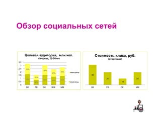
- 3. ą×ą▒ąĘąŠčĆ čüąŠčåąĖą░ą╗čīąĮčŗčģ čüąĄč鹥ą╣ ą”ąĄą╗ąĄą▓ą░čÅ ą░čāą┤ąĖč鹊čĆąĖčÅ, ą╝ą╗ąĮ.č湥ą╗. ąĪč鹊ąĖą╝ąŠčüčéčī ą║ą╗ąĖą║ą░, čĆčāą▒. ą│.ą£ąŠčüą║ą▓ą░, 25-50ą╗ąĄčé (čüčéą░čĆč鹊ą▓ą░čÅ) 3.5 3 2.5 2 ąČąĄąĮčēąĖąĮčŗ 1.5 32 1 20 20 0.5 ą╝čāąČčćąĖąĮčŗ 10 0 ąÆąÜ FB ą×ąÜ ą¢ą¢ ą£ą£ ąÆąÜ FB ą×ąÜ ą£ą£
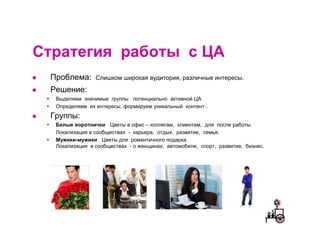
- 4. CčéčĆą░č鹥ą│ąĖčÅ čĆą░ą▒ąŠčéčŗ čü ą”ąÉ ą¤čĆąŠą▒ą╗ąĄą╝ą░: ąĪą╗ąĖčłą║ąŠą╝ čłąĖčĆąŠą║ą░čÅ ą░čāą┤ąĖč鹊čĆąĖčÅ, čĆą░ąĘą╗ąĖčćąĮčŗąĄ ąĖąĮč鹥čĆąĄčüčŗ. ąĀąĄčłąĄąĮąĖąĄ: ąÆčŗą┤ąĄą╗čÅąĄą╝ ąĘąĮą░čćąĖą╝čŗąĄ ą│čĆčāą┐ą┐čŗ ą┐ąŠč鹥ąĮčåąĖą░ą╗čīąĮąŠ ą░ą║čéąĖą▓ąĮąŠą╣ ą”ąÉ ą×ą┐čĆąĄą┤ąĄą╗čÅąĄą╝ ąĖčģ ąĖąĮč鹥čĆąĄčüčŗ, č乊čĆą╝ąĖčĆčāąĄą╝ čāąĮąĖą║ą░ą╗čīąĮčŗą╣ ą║ąŠąĮč鹥ąĮčé . ąōčĆčāą┐ą┐čŗ: ąæąĄą╗čŗąĄ ą▓ąŠčĆąŠčéąĮąĖčćą║ąĖ ą”ą▓ąĄčéčŗ ą▓ ąŠčäąĖčü ŌĆō ą║ąŠą╗ą╗ąĄą│ą░ą╝, ą║ą╗ąĖąĄąĮčéą░ą╝, ą┤ą╗čÅ ą┐ąŠčüą╗ąĄ čĆą░ą▒ąŠčéčŗ. ąøąŠą║ą░ą╗ąĖąĘą░čåąĖčÅ ą▓ čüąŠąŠą▒čēąĄčüčéą▓ą░čģ - ą║ą░čĆčīąĄčĆą░, ąŠčéą┤čŗčģ, čĆą░ąĘą▓ąĖčéąĖąĄ, čüąĄą╝čīčÅ. ą£čāąČąĖą║ąĖ-ą╝čāąČąĖą║ąĖ ą”ą▓ąĄčéčŗ ą┤ą╗čÅ čĆąŠą╝ą░ąĮčéąĖčćąĮąŠą│ąŠ ą┐ąŠą┤ą░čĆą║ą░. ąøąŠą║ą░ą╗ąĖąĘą░čåąĖčÅ ą▓ čüąŠąŠą▒čēąĄčüčéą▓ą░čģ - ąŠ ąČąĄąĮčēąĖąĮą░čģ, ą░ą▓č鹊ą╝ąŠą▒ąĖą╗ąĖ, čüą┐ąŠčĆčé, čĆą░ąĘą▓ąĖčéąĖąĄ, ą▒ąĖąĘąĮąĄčü.
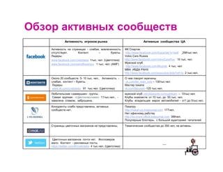
- 5. ą×ą▒ąĘąŠčĆ ą░ą║čéąĖą▓ąĮčŗčģ čüąŠąŠą▒čēąĄčüčéą▓ ąÉą║čéąĖą▓ąĮąŠčüčéčī ąĖą│čĆąŠą║ąŠą▓ čĆčŗąĮą║ą░ ąÉą║čéąĖą▓ąĮčŗąĄ čüąŠąŠą▒čēąĄčüčéą▓ą░ ą”ąÉ ąÉą║čéąĖą▓ąĮąŠčüčéčī ąĮą░ čüčéčĆą░ąĮąĖčåą░čģ - čüą╗ą░ą▒ą░čÅ, ą▓ąŠą▓ą╗ąĄč湥ąĮąĮąŠčüčéčī ążąÜ ąĪą┐ą░čĆčéą░ą║ ąŠčéčüčāčéčüčéą▓čāąĄčé. ąÜąŠąĮč鹥ąĮčé ŌĆō ą▒čāą║ąĄčéčŗ. http://www.facebook.com/fcspartak?v=wall 298čéčŗčü.č湥ą╗. ąøąĖą┤ąĄčĆčŗ: Volvo Cars Russia www.facebook.com/cvetoteka 1čéčŗčü. č湥ą╗ (ą”ą▓ąĄč鹊č鹥ą║ą░) http://www.facebook.com/VolvoCarsRus 10 čéčŗčü. č湥ą╗. www.facebook.com/sendflowersru 1 čéčŗčü. č湥ą╗. (ąÉą£F) ą£čāąČčüą║ąŠą╣ ą║ą╗čāą▒ http://www.facebook.com/Muzhiki 4 čéčŗčü. č湥ą╗ MBA ąśąæąöąÉ ąĀąÉąØąź http://www.facebook.com/executive.ibda?ref=ts 2 čéčŗčü.č湥ą╗. ą×ą║ąŠą╗ąŠ 20 čüąŠąŠą▒čēąĄčüčéą▓ 5- 10 čéčŗčü. č湥ą╗.. ąÉą║čéąĖą▓ąĮąŠčüčéčī - ą× č湥ą╝ ą│ąŠą▓ąŠčĆčÅčé ą╝čāąČčćąĖąĮčŗ čüą╗ą░ą▒ą░čÅ, ą║ąŠąĮč鹥ąĮčé ŌĆō ą▒čāą║ąĄčéčŗ. vk.com/for_men_only ŌĆō 130čéčŗčü.č湥ą╗ ąøąĖą┤ąĄčĆčŗ: ą£ą░čüč鹥čĆ ą┐ąĖą║ą░ą┐ą░ www.vk.com/cvetoteka 91 čéčŗčü.č湥ą╗. (ą”ą▓ąĄč鹊č鹥ą║ą░) vk.com/laburent -125 čéčŗčü.č湥ą╗. ąøčÄą▒ąĖč鹥ą╗čīčüą║ąĖąĄ ┬½ąĘą░ą╝ąĄčĆčłąĖąĄ┬╗ ą│čĆčāą┐ą┐čŗ . ą╝čāąČčüą║ąŠą╣ ą║ą╗čāą▒ odnoklassniki.ru/muzhikam ŌĆō 10čéčŗčü.č湥ą╗. ąĪą░ą╝ą░čÅ ą║čĆčāą┐ąĮą░čÅ - ┬½ą”ą▓ąĄč鹊ą║ą╗ą░čüčüąĮąĖą║ąĖ┬╗ 11čéčŗčü.č湥ą╗., - ąÜą╗čāą▒čŗ ąĘąĮą░ą║ąŠą╝čüčéą▓: ąŠčé 10 čéčŗčü. ą┤ąŠ 50 čéčŗčü. č湥ą╗. ąĘą░ą▓ą░ą╗ąĄąĮą░ čüą┐ą░ą╝ąŠą╝, ąĘą░ą▒čĆąŠčłąĄąĮą░. ąÜą╗čāą▒čŗ ą▓ą╗ą░ą┤ąĄą╗čīčåąĄą▓ ą╝ą░čĆąŠą║ ą░ą▓č鹊ą╝ąŠą▒ąĖą╗ąĄą╣ - ąŠčé1 ą┤ąŠ 5čéčŗčü.č湥ą╗. ąÜąŠąĮą║čāčĆąĄąĮčéčŗ čüą╗ą░ą▒ąŠ ą┐čĆąĄą┤čüčéą░ą▓ą╗ąĄąĮčŗ, ą░ą║čéąĖą▓ąĮčŗčģ ą¤ąĖą║ą░ą┐čĆčā čüąŠąŠą▒čēąĄčüčéą▓ ąĮąĄčé. http://nukan-py.livejournal.com 177č湥ą╗. ąØąĄčé ąŠčäąĖčüąĮąŠą╝čā čĆą░ą▒čüčéą▓čā http://no-more-office.livejournal.com 388č湥ą╗. ą¤ąŠą┐čāą╗čÅčĆąĮčŗąĄ ą▒ą╗ąŠą│ą│ąĄčĆčŗ, čü ą▒ąŠą╗čīčłąŠą╣ ą░čāą┤ąĖč鹊čĆąĖąĄą╣ čćąĖčéą░č鹥ą╗ąĄą╣ ąĪčéčĆą░ąĮąĖčåčŗ čåą▓ąĄč鹊čćąĮčŗčģ ą╝ą░ą│ą░ąĘąĖąĮąŠą▓ ąĮąĄ ą┐čĆąĄą┤čüčéą░ą▓ą╗ąĄąĮčŗ. ąóąĄą╝ą░čéąĖč湥čüą║ąĖąĄ čüąŠąŠą▒čēąĄčüčéą▓ą░ ą┤ąŠ 350 č湥ą╗, ąĮąĄ ą░ą║čéąĖą▓ąĮčŗ. ą”ą▓ąĄč鹊čćąĮčŗčģ ą╝ą░ą│ą░ąĘąĖąĮąŠą▓ ą┐ąŠčćčéąĖ ąĮąĄčé. ążąŠą╗ą╗ąŠą▓ąĄčĆąŠą▓ ą╝ą░ą╗ąŠ. ąÜąŠąĮč鹥ąĮčé - čĆąĄą║ą╗ą░ą╝ąĮčŗąĄ ą┐ąŠčüčéčŗ. __ https://twitter.com/#!/cvetoteka 4 čéčŗčü.č湥ą╗. (ą”ą▓ąĄč鹊č鹥ą║ą░)
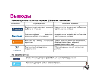
- 6. ąÆčŗą▓ąŠą┤čŗ ąĀąĄą║ąŠą╝ąĄąĮą┤čāąĄą╝čŗąĄ čüąŠčåčüąĄčéąĖ ą▓ ą┐ąŠčĆčÅą┤ą║ąĄ čāą▒čŗą▓ą░ąĮąĖčÅ ąĘąĮą░čćąĖą╝ąŠčüčéąĖ: Social media ąźą░čĆą░ą║č鹥čĆąĖčüčéąĖą║ąĖ ąÆąŠąĘą╝ąŠąČąĮą░čÅ ą░ą║čéąĖą▓ąĮąŠčüčéčī ąÆčŗčüąŠą║ąŠą░ą║čéąĖą▓ąĮą░čÅ ą░čāą┤ąĖč鹊čĆąĖčÅ, ą▓ąŠąĘą╝ąŠąČąĮą░ ąÆąĄą┤ąĄąĮąĖąĄ ą│čĆčāą┐ą┐čŗ, ą░ą║čéąĖą▓ąĮąŠčüčéčī ą▓ čüąŠąŠą▒čēąĄčüčéą▓ą░čģ, ą▓čŗą▒ąŠčĆą║ą░ ą┐ąŠ ąĖąĮč鹥čĆąĄčüą░ą╝ čéą░čĆą│ąĄčéąĖčĆąŠą▓ą░ąĮąĮą░čÅ čĆąĄą║ą╗ą░ą╝ą░ ą¤ą╗ą░č鹥ąČąĄčüą┐ąŠčüąŠą▒ąĮą░čÅ ą░čāą┤ąĖč鹊čĆąĖčÅ, ąÆąĄą┤ąĄąĮąĖąĄ ą│čĆčāą┐ą┐čŗ, ą░ą║čéąĖą▓ąĮąŠčüčéčī ą▓ čüąŠąŠą▒čēąĄčüčéą▓ą░čģ, ą▓ąŠąĘą╝ąŠąČąĮą░ ą▓čŗą▒ąŠčĆą║ą░ ą┐ąŠ ąĖąĮč鹥čĆąĄčüą░ą╝ čéą░čĆą│ąĄčéąĖčĆąŠą▓ą░ąĮąĮą░čÅ čĆąĄą║ą╗ą░ą╝ą░. ąæąŠą╗čīčłą░čÅ ą┐ąŠ ąŠą▒čŖąĄą╝čā čĆą░ąĘąĮąŠčĆąŠą┤ąĮą░čÅ ąóčĆąĄą▒čāąĄčé ą▒ąŠą╗čīčłąĖčģ čāčüąĖą╗ąĖą╣ ą┤ą╗čÅ ą┐čĆąŠą┤ą▓ąĖąČąĄąĮąĖčÅ, ą░čāą┤ąĖč鹊čĆąĖčÅ ą▓ąŠąĘą╝ąŠąČąĮąŠ čĆą░čüčüą╝ąŠčéčĆąĄčéčī ą▓ą░čĆąĖą░ąĮčéčŗ ą╝ąĖąĮąĖą╝ą░ą╗čīąĮąŠą│ąŠ ą┐čĆąĖčüčāčéčüčéą▓ąĖčÅ ą¤ą╗ą░č鹥ąČąĄčüą┐ąŠčüąŠą▒ąĮą░čÅ ą░čāą┤ąĖč鹊čĆąĖčÅ, ąĀą░ą▒ąŠčéą░ čü ą╗ąĖą┤ąĄčĆą░ą╝ąĖ ą╝ąĮąĄąĮąĖą╣, ą║ąŠąĮč鹥ą║čüčéąĮą░čÅ ą╗ąĖą┤ąĄčĆčŗ ą╝ąĮąĄąĮąĖą╣ čĆąĄą║ą╗ą░ą╝ą░. ąØąĄ čĆąĄą║ąŠą╝ąĄąĮą┤čāąĄą╝: ąĪą╗ą░ą▒ąŠą░ą║čéąĖą▓ąĮą░čÅ ą░čāą┤ąĖč鹊čĆąĖčÅ, čéčĆąĄą▒čāąĄčé ą▒ąŠą╗čīčłąĖčģ čāčüąĖą╗ąĖą╣ ą┤ą╗čÅ ą┐čĆąŠą┤ą▓ąĖąČąĄąĮąĖčÅ ąĀą░ąĘą╝čŗčéą░čÅ ą░čāą┤ąĖč鹊čĆąĖčÅ, čüą╗ą░ą▒čŗąĄ čüą▓čÅąĘąĖ ą▓ąĮčāčéčĆąĖ čüąĄčéąĖ.