際際滷

際際滷Share a Scribd company logo
1
Typography from the 19th
to the 21st century
typography
Gutenberg to MODERN
32
54
Over the past few centuries, there has been signifi-
cant and rapid advancements in technology. These
advancements characterized by new innovation has
increased significantly increased the role of tech-
nology in almost every aspects of human life. Equal-
ly, these advancements have had a huge impact on
the world of typography. Today, people have be-
come more aware than ever before about typogra-
phy. The increase
in awareness in
mostly attribut-
ed to todays
digital landscape.
Typography is
an art and tech-
nique that in-
volves arranging
type in order to
make language
legible, and appealing to look at. Over time, typog-
raphy has also evolved to become a crucial compo-
nent to everyday life and is evident in almost every
surrounding (Baines and Andrew 99). Notably, ev-
ery visual component text involves some kind of ty-
pography, be it on documentation, advertisement,
or even on a text on a computer screen. Although
the text is often consistent regardless of how it is
rendered, the style of type usually changes as year
go by. An analysis of text over different time lines
indicates that the style of type advances in a man-
ner similar to the of technology. Typography is also
influenced by time and culture (Craig 2).
Typography is an art and
technique that involves arranging
type in order to make language
legible, and appealing to look at.
Introduction
76
Culture and nationality have played
a significant role in the creation of
certain typefaces.
Culture and nationality have played a significant role in the creation of certain typefaces.This is evident with the Didot
created by the French, the Bodoni, which is created by the Italians, the Helvetica created by the Swiss and Gill Sans
which was created by the British (Fr端h et al. 121).A comparison of different timelines indicates that typography has
changed significantly over time and it appears that it still continues
to change. In particular, the anatomy and style of typography is
advancing.A comparison of two timelines such as that from Guten-
berg to the nineteenth century and the twentieth and twenty-first
centuries indicate that typography used in during these years differ
in so many ways. Equally, these timelines also indicate that typog-
raphy used over these years share several similarities. For instance,
typography from Gutenberg to the nineteenth century shows that
typography was characterized by strong use of serif fonts, while
the period between twentieth and twenty-first centuries emphasis
was on the use of san-serif fonts.Although how type is made has
not changed significantly, there are significant differences in style,
use, and process. Notably, both style and usage is consistent and
carry a strong reputation. It appears that the san-serif font is
more legible and easier to read (Fr端h et al. 121).
Serif typefaces have
been credited for
increasing the readabil-
ity and reading speed,
particularly for long
passages of text.
Typography reflects time and setting, which
explains why typography is changing over time.
For instance, from Gutenberg to the nine-
teenth-century visual component was expressed
through Old Style serifs,Transitional serifs, and
Modern (Didone) serifs. In addition to, the hand
and the machine or the hand-printing press,
metal type and woodblock type.Although serifs
may be considered as being decorative, their
style is designed to serve more objectives (Ser-
if vs. Sans). Historically, Serif typefaces have
been credited for increasing the readability and
reading speed, particularly for long passages of
text.This is because they assist the eye to travel
across the passage lines.This is particularly
important where passage lines are long or have
open word spacing (Serif vs. Sans).
98
During the nineteenth century, serif fonts were accepted and used
often. Serif fonts such as Old Style serif fonts were mainly used in
relation to literature and English while serif fonts such as transi-
tional and modern serifs were often use in relation to fashion and
fortune.Typography in the nineteenth century was known to be
very elegant, literal, and modern. Old Style serifs were invented
between the late fifteenth and mid-eighteenth centuries. Old
style serif became popular in the nineteenth century when it was
often used in literature books and newspaper. Old Style serif is
expressed through the first Roman types (Fr端h et al. 121).
In the 1400s, technology was not as huge and advanced as it
is todays contemporary world, however while dealing with
typography the hand-printing press, metal type and woodblock
type were often at use. Books were printed in the first half
of the typographic printing period, that was called Incunabula.
The term Incunabula or incunable refers to a book or other
types of documents that were printed, and not those that were
handwritten. Before the start of the sixteenth century in Europe,
the term was also used to refer to an emerging form of typology
(Incunabula:The Early) The first book to use these types wasnt
published until a decade later in 1702. In fact, the full set of 82
fonts wasnt completed until half a century later in 1745 (His-
tory of Typography). Old style fonts were often used during this
process and sometimes Transitional serifs.
Transitional serifs were more diverse than the other serifs.Tran-
sition serifs displayed a style that appeared to be in between Old
Style serifs and Neoclassical and Didone serifs (Serif vs. Sans).
These typefaces represent the transition from old style and neo-
classical designs.They also incorporate some characteristics from
each of these types (Serif vs. Sans; Craig 2). In the 1750s, John
Baskerville created a font that stood out the most compared
to other transitional serifs. During John Baskervilles lifetime his
types had little influence in his home country (History of Ty-
pography). In 1758, Baskerville met with Benjamin Franklin who
later returned to the United States with some of Baskervilless
type. Benjamin popularized it through its adoption as one of the
standard typefaces employed in federal government publishing
(History of Typography). Franklin adored Baskervilles work,
and in a letter to Baskerville defended Baskervilles types,
recounting a discussion he had with an English gentleman who
claimed that Baskervilles ultra-thin serifs and narrow strokes
would blind its readers (History of Typography). From liter-
ature books to fashion magazines, Baskerville was often used
in both and is strongly memorized by its diversity.
Old Style serif is
expressed through
the first Roman types
1110
In todays world of typography compared to the nineteenth century, differ in many ways.
From The twentieth and twenty-first centuries and 1900s until today, san-serifs are of-
ten used. Not only is san-serifs after used but the process of type differ as well.While
in the nineteenth century it was a rather busy time in the world and more constructive,
today, more then half of our usage
is based on technology. Due to the
extreme use of technology, they
have made fonts that are easier to
read on the computer and larger
scales. However, Serif fonts are usu-
ally easier to read in printed works
than sans-serif fonts (Scribe Con-
sulting).This is because the ser-
if made the individual letters more
distinctive and easier for our brains
to recognize quickly. (Scribe Con-
sulting.) Without the use serif, the
brain would have to spend longer
identifying the letter because the
shape is less distinctive. (Scribe
Consulting). In other words, the
commonly used exploration for
printed work is to apply a serif font for the bodys text in any work.As such, sans-ser-
if font is usually used for headings, table text and captions. Since technology was so huge
and is still gradually growing, san-serifs are more convenient. From its origins in Europe
in early 20th century, the Art Deco movement rapidly spread across the United States,
where it remained as popular and pervasive style up to the mid-1930s (Art Deco Type-
styles).The Art Deco aesthetic is characterized by stylized, graceful, and geometric
shapes, which usually have symmetrical arrangements (Art Deco Typestyles).Art Deco
is evident everywhere a look at the Chrysler Building, which is found in NewYork City,
provides an example of Art Deco architecture (Art Deco Typestyles).
In the late eighteenth,
Neoclassical & Didone
Serifs were starting to become
a creation, and by the time
it hit the nineteenth century,
Neoclassical & Didone Serifs
became extremely popular.
1312
Futura was known for its clean &
upright appearance, along with
Helvetica, Avenir, and Arial.
Futura
The release of Futura in the year that
followed easily provokes the debate whether
Erbar-Grotesk influenced it or whether it
was possibly the other way around (Types
of Their Time). In fact, Paul Renner had
already presented his type design to an
audience during a lecture at the K旦lner
Werbeschule in 1925, where Jakob Erbar
happened to be teaching (Types of Their
Time). Futura was known for its clean and
upright appearance, along with Helvetica,
Avenir, and Arial.Today, Helvetica is often
used for huge displayed font. Helvetica is
extremely diverse, clean, and easy to read.
Helvetica proved popular, especially among
advertising agencies in the United States. In
fact, it became the default typeface for com-
panies wishing to have project a dynamic,
modern image during the 1960s (Helvetica:
The Little Typeface).
1514
Within a decade, the designers such as Massimo
Vignelli and Bob Noorda choose it as their preferred
typeface for New Yorks new subway signs (Helvetica:
The Little Typeface). Both types from both timelines
will remain in use for different purposes. However, the
process of type is gradually changing and more tech-
nical compared to the ninth century.The constructive
use of type is not often used compared to how typog-
raphers use to make type. Serifs and sans serifs can be
used in any number of applications (Design Shack).
It is important like for any other design technique or
tool, is to use the typefaces well, with purpose and in
concert with the content (Design Shack).
Text is consistent
no matter how
its rendered
1716
Designer
Project
Course
Faculty
Typefaces
Photography
Art Deco Typestyles - Fonts.com - Fonts.com. Fonts.com.Web. 02 Mar. 2016.
Baines, Phil, and Andrew Haslam.Type & Typography. NewYork :Watson-Guptill
Publications, 2002. Print.
Craig, James, Irene K. Scala, and William Bevington. Designing with Type:The Essen-
tial Guide to Typography. NewYork:Watson-Guptill Publications, 2006. Print.
Design Shack - Web Design Gallery,Articles & Community. Serif vs. Sans Serif
Fonts: Is One Really Better Than the Other? Web. 02 Mar. 2016.
Fr端h, Roland, Louise Paradis, and Fran巽ois Rappo. 30Years of Swiss Typographic Dis-
course in the Typografische Monatsbl辰tter:Tm Rsi Sgm 1960-90. Z端rich, Switzerland
: Lars M端ller Publishers, 2013. Print.
Incunabula:The Early Printed Books. AbeBooks.Web. 02 Mar. 2016
History of Typography:Transitional  I Love Typography. I Love Typography RSS.
16 Jan. 2008.Web. 02 Mar. 2016.
Rawsthorn,Alice.Helvetica:The Little Typeface That Leaves a Big Mark. Http://
www. nytimes.com/2007/03/30/style/30iht-design2.1.5085303.html?_r=0. 1 Apr.
2007.Web. 2 Mar. 2016
Prather, Scott.The Importance of Typography.Vital Design. 2014.Web. 02 Mar.
2016.
Serif vs. Sans for Text in Print - Fonts.com. Fonts.com.Web. 02 Mar. 2016.
Scribe Consulting. Serif and Sans-serif Fonts.Web. 02 Mar. 2016.
Types of Their Time  A Short History of the Geometric Sans. FontShop.Web. 02
Mar. 2016.
WORKS CITED
Jada Cash
Typographers Timeline Book
Typograpy II
Francheska Guerrero
Gill Sans
Baskerville
wall.alphacoders.com
www.flickr.com/search
aungthurhahein.github.io
visualhierarchy.co
www.creativebloq.com
www.typography.com/
COLOPHON
1918
20

More Related Content

Similar to French fold book (20)

Basic to Mastering Typography
Basic to Mastering TypographyBasic to Mastering Typography
Basic to Mastering Typography
Shahria Hossain
Week 7_Chapter 7_typography.pptx
Week 7_Chapter 7_typography.pptxWeek 7_Chapter 7_typography.pptx
Week 7_Chapter 7_typography.pptx
WahyuRafdinal1
Typograpghy final
Typograpghy finalTypograpghy final
Typograpghy final
Senistr0
The typography
The typographyThe typography
The typography
Fady El-Masry
Cunning Plan - The Power of Typography
Cunning Plan -  The Power of Typography Cunning Plan -  The Power of Typography
Cunning Plan - The Power of Typography
Cunning Plan Marketing
Cunning Plan - The Power of Typography
Cunning Plan -  The Power of Typography Cunning Plan -  The Power of Typography
Cunning Plan - The Power of Typography
Lizzie Clarke
Typeface Classification for Non-designers
Typeface Classification for Non-designersTypeface Classification for Non-designers
Typeface Classification for Non-designers
Sheel Damani
Type classification
Type classificationType classification
Type classification
Kevin Yeo
Type.2012
Type.2012Type.2012
Type.2012
msickler
Type in 1-2-3
Type in 1-2-3Type in 1-2-3
Type in 1-2-3
Hans Gerhard Meier
Type 1 2 3
Type 1 2 3Type 1 2 3
Type 1 2 3
Hans Gerhard Meier
Calligraphy 102
Calligraphy 102Calligraphy 102
Calligraphy 102
bomxuan868
Fonts
Fonts Fonts
Fonts
Danielle Hulmes
Typographer poster and process package
Typographer poster and process packageTypographer poster and process package
Typographer poster and process package
Jada Cash
Elige un tipo de letra adecuado para tu web
Elige un tipo de letra adecuado para tu webElige un tipo de letra adecuado para tu web
Elige un tipo de letra adecuado para tu web
Ana Cirujano
TYPOGRAPHY 1 OVERVIEW (Intro to GD, Wk 4)
TYPOGRAPHY 1 OVERVIEW (Intro to GD, Wk 4)TYPOGRAPHY 1 OVERVIEW (Intro to GD, Wk 4)
TYPOGRAPHY 1 OVERVIEW (Intro to GD, Wk 4)
Shawn Calvert
LauraMartinez_Typebook
LauraMartinez_TypebookLauraMartinez_Typebook
LauraMartinez_Typebook
Laura Martinez
Calligraphy In Interior Design
Calligraphy In Interior Design Calligraphy In Interior Design
Calligraphy In Interior Design
Aysha Asaad
Typography
TypographyTypography
Typography
Kabir Malkani
Font Basics - a small introduction
Font Basics - a small introductionFont Basics - a small introduction
Font Basics - a small introduction
My.Aegean.gr team | University of the Aegean
Basic to Mastering Typography
Basic to Mastering TypographyBasic to Mastering Typography
Basic to Mastering Typography
Shahria Hossain
Week 7_Chapter 7_typography.pptx
Week 7_Chapter 7_typography.pptxWeek 7_Chapter 7_typography.pptx
Week 7_Chapter 7_typography.pptx
WahyuRafdinal1
Typograpghy final
Typograpghy finalTypograpghy final
Typograpghy final
Senistr0
Cunning Plan - The Power of Typography
Cunning Plan -  The Power of Typography Cunning Plan -  The Power of Typography
Cunning Plan - The Power of Typography
Cunning Plan Marketing
Cunning Plan - The Power of Typography
Cunning Plan -  The Power of Typography Cunning Plan -  The Power of Typography
Cunning Plan - The Power of Typography
Lizzie Clarke
Typeface Classification for Non-designers
Typeface Classification for Non-designersTypeface Classification for Non-designers
Typeface Classification for Non-designers
Sheel Damani
Type classification
Type classificationType classification
Type classification
Kevin Yeo
Type.2012
Type.2012Type.2012
Type.2012
msickler
Calligraphy 102
Calligraphy 102Calligraphy 102
Calligraphy 102
bomxuan868
Typographer poster and process package
Typographer poster and process packageTypographer poster and process package
Typographer poster and process package
Jada Cash
Elige un tipo de letra adecuado para tu web
Elige un tipo de letra adecuado para tu webElige un tipo de letra adecuado para tu web
Elige un tipo de letra adecuado para tu web
Ana Cirujano
TYPOGRAPHY 1 OVERVIEW (Intro to GD, Wk 4)
TYPOGRAPHY 1 OVERVIEW (Intro to GD, Wk 4)TYPOGRAPHY 1 OVERVIEW (Intro to GD, Wk 4)
TYPOGRAPHY 1 OVERVIEW (Intro to GD, Wk 4)
Shawn Calvert
LauraMartinez_Typebook
LauraMartinez_TypebookLauraMartinez_Typebook
LauraMartinez_Typebook
Laura Martinez
Calligraphy In Interior Design
Calligraphy In Interior Design Calligraphy In Interior Design
Calligraphy In Interior Design
Aysha Asaad

Recently uploaded (20)

"Seeing vs. Understanding: The Hidden Psychology of Design", Irene Shkarovska...
"Seeing vs. Understanding: The Hidden Psychology of Design", Irene Shkarovska..."Seeing vs. Understanding: The Hidden Psychology of Design", Irene Shkarovska...
"Seeing vs. Understanding: The Hidden Psychology of Design", Irene Shkarovska...
Fwdays
Sacrament of Confirmation& HolySpirit.pptx
Sacrament of Confirmation& HolySpirit.pptxSacrament of Confirmation& HolySpirit.pptx
Sacrament of Confirmation& HolySpirit.pptx
ShayneMcst
Nature Inspired Innovation : Designing The Future Using Lessons From The Past
Nature Inspired Innovation : Designing The Future Using Lessons From The PastNature Inspired Innovation : Designing The Future Using Lessons From The Past
Nature Inspired Innovation : Designing The Future Using Lessons From The Past
jejchudley
The CLEAR Brands CLEAR EFX Branding Guide
The CLEAR Brands CLEAR EFX Branding GuideThe CLEAR Brands CLEAR EFX Branding Guide
The CLEAR Brands CLEAR EFX Branding Guide
Adriana Yankey
Volodymyr Zelensky Thank You America Shirt
Volodymyr Zelensky Thank You America ShirtVolodymyr Zelensky Thank You America Shirt
Volodymyr Zelensky Thank You America Shirt
robintex21
Design I.Y. HOUSING at Lonavala by S+PS Architects, Sublime Ordinariness H...
Design I.Y. HOUSING at Lonavala by   S+PS Architects,  Sublime Ordinariness H...Design I.Y. HOUSING at Lonavala by   S+PS Architects,  Sublime Ordinariness H...
Design I.Y. HOUSING at Lonavala by S+PS Architects, Sublime Ordinariness H...
JnaneshPreethan
Transform your space into a sanctuary with SPL Interiors where comfort meet...
Transform your space into a sanctuary with SPL Interiors  where comfort meet...Transform your space into a sanctuary with SPL Interiors  where comfort meet...
Transform your space into a sanctuary with SPL Interiors where comfort meet...
SPL Interiors
Tarma - Chanchamayo diagrama unifilar.pdf
Tarma - Chanchamayo diagrama unifilar.pdfTarma - Chanchamayo diagrama unifilar.pdf
Tarma - Chanchamayo diagrama unifilar.pdf
Roger Roman
Smart Farming Technology Pitch Deck Presentation Template
Smart Farming Technology Pitch Deck Presentation TemplateSmart Farming Technology Pitch Deck Presentation Template
Smart Farming Technology Pitch Deck Presentation Template
際際滷sBrain
01_BasicTechniquesTools.pptx "Malware creeps unseen, corrupting data and cont...
01_BasicTechniquesTools.pptx "Malware creeps unseen, corrupting data and cont...01_BasicTechniquesTools.pptx "Malware creeps unseen, corrupting data and cont...
01_BasicTechniquesTools.pptx "Malware creeps unseen, corrupting data and cont...
rohayiw496
LABUAN4D EXCLUSIVE SERVER STAR GAMING ASIA NO.1 TERPOPULER DI INDONESIA ! Ras...
LABUAN4D EXCLUSIVE SERVER STAR GAMING ASIA NO.1 TERPOPULER DI INDONESIA ! Ras...LABUAN4D EXCLUSIVE SERVER STAR GAMING ASIA NO.1 TERPOPULER DI INDONESIA ! Ras...
LABUAN4D EXCLUSIVE SERVER STAR GAMING ASIA NO.1 TERPOPULER DI INDONESIA ! Ras...
PESO4D MANJA
periodic properties NDA.pptx to become better
periodic properties NDA.pptx to become betterperiodic properties NDA.pptx to become better
periodic properties NDA.pptx to become better
steveparker9990sp
edit power------------oooppppppppppppppoint.pptx
edit power------------oooppppppppppppppoint.pptxedit power------------oooppppppppppppppoint.pptx
edit power------------oooppppppppppppppoint.pptx
sarikasharma627282
Crown Freak Of Philos Shirt Crown Freak Of Philos Shirt
Crown Freak Of Philos Shirt Crown Freak Of Philos ShirtCrown Freak Of Philos Shirt Crown Freak Of Philos Shirt
Crown Freak Of Philos Shirt Crown Freak Of Philos Shirt
TeeFusion
Simple Style Thesis Defense Pink variant by 際際滷sgo.pptx
Simple Style Thesis Defense Pink variant by 際際滷sgo.pptxSimple Style Thesis Defense Pink variant by 際際滷sgo.pptx
Simple Style Thesis Defense Pink variant by 際際滷sgo.pptx
josmaryguerraur
TLE-GRADE 9-CLASSIFICATION OF DESSERTS AND THEIR CHARACTERISTICS.pptx
TLE-GRADE 9-CLASSIFICATION OF DESSERTS AND THEIR CHARACTERISTICS.pptxTLE-GRADE 9-CLASSIFICATION OF DESSERTS AND THEIR CHARACTERISTICS.pptx
TLE-GRADE 9-CLASSIFICATION OF DESSERTS AND THEIR CHARACTERISTICS.pptx
Jely Bermundo
LABUAN4D EXCLUSIVE SERVER STAR GAMING ASIA NO.1 TERPOPULER DI INDONESIA ! Ras...
LABUAN4D EXCLUSIVE SERVER STAR GAMING ASIA NO.1 TERPOPULER DI INDONESIA ! Ras...LABUAN4D EXCLUSIVE SERVER STAR GAMING ASIA NO.1 TERPOPULER DI INDONESIA ! Ras...
LABUAN4D EXCLUSIVE SERVER STAR GAMING ASIA NO.1 TERPOPULER DI INDONESIA ! Ras...
PESO4D MANJA
Uncover 5 Secrets to Craft Unforgettable Logos
Uncover 5 Secrets to Craft Unforgettable LogosUncover 5 Secrets to Craft Unforgettable Logos
Uncover 5 Secrets to Craft Unforgettable Logos
Virtual Employee Pvt. Ltd.
Ramadhan 3 Fancy.pdfRamadhan 3 Fancy.pdf
Ramadhan 3 Fancy.pdfRamadhan 3 Fancy.pdfRamadhan 3 Fancy.pdfRamadhan 3 Fancy.pdf
Ramadhan 3 Fancy.pdfRamadhan 3 Fancy.pdf
SuryaDharma65
Ramadhan 1 Large.pdfRamadhan 1 Large.pdf
Ramadhan 1 Large.pdfRamadhan 1 Large.pdfRamadhan 1 Large.pdfRamadhan 1 Large.pdf
Ramadhan 1 Large.pdfRamadhan 1 Large.pdf
SuryaDharma65
"Seeing vs. Understanding: The Hidden Psychology of Design", Irene Shkarovska...
"Seeing vs. Understanding: The Hidden Psychology of Design", Irene Shkarovska..."Seeing vs. Understanding: The Hidden Psychology of Design", Irene Shkarovska...
"Seeing vs. Understanding: The Hidden Psychology of Design", Irene Shkarovska...
Fwdays
Sacrament of Confirmation& HolySpirit.pptx
Sacrament of Confirmation& HolySpirit.pptxSacrament of Confirmation& HolySpirit.pptx
Sacrament of Confirmation& HolySpirit.pptx
ShayneMcst
Nature Inspired Innovation : Designing The Future Using Lessons From The Past
Nature Inspired Innovation : Designing The Future Using Lessons From The PastNature Inspired Innovation : Designing The Future Using Lessons From The Past
Nature Inspired Innovation : Designing The Future Using Lessons From The Past
jejchudley
The CLEAR Brands CLEAR EFX Branding Guide
The CLEAR Brands CLEAR EFX Branding GuideThe CLEAR Brands CLEAR EFX Branding Guide
The CLEAR Brands CLEAR EFX Branding Guide
Adriana Yankey
Volodymyr Zelensky Thank You America Shirt
Volodymyr Zelensky Thank You America ShirtVolodymyr Zelensky Thank You America Shirt
Volodymyr Zelensky Thank You America Shirt
robintex21
Design I.Y. HOUSING at Lonavala by S+PS Architects, Sublime Ordinariness H...
Design I.Y. HOUSING at Lonavala by   S+PS Architects,  Sublime Ordinariness H...Design I.Y. HOUSING at Lonavala by   S+PS Architects,  Sublime Ordinariness H...
Design I.Y. HOUSING at Lonavala by S+PS Architects, Sublime Ordinariness H...
JnaneshPreethan
Transform your space into a sanctuary with SPL Interiors where comfort meet...
Transform your space into a sanctuary with SPL Interiors  where comfort meet...Transform your space into a sanctuary with SPL Interiors  where comfort meet...
Transform your space into a sanctuary with SPL Interiors where comfort meet...
SPL Interiors
Tarma - Chanchamayo diagrama unifilar.pdf
Tarma - Chanchamayo diagrama unifilar.pdfTarma - Chanchamayo diagrama unifilar.pdf
Tarma - Chanchamayo diagrama unifilar.pdf
Roger Roman
Smart Farming Technology Pitch Deck Presentation Template
Smart Farming Technology Pitch Deck Presentation TemplateSmart Farming Technology Pitch Deck Presentation Template
Smart Farming Technology Pitch Deck Presentation Template
際際滷sBrain
01_BasicTechniquesTools.pptx "Malware creeps unseen, corrupting data and cont...
01_BasicTechniquesTools.pptx "Malware creeps unseen, corrupting data and cont...01_BasicTechniquesTools.pptx "Malware creeps unseen, corrupting data and cont...
01_BasicTechniquesTools.pptx "Malware creeps unseen, corrupting data and cont...
rohayiw496
LABUAN4D EXCLUSIVE SERVER STAR GAMING ASIA NO.1 TERPOPULER DI INDONESIA ! Ras...
LABUAN4D EXCLUSIVE SERVER STAR GAMING ASIA NO.1 TERPOPULER DI INDONESIA ! Ras...LABUAN4D EXCLUSIVE SERVER STAR GAMING ASIA NO.1 TERPOPULER DI INDONESIA ! Ras...
LABUAN4D EXCLUSIVE SERVER STAR GAMING ASIA NO.1 TERPOPULER DI INDONESIA ! Ras...
PESO4D MANJA
periodic properties NDA.pptx to become better
periodic properties NDA.pptx to become betterperiodic properties NDA.pptx to become better
periodic properties NDA.pptx to become better
steveparker9990sp
edit power------------oooppppppppppppppoint.pptx
edit power------------oooppppppppppppppoint.pptxedit power------------oooppppppppppppppoint.pptx
edit power------------oooppppppppppppppoint.pptx
sarikasharma627282
Crown Freak Of Philos Shirt Crown Freak Of Philos Shirt
Crown Freak Of Philos Shirt Crown Freak Of Philos ShirtCrown Freak Of Philos Shirt Crown Freak Of Philos Shirt
Crown Freak Of Philos Shirt Crown Freak Of Philos Shirt
TeeFusion
Simple Style Thesis Defense Pink variant by 際際滷sgo.pptx
Simple Style Thesis Defense Pink variant by 際際滷sgo.pptxSimple Style Thesis Defense Pink variant by 際際滷sgo.pptx
Simple Style Thesis Defense Pink variant by 際際滷sgo.pptx
josmaryguerraur
TLE-GRADE 9-CLASSIFICATION OF DESSERTS AND THEIR CHARACTERISTICS.pptx
TLE-GRADE 9-CLASSIFICATION OF DESSERTS AND THEIR CHARACTERISTICS.pptxTLE-GRADE 9-CLASSIFICATION OF DESSERTS AND THEIR CHARACTERISTICS.pptx
TLE-GRADE 9-CLASSIFICATION OF DESSERTS AND THEIR CHARACTERISTICS.pptx
Jely Bermundo
LABUAN4D EXCLUSIVE SERVER STAR GAMING ASIA NO.1 TERPOPULER DI INDONESIA ! Ras...
LABUAN4D EXCLUSIVE SERVER STAR GAMING ASIA NO.1 TERPOPULER DI INDONESIA ! Ras...LABUAN4D EXCLUSIVE SERVER STAR GAMING ASIA NO.1 TERPOPULER DI INDONESIA ! Ras...
LABUAN4D EXCLUSIVE SERVER STAR GAMING ASIA NO.1 TERPOPULER DI INDONESIA ! Ras...
PESO4D MANJA
Uncover 5 Secrets to Craft Unforgettable Logos
Uncover 5 Secrets to Craft Unforgettable LogosUncover 5 Secrets to Craft Unforgettable Logos
Uncover 5 Secrets to Craft Unforgettable Logos
Virtual Employee Pvt. Ltd.
Ramadhan 3 Fancy.pdfRamadhan 3 Fancy.pdf
Ramadhan 3 Fancy.pdfRamadhan 3 Fancy.pdfRamadhan 3 Fancy.pdfRamadhan 3 Fancy.pdf
Ramadhan 3 Fancy.pdfRamadhan 3 Fancy.pdf
SuryaDharma65
Ramadhan 1 Large.pdfRamadhan 1 Large.pdf
Ramadhan 1 Large.pdfRamadhan 1 Large.pdfRamadhan 1 Large.pdfRamadhan 1 Large.pdf
Ramadhan 1 Large.pdfRamadhan 1 Large.pdf
SuryaDharma65

French fold book

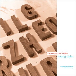
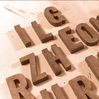
  • 1. 1 Typography from the 19th to the 21st century typography Gutenberg to MODERN
  • 2. 32
  • 3. 54 Over the past few centuries, there has been signifi- cant and rapid advancements in technology. These advancements characterized by new innovation has increased significantly increased the role of tech- nology in almost every aspects of human life. Equal- ly, these advancements have had a huge impact on the world of typography. Today, people have be- come more aware than ever before about typogra- phy. The increase in awareness in mostly attribut- ed to todays digital landscape. Typography is an art and tech- nique that in- volves arranging type in order to make language legible, and appealing to look at. Over time, typog- raphy has also evolved to become a crucial compo- nent to everyday life and is evident in almost every surrounding (Baines and Andrew 99). Notably, ev- ery visual component text involves some kind of ty- pography, be it on documentation, advertisement, or even on a text on a computer screen. Although the text is often consistent regardless of how it is rendered, the style of type usually changes as year go by. An analysis of text over different time lines indicates that the style of type advances in a man- ner similar to the of technology. Typography is also influenced by time and culture (Craig 2). Typography is an art and technique that involves arranging type in order to make language legible, and appealing to look at. Introduction
  • 4. 76 Culture and nationality have played a significant role in the creation of certain typefaces. Culture and nationality have played a significant role in the creation of certain typefaces.This is evident with the Didot created by the French, the Bodoni, which is created by the Italians, the Helvetica created by the Swiss and Gill Sans which was created by the British (Fr端h et al. 121).A comparison of different timelines indicates that typography has changed significantly over time and it appears that it still continues to change. In particular, the anatomy and style of typography is advancing.A comparison of two timelines such as that from Guten- berg to the nineteenth century and the twentieth and twenty-first centuries indicate that typography used in during these years differ in so many ways. Equally, these timelines also indicate that typog- raphy used over these years share several similarities. For instance, typography from Gutenberg to the nineteenth century shows that typography was characterized by strong use of serif fonts, while the period between twentieth and twenty-first centuries emphasis was on the use of san-serif fonts.Although how type is made has not changed significantly, there are significant differences in style, use, and process. Notably, both style and usage is consistent and carry a strong reputation. It appears that the san-serif font is more legible and easier to read (Fr端h et al. 121). Serif typefaces have been credited for increasing the readabil- ity and reading speed, particularly for long passages of text. Typography reflects time and setting, which explains why typography is changing over time. For instance, from Gutenberg to the nine- teenth-century visual component was expressed through Old Style serifs,Transitional serifs, and Modern (Didone) serifs. In addition to, the hand and the machine or the hand-printing press, metal type and woodblock type.Although serifs may be considered as being decorative, their style is designed to serve more objectives (Ser- if vs. Sans). Historically, Serif typefaces have been credited for increasing the readability and reading speed, particularly for long passages of text.This is because they assist the eye to travel across the passage lines.This is particularly important where passage lines are long or have open word spacing (Serif vs. Sans).
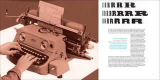
  • 5. 98 During the nineteenth century, serif fonts were accepted and used often. Serif fonts such as Old Style serif fonts were mainly used in relation to literature and English while serif fonts such as transi- tional and modern serifs were often use in relation to fashion and fortune.Typography in the nineteenth century was known to be very elegant, literal, and modern. Old Style serifs were invented between the late fifteenth and mid-eighteenth centuries. Old style serif became popular in the nineteenth century when it was often used in literature books and newspaper. Old Style serif is expressed through the first Roman types (Fr端h et al. 121). In the 1400s, technology was not as huge and advanced as it is todays contemporary world, however while dealing with typography the hand-printing press, metal type and woodblock type were often at use. Books were printed in the first half of the typographic printing period, that was called Incunabula. The term Incunabula or incunable refers to a book or other types of documents that were printed, and not those that were handwritten. Before the start of the sixteenth century in Europe, the term was also used to refer to an emerging form of typology (Incunabula:The Early) The first book to use these types wasnt published until a decade later in 1702. In fact, the full set of 82 fonts wasnt completed until half a century later in 1745 (His- tory of Typography). Old style fonts were often used during this process and sometimes Transitional serifs. Transitional serifs were more diverse than the other serifs.Tran- sition serifs displayed a style that appeared to be in between Old Style serifs and Neoclassical and Didone serifs (Serif vs. Sans). These typefaces represent the transition from old style and neo- classical designs.They also incorporate some characteristics from each of these types (Serif vs. Sans; Craig 2). In the 1750s, John Baskerville created a font that stood out the most compared to other transitional serifs. During John Baskervilles lifetime his types had little influence in his home country (History of Ty- pography). In 1758, Baskerville met with Benjamin Franklin who later returned to the United States with some of Baskervilless type. Benjamin popularized it through its adoption as one of the standard typefaces employed in federal government publishing (History of Typography). Franklin adored Baskervilles work, and in a letter to Baskerville defended Baskervilles types, recounting a discussion he had with an English gentleman who claimed that Baskervilles ultra-thin serifs and narrow strokes would blind its readers (History of Typography). From liter- ature books to fashion magazines, Baskerville was often used in both and is strongly memorized by its diversity. Old Style serif is expressed through the first Roman types
  • 6. 1110 In todays world of typography compared to the nineteenth century, differ in many ways. From The twentieth and twenty-first centuries and 1900s until today, san-serifs are of- ten used. Not only is san-serifs after used but the process of type differ as well.While in the nineteenth century it was a rather busy time in the world and more constructive, today, more then half of our usage is based on technology. Due to the extreme use of technology, they have made fonts that are easier to read on the computer and larger scales. However, Serif fonts are usu- ally easier to read in printed works than sans-serif fonts (Scribe Con- sulting).This is because the ser- if made the individual letters more distinctive and easier for our brains to recognize quickly. (Scribe Con- sulting.) Without the use serif, the brain would have to spend longer identifying the letter because the shape is less distinctive. (Scribe Consulting). In other words, the commonly used exploration for printed work is to apply a serif font for the bodys text in any work.As such, sans-ser- if font is usually used for headings, table text and captions. Since technology was so huge and is still gradually growing, san-serifs are more convenient. From its origins in Europe in early 20th century, the Art Deco movement rapidly spread across the United States, where it remained as popular and pervasive style up to the mid-1930s (Art Deco Type- styles).The Art Deco aesthetic is characterized by stylized, graceful, and geometric shapes, which usually have symmetrical arrangements (Art Deco Typestyles).Art Deco is evident everywhere a look at the Chrysler Building, which is found in NewYork City, provides an example of Art Deco architecture (Art Deco Typestyles). In the late eighteenth, Neoclassical & Didone Serifs were starting to become a creation, and by the time it hit the nineteenth century, Neoclassical & Didone Serifs became extremely popular.
  • 7. 1312 Futura was known for its clean & upright appearance, along with Helvetica, Avenir, and Arial. Futura The release of Futura in the year that followed easily provokes the debate whether Erbar-Grotesk influenced it or whether it was possibly the other way around (Types of Their Time). In fact, Paul Renner had already presented his type design to an audience during a lecture at the K旦lner Werbeschule in 1925, where Jakob Erbar happened to be teaching (Types of Their Time). Futura was known for its clean and upright appearance, along with Helvetica, Avenir, and Arial.Today, Helvetica is often used for huge displayed font. Helvetica is extremely diverse, clean, and easy to read. Helvetica proved popular, especially among advertising agencies in the United States. In fact, it became the default typeface for com- panies wishing to have project a dynamic, modern image during the 1960s (Helvetica: The Little Typeface).
  • 8. 1514 Within a decade, the designers such as Massimo Vignelli and Bob Noorda choose it as their preferred typeface for New Yorks new subway signs (Helvetica: The Little Typeface). Both types from both timelines will remain in use for different purposes. However, the process of type is gradually changing and more tech- nical compared to the ninth century.The constructive use of type is not often used compared to how typog- raphers use to make type. Serifs and sans serifs can be used in any number of applications (Design Shack). It is important like for any other design technique or tool, is to use the typefaces well, with purpose and in concert with the content (Design Shack). Text is consistent no matter how its rendered
  • 9. 1716 Designer Project Course Faculty Typefaces Photography Art Deco Typestyles - Fonts.com - Fonts.com. Fonts.com.Web. 02 Mar. 2016. Baines, Phil, and Andrew Haslam.Type & Typography. NewYork :Watson-Guptill Publications, 2002. Print. Craig, James, Irene K. Scala, and William Bevington. Designing with Type:The Essen- tial Guide to Typography. NewYork:Watson-Guptill Publications, 2006. Print. Design Shack - Web Design Gallery,Articles & Community. Serif vs. Sans Serif Fonts: Is One Really Better Than the Other? Web. 02 Mar. 2016. Fr端h, Roland, Louise Paradis, and Fran巽ois Rappo. 30Years of Swiss Typographic Dis- course in the Typografische Monatsbl辰tter:Tm Rsi Sgm 1960-90. Z端rich, Switzerland : Lars M端ller Publishers, 2013. Print. Incunabula:The Early Printed Books. AbeBooks.Web. 02 Mar. 2016 History of Typography:Transitional I Love Typography. I Love Typography RSS. 16 Jan. 2008.Web. 02 Mar. 2016. Rawsthorn,Alice.Helvetica:The Little Typeface That Leaves a Big Mark. Http:// www. nytimes.com/2007/03/30/style/30iht-design2.1.5085303.html?_r=0. 1 Apr. 2007.Web. 2 Mar. 2016 Prather, Scott.The Importance of Typography.Vital Design. 2014.Web. 02 Mar. 2016. Serif vs. Sans for Text in Print - Fonts.com. Fonts.com.Web. 02 Mar. 2016. Scribe Consulting. Serif and Sans-serif Fonts.Web. 02 Mar. 2016. Types of Their Time A Short History of the Geometric Sans. FontShop.Web. 02 Mar. 2016. WORKS CITED Jada Cash Typographers Timeline Book Typograpy II Francheska Guerrero Gill Sans Baskerville wall.alphacoders.com www.flickr.com/search aungthurhahein.github.io visualhierarchy.co www.creativebloq.com www.typography.com/ COLOPHON
  • 10. 1918
  • 11. 20