ºÝºÝߣ

ºÝºÝߣShare a Scribd company logo
GRAPHS
DISHA
8 A
Graphs
TYPES OF GRAPHS
1.BAR GRAPH
2.PIE GRAPH
3.HISTOGRAM
4.LINE GRAPH
5.PICTOGRAPH
6.LINEAR GRAPH
1. Bar graph
A bar chart or bar graph is a chart that
presents Grouped data with rectangular bars
with lengths proportional to the
values that they represent. The
bars can be plotted vertically or
horizontally. A vertical bar chart is sometimes
called a column bar chart. One axis of the
chart shows the specific categories being
compared, and the other axis represents a
discrete value.
2. Pie graph
Circle graph is shaped like a circle. It is divided
into fractions that looks like pieces of pie. So the
circle graph is called a pie
graph . Many times the
fractional are different colors
and a key explain the colors.
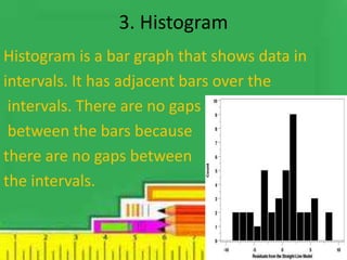
3. Histogram
Histogram is a bar graph that shows data in
intervals. It has adjacent bars over the
intervals. There are no gaps
between the bars because
there are no gaps between
the intervals.
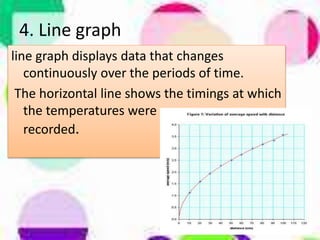
line graph displays data that changes
continuously over the periods of time.
The horizontal line shows the timings at which
the temperatures were
recorded.
4. Line graph
5. Pictograph
Pictograph uses pictures or symbols to show
data. One picture often stands
for more than one vote so
a key is necessary to
understand the symbols.
6. Linear graph
A line graph consists of bits of line segments
joined consecutively. sometimes the graph may
be a whole unbroken line. Such a graph is called a
linear graph. To draw such a line we need to
locate some points on the graph sheet.
Thank you

More Related Content

Graphs

  • 3. TYPES OF GRAPHS 1.BAR GRAPH 2.PIE GRAPH 3.HISTOGRAM 4.LINE GRAPH 5.PICTOGRAPH 6.LINEAR GRAPH
  • 4. 1. Bar graph A bar chart or bar graph is a chart that presents Grouped data with rectangular bars with lengths proportional to the values that they represent. The bars can be plotted vertically or horizontally. A vertical bar chart is sometimes called a column bar chart. One axis of the chart shows the specific categories being compared, and the other axis represents a discrete value.
  • 5. 2. Pie graph Circle graph is shaped like a circle. It is divided into fractions that looks like pieces of pie. So the circle graph is called a pie graph . Many times the fractional are different colors and a key explain the colors.
  • 6. 3. Histogram Histogram is a bar graph that shows data in intervals. It has adjacent bars over the intervals. There are no gaps between the bars because there are no gaps between the intervals.
  • 7. line graph displays data that changes continuously over the periods of time. The horizontal line shows the timings at which the temperatures were recorded. 4. Line graph
  • 8. 5. Pictograph Pictograph uses pictures or symbols to show data. One picture often stands for more than one vote so a key is necessary to understand the symbols.
  • 9. 6. Linear graph A line graph consists of bits of line segments joined consecutively. sometimes the graph may be a whole unbroken line. Such a graph is called a linear graph. To draw such a line we need to locate some points on the graph sheet.